Final evaluation – JDO
JDO - bomb projectEvaluation and Reflection:
Please find below three sets of evaluation questions to consider at the end of your project and write up in your blog.
You should also check on these throughout the process of your project as this will help you to develop ideas and problem-solve issues before it is too late (ie: the end of the project!)
1) Visual Communication:
In what ways does the visual communication/message of the piece meet the needs of the brief?
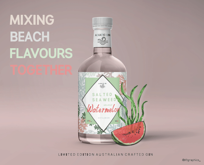
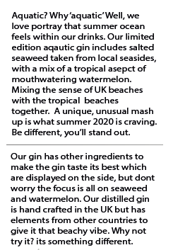
This was a live brief therefore we had to make sure we was doing exactly what the brand was asking – they came into the university where we wrote down all the things that we needed to incorporate within the design to meet their brief, for start of the main thing was just to create something that is a mix up of unusual aspects and create 6 boards to showcase that. My entire design portrays the avenues I want to achieve in graphic design and also created a drink with weird flavours that create a story which is exactly what meets their brief. They also say with the boards to create clear designs and mine displayed showcase a prototype of the design so people can really get a feel of the drink and design and the story I am trying to showcase.
In what ways does the visual communication/message of the piece fail to meet the needs of the brief?
Due to it being a live brief meeting the standards meant it was easier for us to meet it and not not meet the brief. When you have a client actually come in and real down the brief it becomes. Lot easier as you’re not just reading it off a screen for pulling things apart ad asking questions. The brief also is not that hard and the briefs that allow me to create my own ideas always are easier as I can be as creative and unique as possible.
What are the strengths of the visual communication? Why?
Within the design I think there is a lot of strengths within each individual design piece as I spent so long on the design. I had the idea in my head and then went with it – I find sometimes going with the first idea works better and developed from their. There are 6 boards that we had to create the design for therefore had to make sure I was creating visual communication that fitted in with that, each board portrays the bottle in different ways and different aspects that they display – out of all of them the bottle design in general front and back is a strong visual communication aspect as it portrays all elements that fit in with the bottle , it allows the reader to understand what the bottle would like when made and how the elements of flavour come together for the bottle design. Another thing that allows the visual communications to be strong, is the advertising platforms I have created to make the design work well and almost create a campaign for the product, I had to make sure each and every design linked with the bottle meaning the same colours and aspects to make it all consistent and thats what overall makes the visual communication strong.
What are the weaknesses of the visual communication? Why?
I personally worked so hard on the visual communication for my design as I wanted to make sure it would portray way to the audience and how it would look at a distance – the only thing I dislike and think could be developed if we had more time, would be to showcase the bottle on different sides for example on the side, and display the right and left side of it. However, the overall display I created almost suggest what it would look like on the side of the bottle design.
In what ways could the piece be mis-read or mis-understood by the audience? Be specific about who the audience is.
Personally speaking I do not think it could be mid red by anyone, I did a lot of research on what needs to be presented on a bottle therefore everything on the bottle relates to the designs out there. I also think that the poster speaks to audience well, and without the little icons of the watermelon and the seaweed this potentially create a mis-read or understood poster for the audience.
In what practical ways could the piece be developed or improved?
I would of loved to actually create the bottle on different view points, I displayed the back and the front and obviously they look the same but I do wish I could make more bottles and different angels; however the reason I only chose to showcase one bottle was to showcase the fact that its limited edition so buy it and try it quick. I did spend a while making sure this design was perfect and I did a lot of development to achieve my goal, obviously I would change this if I had more time and would make the bottle appearances more interesting to the audience by show casing it on different scenarios and perspectives. However my design display s the bottle I believe; would be cool to actually print the label and design out and test it on a gin bottle though…
2) Good Design? Evaluation
In what ways did you consider Designing Backwards or application of Systems Thinking to your project?
I think with this project system thinking was a big part of it, as its understanding how things influence one another within a whole, for me it was about creating something thats not already been done but also not adding to the issues that we face today. For the design process and mixing ingredients together I used systems thinking techniques as I had to work out ways that certain flavours can be mixed together but actually work if created in the real gin world therefore had to pick a citrus flavour and a dry flavour to counteract one another. I did design backwards for this project, I was thinking of the end outcome before hand and thinking of the ways I could benefit the world and the issues I would face along the way therefore it helped me when coming towards these issues when designing.
In what other ways have you considered the sustainability of your project process and outcomes?
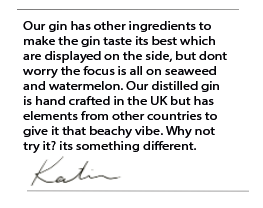
The climate is slowing dying therefore I did not want to add a product that would harm the environment I made sure it was designed through out to follow the recycling pattern and benefit the climate. I made sure I was creating something with natural ingredients, so seaweed from the beach / shops and watermelon. And then looked into other botanical flavours that are involved. I wanted to create a gin that was recyclable after use, made out of recyclable glass and would benefit the sustainability issues, and thats also why there is the sustainable symbol on the back to showcase my added part to the economy.,
In what ways have you considered the ethical implications of your project process and outcomes?
Within my design ethicals implications have to be considered and that is with all graphic design elements. The main thing with ethics in graphic design, is the audience and how they would perceive it and I think I spent ages trying to work out how to portray a gin for all audiences over 18 years old. Another element of ethics, is following the gin guidelines, for example the amount of units one can drink, the ingredients, and what needs to be displayed on the bottle at the front and the back. If I did not research or add this onto my design it would be a bottle that could not be sold as it didn’t have these implications on them that would fit into the gin market which links to the ethics within thud design.
In sustainability and ethical terms in what ways was your work in this project an improvement or a backward step for you as a socially conscious designer?
I feel as the years are going on and I am reaching the end of my graphic design education, I have learnt so much about sustainability and ethical. Every-time I design I always think how is this benefitting people, its important as designers to understand design for good and as the years go on I am progressing that more and developing ideas that benefit people not add to the issues, and this is defiantly something I would continue through the years.n
What targets can you make at this point for your work in the future as a socially conscious designer?
I want to make sure I always follow rules within designs, by this I mean making sure if I am creating a product research as much as possible and always portray the correct information. Double check everything and make sure I am designing for good not bad.
3) Reflection of own working practices:
Be very honest with yourself in this section. Please feel free to approach a member of staff for help finding ways to develop skills.
How was my time keeping?
I felt like my time keeping was pretty good. I aimed for this to be finished when the first set of deadline was set so Feb 20th. I planned to finish it then and I did. I obviously changed a lot of my work but honestly my blogs were up to date and I never felt rushed with this project unlike some others in the past. When we started FMP my focus was just on FMP not JDO, as other people in the class were still continuing JDO. therefore I do think my time keeping for this project was actually really good.
How was my analysis of the brief?
I think because JDO came in and actually spoke to use it made it so much easier to understand the brief in a deeper understanding. Having them come in and break it down and then me writing notes made me understand it and I never felt like I was confused during the process.
How was my research?
I researched into a lot of gin, gin bottles, gin flavours, gin labels and generally think I would not of created the outcome I did if it was not for research.
How did I draw conclusions from my research?
Conclusions from my research allowed me to understand how to make aspects of the design, and how to make it perfect as if it was a real gin bottle being made. I think that when I researched things it allowed me to generate my own ideas and develop them further.
How did I use research to generate and develop ideas?
An example of this through my process would be the first ever bottle I made with the poster, after doing that and researching into gin adverts it made me entirely change my bottle design. Which show cases best designs come when you research. Without researching my bottle would of stayed the same as the beginning and I would not of developed into what it is today, being able to hold a gin bottle at home also helped so I could understand exactly how the product would eventually visualise like.
How did I use evaluations to help with my ideas generation and development?
When I was actually writing the blogs for my first bottle design it was then I realised I hated it, by evaluating my first attempt allowed me to point out everything wrong with it, compare it to gin bottles out there and from that understand what I needed to do to make it better and more professional.
How did I use experimentation during the project? How can I make this more effective?
I had the idea of the flavour first, but then dive straight into the first mock up I saw; and thats why I did not work, I need to make sure I am experimenting different ideas before concluding to the final one, and yes the idea was 100% but the design wasn’t and I need to continue that. I think I would make more sketches in the future and play around with ideas a bit more before concluding. If I did not experiment with the first bottle though I do not think the final outcome today would be as good as its turned out.n
In what ways did I show that I had achieved the Learning Outcomes? How can I improve this next time?
Due to this being a live brief there was no set out learning outcomes. However, I think just meeting what the client asked for giving your justification of why you designed it the way you did and the reason behind it and showing the 6 boards meets to the brief which is like the learning outcomes.
What parts of the project did I enjoy most? Why was this the case?
I love open brief projects, it allows you to be part of a real client and allows us BA’s to understand what it could be like when entering the graphic industry. I loved the mash up idea and it allowed us as designers to create something that related to use our personality and something we found interesting to mix together.
What parts of the project did I enjoy least? Why was this the case?
I think the timing, I think we should of done this beginning of the year as a big project because it could of been something amazing and developed so much more if I had longer and not other projects coming up.
At what times did I work best? Why might this be the case? How can I ensure that I work well at al times?
I always work my best at home. I am finding university very loud and hard to work in at the moment, the first years always scream and shout and its not fair on us BA’s. Sometimes working st my desk at home makes me work better as I am focused and no distractions surrounding me. Weirdly I work better under pressure so when I had the first set deadline I was so ready to finish it and did a lot better than if I knew we had longer.
What areas inspired me? Why was this the case? How could I follow these up?
I was inspired by the beach. The entire design is based on the beach. I love travelling, the beach and getting that taste of summer and thats whta inspired the drink over all, however I also like gin and recently have had t stop drinking alcohol as a hole, and creating this for someone else to enjoy really made this fun. I think gin designs overall inspired me and labels and the personalities and stories each gin provides, and without looking into gins my final would not be strong. I will follow this up by always looking at exciting work out there as this can benefit my designs on what to do and what not to do.
What areas were challenging or difficult? Why was this the case?
I did experiment with cinema 4D which would allow me to create a 3D replicate of the design, but I really struggle with numbers and confusing instructions and I just could not get to grips with it. I have more of an interest in the design itself rather than the bottle therefore found it challenging and did not want to continue that. but I knew it was not for me and did not let it get to me as I knew my stronger points were else where and now I know that for certain.
How can I go about developing and improving the parts I found difficult?
I will try in the near future 3D modelling but its all about practicing when I finish university and have more time it may be something I develop more.
Do I need to develop certain skills? Do I need these now? Or later?
I need to keep up with blogs like I did on this project and do not get bored of research. IT HELPS YOU.
FINALS JDO
JDO - bomb project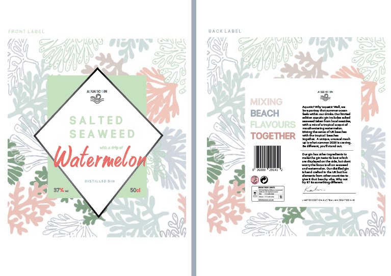


Comparing my design to other gin brands
JDO - bomb projectI thought it would be important to create a blog on how my final design presents in comparison to gin brands that are already out there and if it is better or worst.
I chose a collective of images that represent the gins that are already out there – and then from that came from a conclusion.
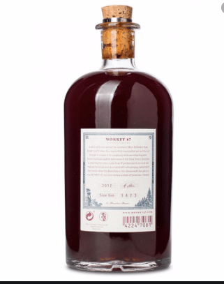
Other brands of gin:
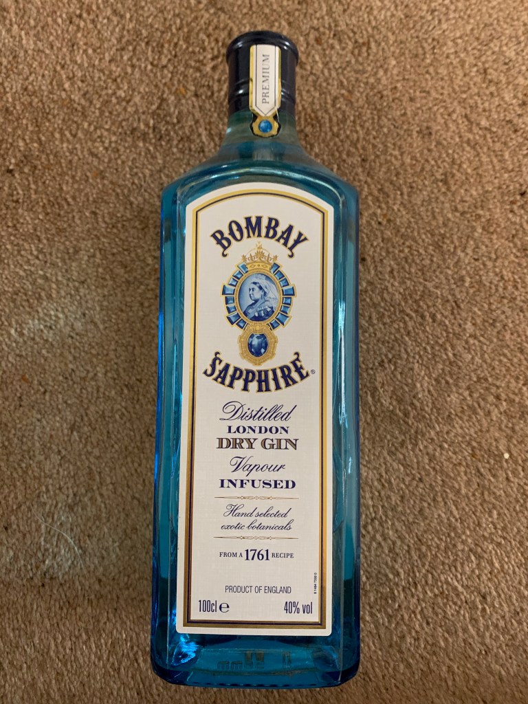
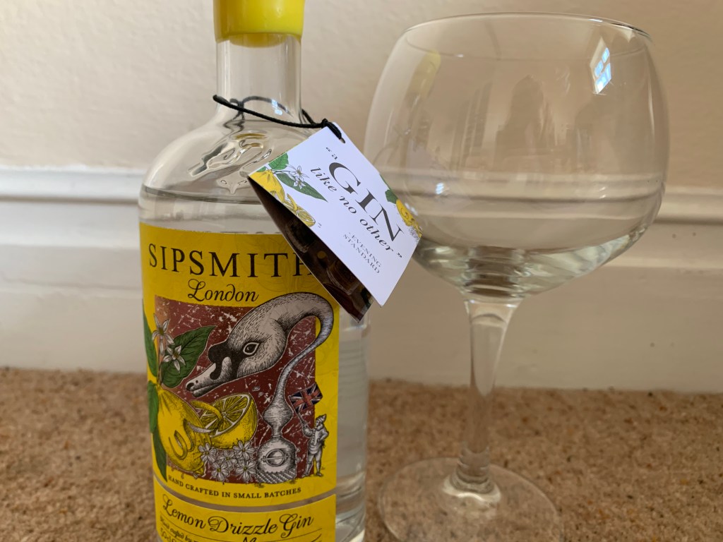
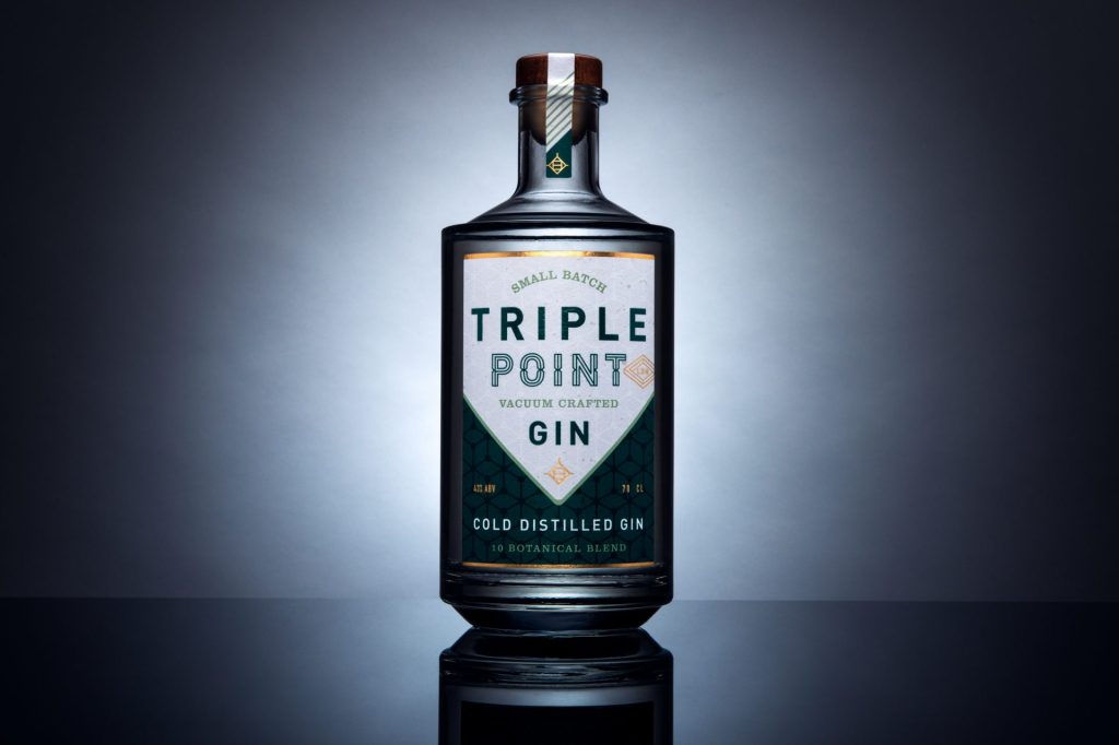
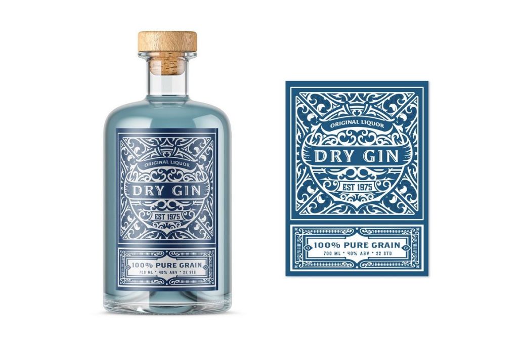
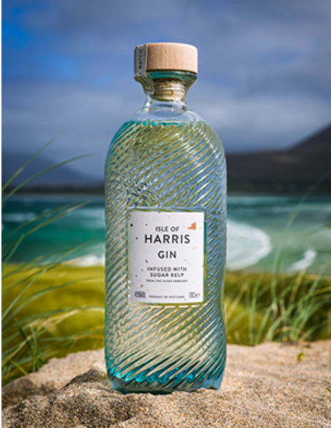

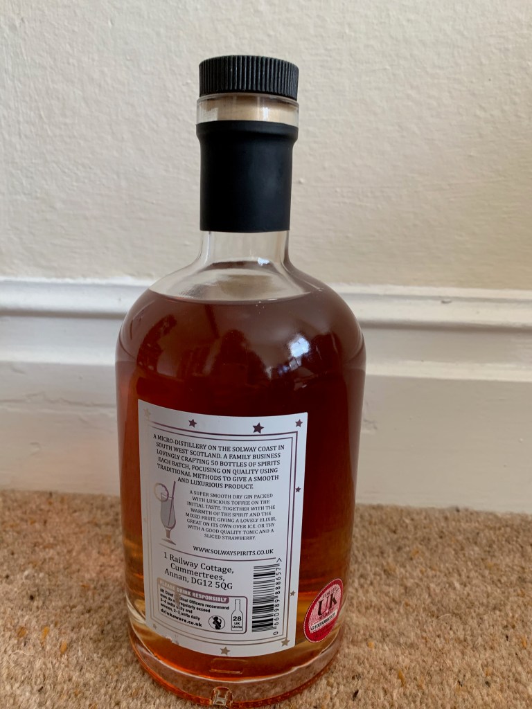
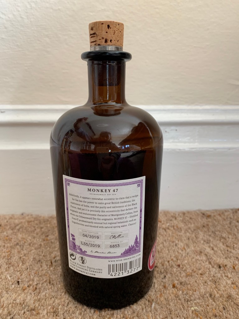
Within the pictures above there was a certain category that I was focusing my designs on which was the beach gins – out of the ones from above I think mine looks like a real gin brand. Most gin brands conclude patterns, interesting type and they all tell a story and are sophisticated which I believe mine is.
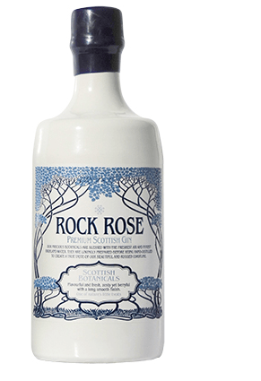
The beach designs:
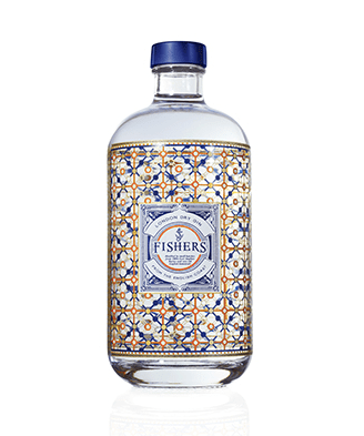
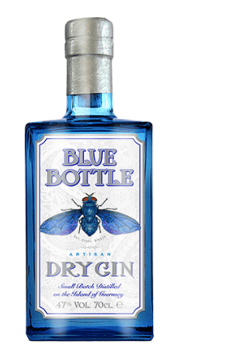
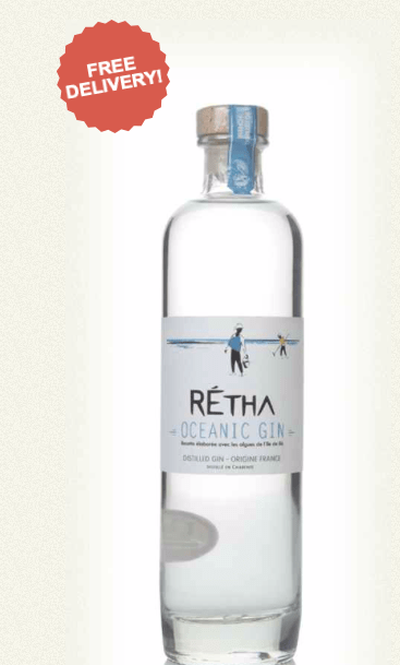
Below are examples that I already analyse that showcase the sort of beach flavoured related gins that are already out there. if you look with all these designs they showcase a beach vibe with the colours they use, they portray patterns that relate to the flavour and the purpose and each one tells a story with its unique shape of the bottle. The one on the right hand side is similar to mine due o the pattern but the one at the bottom right is the exact sort of layout as mine just a different style. Personally each beach gin, portrays its own story like most gins, but you can tell by looking at all these gins that they are related to the beach within their flavours or brand and this is not only for the logo, its also the shape colours and liquids used.
I think my design would fit into the market, its a design that showcases the beached presents this summer idea. Each gin has its own story and personality and so does mine. I did a survey of how many people thought my gin bottle looked like mine, I asked every single family ember who had not seen my design what they thought of the advert and every single one said is that a real gin? And that to me proves that it could work within the market. I researched so much and made sure it would fit in. I do want to make some parts more classy but over all I think the gin could fit into the gin market.
6 boards – sending to JDO
JDO - bomb projectWith the JDO brief it states that we have to provide 6 boards in PDF format and send it to them and thats exactly what I printed for my portfolio and if I decide to send them off I will.
I wanted to make 6 boards that would show advertising the bottle well, introducing this new flavour and giving people that sweet taste of summer. I wanted to boards to be simple yet effective and then along side this sits a description of the board that I will finalise when (if) I send this off.
1st board:
this one show cases the labels up close with no bottles in the way and focuses on the pattern the flavour and design for the gin.
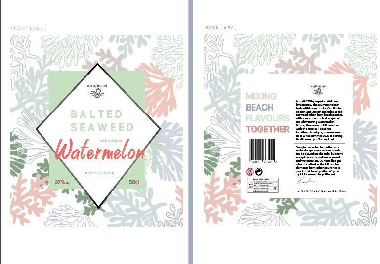
2nd board
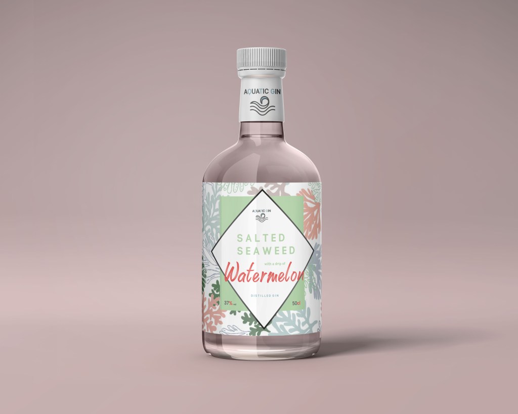
The second board is of the bottle shape – with the logo to showcase the prototype and the concept idea.
3rd board:
The 3rd one is the back design to showcase I have designed all around the bottle.
4th board
The fourth board is the original design of the poster to showcase all the elements of the design and what advertising techniques are being used to achieve that.
The 5th and the 6th boards are the mock ups to showcase the areas I am interested in and how the poster could be use as an advertising material.
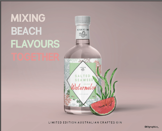
My final poster design
JDO - bomb projectI am a lover of poster design and advertising posters and thats why I wanted to showcase my bottle in a poster format, whether this would be on billboard or magazine and would display the gin bottle.
Poster design:
I wanted the poster design to be so bold and similar to the Gordon pink drink poster, I thought that my label design by it self had a lot of design and patterns within it that I did not want to over do it with other imagery.
When I designed the mock up for the designs it already had a background that I felt was perfect for the poster billboard design. From the image below of the bottle it has this pink background all around and really makes the design stand out therefore this was the base for my poster design to continue the sophisticated appeal of the gin bottle.

so because I already had the base layout to display my product I just had to add elements to make it more a poster advertising campaign.
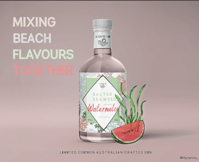
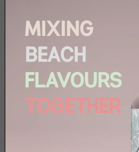
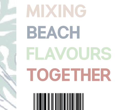
throughout the design for the product I wanted to make sure the same story was going through all the designs, if you look at the back design the description of ‘mixing BEACH FLAVOURS TOGETHER’ Therefore I wanted to use this within the poster design – it described the bottle, the flavours and the product as a hole.
I used the exact same colours as the phrase that was on the label on the back to show consistency throughout the designs. When you look at a poster you read left to right, therefore it was almost the first thing I wanted to see when scanning the poster. As you can see its the exactly the same layout of the type as the label and provides the exact same colours. It was a worry that the type would be lost against the background but it actually works quite well therefore I didn’t change anything.
If you remember, when I created my first poster I created a watermelon and a seaweed element for the design, and this was something I wanted to use within this design to showcase the flavours from a far when people view the poster, and adds that interesting feel to the design. I did just copy them from the previous design and added it onto the right hand side of the design, – that way there was writing on the left and imagery in the right making it a spaced out design.
For a while my design was done, then I was analysing my work and realised I didn’t have the where the gin came from, and therefore felt it was needed on the poster as its only displayed on the back label. Therefore in the exact same type that’s displayed on the back label I added this to the design. I made it sit exactly under the gin bottle to tie the design together, and felt like it worked well there.
Now the one thing thats different about my poster is where I have placed the brand logo. The brand is aquatic gin, I chose not to place it on the poster because its visible on the lid very well. You can see it clearly and there it is again on the logo, therefore I just felt like it wasn’t needed. Sometimes less is more.
final poster:
Below is my final poster for my bottle. I think it works so well. It is simple, describing the flavours of the bottles, its simple effective and straight to the point. The colours all link with one another and portray this sophisticating appearance and appealing gin. It is a weird mixture for a drink but I think that the design makes it seem really appealing and creates its own story through the poster and thats all advertising is.
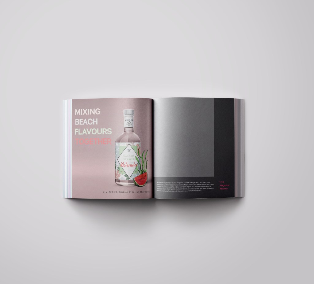
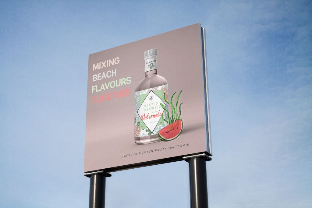
Mocking it up:
I mocked up this poster in a magazine and a billboard. Reason being, because I want a career within magazine and poster design, therefore wanted to showcase how my other graphic skills can be part of that.
billboard:

Magazine mock up:

Research into gin adverts
JDO - bomb projectPreviously I created a gin bottle and I absolutely hated it, I created a poster and everything but due to the bottle design and the lack of research I did not conclude this as my final design. Therefore being I showcase the final poster I want to show there research that took place in order to make my final poster.
Gin adverts anaylsed (posters)
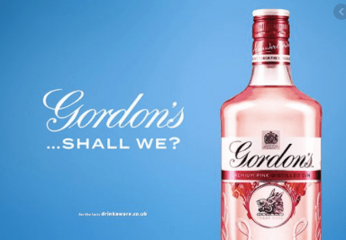
The first one I picked was this Gordons gin below. The pink gin sits onto of a blue background which contrast the design as it makes it stand out. Personally would not pick these colours myself but it works weirdly. They then have the Gordons title going across, with an ellipsis saying ‘shall we?’ and the drink sitting in the right hand side by itself. THAT’S IT. This advert does not need loads of information portraying the bottle, and a rhetorical question makes the reader see this design, and think ‘yes we shall’ it’s a clever advertising technique and little design is needed to achieve the goal.
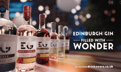
I chose this one as it displays a series of different gin, using the camera angle allowing the design to follow on through the picture. They design then again has the gin name, and the filled with wonder slogan that sits with the gin. Short simple and effective.
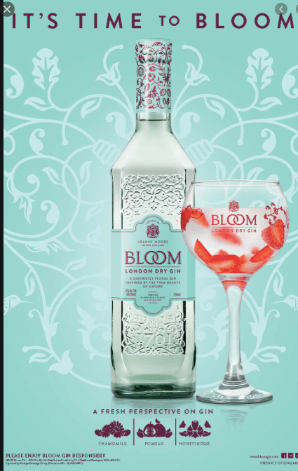
This one below is slightly different to the others as more design elements have been involve to showcase their message. They have used a variety of patterns to match the word Bloom within the design, with the floral pattern throughout. Unlike most gin adverts they display a gin bottle with the logo on it and this gives the audience an idea of the bottle and the way in which the drink can be drunk. It gives the audience an idea of how they could drink the drink, and portrays the imagination. It is such an appealing design and makes you want to drink the drink and visualise sitting on a bench and thinking of the way you can taste the drink and thats the perk of this design.
I did not look through loads I picked three that were different to one another; I looked t one that displayed one bottle by it self, another showing a variety of drinks and then another displaying a glass bottle. All these portray the drinks in different ways and different lights but they all portray gin and the ways to enjoy it. They use less type and more imagery and some are simple and some are more decorative.
Getting rid of the side design
JDO - bomb projectEven though I spent a day researching and analysing different ingredients for gin, I decide to not use it for me design. When I had completed the front design and the back design, I placed them next to each other, and then added the side parts. And it did not go. I think having a pattern all the way round is better and these labels did not fit in with my design at all and not all gins display each individual ingredient, and from research its usually dry gin that displays the ingredients in comparison to distilled gin which is my product.
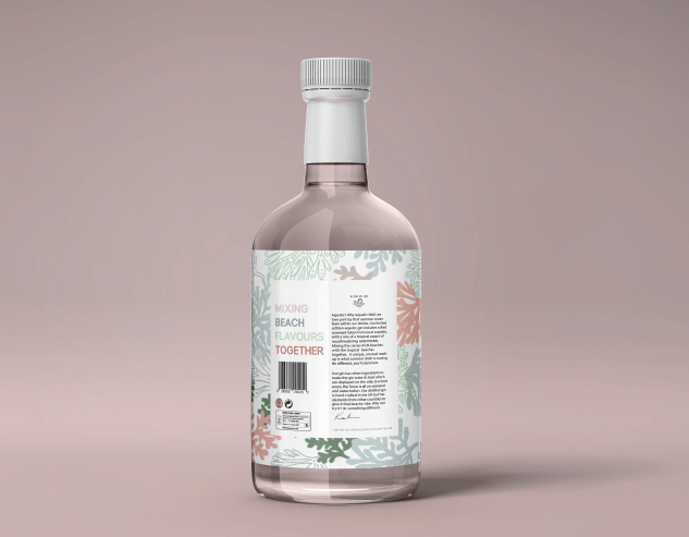
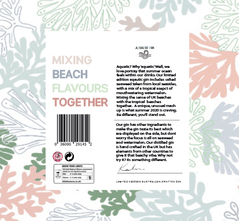
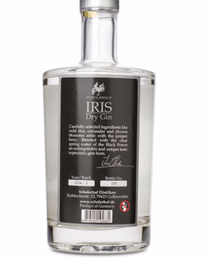
Finalising the back label
JDO - bomb projectNow I had all the elements needed it was time to make the design come together, all the small needs elements like the barcode etc. From the previous blog post you will notice I said where I placed these elements and they sat on the right hand side in the corner on top of one another, and the signature was still yet to be placed.
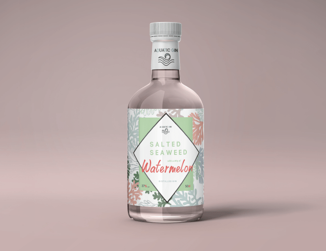
To make the back link with the front, the pattern had to be continued throughout the design. I wanted to make sure the pattern went around the entire bottle without any breaks. Therefore I copied the exact same pattern background and added a plane white square over it to make the information clear to read. As you can see from the image below all the elements added made the back label look so professional and really make it come together as a product. With the white background it worked well and stood out, as you can also see there is so much room left on the white square background to add elements of design I wanted to tell the story.
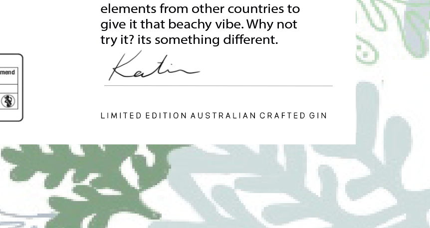
I said previously when creating the first ever design, with the poster aspect I thought of the phrase ‘Mixing beach flavours together’ and I wanted to use this on the back of the label as then when I created another adevrtising poster there would be a link. I think its a simple, sort and effective way of expressing my story through the gin and makes it link well with the flavours and thats why I decided to use it on the back label design.
Above the barcdoe was enough space to add this description. Therefore I used the space, the add each individual word in different colours as it relates to different flavours mixing together. Each colour for the words relates to the background and it made the entire label come together and tell a story, also is eye catching to the audience.
The next thing to design and add to the label, was to write the description of the brand. I was inspired by a bottle that I had laying around the house that was my boyfriends mum. It started with this quickness and almost answering its own question and then from there I just added what the story was of gin, and trying to advertise it as well as I could.
Below is what the writing is that is on the bottle of gin. The top is more about the aquatic gin, and then under the line is ingredients. It’s describing being different, mixing unusual things and the story of the beach and craving summer. I decided to add a line between the two so people would actually read it, personally when there is load of type I find it so difficult to read it and I get bored, adding this line made it two seperate paragraphs advertising the gin in different aspects.
I thought by adding the line in the middle of these paragraphs would then allow me to add a line at the end of the paragraphs to add the signature within the design. Adding that small logo at the bottom made the design become more personal and have that professional appeal to it.
I wanted to add something to make the design link to front even more, and to make it aware of the brand, On the front of the bottle sits the AQUATIC GIN logo on the lid, but then there is nothing on the back as I wanted to make it visible that is was the back. Therefore I thought about adding the brand logo at above the writing to indicate the brand and it also made sense with what I was writing about.
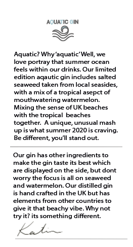
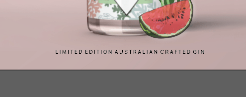
For a while I kept the design the way it was, between posting it on my instagram and writing all the blogs I noticed that I did not mention anywhere its a Australian crafted gin, and this was after creating my poster design. Therefore used the same design I used in that and put it on the bottom of the back label.
The final back logo
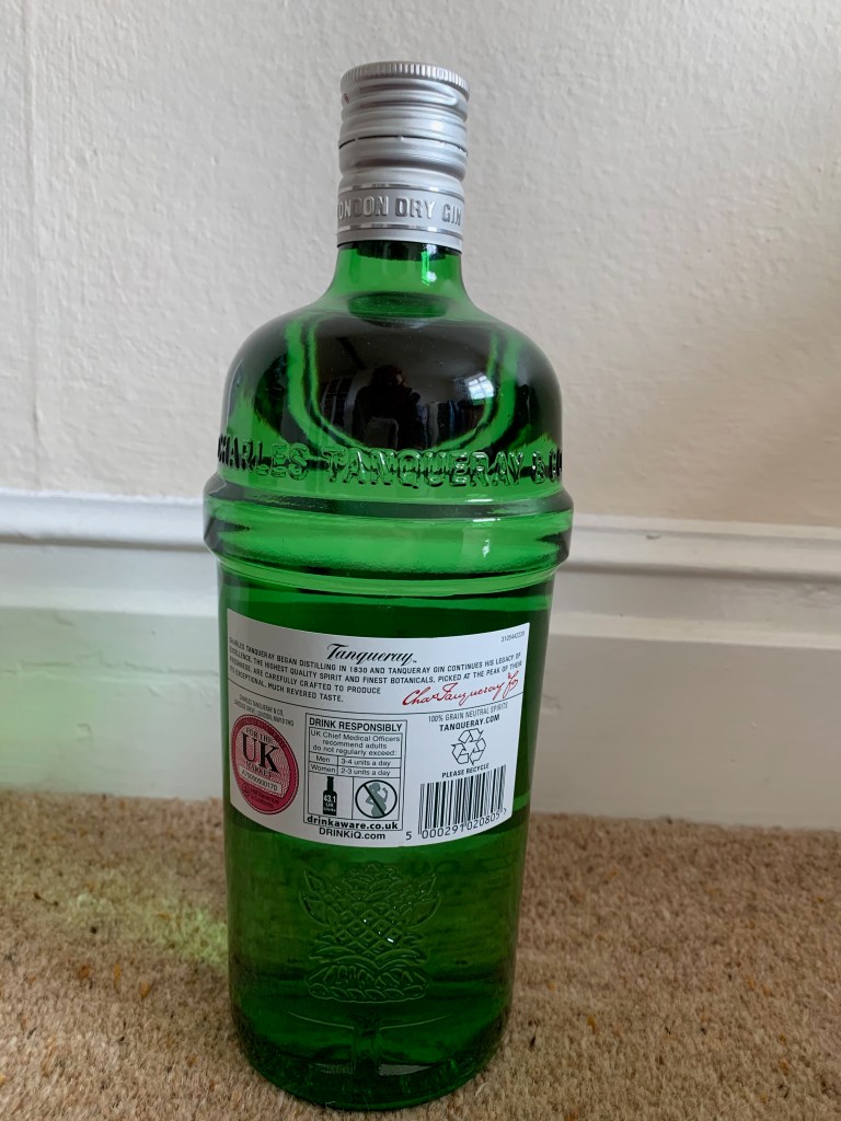
Below is an image of the final back logo for my gin bottle. I think all the elements come together so well and make each piece stand out but not look crowded. Comparing this to other gin bottles, I think it fits the market well and continues the theme of the bottle throughout. It has that appealing advertisement to it like the rest of the design process.
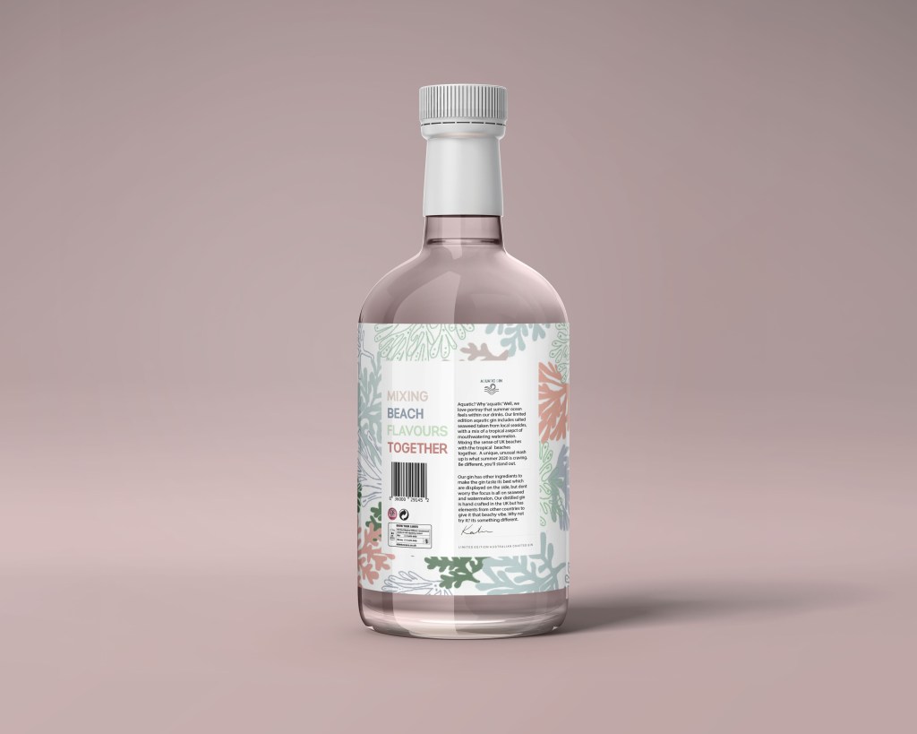
Adding it to the bottle:
Adding the design to the back was easy, as it was the exact same process as the front. When adding this to the bottle, automatically you could see that the pattern continued the entire way around and made it a story throughout. The worry for me was the details on the back would not be seen, but with this gin bottle shape and the background and the way I designed each piece individually you could see every single part of the design. This made the design complete and made it into a professional gin bottle.
RESEARCH FOR BACK LABEL / creating the elements
JDO - bomb projectThe next step for me was creating the back label for my gin as when adding the front label it allowed the pattern to follow around the gin bottle, therefore allowing me to create a back label following the similar style and the pattern. to make sure I knew what I was adding within my design for the back label I did a bit of researching into key elements.
Packaging regulations require the volume and weight of packaging to be the minimum necessary, taking into account safety and hygiene requirements and ‘consumer acceptance’ of the product.
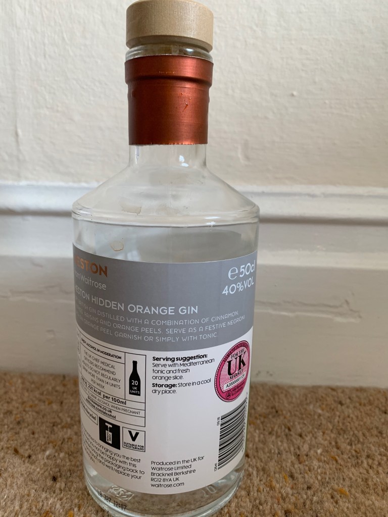
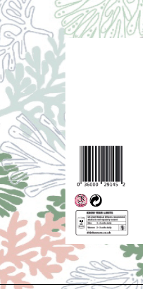
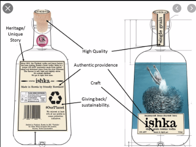
When I was researching on different bottles online I came across this. It is a diagram that displays different aspects of the bottle of the gin. You have the Heritage Unique story that goes along with the gin within the long writing, you then have the giving back to sustainability sign and obviously a barcode and the safety drink reasonable label along side the UK market sticker. All these aspects have to be used within the back of a gin bottle if selling within the UK.
Different images of gin back labels:
Most gin bottle labels look the same on the back, so I did not analyse each individual picture but I did collectively place all the images I referred to and was inspired by through creating my label.
This one below was an inspiration to me as it was very similar to the design of my bottle. I wanted to make the design stand out and tell a story on the back as well as the front therefore it was important to gather a bunch of reference images. When I collected all my reference images, I then combined all the elements to then create my own.

Above is all the reference images I collected and put elements together to work out what should go on the back of mine. Each label is different but have to similar other aspects to make sure its ok for the market and selling the correct information, from gathering all these bottles I knew what I needed to collect.
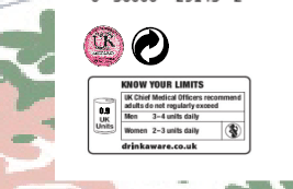
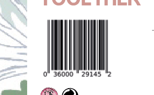
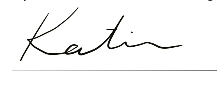
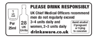
I collected a bar code, a recycle logo, a signature, and a drink responsibly label and then a UK Market label.
The signature was created on my iPad, and is just my name as then looking into it it was people who inspired the drink. I then researched the units per gin people are meant to drink which is 0.9 and thats what went on the label , I used a template one but changed the units slightly. I then added the recycle symbol but image tracing it and the same fro the UK marketing logo.
Signature:
This is the drink responsibly logo I used, and then I changed the 1 uk unit by adding 0.9 over the one to create my one.
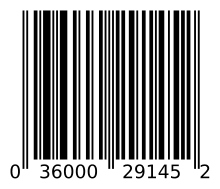
I got a random logo of a barcode and this then was easy to image trace and use for the barcode that could sit on the bottle
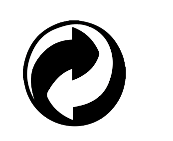
Recycle symbol:
I looked online the best way to showcase the sustainable symbol and the most elegant way, the most common one that came up was the one below, therefore I used this one, pen tooled around it and used it for the back of the label.
UK market symbol:
The last thing to add was the UK marketing symbol, this is used on gin bottles when they are being sold to a UK market. It would of been so har to copy this detail from detail, so to make sure it had all the correct elements, all I did was add this to illustrate and do a high quality image trace to allow all the right colours shades and elements to come through, then make a clipping mask to fit the size.
Adding all these elements together:
Adding all these elements together was the first step I did on achieving my back label as this then would allow the rest of the space for me to add in my own design elements.
I noticed when researching, the majority of these design elements featured at the bottom of the label whether that be in the centre, the left hand corner or the right and they were usually always near one another.,
Below is a zoomed in scale of the elements that are featured within the design. In the left hand corner sits the know your limit labels, the UK market sticker and recyclable label. And above this sits the barcode. Now the was all in I could now start to design to back cover.