The first poster I designed was a. trial and error to establish whether or not it would work as a design concept.
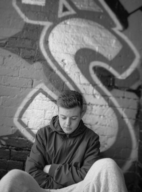
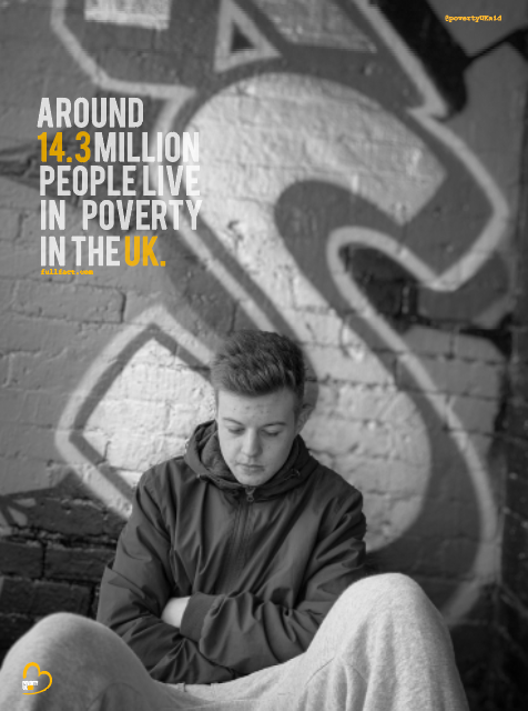
Before designing anything I looked at full fact . com and this is where I accumulated the majority of the facts that are portrayed in the designs, so people knew where the facts came from to make them more true. The first photo I used was this one below as I thought it represented emotion of poverty well and the life that surrounds it. This photo represents sadness and life on a daily basis. What I think makes this photo stand out and work well is the graffiti in the background and the emotion displayed on the face/
The final took a lot of adjusting before the completing it to the standards that I would be happy with. I wanted to have the logo within the poster and this then would set the colour scheme that I would use through the designs.
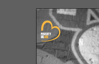
Finding the right place for the logo was actually a lot harder than you would thing. At first I tried it in the top two corners and it appeared way too big. Below are some examples of what it looked like and to me it was taking over the poster photography and was way too bold for the eye. I then thought I want people to read the text then the image then realise the company therefore I thought it was easier to just to put the logo nearer the bottom.
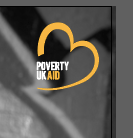
I then decided to add the logo in the bottom left hand corner because you could easily navigate it and still represented the company well. Due to the fact that the picture is black and white it makes the logo stand out so much more and develops a colour scheme through the rest of the design. I think the logo works well with the BEBAS type through the poster design; the key thing with logo design … is that as long as the design works small and large it can work well with the design which in this case I think the logo works big and small as its able to read.
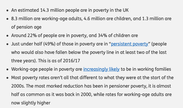
The purpose of the posters was to make awareness of poverty in the UK. Therefore having facts and statistics would enable people to understand poverty more. Before we had the first crit my designs did not have any indication of where the facts were gathered from. Therefore one of my developments to insure I had somewhere on the poster of where I got these facts from, otherwise it’s the so what factor? and the audience may not believe the facts I am portraying.
I took all the information from full fact . com therefore wanted to display this somewhere in the poster design. Below is the information I used for the posters. I wanted the type to be short, sweet and straight to the point to make awareness.
I decided to stick with the BEBAS type face to show the link between the logo and the poster design otherwise would be way too much type going on. This is first thing you would notice along side the photography therefore it was key to make this bold and set the entire theme for the poster.
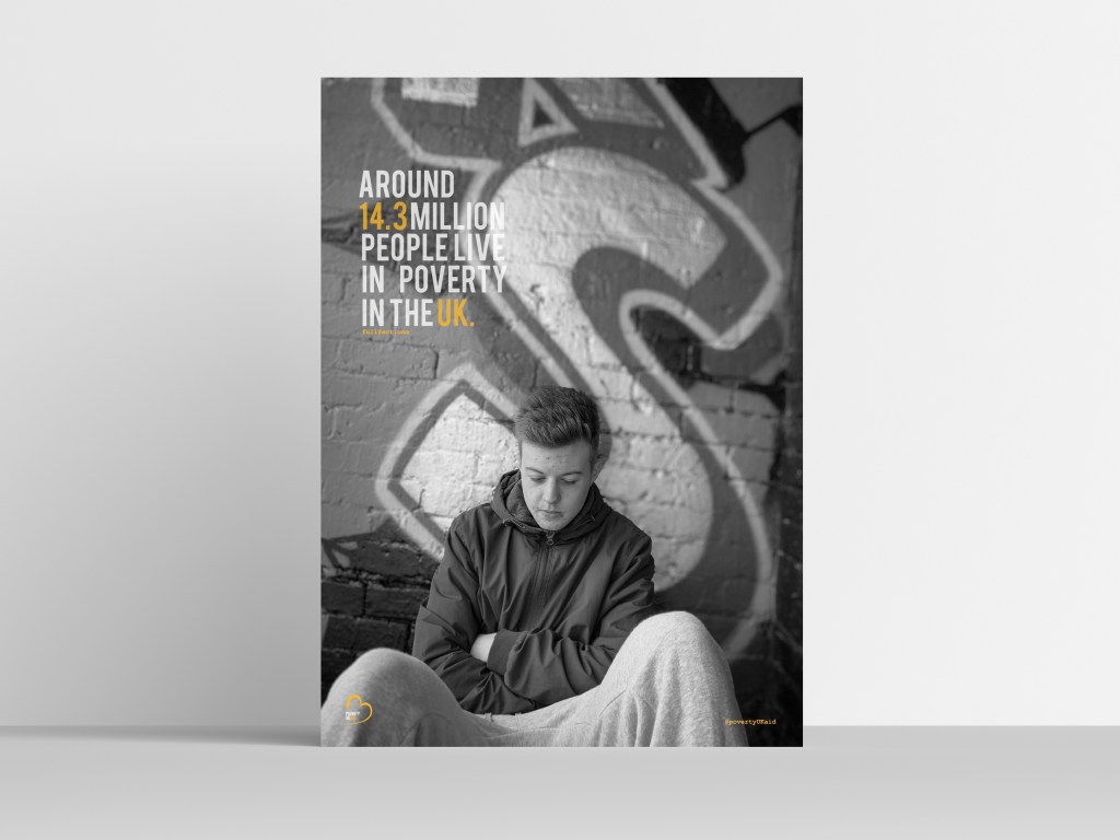
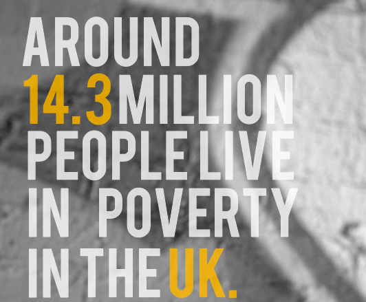
I used the fact ‘around 14.3 million people live in poverty in the UK’ I wanted to use a fact that went straight to point of the million of people who suffer within poverty and how it effects people that are right under our noses.
I played around with the type for a long time to ensure it was the best layout possible for the design. I wanted to make the type feature colours that was in the logo as this then became the theme through the designs. The idea was to highlight the words in orange so these stood out more against the background image. At first I thought the type was way too bold and almost clashed against the image; therefore I lowered the opacity to 78 and this made it visible still to the eye. I wanted the 14.3 and the UK to be in orange – this then makes the audience focus on the facts and want to read more and understand more in ways to help. It is only a small feature but the full stop makes it seem quite blunt and too the point, I think it makes it quite a snappy point; if it did not have a full stop I feel as if the audience would feel as if the information may continue.
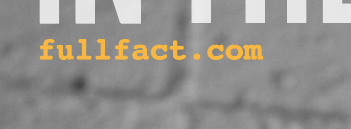
As said previously In my first feed back I got told to add somewhere within the design about where I gathered the information from to make it a reliable source. I gathered all my information from full fact. com therefore this was linked within the poster. Within my magazine design I wanted to use courier type face therefore to show a connection between everything I thought I would use these for the smaller information provided on the poster. Therefore below the type, I added this in the courier type face \ I did not put the entire URL as it would look awful and less professional… therefore I just put the general website therefore people could locate other factors for themselves.I decided to make it in this case sit in orange as there was a mixture of white and orange in the text and felt like this stood out more in the orange in this case.
I then decided to actually create an instagram page dedicated towards poverty UK aid to make people aware of the upcoming issues the UK faces today. Therefore, due to the era we are in the main form of interaction seems to be instagram, However I would create a magazine as time progresses.
In the top right hand corner, I decided to add the instagram – I was going to add the website etc however I wanted a quick way people could view what we do and then direct them to websites etc. I then decided to put it in exactly same time as the full fact one so these two aspects acted as information that was key.
Final poster design:
Below is the image of my final first poster. I think it portrays the message well. The emotion for this image is portrayed through the colour of black and white. It’s the idea of being alone and feeling so isolated within the life of poverty. The type is simple yet effective, and sets the colour theme for the rest of the design. Poverty is something quit delicate and something that is a sensitive topic to some people; therefore I think this image portrays’ poverty well and makes a good advertising campaign. Every element within this design will feature on all the magazine. The use of golden spiral through this design allows the perceptive of each element appear to the eye.
Mock up of poster: