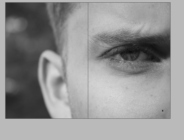
The next page featured an image that has already been displayed within the posters. I wanted to show a link between the magazine and the posters and I thought by using one iconic picture that feature on the poster as well as the imagine would show the link. creating this page also made the picture have more a story and a real personal meaning and that’s explained when you see the design process.
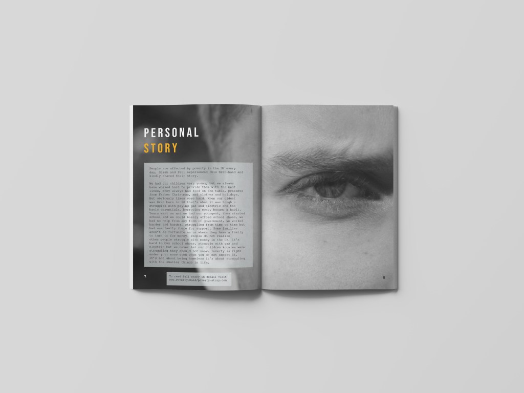
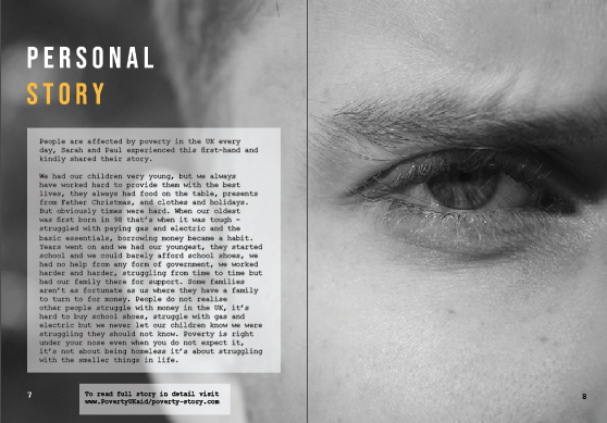
Within the magazine, I thought of the idea of presenting personal stories so people could get an understanding of what it’s really like and how it effects the norm. When I used this photo for the poster, I thought it presented a lot of emotion within Jack’s eye and symbolised a more personal approach towards poverty. I then decided to use this within the magazine as the photo to me displays life through poverty and relates well to personal stories and struggles. I made the photo go across the entire page as it gave it a bigger and deeper effect to the audience.
I used a personal story from my mum and dad this would then be featured over the entire page. Even tho the story is not related to the image, the image it self portrays what is said in the story.
At firs I wrote personal stories, but then I wanted a one story that I felt was personal and more heartening then random fake small ones. I made the type agains sit in the space BEBAS type face therefore would so consistency. I then decided to make the ‘person’ in white so it was easier tor reader and the ‘story’ in orange as this is what the type is like on other pages. I decided to make this type sit on the left hand side because this is where there was no image contrasting the type, and I wanted the left hand page to be vigilant to the eye at all times.

The person story:
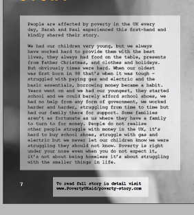
People are affected by poverty in the UK every day, Sarah and Paul experienced this first-hand and kindly shared their story.
We had our children very young, but we always have worked hard to provide them with the best lives, they always had food on the table, presents from Father Christmas, and clothes and holidays. But obviously times were hard. When our oldest was first born in 98 that’s when it was tough – struggled with paying gas and electric and the basic essentials, borrowing money became a habit. Years went on and we had our youngest, they started school and we could barely afford school shoes, we had no help from any form of government, we worked harder and harder, struggling from time to time but had our family there for support. Some families aren’t as fortunate as us where they have a family to turn to for money. People do not realise other people struggle with money in the UK, it’s hard to buy school shoes, struggle with gas and electric but we never let our children know we were struggling they should not know. Poverty is right under your nose even when you do not expect it, it’s not about being homeless it’s about struggling with the smaller things in life.
my mum and dads story 🙂
The design aspect was actually quite simple for this type. I thought I would put it in a white lowered opacity square so you could still see the image in the background and read the information clearly. As you can see from the image below, there is a lot of type but it fitted nicely within the box and onto the left hand page well. The type sits in courier 10 like the other designs. Below the box sits another box, that indicates a link to the website (that would be made in near future and if we had longer on this project) I wanted to use this page as an advertising technique as well as an informative page. With the personal story it connects to the reader and the understand it more, then linking them to the website allows them to read the story in full and promote the brand more.
The final page:
This is the final page for my designs. This presents personal stories from my mum and dad but not the entire article as the idea is people go and visit the website to find out more. The image portrays emotion so well and indicates what life feels like to people in poverty just by the squinted look in his eye. I think this page goes against all the stereotypical aspects of poverty and really makes the reader engage with the issues the UK face today.
mock up of design:
Out of all the pages, I think this is my all time favourite. Obsiouly what I think is irrelevant but when I showed this page to my family and friends, they felt connected to the page and the story got told through the picture before even reading about it. my mum said she looked at this page and cried as the picture captured so many emotions and the story melted her heart and that’s why I design and do what I do. When compressed into this layout it makes the two pages come together and tell a story, and fills the entire page with emotion. its eye catching tot he audience and says for them to understand.