The final page for the editorial design was one in which enabled the audience to understand ways in which they could help the families and people who struggle with poverty in the UK. It is all good and we’ll designing to make people aware of poverty but what are you actually going to do to stop it. I make designs to benefit people and help communities and issues in the world. I hope these designs show that.
I made this page about how you can help, how to donate and how it benefits you. A lot of the time if a company says to you donate, you go ok yes but what do I get out of it. Not me personally I think its nice to donate without getting anything back. But when advertising big companies I feel as if you need to portray a benefit the consumer gets so they actually take action.
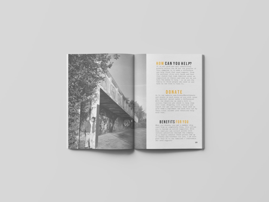
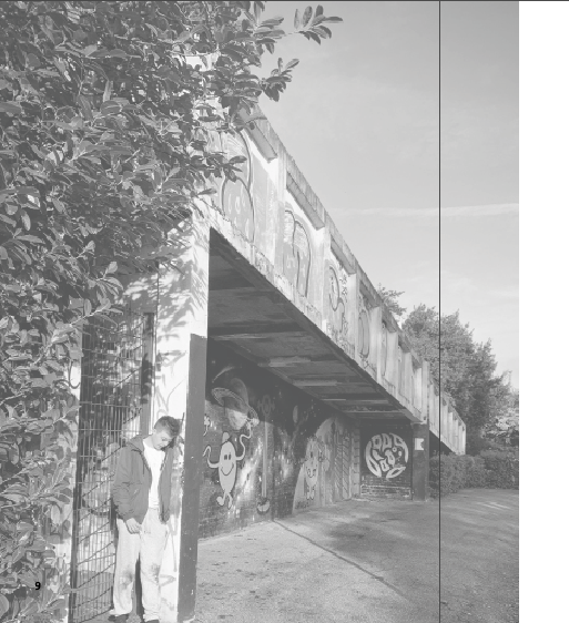
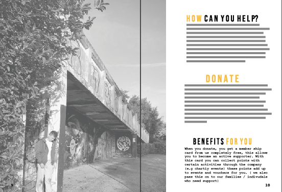
Within this page there was not really a certain photo I would use, just one that pretty much I haven’t used already and one that sort of summed out poverty as a hole. I decided to use a picture that was taken in the first set of photos. With the subject leaning against a rough area and him looking slightly sad. What I think makes this photo work, is the fact that it is not portraying living on the streets it portraying getting on with your day like everyone else but showing that glimpse of poverty that surrounds you, preventing you from doing certain things. At first this image had a lamp post in it however after the second critique I got advised to remove that and since I did that it made the page become more professional. I decided to make the image sit on the left hand side and continue over the gutter to be seen slightly on the right hand side. I lowered the opacity of this image just I felt as if it was way too bold when a 100% opacity was displayed – it gave the design a nice sensivtive vibe about it and did not clash with the other design elements that I later added.
I wanted to make sure this page involved all the important information that was needed to be displayed to the audience. The key aspects I wanted to display was ‘how can you help’ ‘donate’ and ‘benefits for you’ Each of them sit in the separate BEBAS type face ad feature colour usage of black and white. I wanted the key words that I thought would stick out toe the audience therefore the words ‘how’ ‘donate’ and ‘for you’ as then the eyes automatically see these words and can have a brief description of what they can do etc.

Within each one you can see quite clearly what each one is about therefore I am not going to over it however I am going to discuss what the benefits are for the audience as this is quite unique.
When you donate, you get a member ship card form us completely free. (as I have typed this I noticed a spelling mistake within the benefits for you section which I am now currently changing), this entitles you to become an active supporter. With this card you can collect points with certain activities through the company (e.g charity events) these points add up to events and vouchers for you. ( we also pass this on to our families / individuals who need support)
At work, we have member ship cards and this was something that then inspired me to create for this company in order for people to actually make a difference. (this will be discussed at the end of the blog)
The final design:
This design process was actually quite easy as I did not spend so long on it due to the fact I knew what theme I would be using knew what I wanted to portray therefore was quite a simple process. This is the final page… On the left sits the image which continues over top the right hand page to display that the two pages are connected and telling the same story. Then on the left sit the titles of ways to help and donate. I made sure each paragraph had the same amount of space between the designs and made sure everything was in line with one another. The audience want to quickly navigate ways they can help not read a long winded paragraph therefore the titles allow them to navigate it quickly and efficiently and help poverty Uk quickly.
Mock up of design
The final mock up turned out so well. The way the image continues over the gutter makes the page have a story and a meaning. Not only do you see the subject in the photograph but also the surrounding which portrays a lot of emotion. Removing the lamppost worked wonders and made it go from tacky to professional on minutes. I think the type is easily navigated for the reader and overall a simple clean effective way to end the magazine.