The first thing I created was the magazine therefore the first thing I looked into was the magazine layout that I wanted to use for the front cover and the inside of the designs:
I find layout plays a big role within magazine design as it gives the overall message not only on the topic but also you as a designer.
First magazine front cover inspiration
The first one I loved was this one below, the colours linked well with my topic however for me it was not the outcome I was after. However the reason I am putting this here is to show I did not just go for the first design layout I found – I found this one first experimented with this (but lost the screenshots) and then took elements from that experimentation which would feature in my design meaning the blog ‘icon’ title was something I wanted to include within my design.

INSPIRATION FOR FRONT COVER / LOGO DESIGN
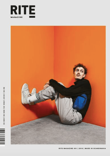
This design was one of my all time favourite designs as its so simple and so effective in the way in which they have displayed their message. The biggest inspiration for me was the type in the corner, ‘rite’ it was so simple but caught my eye right away – which inspired my logo. The positioning of the page worked so well which also inspired me and the little details either side. I personally love having white surrounding the design as it lets the image breathe and the type and title breath a lot more.
Double page spread layout inspiration:
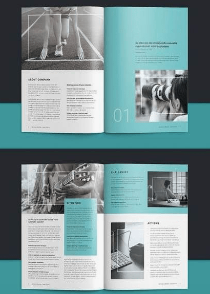
Now I did not stick with one design layout throughout the making it was more of a case of being inspired by a variety of a designs. Now I wanted to make sure there was colours within the design as it is aimed at kids, therefore I picked up designs that had colour. I always aim there to be some elements of white within the designs, as for me it makes the design look clean and simple, but adding colour I felt had to be done right and work well with the topic.
If you look at all these designs, you’ll notice every single one has an element of colour within them. I actually did experiemnt with the first layout, but it did not work at all, I did the exact same layout but changed it to red and added fire fighter colours however it was so cluttered and from that I knew not to just stick with colour just adding elements of colour would allow the design to come together.
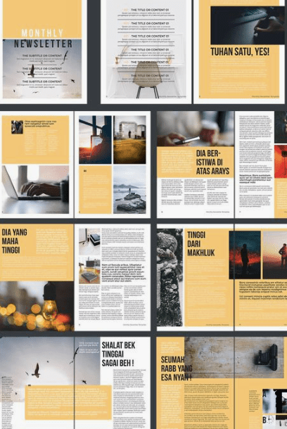
This one was the biggest inspiration for my designs, reason being, that the designs feature a ‘pop’ of colour that goes over white backgrounds. The yellow stands out but also allows the white areas to shine through.