For my project the magazine is the focal point and therefore I wanted to make sure the design was easy for adults and secondary school kid to read. I did look at some reference layout imagery but personally I found it easier to create from my own I looked at a few from previous but sort of made up my own style which I was quite proud off.
This is the first double page spread. I wanted to have a page that introduced people to the topic I was aiming for with the design and entice them into the design. On the left hand page I have decided to make this was an about page; This is a small magazine therefore it has to be structured well. As the years have gone on I have thought a lot about a reproduction and the way in which a magazine needs to form and structure.
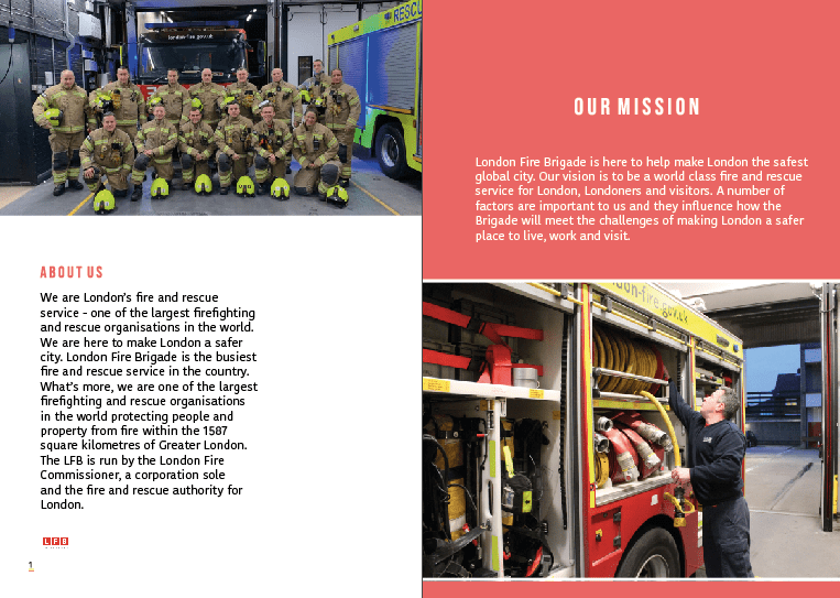
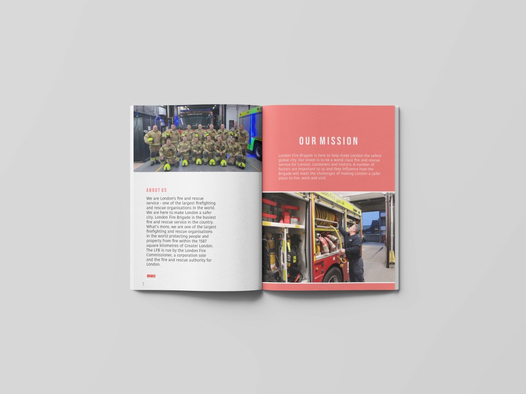
The left hand page starts off with a group photo of them all together and placed in their LFB surroundings – having them in their uniforms when they would go out makes it eye catching the audience. I feel like school kids automatically associate fire fighters in this uniform and therefore acts as an indicator for the design outcome. I decided to make the image sit at the very top of the left hand page leaving no gaps. I didn’t want to over crowd this magazine with information wanted to make it quite simple. I then decided to start of the colour theme within the design – below we have in a spaced out type BEBAS type face. I started this with a red type and then below adding this type. Now I am looking at the finals I realise that the type could be a lot more paragraphed and edited better and I think thats due to the fact that I have developed since creating this. I used the information from the lFB and to showcase that it was from that website and this is the income of information. I think that I wanted to make this design quite simple and not over powering. I think that this page set up the rest of the magazine design. I made the paragraph sit slightly of centre and then below I added the LFB logo which could allow the audience to associate where the information came from and what this entire magazine is focused on. In the corner sits the page number which is underlined with red and yellow as I felt like it was needed to make it seem a less randomly placed.
Right hand page: *
This page sets up the colour theme throughout and works well against the left hand page. I decided to make the page this light red colour and it would then would relate to the inspiration of the Pinterest picture. I made the right hand side was the same colour as the title of the title displayed on the ‘about us’ title. If you look at these pages next together you can see they are opposite – so the right hand page starts with a red background and our mission sits slightly bigger in white and then the type sitting underneath is again sitting in white. Below sits the image – but due to not making exactly the same I thought of adding the photo in the middle slightly and with a white boarder – without the white boarder the image didn’t really stand out due to the fact of the colours and thats the issue if both the pages were colourful.
I think this page really engages the audience and allows you to have an insight into the LFB – when asking my uncle he said that everything displayed on here portrays LFB in their best lights and thats a good reaction. On the left you get an insight into them as a collective and all working together so save their city. I think having the red against the white page makes it become less repetitive and boring to the audience. I think it makes I have a bit more character.
*The right hand page was inspired by this image below; that I found on Pinterest- I thought due to the audience being kids and secondary school kids. I was going to use the entire page filled with colour background but because a lot of the photography had colours and different shapes etc I felt like this would make it a little bit tacky.
I actually did two mock ups and develop them further due to the length of time I had been given I felt like it was needed to make a bit more of a development with the mock ups. An issue had occurred to one of the a5 papers and therefore this is why I decided to mock up a little bit different.
this is the first mock up:
This mock up shows what it looks like as a magazine and it works well and allowed me to understand the design when printing. I actually used this as sort of a test print. As I printed this off at college and started analysing it but I felt like it could be developed a lot more. I actually did all the pages as mock ups and then I developed the mock up and I will show that on each blog.
final mock up:
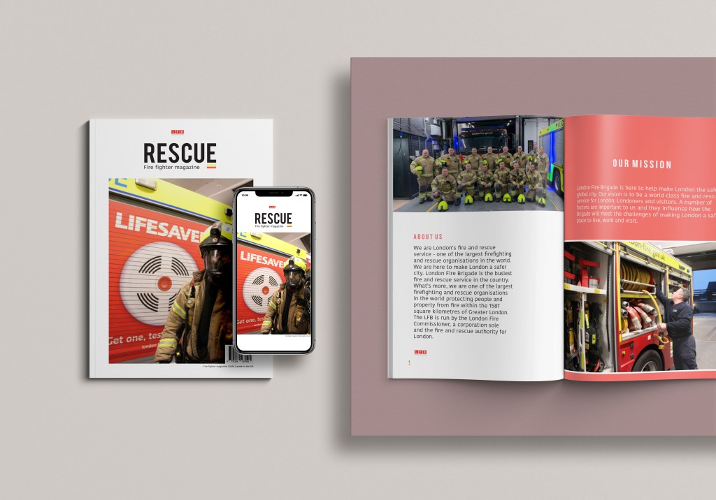
Due to losing one piece of work I had to add more. So this mock up shows not only the magazine but the front cover and also how that would look on a website. I want to make this magazine able to view on the lFB website – say for example when your on their website its a link that takes you to a PDF magazine. the years are progressing and making things feature on phones etc allows the target audience grow and reach down to the younger generation levels.
This mock up therefore displays a front cover – and what that would potentially look like as a on screen magazine. I then have the right hand side the magazine. The issue is it cuts of some but I think the fact that I have the old mock up allows you to visualise what it is like. This entire mock up allows the audience to visualise the entire magazine even if they advent purchased it your viewing the outside and the inside the only thing your not is the back cover but thats a seperate mock up as it wouldn’t be shown on a phone.