The page numbers for this magazine is slightly different to other designs I have achieved due to the fact it being so small. So the next DPS counts as page 2 as it follows on.
This page is dedicated to the person who inspired me through this design and the person I interview. My uncle has been a fire fighter my entire life its all I have known him to do, when I was little he was a hero to me and my brother looked up at him so much. I wanted to get inside his head – understand what its like to be a fire fighter and even if some of the things he didn’t tell me aren’t on here I did learn so much for him and made me realise a lot. I do have his permission also for this therefore i was able to use his photo and his name.
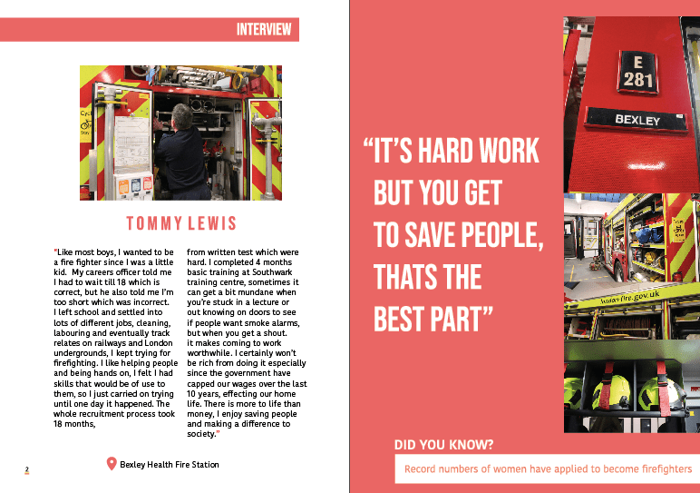
So the left hand page is dedicated to his interview. I wanted to now start making it a bit easier for the audience to understand the design. Now this a magazine but it acts like a leaflet almost as there is no context page and thats purely because its so small and I did not think it was needed. I started the page with a red square with a white type of interview – to allow the audience to have some indication of the design. I then decided. to add a small photo of the back of my uncle working and showcasing different elements of the fire equipment. I felt like this picture spoke a lot of words as it was able to show all different equipments and see a fire fighter in action without going into fire – preparation is key. Like the first about us page, I made his name in this space out type and this then became a running theme throughout the magazine for titles. Now that I am looking at this design over developing my magazine skills the writing angers me so much – but its too late to chance. I made the writing sit in red speech marks to fit in with the theme – and have two columns of information and this is word by word what my uncle said. I now wish I had edited the paragraph style as I think its so annoying as my skills have developed a lot and there is a lot I would change about this DPS. Underneath I wanted to add the location of his fire station because it deserved credit, I am taking photos of their station and without them this magazine would not have happened – also to make awareness as my uncle said a bunch of fire stations were cut due to the government and making awareness of them is important.
We then move onto the right hand side – this is the exact same as the page before in the meaning of the red background. I wanted to make sure there was a consistency throughout as it was dedicated towards the exact same topic and if they were different it would be awfully designed. When we had the first criticism I got told to change the type as as if you look below the image I explain why*
I made the type sit in quote marks – this was a quote I felt represented what being a fireman was like. This was the best way to describe it. I asked my uncle why he did it and this was his answer. I made this sit a lot larger because I felt it was important for the reader to visualise. I then made all the images sit down the right hand side. Like the first red page I left gaps a there is a lot of information in this magazine and sometimes leaving negative space allows the design to breathe. Having the type large also allows the page to not be as boring – not a lot of kids would read the paragraph but I feel like if they had a focus which is the quote they would actually want to read what its like being a fire fighter.
*
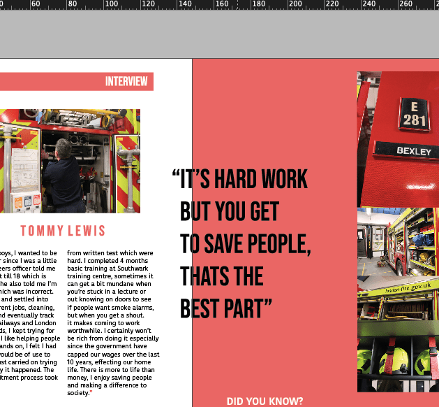
so this was how the type was at first – but someone said at the first crit that when printed they wouldn’t be able to read that. its not always true as depending if the size is large and its a small amount of text it can be read over the gutter but I did understand that it could be hard to read as its a few words. Also that the black wasn’t really fitting in which I knew. Therefore I changed that complexly.
At the bottom of the pages. Then began adding a did you know section. When researching into magazines for school kids (secondary) thy usually displayed a did you know factor. I added this because I think even if someone who hates reading only looks at the pictures and reads the big quote they come away leaning something. If they then read that small did you know fact they are being educated which links to design for good.
first mock up:
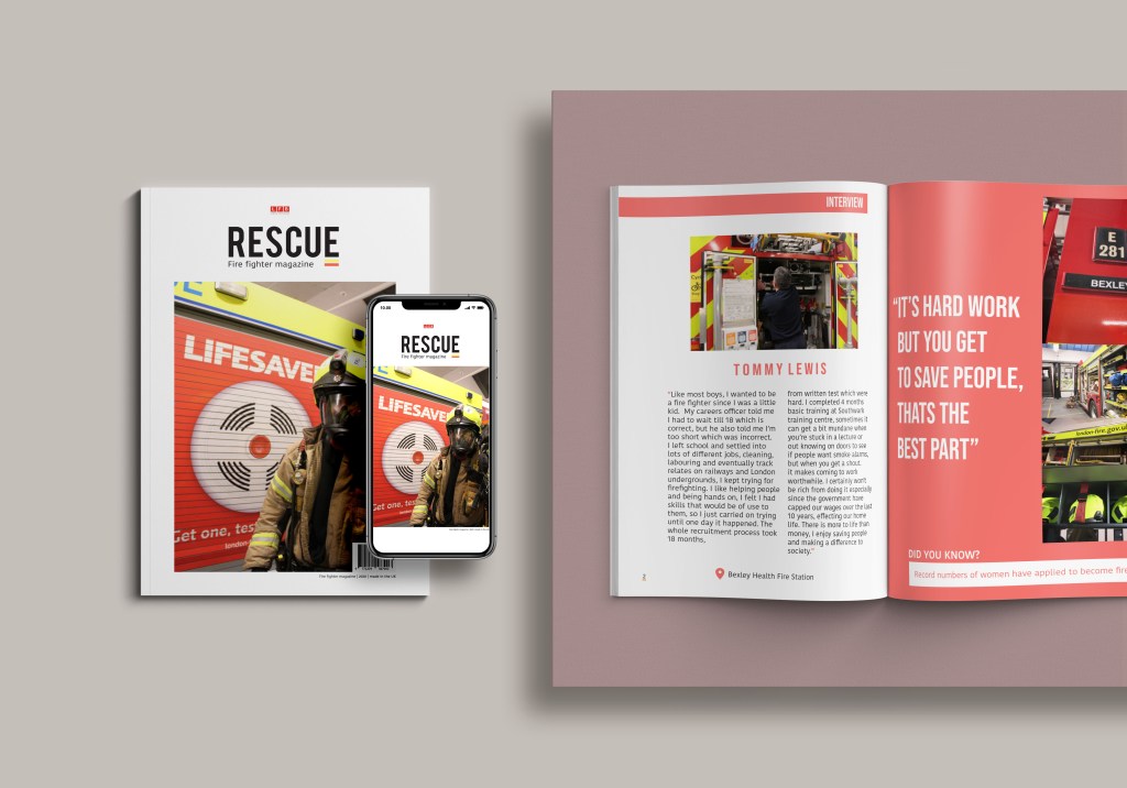
This is the final mock up for this design. I did do one like I said previously but I felt like throughout I want to show the finals I would off printed and this is the mock up I would off printed. Doing this also allowed me to see if the DPS actually linked with the front cover and if I was using all similar colours throughout.