This is the final page for this DPS. This one is slightly different in comparison to other pages as I feel like there is a lot more information. I tried my hardest to make sure I was making it interesting and adding colour so people wouldn’t skip pass this page. Yes I could of made a better design for it or not even used this page – but I felt like it was important for people to understand the life of a fire fighter. I think a lot of people who arrest related to fire fighters or learn about it think all they do is put out fires and that is not all they do. they help the communities in a greater way, they have to sacrifice a lot of time and by show casing different avenues within this design I really am educating kids if they are cut out to be a fire fighter and what fire fighters do.
Just like the previous page – I start of with a bold headline indicating what this page is going to be about – sitting the exact style and format as the page prior. I then thought of ways in which I could break this down – I could add an image but I have used so much already and also didn’t have one that I felt would fit the design message. Therefore I went to my best source of colour to fit the page together. Now as your notice the next few pages do not display the red page on the right instead displays white and has elements of red across the DPS. I didn’t feel like it was needed on every single page – the thing with a magazine not every page is the same otherwise it gets quite repetitive therefore where there was more information or not a lot of imagery I decided against the red but the theme does continue.
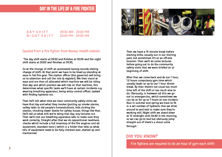
On the left hand page we have at the start the day shift and the timing that involves that – and then below we have the night shift with the timings on that. I wanted to showcase this purely because I didn’t even know this myself and thought it would be a good idea for the younger audience to visualise what a day in the life of a fire fighter is and understand the long hours they do. We then start of the paragraphs with where I got this information from and it was quoted from my uncle but because we already used him as the interviewee I didn’t want to showcase his name again, therefore it looks like I gathered my information of a bunch of people not just my uncle. I then used red quote marks again and began wiring his day via a night shift and a day shift. AGAIN I wish I could change the awful type as I cannot stand the way its placed and it has to be edited but I just don’t have time – after doing more magazines since this I have developed so much more and I am picking out a lot of issues right now. I would off loved the type to be thinner in and ave the paragraph edit where the enlinements was clearers. On the right hand page I added some photographs at the top – the photos are of equipment as this is part of the daily life of a fire fighter. and then the information continues over the page.
to keep the consistency and the audience entertained I added another did you know fact – but the time it linked to part of their day. Having this little fact really enables the audience to feel attached to the design and actually walk away with something no matter what part they choose to read.
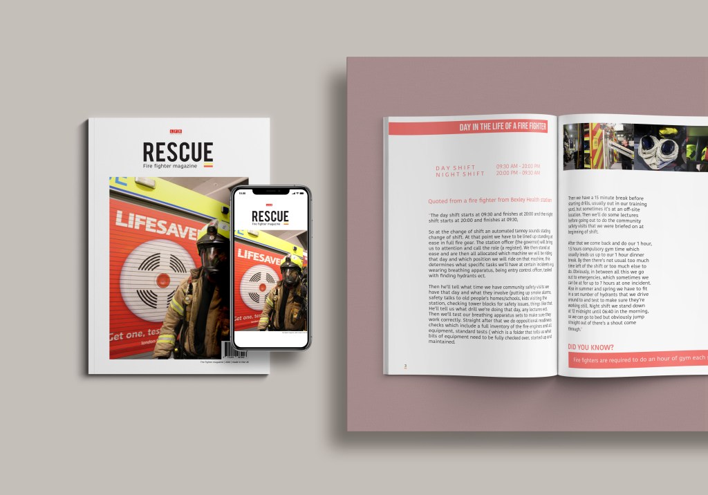
mock up:
This is the final mock up for this page. I think this page works well there are a few things I would change like I said the paragraph settings. I feel though considering there is a lot of information here I have broke it up well to allow the audience to learn something and understand what it’s like to be a fire fighter. I could off put it in bullet points but I always want my designs to tell a story and I think this page achieves that.