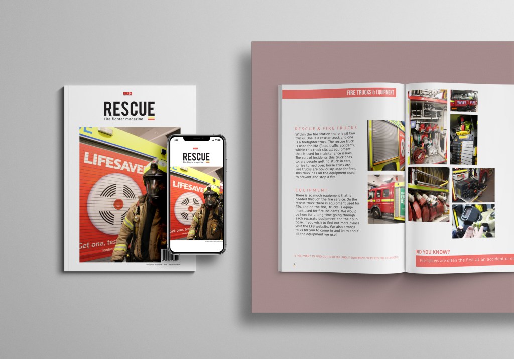
Now I decided for this magazine not to be that long – in fact it was more of a educational catalog that fire fighters could give to school children after finishing the assemblies to educate them not only about fire fighters themselves but also LFB and if these kids would want to be a fire fighter here is how and everything you need to know.
I wanted to end this magazine quite quickly and not go on forever due to the target audience and after a while they wouldn’t continue reading. So we continue the title theme again with a red box with the title fire trucks and equipment and this is the category for the next DPS. I used a lot of negative space in this design and wanted to almost mix it up a bit in style of placing images. So on the left hand page I started with rescue and fire trucks and gave a brief explanation and then underneath equipment. The issue with this topic is that fire fighter information and truck information could generally go on forever and its really complex therefore knowing the audience would be schools kids (secondary school kids) I just wanted a brief explanation then I would add links elsewhere to find out more.
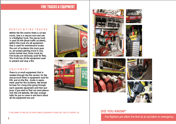
I then decided to add a little information in red that read that if you want to find out in detail about all the equipment contact them as there is so much to discuss and if the kids are interested they can find it out further.
starting on the left hand page I have started a collection of images that then fall over the gutter and into the right hand page. I felt like because I was discussing a lot I felt like a variety of images were needed – but to engage the audience I decided to make them sit with one another and create this collage effect. I think this lay out not only interest the audience its different but it allows the audience to visualise in a unique way different parts fo the equipment used.
I think this page is a great way to end this sort magazine as I feel like its a teaser for becoming a fire fighter allowing the audience to connect with it and want to find out more. its a perfect way to end due to the colours and the layout as it displays a more unique look in comparison to other pages.
thesis the final mock up for this design and when added to the mock up I decided to make a few alternations such as moving the images over so it wasn’t so close to the gutter other wise you couldn’t visualise them therefore now there sits a white line where the gutter is. I also forgot to mention that there is another did you know fact that I added the bottom of the right hand page to allow the audience to walk away with some sort of knowledge.