I have looked into gin bottles that are just on google, but now I think its best to look into the designs that already exist within the market showcasing the different brands the feature in the UK now. This will enable me to understand product marketing as well as a design for the product.
I typed into google, top gin designs and clicked on a. few websites and bottles to analyse through this blog post.
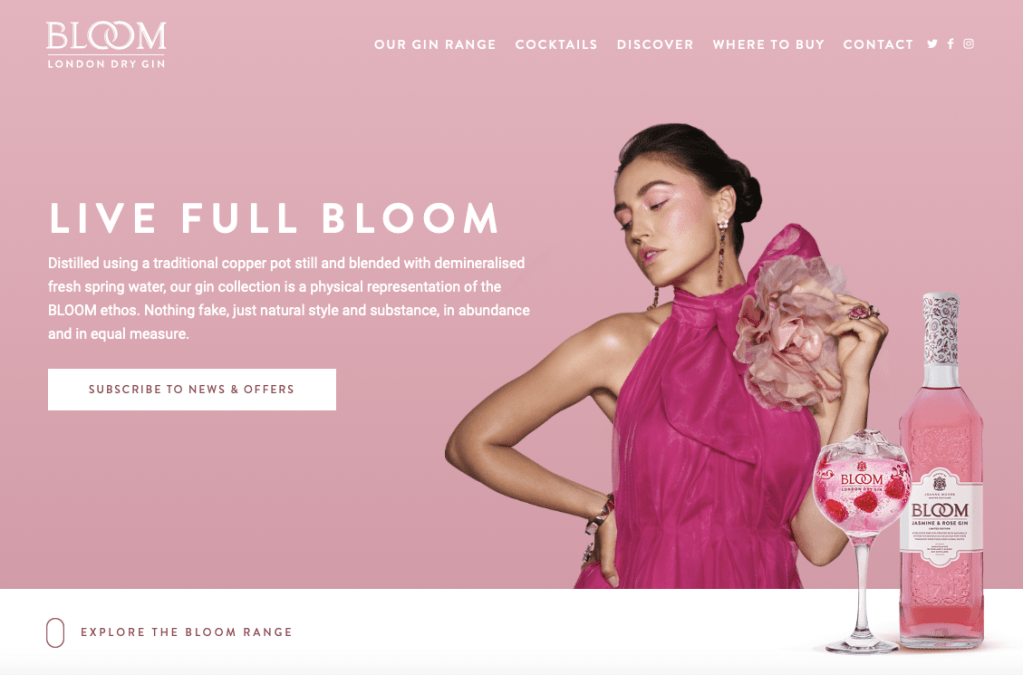
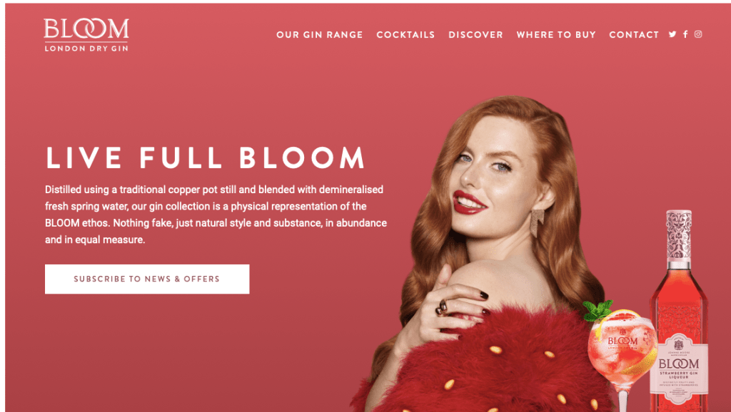
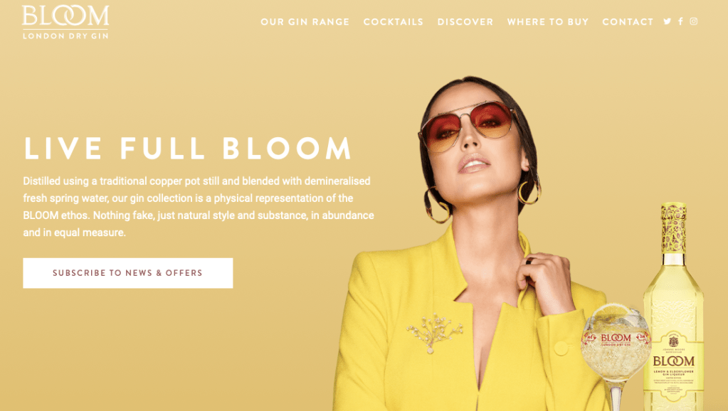
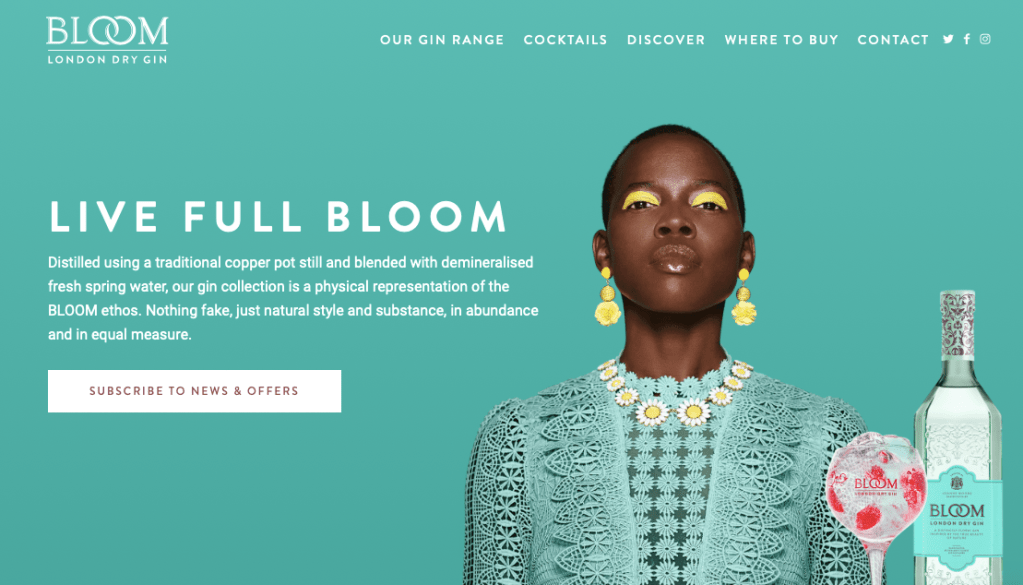
The first one I looked into was the brand bloom gin – which has an online website where they showcase their design and products through that. When you first go onto their website they showcase 4 alternative flavours that are displayed showcasing the different flavours. Each flavour show cases a model wearing the same colour as the gin and the entire design focuses around the certain flavour and colour of gin.
Now above is the advertising for this certain gin therefore – the bloom distilled gin original. When you then scroll down the website you enter into the ‘explore the range’ I found this so interesting because its almost like a website for new clothing products exploring the range.
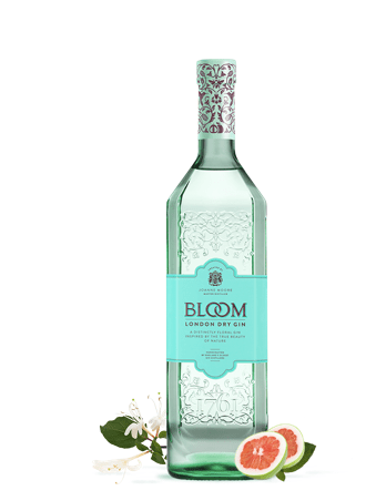
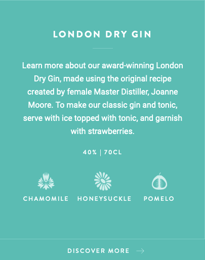
The gin I decided to analyse was the most iconic design and the original design for blossom. This design on the website was hovered over with an image that displayed the description of the gin and used as a form of advertising for the consumers. The description I almost what you would display on the label of a gin bottle, as it displays the name, description, the CL and the ingredients.
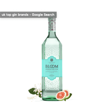
When the design is featured after the quick hover over image, you get a simple design of the bottle. This design works so well as it just focuses on the bottle, nothing else. The shape of the bottle is very sophisticated and displays a unique style to the dry distilled gin. The colour palette for this design is a turquoise which personally speaking fits in with the dry gin style, but also links with the bloom idea. The thing that stood out to me not just the logo and the bottle design (with the pattern) but the small details of the ingredients placed either side of the bottle. In the lower right corner you have dragon fruit and then in the back another ingredient which I am unsure off – however it works so well for the design advertising techniques. Adding the small ingredient almost allows the audience to taste the fruit to a hole new level.
When you then click on this certain gin – it takes you on a story. I find that most gin brands have a story behind them and portray a certain personality through their designs and Bloom showcase this on their designs and their website.
Their advertising continues through the branding, as it displays where you can buy the gin from and I think this is such a good advertising platform because it allows them to showcase where their audience can purchase their designs from. You never see this on adverts or on the bottles the fact they can showcase this on the website is a really good idea and perfect advertising platform.

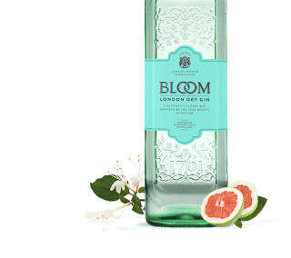
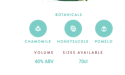
Above is the images displayed when scrolling down on the design – they showcase the bottle the way its shown at the beginning of the design. They showcase almost what it would look like on a poster. The image is clear, and the product is so appealing to the audience. They display the botanicals involve and the volume, and the sizes available throughout the product. The pictures of the bottle is so small I think it would work so much better if it was sightly larger as I find it hard to see some of the key points, or to even analyse the design. The entire design throughout is dedicated to link with the bottle, meaning the same colours and style will be used.
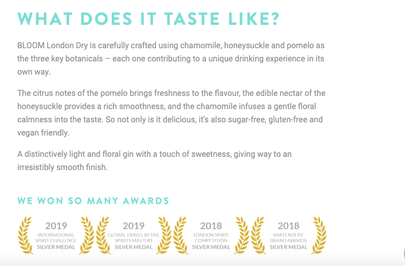
The best thing about this, is they describe what it taste like. When you want to try a new gin, you want to be able to know what it taste like without tasting it, if that makes sense. I think the design it self makes people almost taste it due to the ingredients displayed either side, and now they describe which draws the audience in even more.
The description is simple, effective and allows the reader to want to try it. I want to try it now I have read that. The entire Bloom brand portrays this elegant and sophistication through their design, it gives people a feel of spring and summer and the flowers blossoming. The design overall is dedicated towards elegance and flowers and thats what makes it work so well when advertising for the design and creating platforms.
The next brand I decide to analyse due to their marketing techniques, website and product was Blackwoods Gin with botanicals from the Shetland Islands. Their website has that very pub feel to it, with a traditional sort of display. The type for the brand/product is very tradition, and old school and sets out the rest of the design for the bottle, logo and the website advertising platforms. When you first click on the website you see this image, no words, no random images, just a single bottle displayed within a a sub scenery which tells the story straight away about this gin.
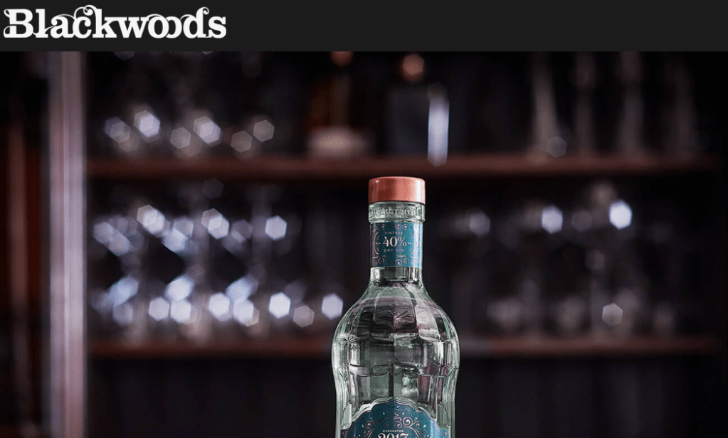
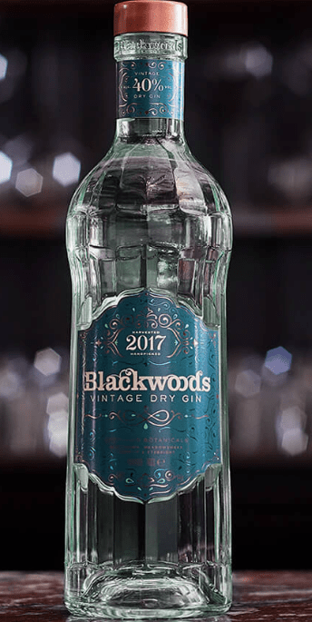
The bottle:
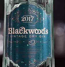
The bottle it self is so different in comparison to other designs I have seen – I personally think it looks so much like tonic water styles, its quite simple, small but has the elegant sort of style to the design. The bottle it self has a sort of pattern engraved within the design, and the top of the bottle features a label that links with the main label. The logo it self is very traditional like, with a teal background and a vintage type colour palette to relate to the description of vintage dry gin. The thing with vintage, is its old and unique and I think that this is displayed within this design throughout and thats its personality and story towards the bottle.
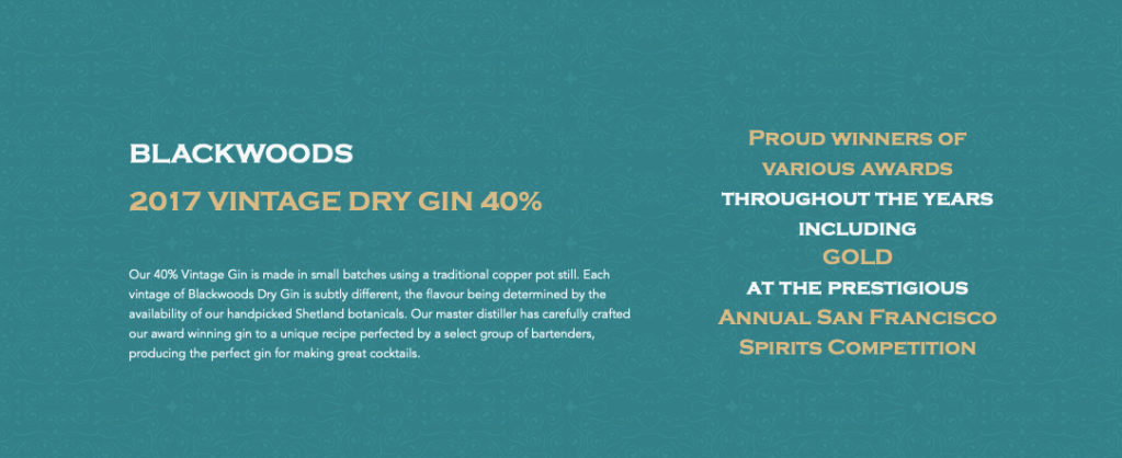
The design for this website is quite different to the previous design, when you scroll it then takes you into the next informative section. The colour palette is decided due to the colours used within certain bottles therefore in this case is this teal colour to link with the vintage dry gin design. They display key information, that they are proud winners and advertise their product as a hole. The information is clear, easy to read and gets. Straight to the point.
The last thing I wanted to analyse was this image below the related to the product. they have done it sightly different to other gins and displayed different ways in which you could use the gin and mix it with your favourite flavours. They showcase a more sophisticated design along side a more tradition every day design. Having these two designs, and showcasing how one could encounter this design allows the audience to experience what it could be like if you purchase this gin.

