I already looked into the looks of bottles that interested me, but I feel that to develop my ideas further, and making sure my labels and designs fitted into the gin world as to research labels (front and back)
WHAT GOES ON THE LABELS OF GIN BOTTLES
- Name and address of the bottle
- Country of origin
- Nominal volumen in litres, centilitres or millimetres
- The alcohol strength should be shown by volume
- Allergy declarations
- recyclable glass
I chose a few gin bottle labels to analyse to get an understanding of the gin world branding.
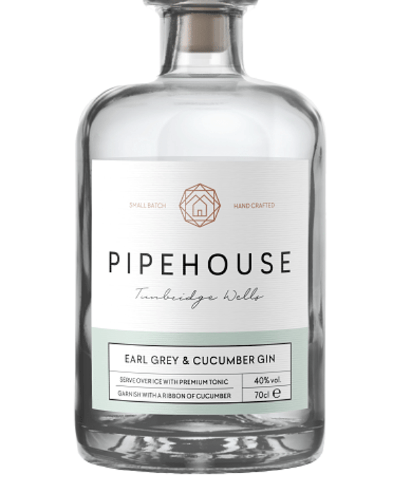
The first one I chose to analyse was this one below. At the top of the label sits the brand logo, with the main title and then the location of the design. The label is just white which fits into the flavour of earl grey gin. I think this label is very simple but fits so well with the flavours. The colours within this design are grey and a cucumber colour, which then almost provides a story through the design. This design shows that the design can be simple yet effective as long as it fits with the product and what it is selling which this one does. The space within the design is important as each separate part of the design represents something different but they all come together well. The brand logo also is a different colour to the rest of the design to make it stand out.
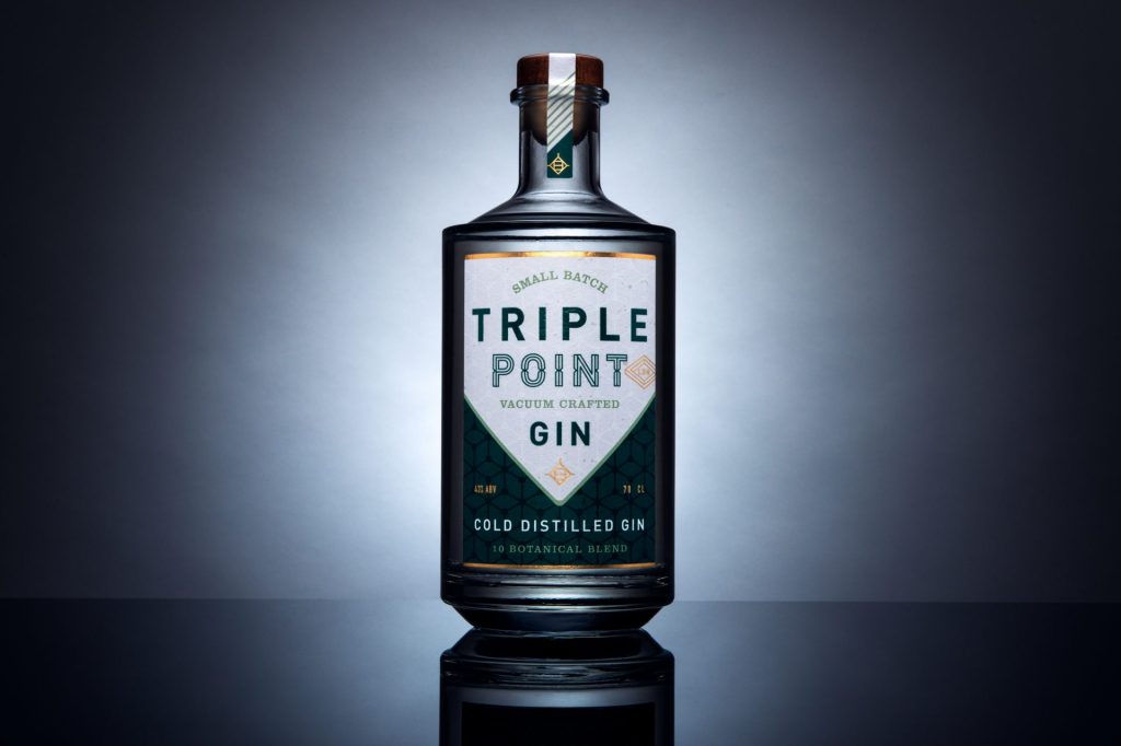
I chose this one as its slightly different with the logo as it becomes more unique. This presents quite a cold through the design/. The reason I chose this was the use of different patterns, reflections on the label. The design has elements of gold and different styles of type. Within the logo there sits a triangle pointing down but this then creates an overall square. Sometimes adding so much different type doesn’t work, however within this design having the different adds
After analysing these two designs, I decided to look into another two that I felt would inspire me through the process of gin label designing. I think there is a sot of sophistication that comes through gin label designs and thats why its important for me to research them well.
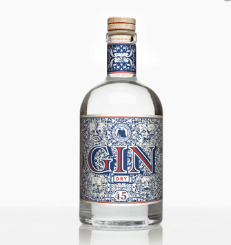
I chose this one below to showcase the ways in which a complex pattern can be incorporated within a design. Unlike the other gin designs I have seen I feel as if this one portrays more pattern through its design but also focuses a lot on the word gin. The word gin is the main title within the bottle, not the flavour which is unique in comparison to other peoples designs, and usually the flavour becomes the focal point for the design. The main focus here that I wanted to point out, was even though this design features a pattern the type is designed so well and bold with the choice of colours to showcase it from a far – and it works well. The only issue for me is I am unsure what sort of gin this is and the flavour is is from a far – but then looking closely I do not think I can even view it from up close.
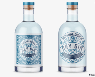
I chose this one below to showcase the idea of beach like colours displayed in a dry gin design. Now this design as two alternative designs in which they could display therefore I thought analysing both would be interesting as they are the same brand but different designs. This design has that dry gin appeal to it, meaning its quite subtle and basic which most dry gin is. On the left hand side the design features the logo with the pattern whereas on the right hand side it does not. Now the design on the right to me looks quite vodka like and doesn’t have that gin appeal to it. The design features a pattern within but the entire bottle as a whole when the design is placed does not scream gin to me. I then think adding the background on the label allows the entire design to come together and allow it to portray that gin sophistication targeting a certain market and telling a story.