Even though every gin is a different shape and portrays a different story through its designs. I wanted to showcase what different shape bottle are already out there and if there is a meaning to them. I also looked into different materials that gins are made from as personally speaking I would want to create a product that is benefitting the environment and helping decrease the issues that we are surrounded by today so also in this blog post I looked into sustainable glass and other products my design would use.
Majority of the gin bottles are made out of glass, I decided to look into certain manufactures to understand gin making a lot more. When typing into google the different types bottles and the manufacturing process, I could not actually find a lot, however the main thing that kept coming up was premium glass so I decided to look into this more.
Every gin I already looked into were a different bottle shape there was not one that was a certain shape it just depended on the flavours that were used in the gin that would determine on the shape and the design. One thing I noticed particular was that there seems to be a sophisticated appearance within gin designs and gin bottles and thats the only consistency that follows through gin bottle design making.
I typed into google – gin bottles and looked on this website https://www.fromtheginshelf.com/the-most-beautiful-gin-bottles/ and this allowed me to understand different gin bottles as there was so many on here. I have technically already analyse gin bottle designs but this was focusing on the gladdest and the lid not the label and flavour design, and the marketing design.
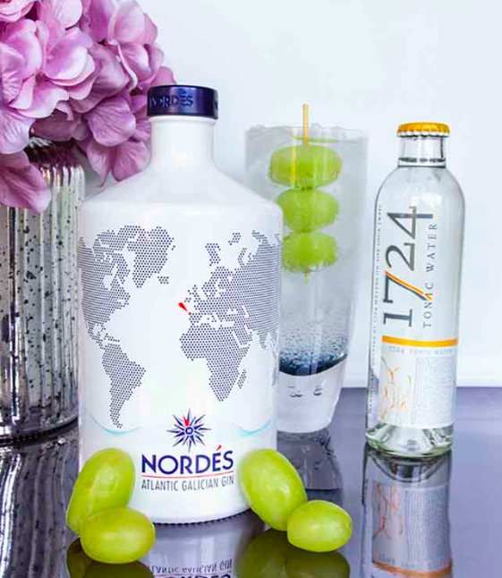
NORDÉS GIN
The bottle design is inspired by traditional ceramics of Sargadelos from the gin’s home in Galicia. Synonymous with utilising singular designs and white and blue colours, Nordés mirror these designs expertly to create a bottle instantly recognisable as their own.
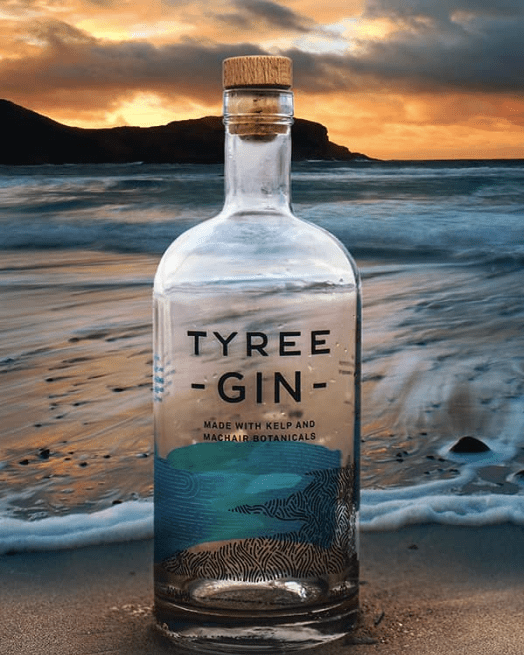
TYREE GIN
The first of many island gins on the list is Tyree Gin. Created by Glasgow-based consultancy O Street, it focuses on a clean design using two of Tyree Gin’s main botanicals – kelp and machair – marrying the land and sea with simplistic turquoise and charcoal hand-drawn type marque. A really stunning design in its simplicity.
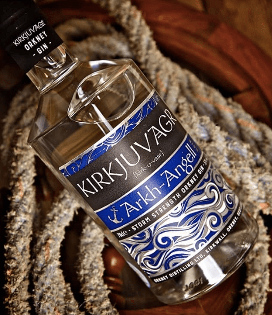
KIRKJUVAGR STORM NAVY STRENGTH GIN
Ever since I was a small boy, I’ve always been fascinated by the Vikings. Perhaps that’s why I’m so drawn to the packaging of Kirkjuvagr, particularly their navy strength gin – “Storm”.
TARQUIN’S CORNISH GIN
ENGLAND
Tarquin’s Gin has always had a really pretty bottle. With its signature wax finish, it’s one that stood out. In August 2018, to mark the 5th anniversary, the bottle went to a whole new level.
The sea glass design – “a tactile and emotive nod to the Cornish provenance” – really is beautiful and further adds to what is, a truly great gin.

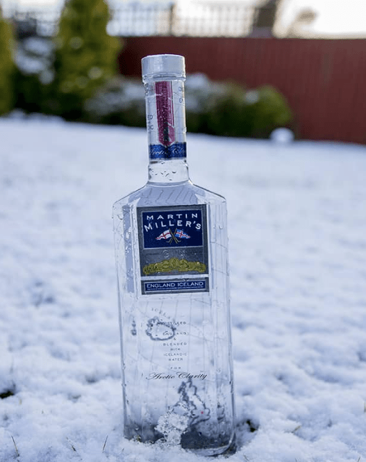
MARTIN MILLER’S GIN
ENGLAND
Martin Miller’s Gin was one of the frontrunners of the gin revival. Launched in 1999, it remains an excellent gin to this day.
The bottle itself is cleverly styled. With transparent glass the designs on the front and back of the bottle work in tandem, showing the location of its distillation (England) and the journey it makes to add the pure waters of Iceland that are synonymous with the brand.
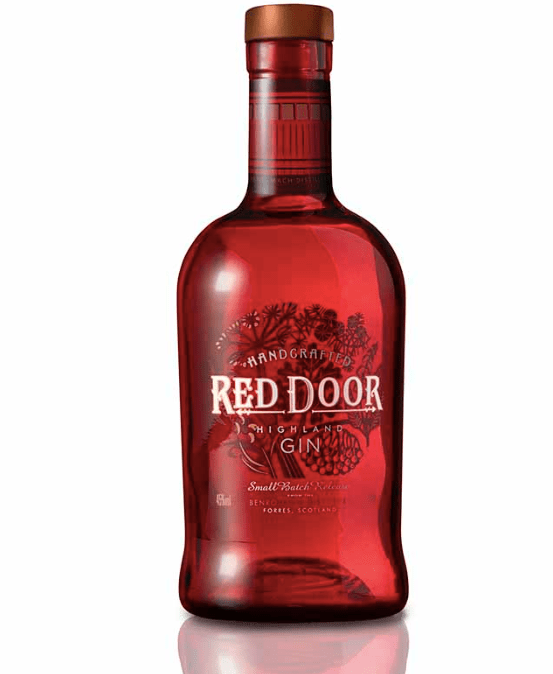
RED DOOR GIN
SCOTLAND
After 120 years of distilling whisky, Benromach Distillery in Speyside turned their hand to gin in July 2018. Taking its name and bottle design from the distinctive doors on the distillery, it makes for a striking red bottle.
Around its neck you’ll find the doors themselves and if you look closely, their resident distillery cat!
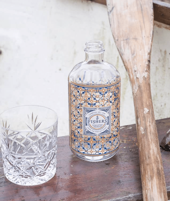
FISHER’S GIN
ENGLAND
The Fishers Gin bottle was designed by Parisian, Gilbert Lopez. Following a three-day visit to their Aldeburgh home in Suffolk, he took inspiration from the coastal town for his creation – most notably the fishermen’s lanterns and the vibrant colours of their nets. It makes for an extremely pretty bottle, tying in perfectly with the brand.
Conclusions gathered from these photographs:
From these photographs above the focus lies with the bottle design and the background they are displayed on. Each bottle is completely different from one another, and each one have a completely different story to one another. The background relates to the gin and the name of the brand and that creates the story. The size and shape of the gin doesn’t matter, whatever fits with your message allows the design of the bottle.
