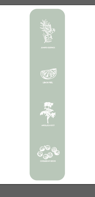
The first thing I did was actually the sides of the bottle as this then sort of tied in with the rest of the design. I am using natural botanics within my distilled gin and like a certain inspiration shown in the previous blog, I want to showcase these on the sides of the bottles. To make sure each botanic was right, and showcasing the right ingredients and the small icon that would display it.
I drew all the ingredients first before design it onto the bottle to make sure I had them all secure.
JUNIPER BERRIES:
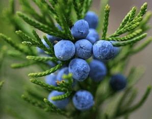
A juniper berry is the female seed cone produced by the various species of junipers. It is not a true berry but a cone with unusually fleshy and merged scales, which gives it a berry-like appearance.
OUTLINE SKETCH
to create the outline sketch I googled an outline image which is displayed below however I did not like how the lines linked with one another as to me it felt a bit too bulky. Therefore I transferred this outline onto my iPad and began sketching it myself.
outline:
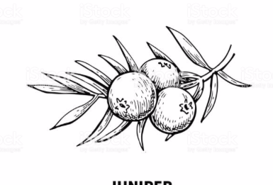
my sketch:: I made the sketch white and sit on a colour background just so I could see what it would look like against a colour background as this is how I would create the sides of the gin bottle.

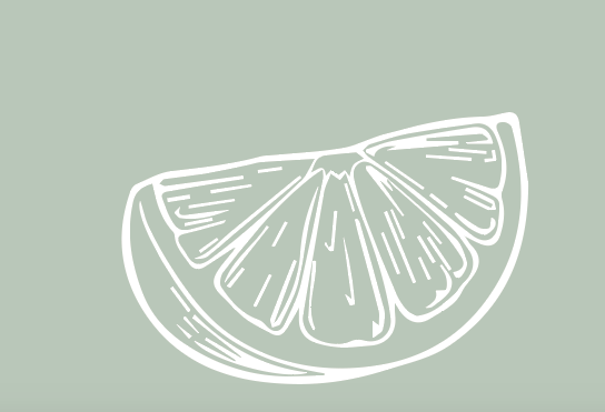
The next ingredient I designed was lemon peel to be added to the gin. I googled into it and got a reference image and with this design I felt as it would be okay to image trace it. The image in large scale I took into illustrator and I decided just to image trace it to see if the lines would be ok to use.
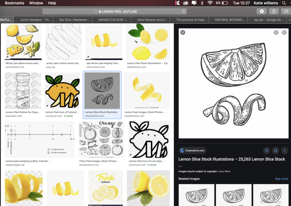
I decided to image trace it then make it white to make sure it would work in this type of style; I felt as if the design was simple and effective and linked to the image before in the case of the thickness of the lines.
Angelica root
Angelica archangelica, commonly known as garden angelica, wild celery, and Norwegian angelica, is a biennial plant from the family Apiaceae, a subspecies of which is cultivated for its sweetly scented edible stems and roots.
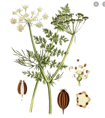
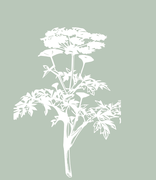
I tried to draw this on my iPad but personally it just didn’t look right and almost looked a tad rushed. I image traced it and turned it into a white outline to see if it would would and personally speaking it did the job. Unlike the other designs it is filled in but that is what the product is like to it matches the realistic image. Again, I placed it on this green like background and it worked well as small and format a far. Its a little more blocky and more triangular than the other designs but it does not stick out it fits nicely within the design process.
I decided to show case 4 different ingredients thats involved within the design on the left and the right making a total of 8 ingredients all together.
Coriander seeds:
Coriander is an annual herb in the family Apiaceae. It is also known as Chinese parsley, and in the United States the stems and leaves are usually called cilantro. All parts of the plant are edible, but the fresh leaves and the dried seeds are the parts most traditionally used in cooking.

I typed in coriander outline and within that displayed this image which is shown below. The image works so well as an image trace therefore thats what I did. Once image traced I again made it a white outline and this automatically made the lines appear thinner.
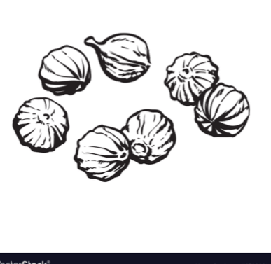
I decided to make it the exact same as the other designs as I wanted to make sure it would work through the same design process. I made the lines white and this stood out the most. What makes these seeds stand out is that they are all spaced out so you are able to see it.

Combining the ingredients together:
I then had to combined all the designs with one another to ensure they all worked when combined.
I went for this sort of green colour as personally speaking I think it matches with the logo with the idea of seaweed and this would be on both sides of the design. I made sure each ingredient had the same distance between one another, and by doing that I made a box and carried this through the design to ensure the correct space was shown.
Quick design:
This is a quick design show casing how this would look as a design aspect. I wanted to ensure it displayed the right information and was clear to the audience but also match the front and the back of the design, with that seaweed colour displayed. I will change this design once I have completed the right hand side therefore make it perfect.
