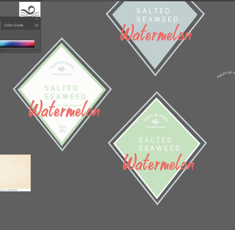
I wanted to experiment further with the type and the diamond shape. I wanted to add more character within the diamond as the flat shape made it a tad boring and not stand out as much.
Before I go into explain the brand I made (as this is portrayed within the designs below) I want to focus on the diamond.
I wanted to add more depth to the diamond as it was so flat and boring. I tried alternative colours angles and adding another one to make It more unique. The top one is using the sea salt colour, but personally speaking it represented sea way to much and not seaweed. I then tried having it white with green type and the added blue diamond outline to give it more depth, and out of all them this one worked the best so I took this further. But I also did try the entire diamond the seaweed colour and it did work but because I knew I was going to add a pattern some way or another so I knew to keep it white and simple so not so much is going on and clashing.