I thought of all words that related to the ocean and the beach wrote them all down research if they exist and the one that was at the top of the list was AQUATIC GIN. which does not exist.
What is aquatic gin?
Aquatic gin is a beach gin that only produces flavours from the ocean and beaches, to give people that summer feel. Aquatic gin is about using a scent (feature) of a beach for example seaweed and mixing it with your summer fruit. Aquatic gin is all from organic ingredients and all gin is 37% VOL. in glass bottles that are recycle and helping the environment rather than destroying it.
MIXING SUMMER FLAVOURS TOGETHER IS AQUATIC GINS PURPOSE
The logo process:
I did not want to spend ages on my gin brand logo as when researching into gin products I noticed the flavours almost take over the design but every single on is different and has its own story to represent.
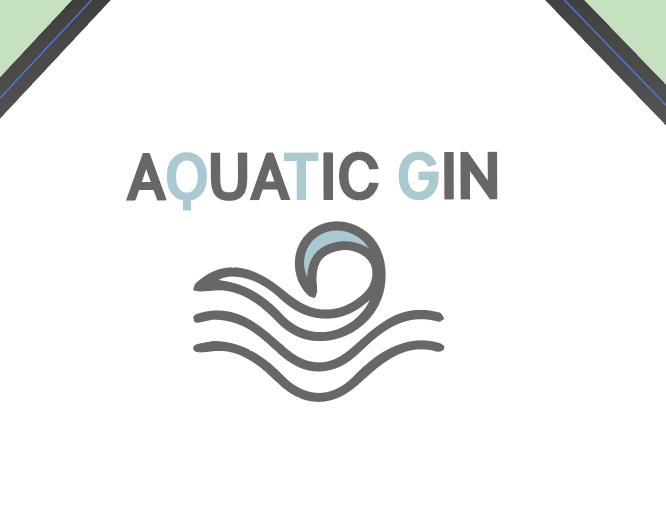
I knew I would make it the same type face as inspired by the flavour of seaweed which was Manti sans in bold. If you look into this design you will see the first idea of the brand logo at the top of the diamond design. AQUATIC GIN SOCIETY . With a wave within the logo. I tried at first to make it have warp but personally speaking it just looked awful and so tacky, I also could not really see it therefore I experimented with it further.
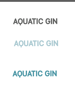
I then just got rid of the word society as it was not needed at all within the design and just looked weird. I then just started experimenting with the different ways of writing AQUATIC GIN. I started of with writing it in different colours, I thought blue would sort the theme more, but when I tried this on the logo and placed it from a far you could not see it within the logo. Thats when my idea clicked – mixing the grey colour with a blue.
I chose to mix the sea salt colour together to fit in with the theme and the other pastel colours within the design. This allowed the word to stand out but also have elements of the pastel blue design.

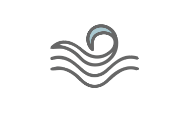
I then wanted to add a logo to make it all link, when I think of aquatic I think of waves and the ocean so I knew this would be an element within my design somehow. This did not take long at all, I got a reference image of google and decided to draw it and then refine it on illustrator and to fit in with the type I added the blue sea salt colour within the wave and then the grey. Adding that small extra colour made the title and the logo link together.
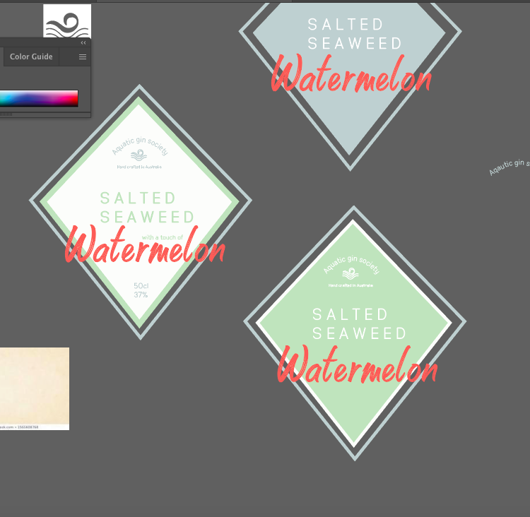
WHAT FINAL BRAND LOGO WOULD LOOK LIKE ON BOTTLE: