When looking into a variety of gin brands, there is always a pattern that surrounds the design as it creates this sophisticated appearance through the design. I knew I wanted to add some sort of pattern to make the design come alive and tell a story.
On pinterest i typed in seaweed backgrounds to get some inspiration as I really wanted to use pastel colours and add some pinks within the design, and sea weed is obviously a dark green which isn’t what I want the entire design to be.
Below is the process that was taken to create the patter, going from left to right. The first image is the mage from punters and red a bunch of colours that appealed to me, I then created numerous amount of layers and recreated it but changed the colours slightly. I wanted to add green within the design to match the idea of seaweed and then the pattern links with the label instead of it being two single designs.
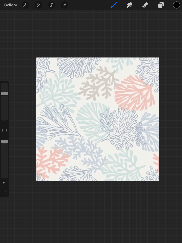

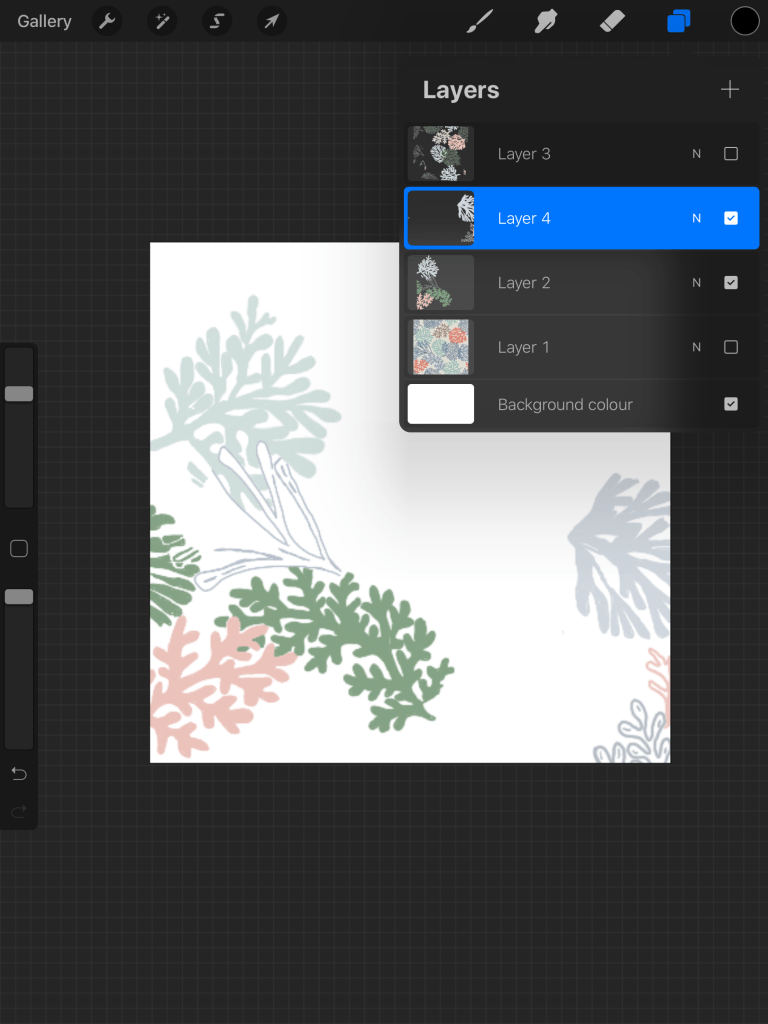
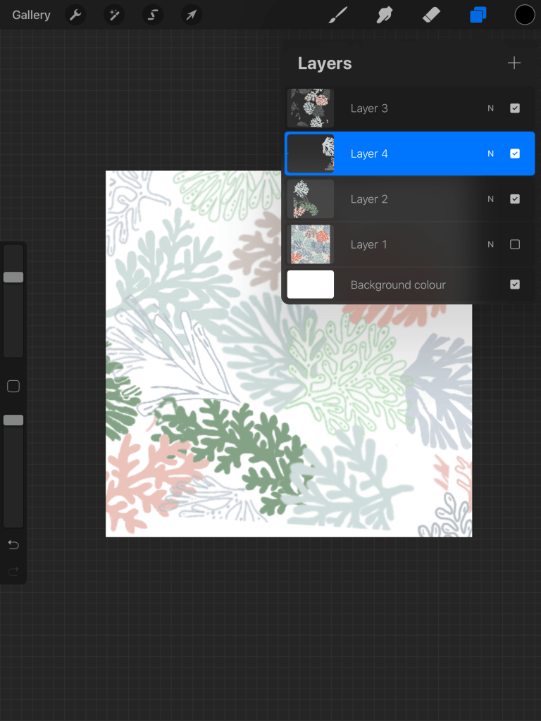
The process was easy, it was a case of referring back to the original image and then using a brush on procreate on my iPad created my own and added the colours I felt was appropriate to fit the flavour of the gin I created.
After it was created I took into illustrator and started to see how it could work within the logo form and this is when the logo started to change, which is described and shown within the next blogs as the pattern was done and I had it to refer back too.
