I wanted to the logo to have more character to it and fit in with the message I wanted to portray which is a beach vibe. This post showcases the final development to create my logo and finalise all its aspects. Some of these experimentation were done before I changed the brand logo so some of these screenshots have the old brand located on them.
Trying different colours:
Previously I tried different colours but I thought about trying a more tradition colour. I thought it could work but you could not really see the writing very clear even as a close up, therefore from a far you would hardly see it and this did not give the pastel beach feel approach I was going for.
Adding elements:
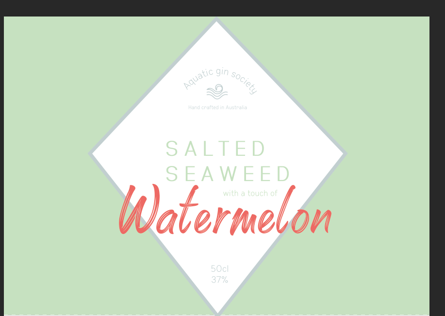
I then thought about making it a square logo with the diamond within it to make it fit better on a rounded gin bottle design. I thought about changing the diamond colour to the sea salt blue colour. I then thought about linking the green background to the type of salted seaweed.
changing shape:
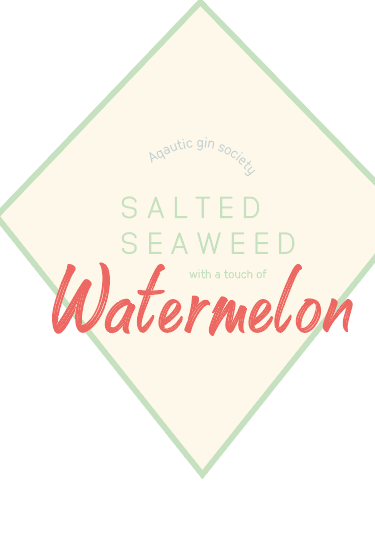
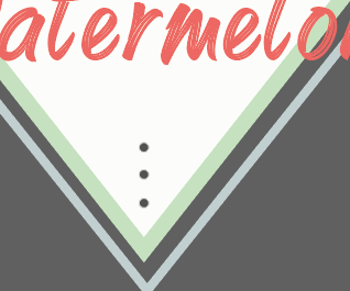
I then thought the green was too boring and again looked to flat, so I decided to change it again. I experimented with two diamonds on top of one another one blue and one green then three little dots either end to showcase the idea of water melon but again there felt like something was missing which at this point I created the pattern
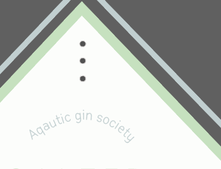
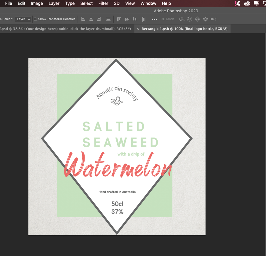
I then came to this conclusion (before changing the aquatic gin logo) I thought about the square at the back but allowing room for other designs, at first I wanted the pattern to sit in the bottle and this would reflect. Now looking back at these designs, it looks awful and I am so glad I did these experiments other wise I would not be concluded to the design I have today. I wanted to ensure the design could work against bottles and thats what I explain in the next blog post. After this I finalised this design and changed the aquatic gin logo and refine it onto a bottle to see if it could work.