The first attempt for the bottle was absolutely awful now looking at it and just by recreating a bottle made the design change. This was almost a trial and error sort of design as I wanted to see if the label could sort of work and before I go into the first design I want to briefly touch upon the fact that during this process the logo had developed before hand.
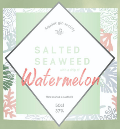
As you can see from the screenshot up close of the first bottle attempt: The logo developed displays a pattern as the background as this was something I felt was needed,. when researching so many different gin bottles I noticed that patterns play a big part in the design as it tells a story and shows a more sophisticated side to the design. I added this pattern which I created and explained in a previous blog and added it underneath the green square, at this point I was unsure whether or not it would be the bottle pattern, reflecting pattern or part of the logo.. within the logo you have the aquatic gin society before it was developed (as for a while I stuck with this) had the flavour, and then where its crafted and the CL an Vl it has in it. I decided to go for Australia as to me charts such a beachy place and would be something they create not really the UK.
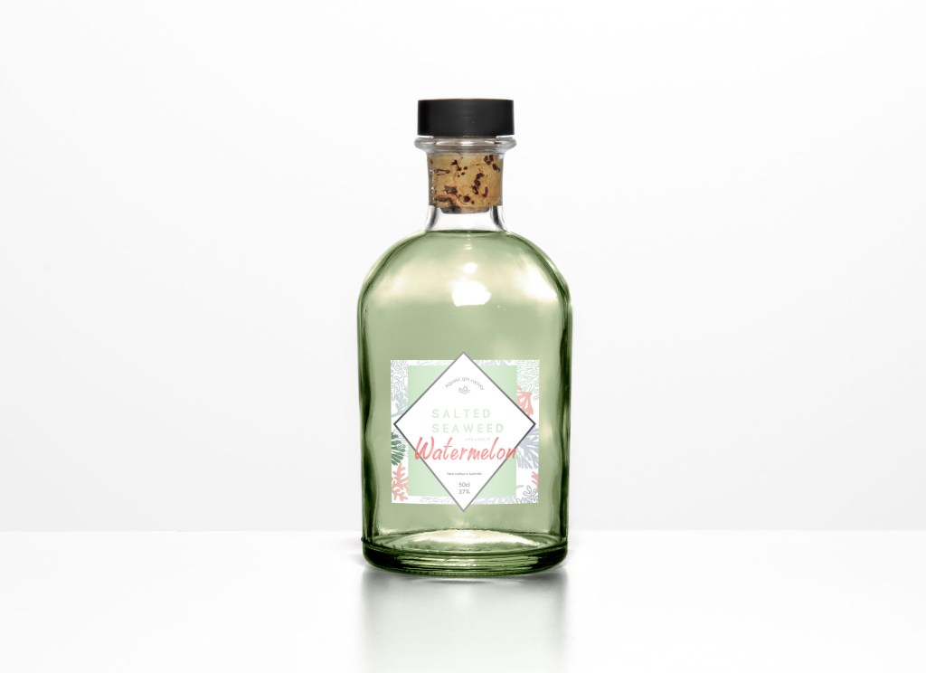
The first mock up, looking back at it now is absolutely awful and so glad I developed it. I got the mock up from mockupworld.com and just typed in gin bottle glass, it was actually a nightmare trying to find one and I think I was rushing the idea so I just picked anyone. I then thought ok seaweed is green lets make the liquid green (which made sense and looked great in my head but did not turn out like at all) I then added the logo just placed in the middle.
Reason why I developed this was because of the way it looked, the top looked so realistic in comparison to the liquid and the logo looked so small and flat. I felt like it looked so rushed and not finsihed and overall was not happy with it so I began re designing the bottle ideas.
Development of bottle:
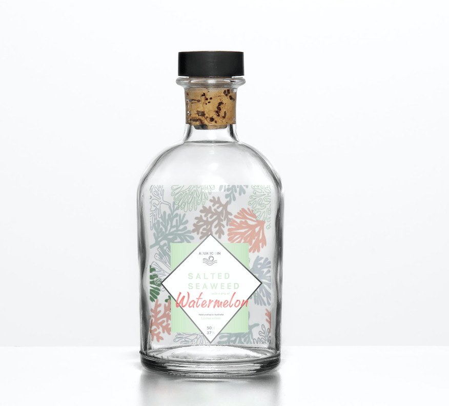
I usually sleep on a idea before developing because my view is always different in the morning, the first attempt was an evening and I woke up wanting to change it straight away. I thought about getting rid of the horrible dirty green liquid for starters and making the liquid clear. Most flavoured gins aren’t coloured so that’s why I changed that. I then was looking at a photo on Pinterest and I have shown it on the blog before, it was a gin bottle where the pattern was inside the bottle, and that’s almost what I attempted here. I added to pattern to fit in the liquid and then add the logo as its own like before.
If you look closely here, you can even see the logo has developed even more. I added the new and improved ‘Aquatic gin’ log I also added the words ‘limited edition’ and ‘hand crafted in Australia’ and changed the colour of certain type to make it fit together more.

For a long time I stuck with this design created different advertising platforms and it wasn’t til a few weeks after I then changed again but for the next few blogs I will show case the developed work I created and stuck with for a while on this bottle design.
