I wanted to create a poster and some advertising platforms for my bottle as that’s something I am very interested in and want to take further as the years go on therefore thought I would incorporate that within this design.
Poster design:
The poster was something that I did first and kept this for such a long time before the development of the bottle. I thought about the story within my gin which was about mixing different beach flavours from different areas together so seaweed being from the UK, and watermelon being from a tropical island to then make this gin. I did not just want to add the bottle, that’s boring. Therefore created the type sitting on the side of ”mixing beach flavours together’ I wanted to make them fit in with the design a bit therefore made each word a colour that was shown in the pattern in the bottle. I could off made the type all the same colour but the purpose is mixing things together also colours to create this unique drink.
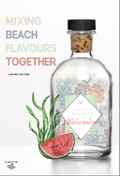
I wanted to make a subtitle of limited edition as it was something I would not be making again within a company therefore the uniqueness of the design is displayed more because its limited edition. I decided to use this in the same type face but then make it slightly different by making it smaller and in black so dint contrast against the other type and the bottle image.
When I completed this, at first I thought it looked a bit boring and if it was to be on a poster then people would sort of walk away from it because it looks like so many different gins out there. I felt like adding something that linked to the flavour would make it work,
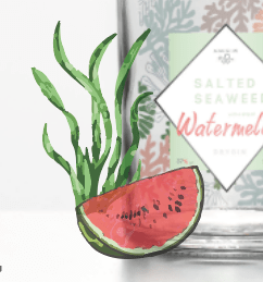
I actually made lime at first, because when asking my boyfriends mum and she said she would want to drink it with lime, however it made it look like there was lime in the drink, and thats what inspired me to the create the seaweed and lime.
To make the water melon and the sea weed I got a reference image from google, and vector it. For the seaweed however though due to me rushing it I quickly high image trace it to give it all them different elements of green. At first look I added this to the left Hand side of the bottle and ti almost made the design come together.
Issue with the design:
I made this design before any research took place and I think that shows within the design. The design looks very rushed and cramped, and when adding it to some mock ups I felt like it didn’t grab peoples attention enough. There was some elements did work such as the type and the water melon and the seaweed illustration but to me the bottle did not work and the layout, so I basically went back to square one and researched into some more adverts and bottles.
