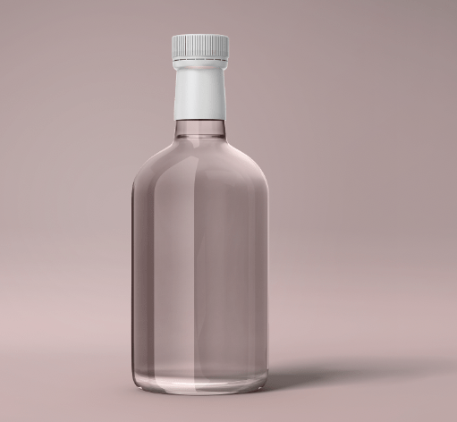
Final bottle shape:
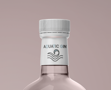
I am so happy with my final bottle outline. I had this image in my head for so long, and the fact it all came together was so good. I changed the lid to white as I have quite a pastel theme going on within my design for the label therefore thats why I wanted to make sure the background coming through was a subtle. I think this pink doesn’t link to one specific flavour but almost links with the entire design therefore thats why I chose it. Now I had my bottle it was time to add my logo.
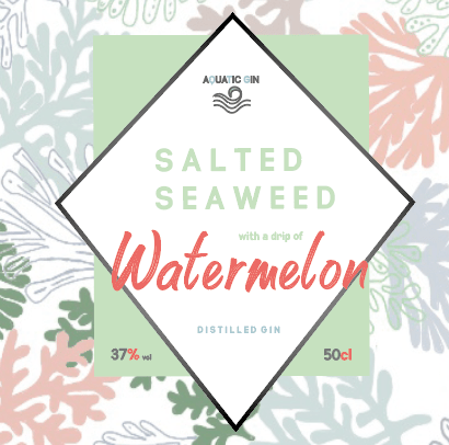
FINAL LOGO ADDED:
Here I thought would be a great place to show case the final ever logo. It took me a while to end up here but I think changing the bottle the style and the way I wanted to showcase this brand played a big role in the process of this design. I linked the pattern background within the design more as it became more interesting and make it stand out as a logo. Each element of the logo plays a part int telling the story however they connect together well without being separate. I decided to add the vol and to CL outside the diamond as I felt there was way to much going on within the diamond. I added the aquatic gin logo centre of the diamond at the top of the it making the rest of the type sit in within. If you look closely you will see its now a distilled gin as I did a lot of research to understand whether or not that this should be a dry gin or distilled gin. The thing removed from this is the fact its from Australia as I was going to add this onto the back. Reason being there is a lot of information being displayed within this gin, and some gins have the place its located from on the front others have it on the back there is no rule therefore I decided to add it on the back. I think the design fits with what I want to portray and I think it links with the pastel theme and the beachy vibe my brand is trying to portray.
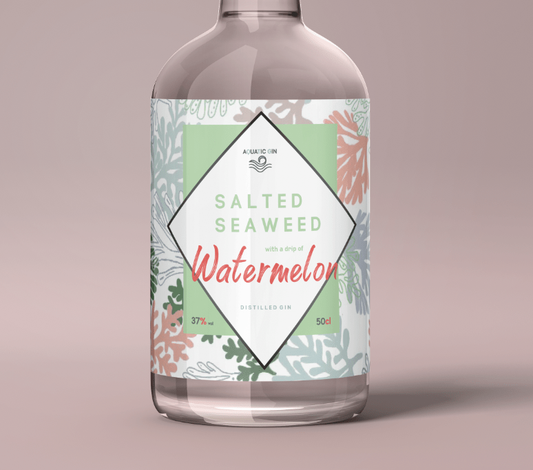
Adding logo to the bottle:
Adding this logo to the bottle made the design finally come together and become a real brand. To add this onto the bottle it was a simple process, of saving the logo as a JPEG, opening the mock up, clicking on the current label that was there and changing the mock up to my own label.
Bottle with front label:
With the background it made the entire bottle design stand out so much in comparison to the first design as that was quite blurred. The label fitted around the entire bottle which would then allow me to create a back label design. Unlike the first design for the bottle, this one allowed the label to take over most of the bottle shape and thats exactly what I wanted to achieve within this design process. I think the development from the first bottle to this a big jump and thats thanks to experimenting different designs.
Adding branding:
Now even though the Aquatic gin label is dipslayed in the diamond I always wanted to showcase it within the bottle cap somewhere. From the original mock up I noticed that the design had the branding logo front facing on the lid and thats what I wanted to do. In order to do that, I changed the lid to white instead of black as I felt this match the pastel softness of my design better. I then did the exact same process of the main label and it made it all come together nicely.Also by adding this brand logo the consumer can tell from the image what is the front and what is the back of this bottle design.
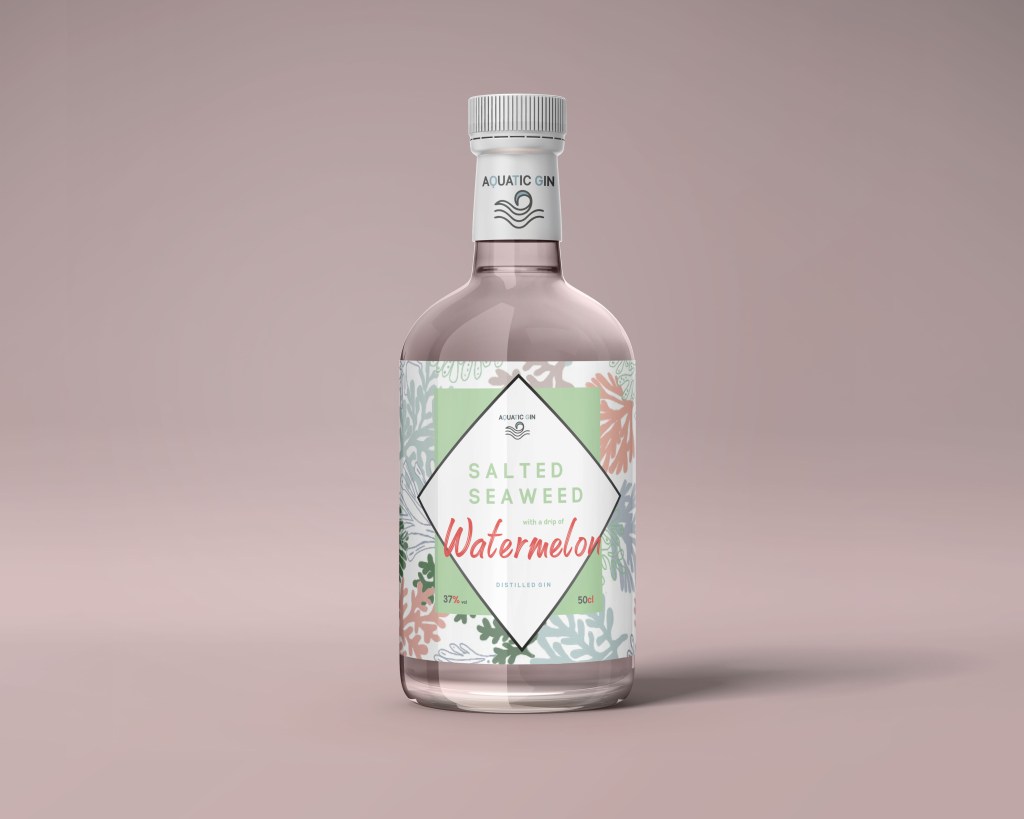
THE FINAL FRONT OF BOTTLE:
and this is my final front of the bottle: I spent weeks making this the best I could and making sure the bottle was the way I wanted it and what it portrayed.I wanted my design to tell a story, which I think it does. It automatically displays that beach vibes and screams summer with all the pastel colours involved. it portrays happy colours and makes people want to associate themselves in a certain place drinking this drink which I believe is key for advertising, selling a dream. The liquid stayed plain and seethrew to make sure nothing clashed with the design, and thinking about it and looking into gins with similar flavours they are always the plain colour, Its only really strong citrus ones that are coloured. I think the fact the label follows through to the back and portrays not only a label but a pattern gives it that gin sophisticating, and makes it stand out in the world of gin. I am extremely proud of this, and believe the development has come a long way and made a fine gin for them beach lovers.
