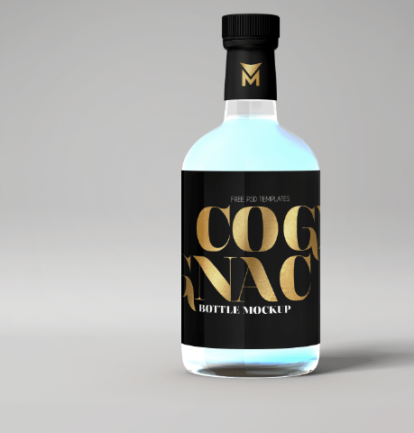
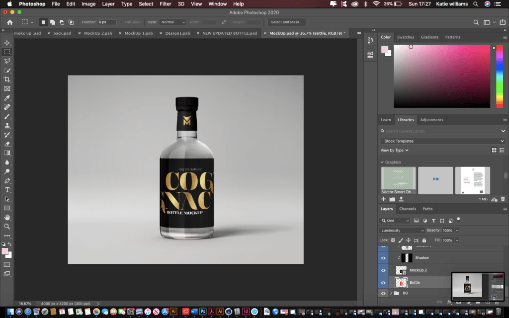
I had spent ages trying to find the perfect gin bottle and I could not find it. In my head knew exactly what I wanted, I wanted it to be small rounded slightly, have deep shadows. Thats when I thought about typing in a different mock up, so this time instead of gin bottle do whisky bottle as these actually are similar to the design of a gin bottle and this is when the design finally started coming together.
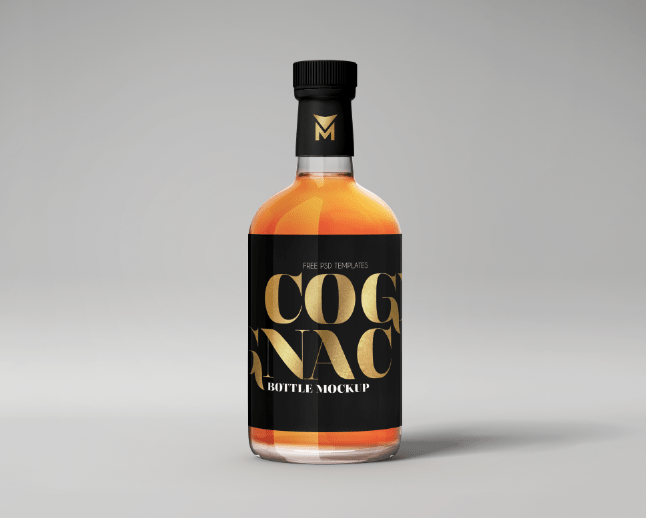
Origanal mock up:
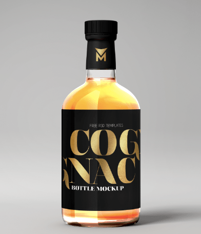
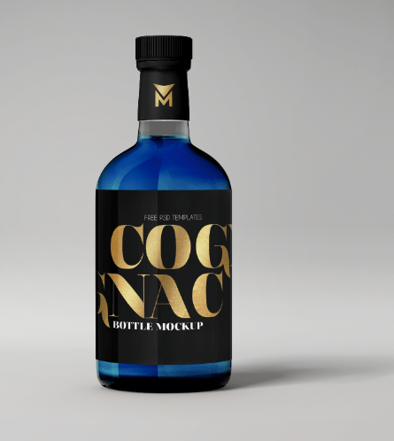
The original mock up is displayed below. As you can see it’s not the normally gin bottle and actually is a whisky bottle but it has all the elements I wanted to use for the gin bottle. What works with this design is the bold logo and the liquid coming through and the small icon on the lid and this almost inspired me for my design.
Editing the mock up:
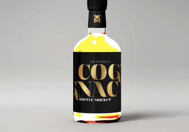
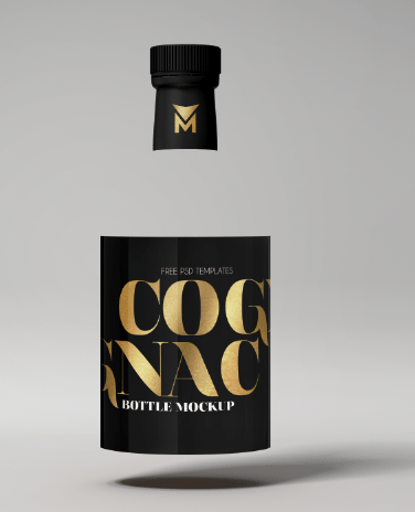
When I removed the orange liquid (because this did not link with my flavour and gin) it left the label and the lid floating and it was impossible to change the liquid or even remove it. I almost gave up with this until I started playing with the hue and saturation on photoshop.
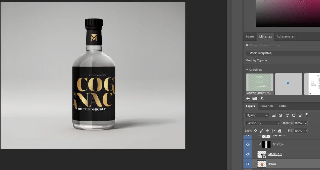
On the right hand side (displayed in the image below) where it says luminosity is where I was able to change the colour sort of until I was happy with the way the bottle looked.
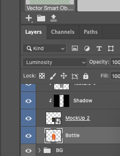
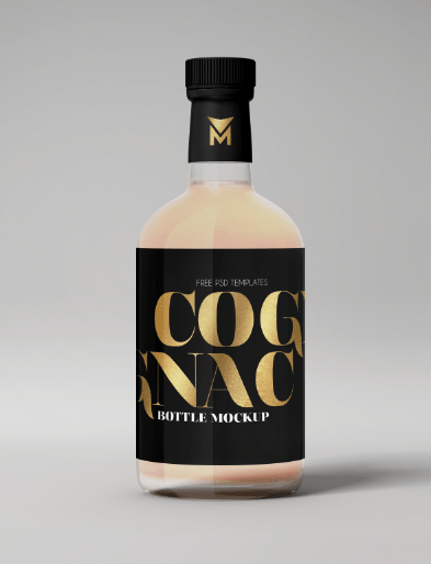
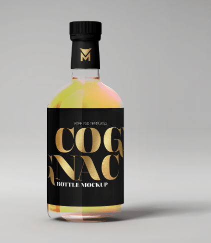
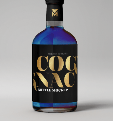
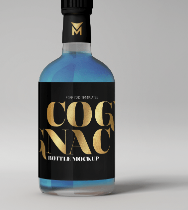
When I changed the option you can see the difference in the colours and the way different effects affected the liquid of the bottle, none of them matched my theme at all until I got to the luminosity option.
luminosity
As you can see this makes the bottle clear and reflects through the colour that the background is which in this case is grey, making the liquid appear clear. I chose this because it related to my flavour for a clear gin, and I could then create whatever label and design and not worry about the colour of the liquid.
