When creating the first poster, I felt there was an issue with the design and personally was the bottle. I absolutely hated how it looked, you could hardly see the design the way I wanted it to and it did not catch your attention so much. so starting from scratch, I redesigned my bottle.
EXPERIMENT ONE:
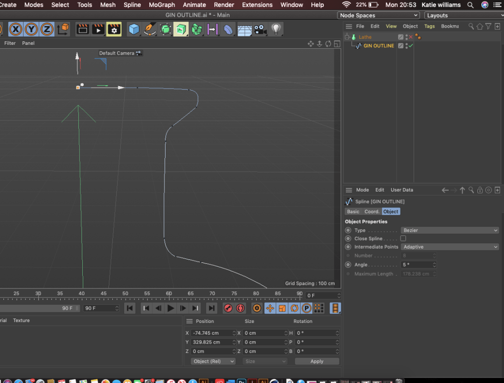
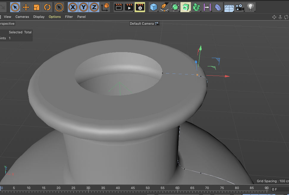
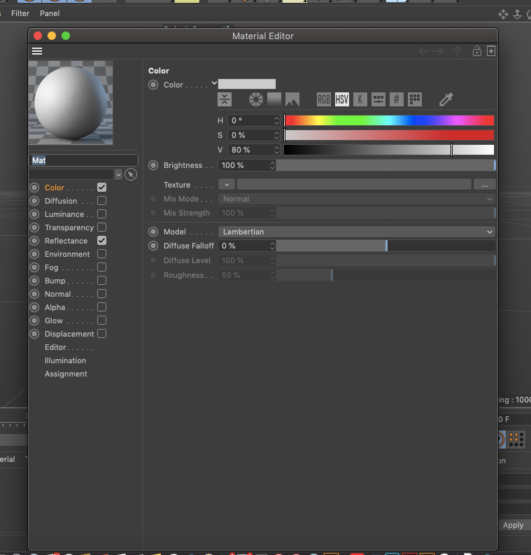
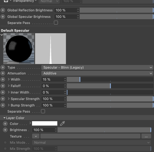
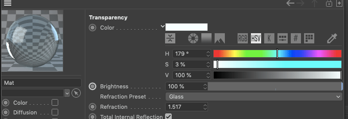
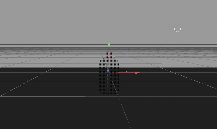
Previous projects, and during this I really wanted to try cinema 4D, Jack was doing it for his project and I kept watching it and thought maybe I could try it but it didn’t really work out for me. But I thought I would show case it to showcase the experiment and takes I took to even reach my final outcome for my designs. I got to the stage of making the bottle, and even though I did not continue it, it almost helped me conclude to the final design as it allowed to visualise digitally a gin bottle and all it’s aspects.
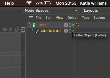
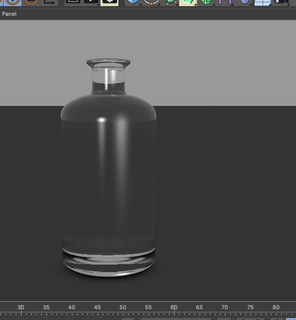
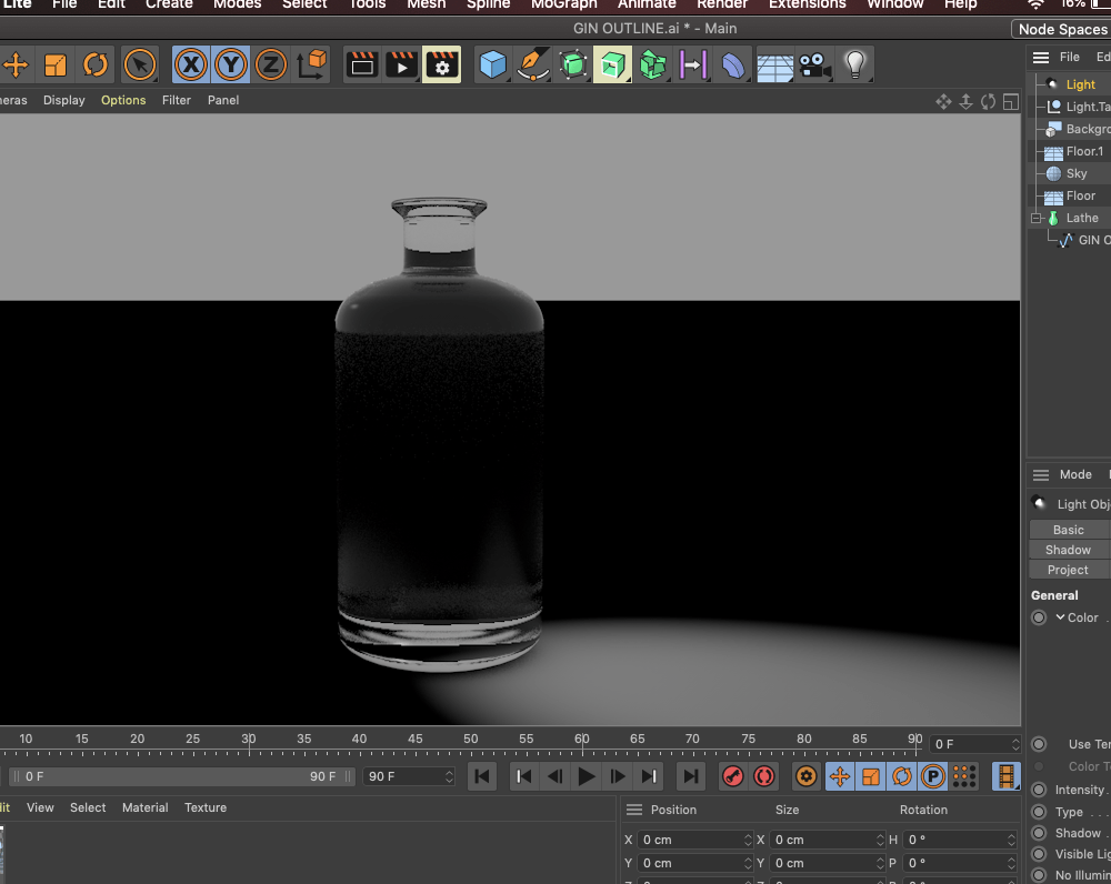
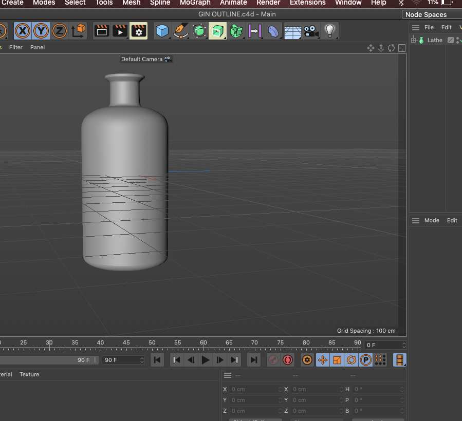
All I did was create a gin outline on one side, and then take that into cinema 4D, the rest I watched tutorials and tried to workout how to conclude to this outcome, this process was so confusing and I could not continuer it any further. I managed to add glass, and then played around with the lighting. After this I got so confused, personally speaking I wanted to make the advertising aspects and the logo the best and not spend ages on this as it isn’t really my interest in comparison to poster and magazine design.