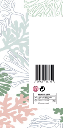
Now I had all the elements needed it was time to make the design come together, all the small needs elements like the barcode etc. From the previous blog post you will notice I said where I placed these elements and they sat on the right hand side in the corner on top of one another, and the signature was still yet to be placed.
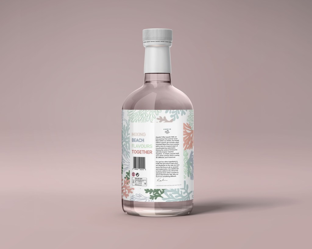
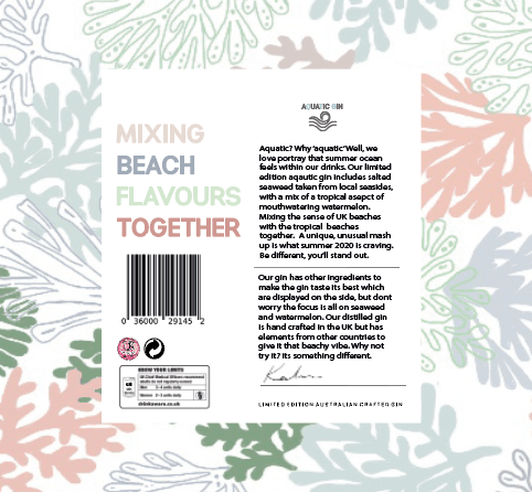
To make the back link with the front, the pattern had to be continued throughout the design. I wanted to make sure the pattern went around the entire bottle without any breaks. Therefore I copied the exact same pattern background and added a plane white square over it to make the information clear to read. As you can see from the image below all the elements added made the back label look so professional and really make it come together as a product. With the white background it worked well and stood out, as you can also see there is so much room left on the white square background to add elements of design I wanted to tell the story.
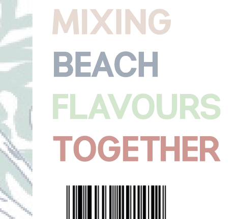
I said previously when creating the first ever design, with the poster aspect I thought of the phrase ‘Mixing beach flavours together’ and I wanted to use this on the back of the label as then when I created another adevrtising poster there would be a link. I think its a simple, sort and effective way of expressing my story through the gin and makes it link well with the flavours and thats why I decided to use it on the back label design.
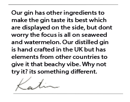
Above the barcdoe was enough space to add this description. Therefore I used the space, the add each individual word in different colours as it relates to different flavours mixing together. Each colour for the words relates to the background and it made the entire label come together and tell a story, also is eye catching to the audience.
The next thing to design and add to the label, was to write the description of the brand. I was inspired by a bottle that I had laying around the house that was my boyfriends mum. It started with this quickness and almost answering its own question and then from there I just added what the story was of gin, and trying to advertise it as well as I could.
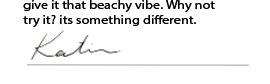
Below is what the writing is that is on the bottle of gin. The top is more about the aquatic gin, and then under the line is ingredients. It’s describing being different, mixing unusual things and the story of the beach and craving summer. I decided to add a line between the two so people would actually read it, personally when there is load of type I find it so difficult to read it and I get bored, adding this line made it two seperate paragraphs advertising the gin in different aspects.
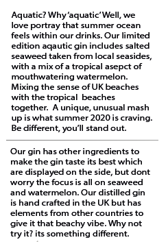
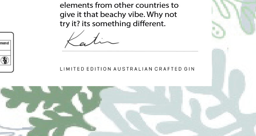
I thought by adding the line in the middle of these paragraphs would then allow me to add a line at the end of the paragraphs to add the signature within the design. Adding that small logo at the bottom made the design become more personal and have that professional appeal to it.
I wanted to add something to make the design link to front even more, and to make it aware of the brand, On the front of the bottle sits the AQUATIC GIN logo on the lid, but then there is nothing on the back as I wanted to make it visible that is was the back. Therefore I thought about adding the brand logo at above the writing to indicate the brand and it also made sense with what I was writing about.
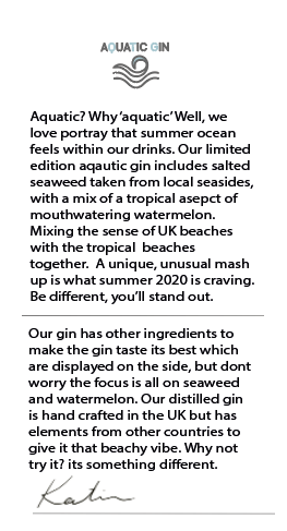
For a while I kept the design the way it was, between posting it on my instagram and writing all the blogs I noticed that I did not mention anywhere its a Australian crafted gin, and this was after creating my poster design. Therefore used the same design I used in that and put it on the bottom of the back label.
The final back logo
Below is an image of the final back logo for my gin bottle. I think all the elements come together so well and make each piece stand out but not look crowded. Comparing this to other gin bottles, I think it fits the market well and continues the theme of the bottle throughout. It has that appealing advertisement to it like the rest of the design process.
Adding it to the bottle:
Adding the design to the back was easy, as it was the exact same process as the front. When adding this to the bottle, automatically you could see that the pattern continued the entire way around and made it a story throughout. The worry for me was the details on the back would not be seen, but with this gin bottle shape and the background and the way I designed each piece individually you could see every single part of the design. This made the design complete and made it into a professional gin bottle.