I thought it would be important to create a blog on how my final design presents in comparison to gin brands that are already out there and if it is better or worst.
I chose a collective of images that represent the gins that are already out there – and then from that came from a conclusion.
Other brands of gin:
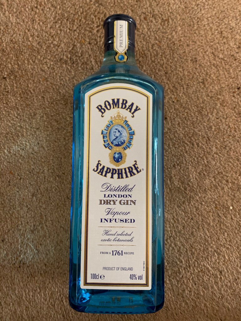
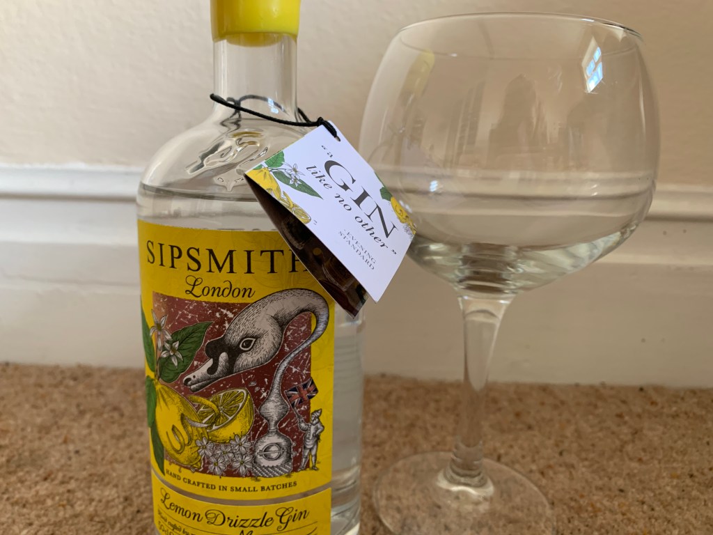
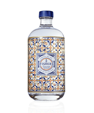
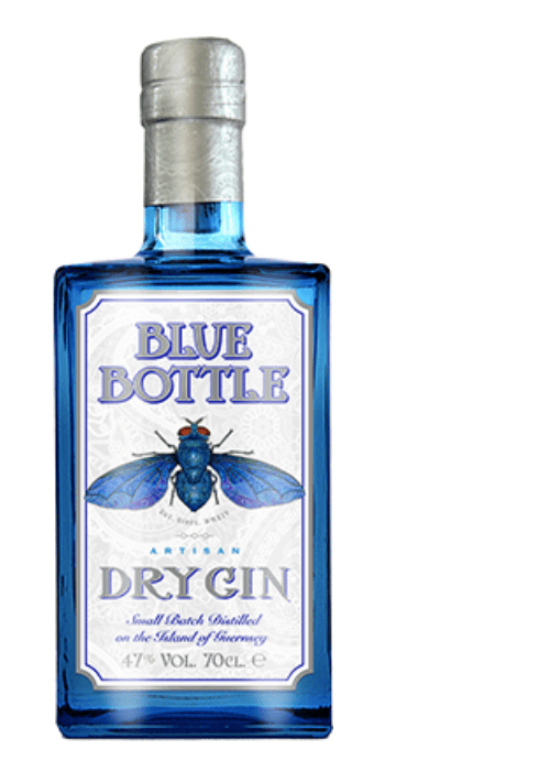
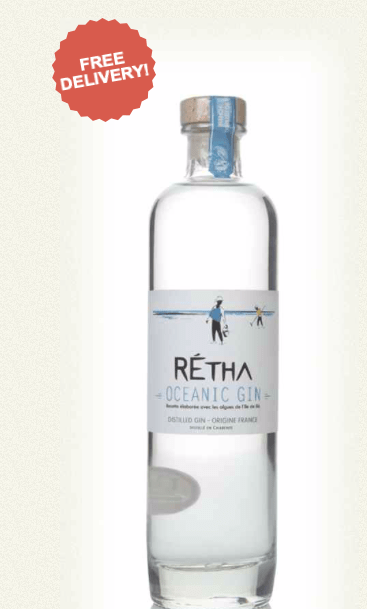
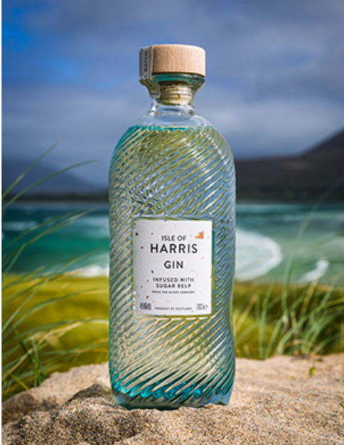
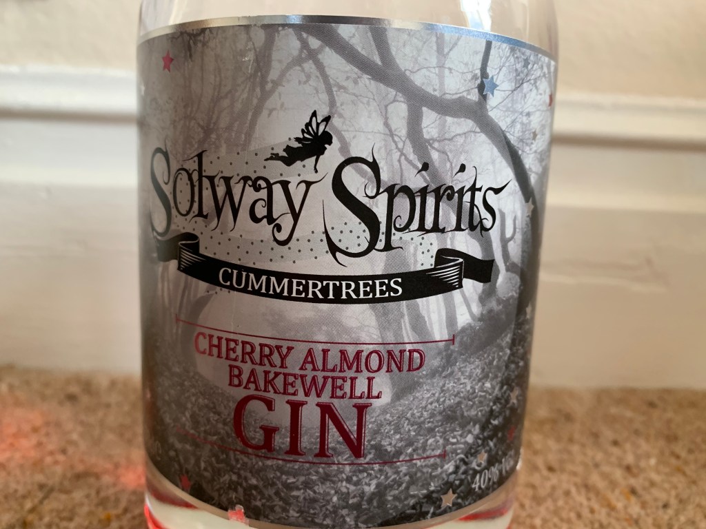
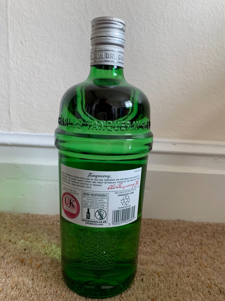
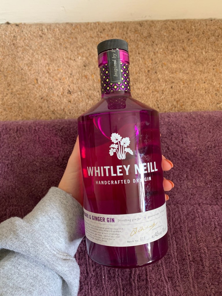
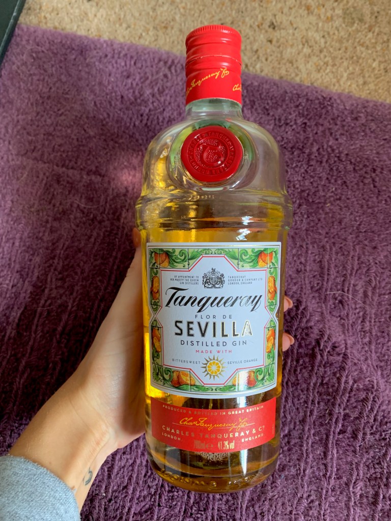
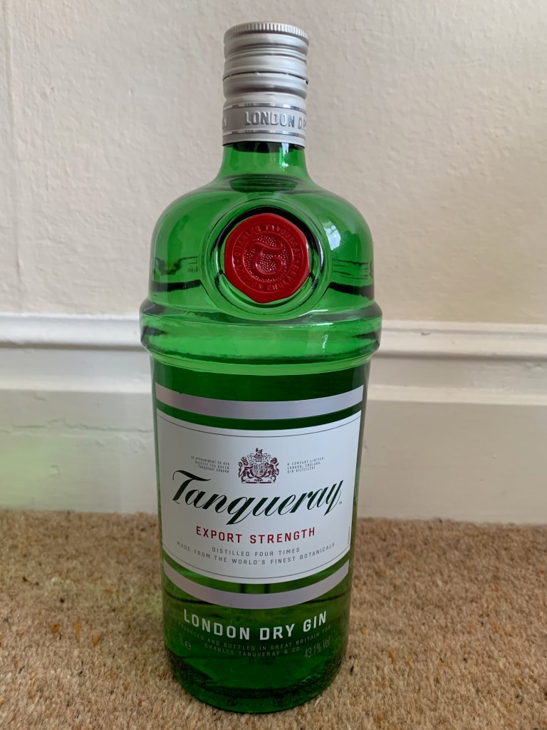

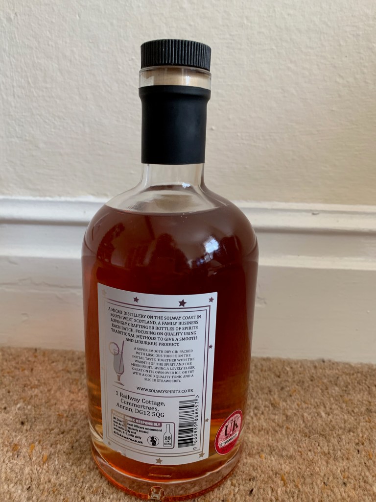
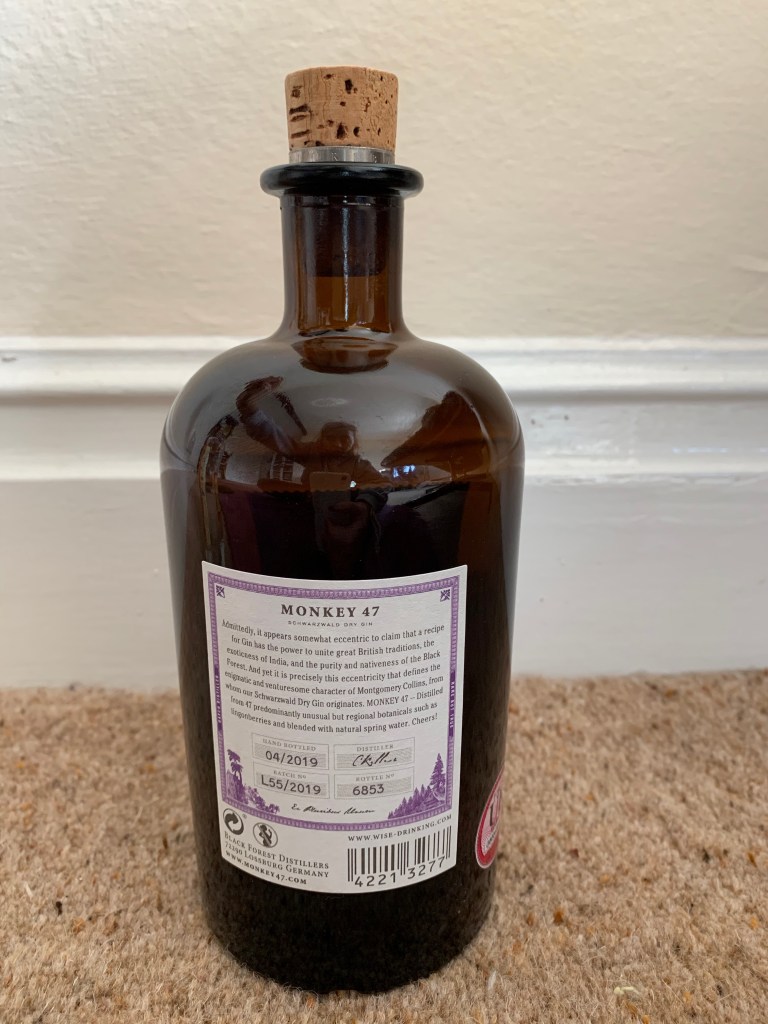
Within the pictures above there was a certain category that I was focusing my designs on which was the beach gins – out of the ones from above I think mine looks like a real gin brand. Most gin brands conclude patterns, interesting type and they all tell a story and are sophisticated which I believe mine is.
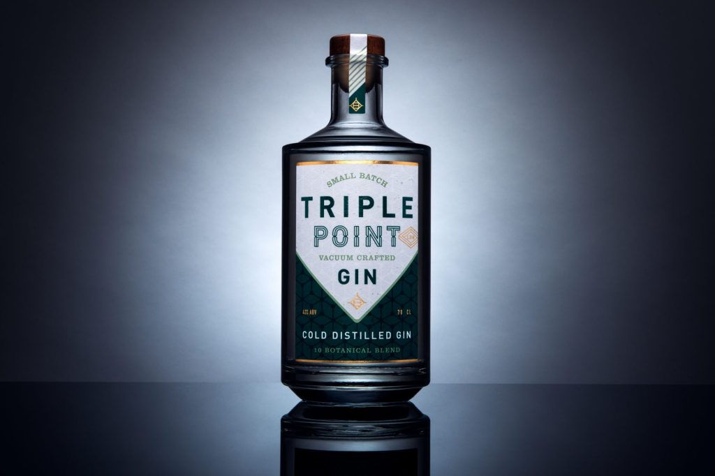
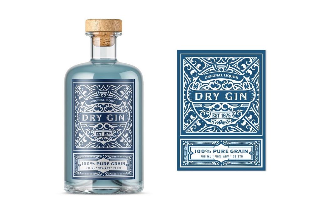
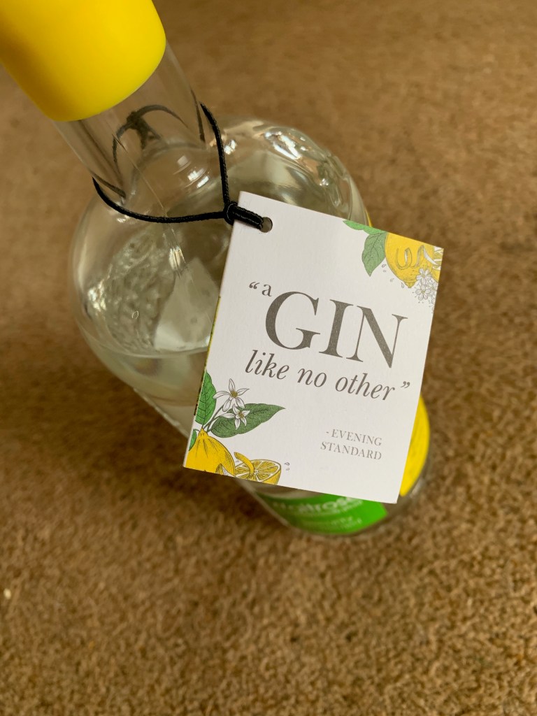
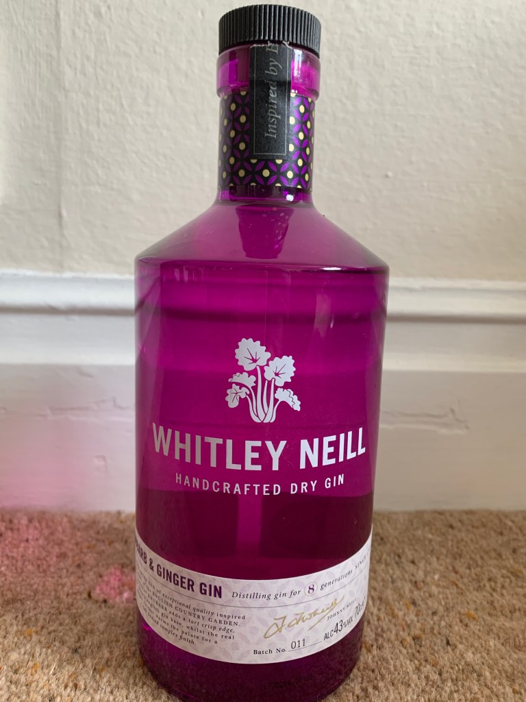
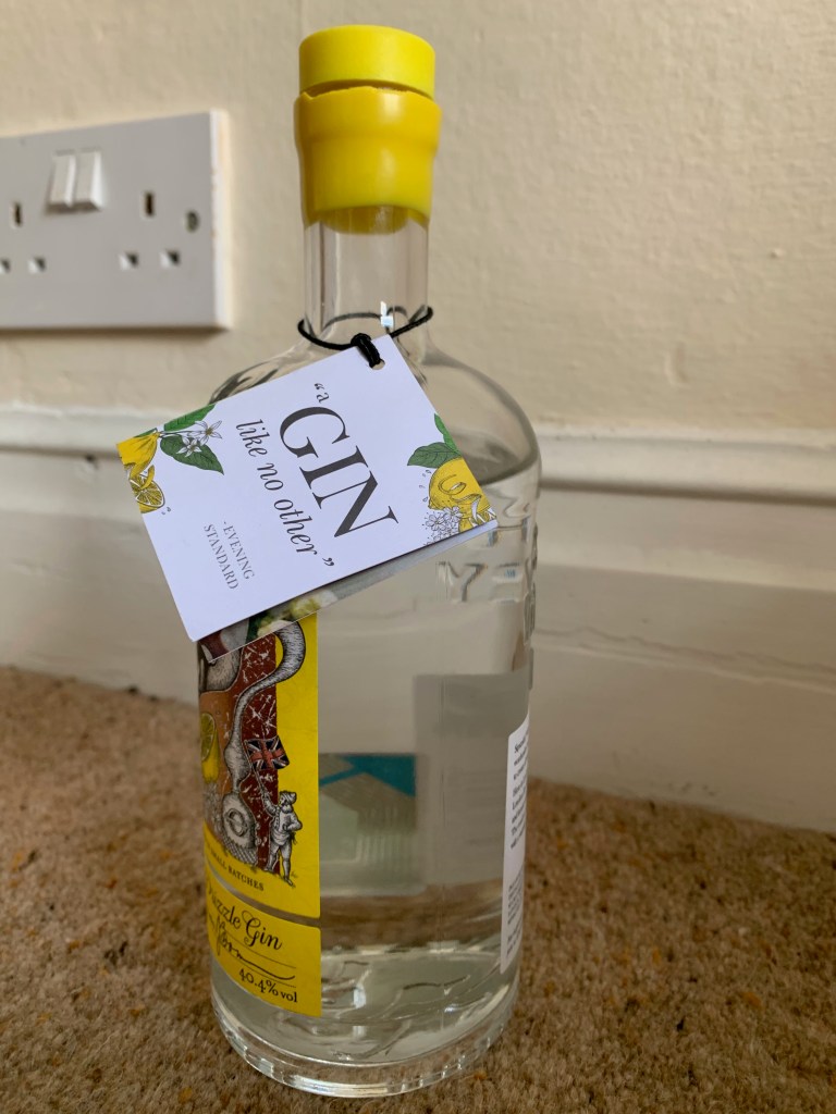
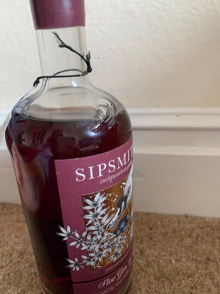
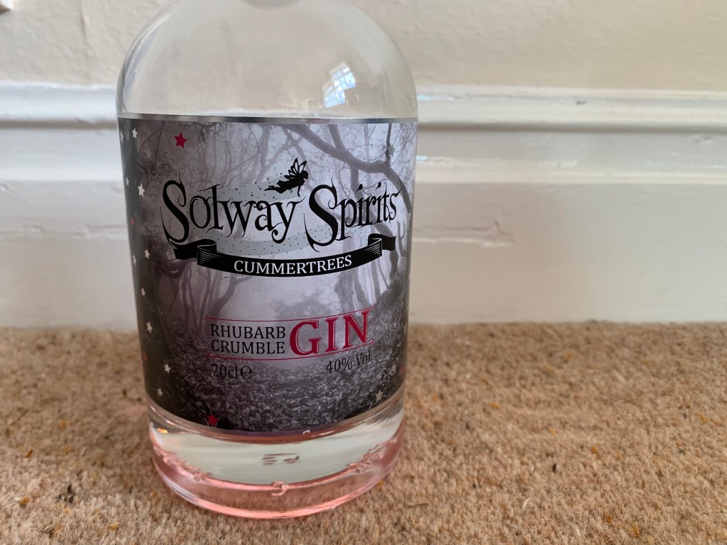
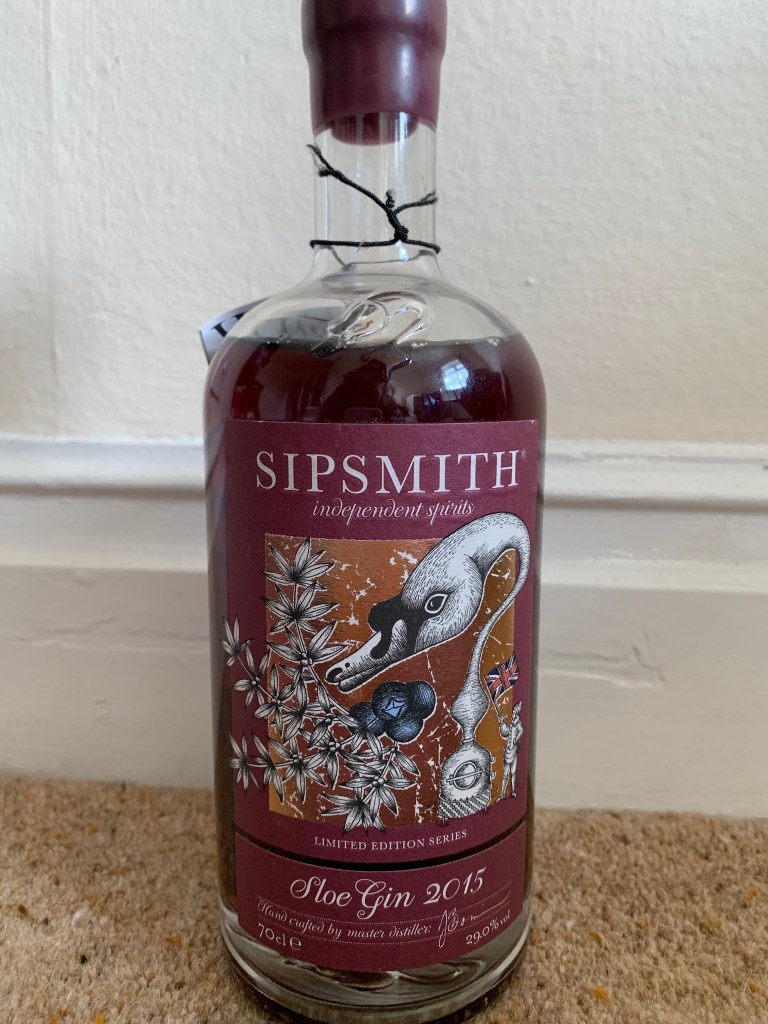
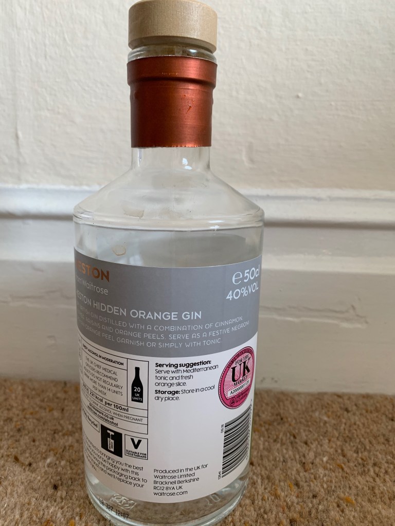
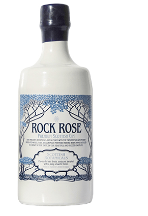
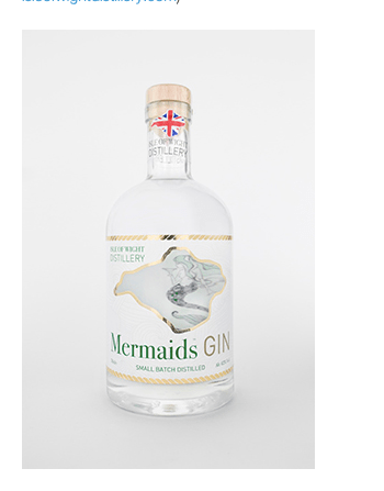
The beach designs:
Below are examples that I already analyse that showcase the sort of beach flavoured related gins that are already out there. if you look with all these designs they showcase a beach vibe with the colours they use, they portray patterns that relate to the flavour and the purpose and each one tells a story with its unique shape of the bottle. The one on the right hand side is similar to mine due o the pattern but the one at the bottom right is the exact sort of layout as mine just a different style. Personally each beach gin, portrays its own story like most gins, but you can tell by looking at all these gins that they are related to the beach within their flavours or brand and this is not only for the logo, its also the shape colours and liquids used.
I think my design would fit into the market, its a design that showcases the beached presents this summer idea. Each gin has its own story and personality and so does mine. I did a survey of how many people thought my gin bottle looked like mine, I asked every single family ember who had not seen my design what they thought of the advert and every single one said is that a real gin? And that to me proves that it could work within the market. I researched so much and made sure it would fit in. I do want to make some parts more classy but over all I think the gin could fit into the gin market.
