I am a lover of poster design and advertising posters and thats why I wanted to showcase my bottle in a poster format, whether this would be on billboard or magazine and would display the gin bottle.
Poster design:
I wanted the poster design to be so bold and similar to the Gordon pink drink poster, I thought that my label design by it self had a lot of design and patterns within it that I did not want to over do it with other imagery.
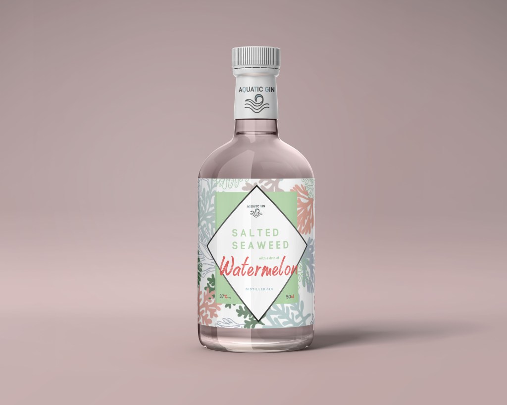
When I designed the mock up for the designs it already had a background that I felt was perfect for the poster billboard design. From the image below of the bottle it has this pink background all around and really makes the design stand out therefore this was the base for my poster design to continue the sophisticated appeal of the gin bottle.
so because I already had the base layout to display my product I just had to add elements to make it more a poster advertising campaign.
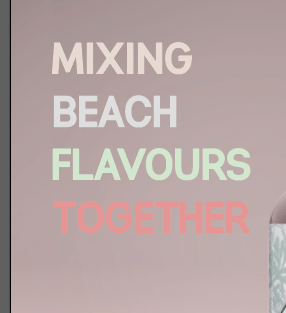
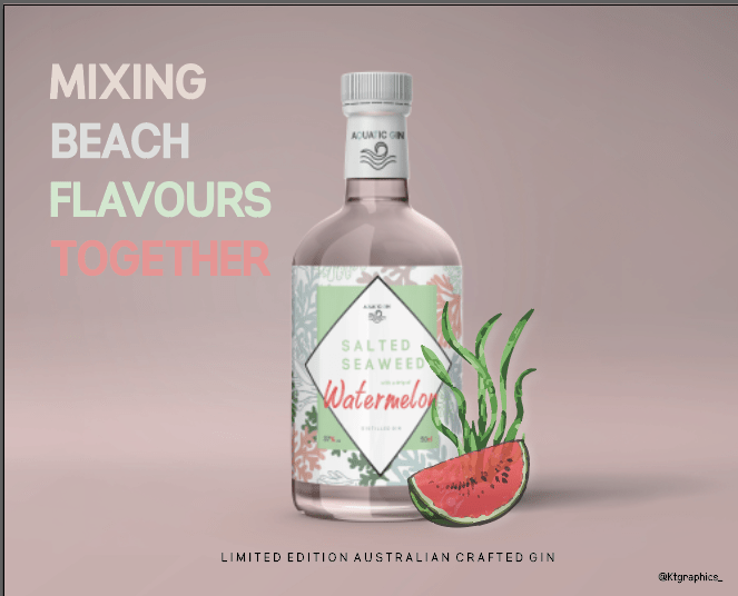
throughout the design for the product I wanted to make sure the same story was going through all the designs, if you look at the back design the description of ‘mixing BEACH FLAVOURS TOGETHER’ Therefore I wanted to use this within the poster design – it described the bottle, the flavours and the product as a hole.
I used the exact same colours as the phrase that was on the label on the back to show consistency throughout the designs. When you look at a poster you read left to right, therefore it was almost the first thing I wanted to see when scanning the poster. As you can see its the exactly the same layout of the type as the label and provides the exact same colours. It was a worry that the type would be lost against the background but it actually works quite well therefore I didn’t change anything.
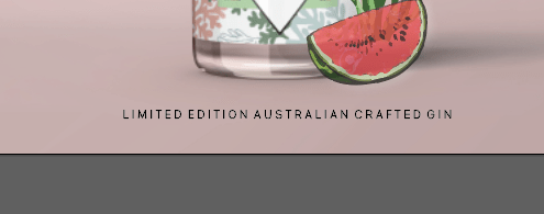
If you remember, when I created my first poster I created a watermelon and a seaweed element for the design, and this was something I wanted to use within this design to showcase the flavours from a far when people view the poster, and adds that interesting feel to the design. I did just copy them from the previous design and added it onto the right hand side of the design, – that way there was writing on the left and imagery in the right making it a spaced out design.
For a while my design was done, then I was analysing my work and realised I didn’t have the where the gin came from, and therefore felt it was needed on the poster as its only displayed on the back label. Therefore in the exact same type that’s displayed on the back label I added this to the design. I made it sit exactly under the gin bottle to tie the design together, and felt like it worked well there.
Now the one thing thats different about my poster is where I have placed the brand logo. The brand is aquatic gin, I chose not to place it on the poster because its visible on the lid very well. You can see it clearly and there it is again on the logo, therefore I just felt like it wasn’t needed. Sometimes less is more.
final poster:
Below is my final poster for my bottle. I think it works so well. It is simple, describing the flavours of the bottles, its simple effective and straight to the point. The colours all link with one another and portray this sophisticating appearance and appealing gin. It is a weird mixture for a drink but I think that the design makes it seem really appealing and creates its own story through the poster and thats all advertising is.
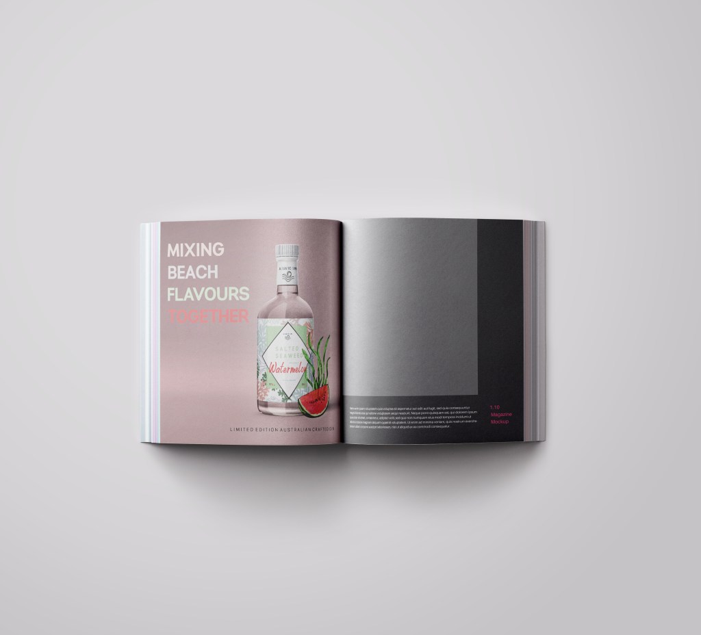
Mocking it up:
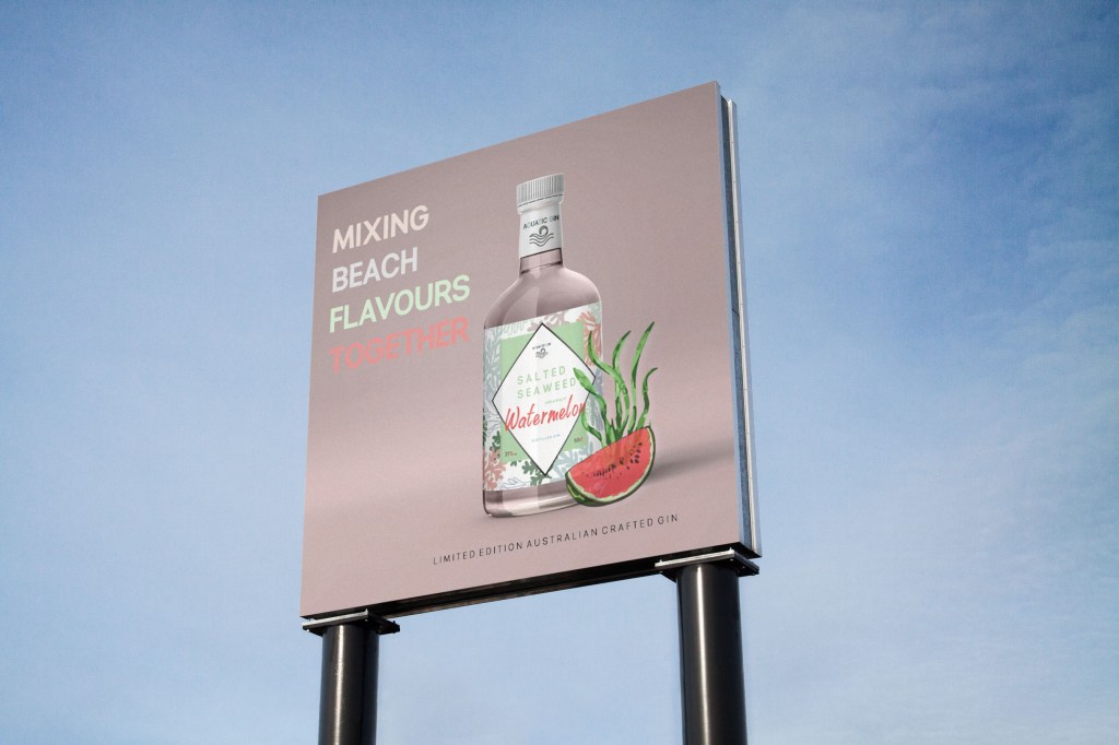
I mocked up this poster in a magazine and a billboard. Reason being, because I want a career within magazine and poster design, therefore wanted to showcase how my other graphic skills can be part of that.
billboard:
Magazine mock up: