I had spent ages trying to find the perfect gin bottle and I could not find it. In my head knew exactly what I wanted, I wanted it to be small rounded slightly, have deep shadows. Thats when I thought about typing in a different mock up, so this time instead of gin bottle do whisky bottle as these actually are similar to the design of a gin bottle and this is when the design finally started coming together.
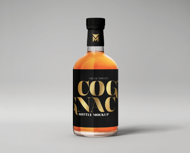
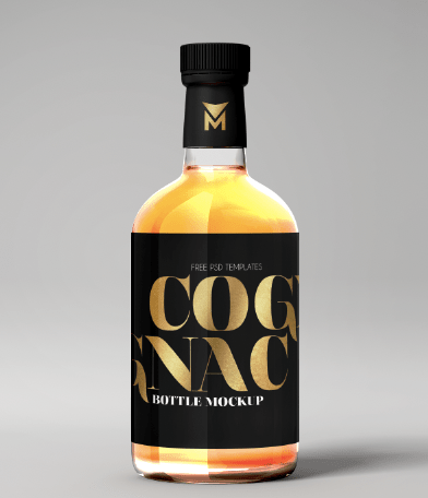
Origanal mock up:
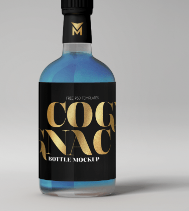
The original mock up is displayed below. As you can see it’s not the normally gin bottle and actually is a whisky bottle but it has all the elements I wanted to use for the gin bottle. What works with this design is the bold logo and the liquid coming through and the small icon on the lid and this almost inspired me for my design.
Editing the mock up:
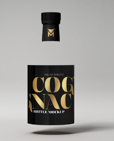
When I removed the orange liquid (because this did not link with my flavour and gin) it left the label and the lid floating and it was impossible to change the liquid or even remove it. I almost gave up with this until I started playing with the hue and saturation on photoshop.
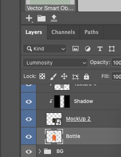
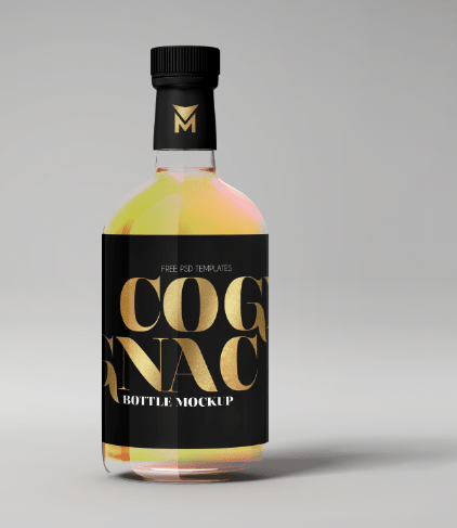
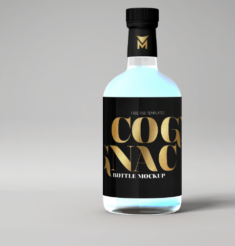
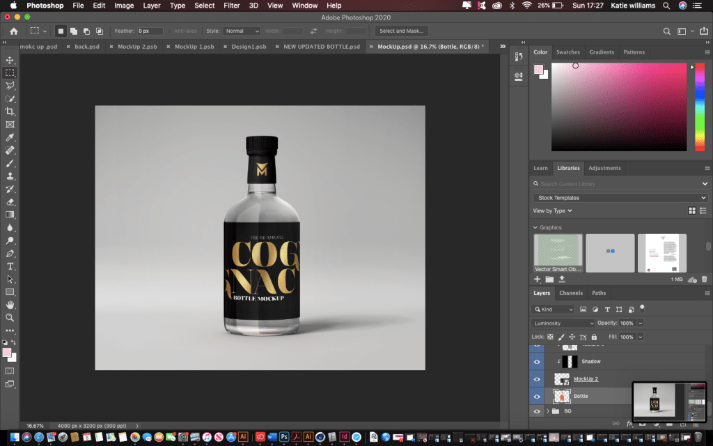
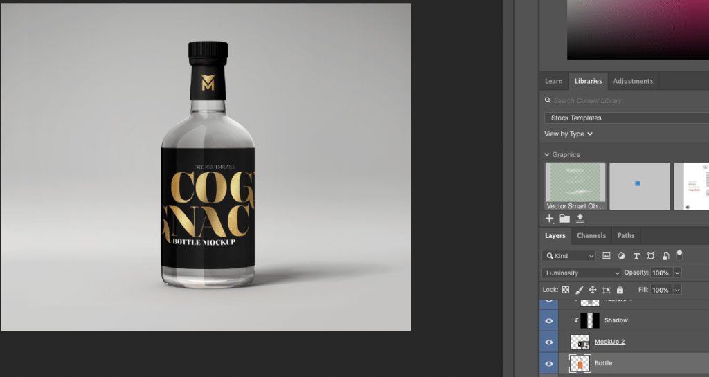
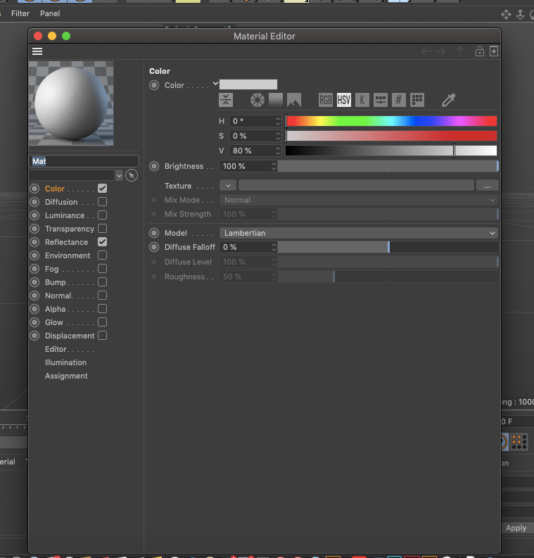
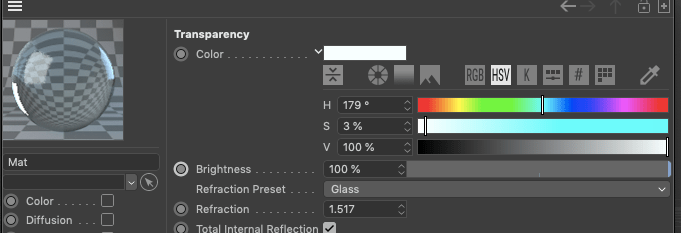
On the right hand side (displayed in the image below) where it says luminosity is where I was able to change the colour sort of until I was happy with the way the bottle looked.
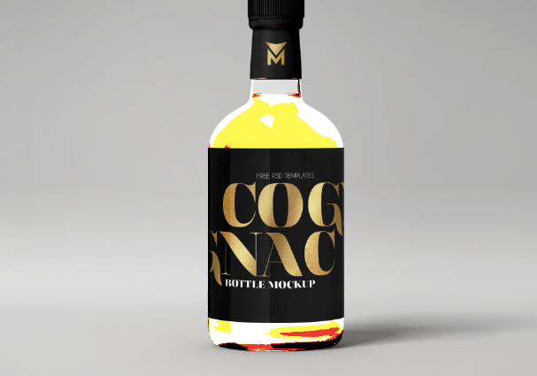
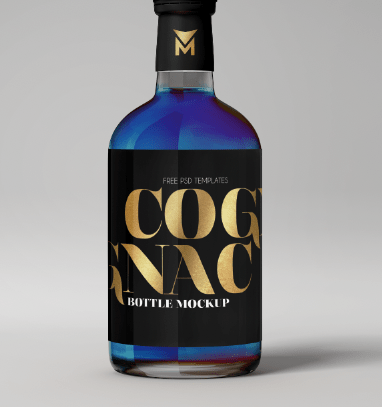
When I changed the option you can see the difference in the colours and the way different effects affected the liquid of the bottle, none of them matched my theme at all until I got to the luminosity option.
luminosity
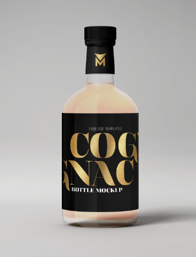
As you can see this makes the bottle clear and reflects through the colour that the background is which in this case is grey, making the liquid appear clear. I chose this because it related to my flavour for a clear gin, and I could then create whatever label and design and not worry about the colour of the liquid.
When creating the first poster, I felt there was an issue with the design and personally was the bottle. I absolutely hated how it looked, you could hardly see the design the way I wanted it to and it did not catch your attention so much. so starting from scratch, I redesigned my bottle.
EXPERIMENT ONE:
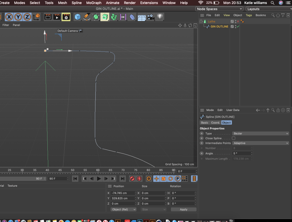
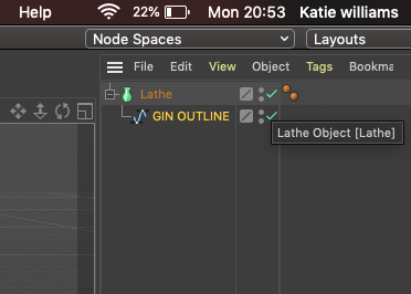
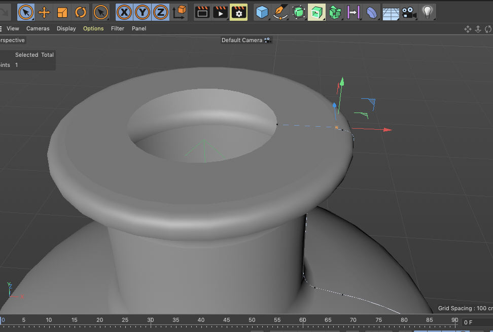
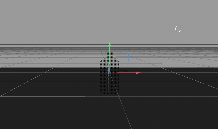
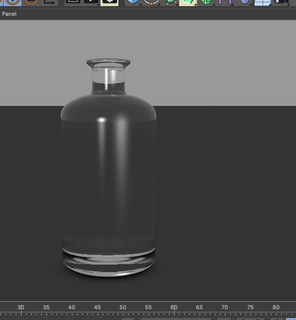
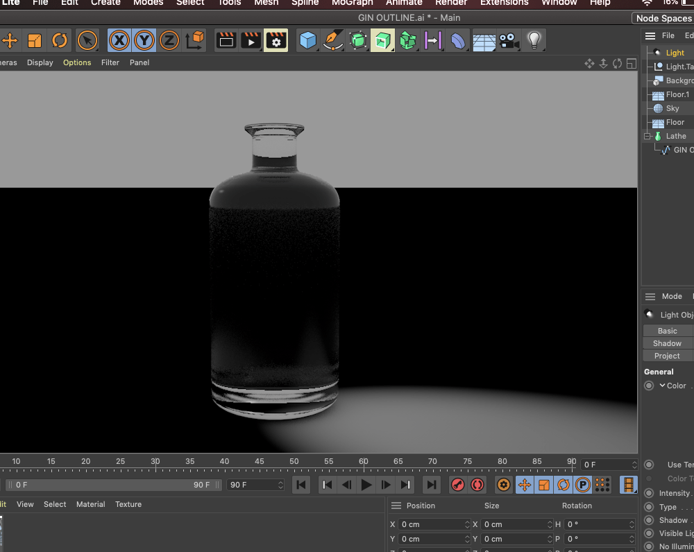
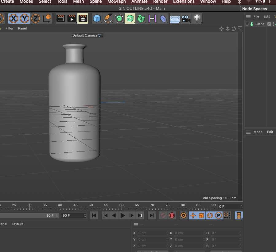
Previous projects, and during this I really wanted to try cinema 4D, Jack was doing it for his project and I kept watching it and thought maybe I could try it but it didn’t really work out for me. But I thought I would show case it to showcase the experiment and takes I took to even reach my final outcome for my designs. I got to the stage of making the bottle, and even though I did not continue it, it almost helped me conclude to the final design as it allowed to visualise digitally a gin bottle and all it’s aspects.
All I did was create a gin outline on one side, and then take that into cinema 4D, the rest I watched tutorials and tried to workout how to conclude to this outcome, this process was so confusing and I could not continuer it any further. I managed to add glass, and then played around with the lighting. After this I got so confused, personally speaking I wanted to make the advertising aspects and the logo the best and not spend ages on this as it isn’t really my interest in comparison to poster and magazine design.
I wanted to create a poster and some advertising platforms for my bottle as that’s something I am very interested in and want to take further as the years go on therefore thought I would incorporate that within this design.
Poster design:
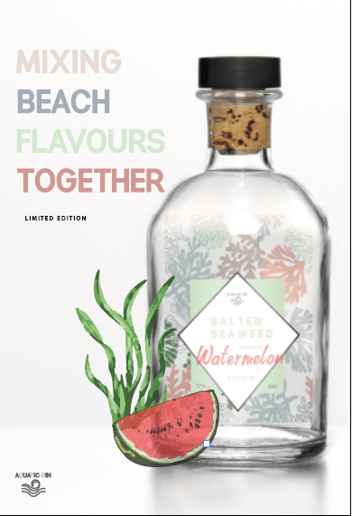
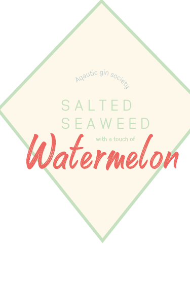
The poster was something that I did first and kept this for such a long time before the development of the bottle. I thought about the story within my gin which was about mixing different beach flavours from different areas together so seaweed being from the UK, and watermelon being from a tropical island to then make this gin. I did not just want to add the bottle, that’s boring. Therefore created the type sitting on the side of ”mixing beach flavours together’ I wanted to make them fit in with the design a bit therefore made each word a colour that was shown in the pattern in the bottle. I could off made the type all the same colour but the purpose is mixing things together also colours to create this unique drink.
I wanted to make a subtitle of limited edition as it was something I would not be making again within a company therefore the uniqueness of the design is displayed more because its limited edition. I decided to use this in the same type face but then make it slightly different by making it smaller and in black so dint contrast against the other type and the bottle image.
When I completed this, at first I thought it looked a bit boring and if it was to be on a poster then people would sort of walk away from it because it looks like so many different gins out there. I felt like adding something that linked to the flavour would make it work,
I actually made lime at first, because when asking my boyfriends mum and she said she would want to drink it with lime, however it made it look like there was lime in the drink, and thats what inspired me to the create the seaweed and lime.
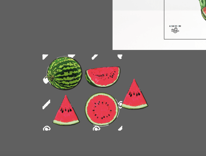
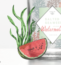
To make the water melon and the sea weed I got a reference image from google, and vector it. For the seaweed however though due to me rushing it I quickly high image trace it to give it all them different elements of green. At first look I added this to the left Hand side of the bottle and ti almost made the design come together.
Issue with the design:
I made this design before any research took place and I think that shows within the design. The design looks very rushed and cramped, and when adding it to some mock ups I felt like it didn’t grab peoples attention enough. There was some elements did work such as the type and the water melon and the seaweed illustration but to me the bottle did not work and the layout, so I basically went back to square one and researched into some more adverts and bottles.
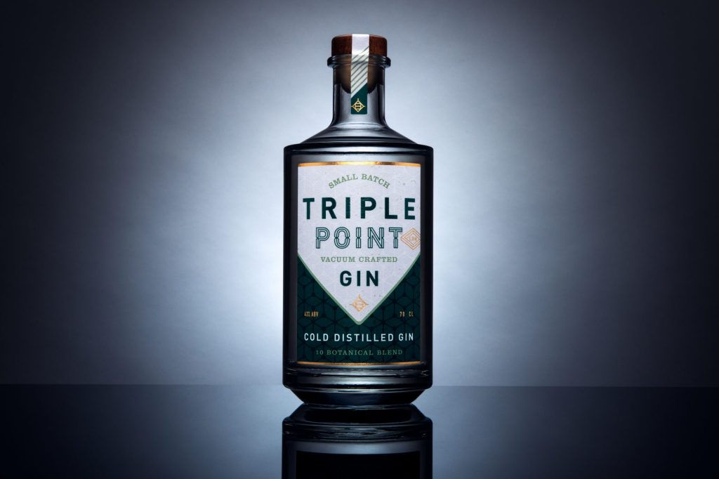
The first attempt for the bottle was absolutely awful now looking at it and just by recreating a bottle made the design change. This was almost a trial and error sort of design as I wanted to see if the label could sort of work and before I go into the first design I want to briefly touch upon the fact that during this process the logo had developed before hand.
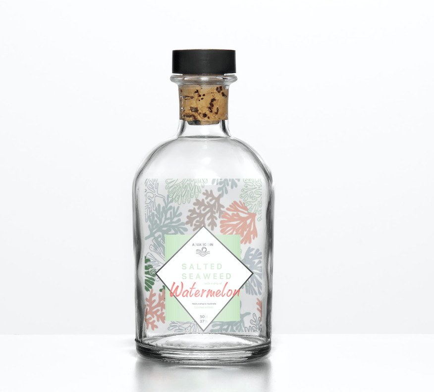
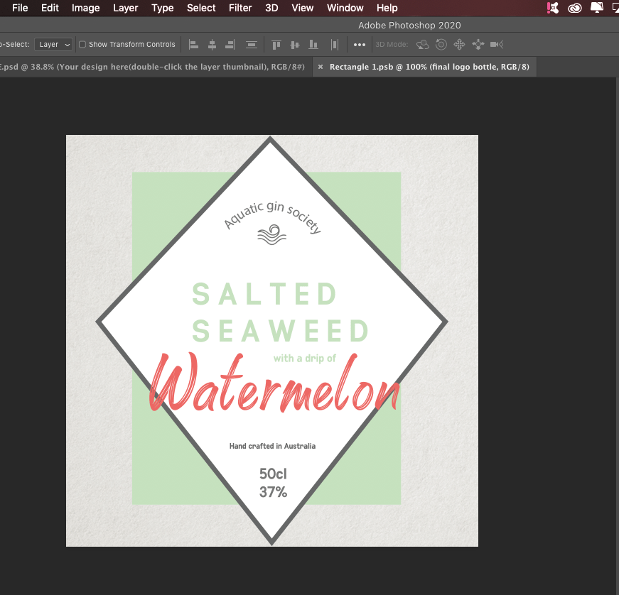
As you can see from the screenshot up close of the first bottle attempt: The logo developed displays a pattern as the background as this was something I felt was needed,. when researching so many different gin bottles I noticed that patterns play a big part in the design as it tells a story and shows a more sophisticated side to the design. I added this pattern which I created and explained in a previous blog and added it underneath the green square, at this point I was unsure whether or not it would be the bottle pattern, reflecting pattern or part of the logo.. within the logo you have the aquatic gin society before it was developed (as for a while I stuck with this) had the flavour, and then where its crafted and the CL an Vl it has in it. I decided to go for Australia as to me charts such a beachy place and would be something they create not really the UK.
The first mock up, looking back at it now is absolutely awful and so glad I developed it. I got the mock up from mockupworld.com and just typed in gin bottle glass, it was actually a nightmare trying to find one and I think I was rushing the idea so I just picked anyone. I then thought ok seaweed is green lets make the liquid green (which made sense and looked great in my head but did not turn out like at all) I then added the logo just placed in the middle.
Reason why I developed this was because of the way it looked, the top looked so realistic in comparison to the liquid and the logo looked so small and flat. I felt like it looked so rushed and not finsihed and overall was not happy with it so I began re designing the bottle ideas.
Development of bottle:
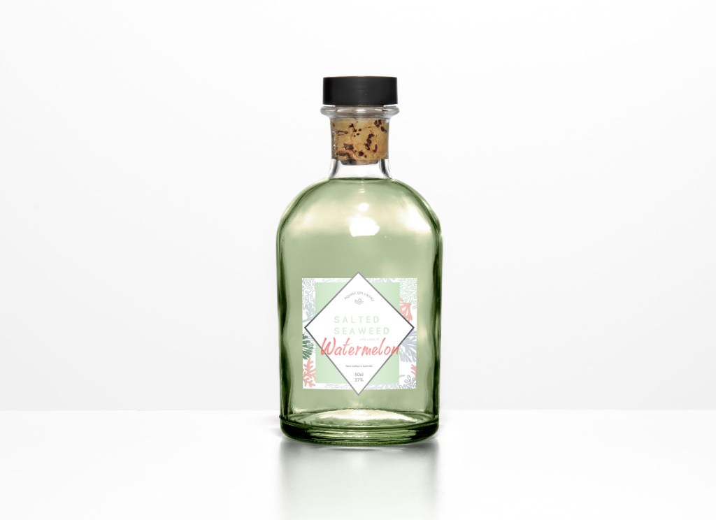
I usually sleep on a idea before developing because my view is always different in the morning, the first attempt was an evening and I woke up wanting to change it straight away. I thought about getting rid of the horrible dirty green liquid for starters and making the liquid clear. Most flavoured gins aren’t coloured so that’s why I changed that. I then was looking at a photo on Pinterest and I have shown it on the blog before, it was a gin bottle where the pattern was inside the bottle, and that’s almost what I attempted here. I added to pattern to fit in the liquid and then add the logo as its own like before.
If you look closely here, you can even see the logo has developed even more. I added the new and improved ‘Aquatic gin’ log I also added the words ‘limited edition’ and ‘hand crafted in Australia’ and changed the colour of certain type to make it fit together more.
For a long time I stuck with this design created different advertising platforms and it wasn’t til a few weeks after I then changed again but for the next few blogs I will show case the developed work I created and stuck with for a while on this bottle design.
I wanted to the logo to have more character to it and fit in with the message I wanted to portray which is a beach vibe. This post showcases the final development to create my logo and finalise all its aspects. Some of these experimentation were done before I changed the brand logo so some of these screenshots have the old brand located on them.
Trying different colours:
Previously I tried different colours but I thought about trying a more tradition colour. I thought it could work but you could not really see the writing very clear even as a close up, therefore from a far you would hardly see it and this did not give the pastel beach feel approach I was going for.
Adding elements:
I then thought about making it a square logo with the diamond within it to make it fit better on a rounded gin bottle design. I thought about changing the diamond colour to the sea salt blue colour. I then thought about linking the green background to the type of salted seaweed.
changing shape:
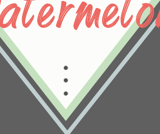
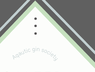
I then thought the green was too boring and again looked to flat, so I decided to change it again. I experimented with two diamonds on top of one another one blue and one green then three little dots either end to showcase the idea of water melon but again there felt like something was missing which at this point I created the pattern
I then came to this conclusion (before changing the aquatic gin logo) I thought about the square at the back but allowing room for other designs, at first I wanted the pattern to sit in the bottle and this would reflect. Now looking back at these designs, it looks awful and I am so glad I did these experiments other wise I would not be concluded to the design I have today. I wanted to ensure the design could work against bottles and thats what I explain in the next blog post. After this I finalised this design and changed the aquatic gin logo and refine it onto a bottle to see if it could work.
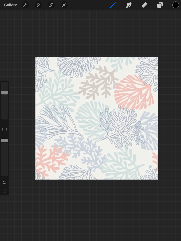
When looking into a variety of gin brands, there is always a pattern that surrounds the design as it creates this sophisticated appearance through the design. I knew I wanted to add some sort of pattern to make the design come alive and tell a story.
On pinterest i typed in seaweed backgrounds to get some inspiration as I really wanted to use pastel colours and add some pinks within the design, and sea weed is obviously a dark green which isn’t what I want the entire design to be.
Below is the process that was taken to create the patter, going from left to right. The first image is the mage from punters and red a bunch of colours that appealed to me, I then created numerous amount of layers and recreated it but changed the colours slightly. I wanted to add green within the design to match the idea of seaweed and then the pattern links with the label instead of it being two single designs.
The process was easy, it was a case of referring back to the original image and then using a brush on procreate on my iPad created my own and added the colours I felt was appropriate to fit the flavour of the gin I created.
After it was created I took into illustrator and started to see how it could work within the logo form and this is when the logo started to change, which is described and shown within the next blogs as the pattern was done and I had it to refer back too.
I thought of all words that related to the ocean and the beach wrote them all down research if they exist and the one that was at the top of the list was AQUATIC GIN. which does not exist.
What is aquatic gin?
Aquatic gin is a beach gin that only produces flavours from the ocean and beaches, to give people that summer feel. Aquatic gin is about using a scent (feature) of a beach for example seaweed and mixing it with your summer fruit. Aquatic gin is all from organic ingredients and all gin is 37% VOL. in glass bottles that are recycle and helping the environment rather than destroying it.
MIXING SUMMER FLAVOURS TOGETHER IS AQUATIC GINS PURPOSE
The logo process:
I did not want to spend ages on my gin brand logo as when researching into gin products I noticed the flavours almost take over the design but every single on is different and has its own story to represent.
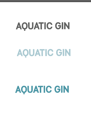
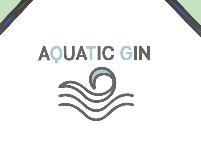
I knew I would make it the same type face as inspired by the flavour of seaweed which was Manti sans in bold. If you look into this design you will see the first idea of the brand logo at the top of the diamond design. AQUATIC GIN SOCIETY . With a wave within the logo. I tried at first to make it have warp but personally speaking it just looked awful and so tacky, I also could not really see it therefore I experimented with it further.
I then just got rid of the word society as it was not needed at all within the design and just looked weird. I then just started experimenting with the different ways of writing AQUATIC GIN. I started of with writing it in different colours, I thought blue would sort the theme more, but when I tried this on the logo and placed it from a far you could not see it within the logo. Thats when my idea clicked – mixing the grey colour with a blue.
I chose to mix the sea salt colour together to fit in with the theme and the other pastel colours within the design. This allowed the word to stand out but also have elements of the pastel blue design.
I then wanted to add a logo to make it all link, when I think of aquatic I think of waves and the ocean so I knew this would be an element within my design somehow. This did not take long at all, I got a reference image of google and decided to draw it and then refine it on illustrator and to fit in with the type I added the blue sea salt colour within the wave and then the grey. Adding that small extra colour made the title and the logo link together.
Every single gin and any alcohol beverage or drink in fact, has a brand and then the flavour comes along side of it. I wanted to make sure my brand was unique, not done before but also related to the story of my gin as otherwise would not make sense for this one time limited edition.
Researching into brands linked to the ocean:
There is so many brands of gin I could be here all day writing about each and every single out there, therefore I picked ones that specialised within the ocean and the beach so I knew this idea of aquatic gin was not already out there.
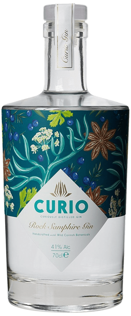
In google I typed in coastal brands of gin and came up with a bunch of lists which I have displayed below with an image of the product. Whether or not they were called by a specific beachy name or they portray a sort of beachy feel or flavours, all are taken from a certain website displaying the image and the description. https://www.coastmagazine.co.uk/content/spirit-sea-top-10-coastal-gins
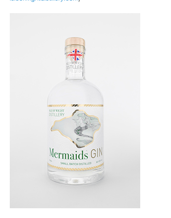
WIGHT MERMAIDS GIN The Isle of Wight Distillery is making history – there are no known records of distilling on the island previously. Rock samphire hand-picked from the island’s chalk cliffs, local Boadicea hops and English coriander seeds help give this gin its smooth peppery flavour. Best for: Bramble fans – the cocktail created by drinks icon Dick Bradsell, who grew up on the island (£36.50/70cl,
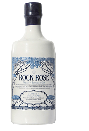
ROCK ROSE PREMIUM SCOTTISH GIN Multi award-winning Rock Rose hails from Scotland’s Dunnet Bay. Seabuckthorn and rose root help to flavour this prized spirit, and each bottle is filled, hand-waxed, batch-numbered and signed at the distillery. Best for: A wonderful G&T. Founders Claire and Martin Murray mix it with Fever Tree tonic, using orange zest and rosemary as garnish (£34/70cl, dunnetbaydistillers.co.uk)
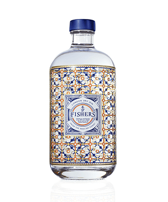
FISHERS GIN Fishers Gin is the brainchild of a master distiller and an Oxford University botanist, with the aim of reviving the wild and forgotten flavours of the English coastline. The starting point is barley from East Anglia, and among those foraged botanicals are wood aven and rock samphire – this is a gin rooted in the sea if you will. Best for: Interesting cocktails – there are lots of recipes inspired by seafaring on its website (£39.95/50cl,
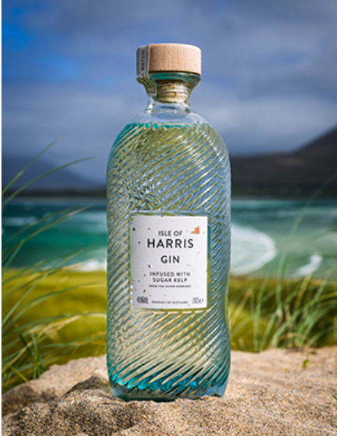
ISLE OF HARRIS GIN What makes Isle of Harris Gin so distinctive is the inclusion of hand-harvested sugar kelp from the sea among its botanicals – for a true taste of the ocean this is the gin for you – and the beautiful bottle is surely destined to become a design classic. Best for: A unique taste –team it with Walter Gregor’s Scottish Tonic Water (long) or with a few drops of Isle of Harris sugar kelp aromatic water (short) (£37/70cl, harrisdistillery.com)
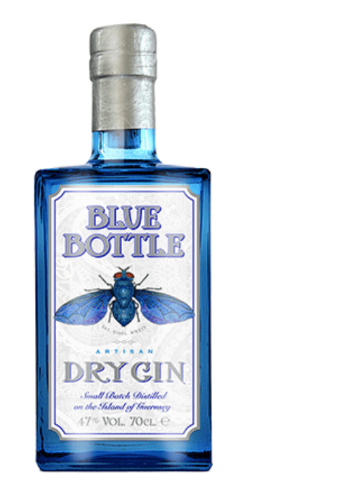
BLUE BOTTLE DRY GIN From the Three Fingers Distillery in Guernsey, Blue Bottle Dry Gin is all about attention to detail. Expect a hand-crafted spirit with local gorse flowers and Indonesian cubeb pepper among its premium botanicals, in a distinctive heavy glass bottle with a detailed drawing of its surprisingly beautiful namesake. Best for: A sophisticated flavour that’s bold and unusual (£41.99/70cl,
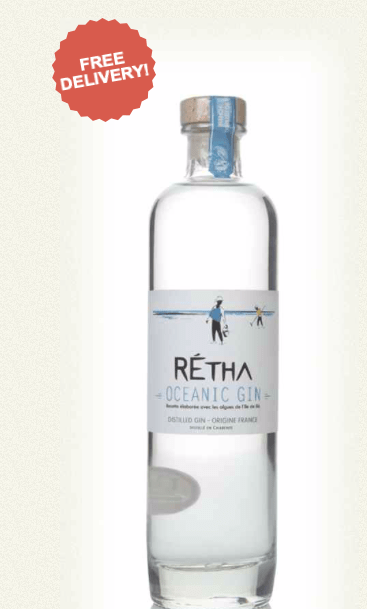
Well, here’s a maritime gin if we ever saw one! Rétha Oceanic Gin takes the star botanicals of fucus algae (also known as seaweed) harvested by hand on the Île de Ré coastline, and combines it with juniper, citrus and pepper. Over on the island, those who live there are known as Rétha, hence the name of the French spirit. An interesting balance of fruity and seaside flavours, one to try in a classic such as a Martini.
I wanted to experiment further with the type and the diamond shape. I wanted to add more character within the diamond as the flat shape made it a tad boring and not stand out as much.
Before I go into explain the brand I made (as this is portrayed within the designs below) I want to focus on the diamond.
I wanted to add more depth to the diamond as it was so flat and boring. I tried alternative colours angles and adding another one to make It more unique. The top one is using the sea salt colour, but personally speaking it represented sea way to much and not seaweed. I then tried having it white with green type and the added blue diamond outline to give it more depth, and out of all them this one worked the best so I took this further. But I also did try the entire diamond the seaweed colour and it did work but because I knew I was going to add a pattern some way or another so I knew to keep it white and simple so not so much is going on and clashing.
The first set of design was inspired this image below. I loved the way the triangle formed and thought it would be more unique and sort of resemble towards the beach more as I had the idea of a boat sign.
First step:
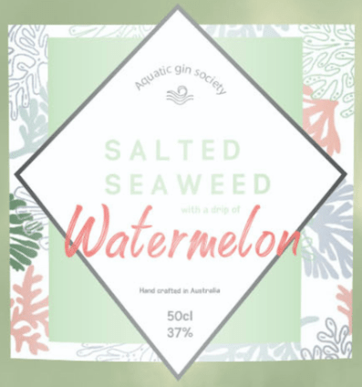
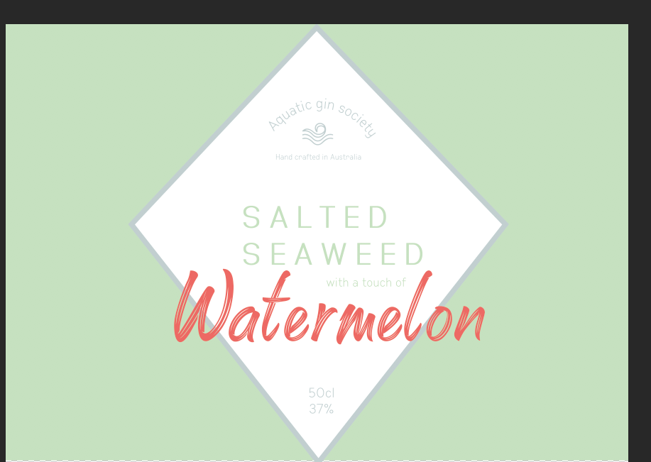
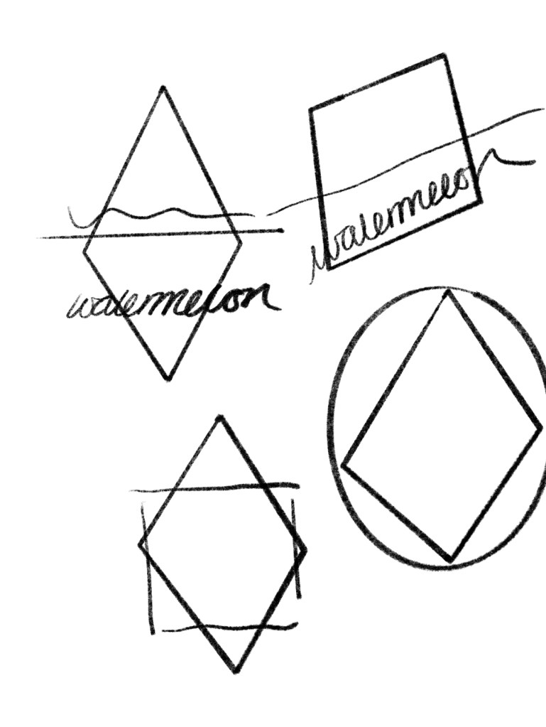
Below is the firsts of the design I did. As you can see it’s awful and really rough sketches, at first I did a lot more in detail sketches as they were developing ideas however now that I reached a design I sort of knew in my head how I wanted it to look. I thought of using a more unique shape than your standard shape for gin bottles. I sketched diamonds a slanted square, mixed them together and a circle. I knew I wanted the watermelon word to almost look like water melon therefore thats why its in italic within these sketches. The scribble at the top of each little design portrays where the sea weed type face would sit.
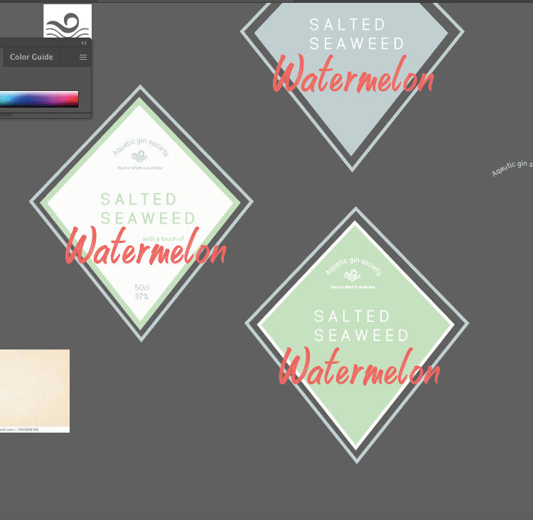
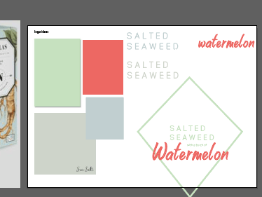
From the sketches, I found the diamond design worked the most for me therefore wanted to continue with this idea. I find it easier to portray the different shades of colours I could use on illustrator as thats how they would be displayed digitally , I thought of the words so seaweed is obviously green, but I wanted it to be a soft pastel sort of feel. I then thought about sea salt which is a colour by it self this blue almost grey appeal and then obviously the water melon colour (the colours I used within the entire design are displayed in the screenshot below)
On the right hand side of this image is displayed of the type that starts to form. I looked into a punch of gin bottles and there was one in particular that used this sort of space out type (shown in picture 2) they used this spaced out type and it really inspired me to create something like that as with every thing else going on within the gin bottle it stood out even when a pastel colour due to the spacing. I tested it in two colours the green and the salted blue and at first thought the blue worked but it didn’t fit the wording as much in comparison to the green as it represented seaweed.
I then played with the word watermelon. Watermelon obviously is red and watery and thats what inspired the type I wanted one that displayed the watering effect but also readable to the audience. I went on dafont.com and found this amazing type face which represented watermelon so well. unfortunately my Mac lost the typeface so I cannot remember what its called, but I did not change this through my entire design.
From all this experimenting I decided to see what it would look like in a diamond shape to see if it could work together. I think it worked wonders. The idea being that the outline of the logo would match the seaweed word to show consistency. I thought how to make the water melon stand out and to me putting it over the diamond made it come a alive a lot more and stand out but also be part of the design.