I wanted to stick with the sort of green colour thats involved within the first left side design as personally speaking I feel as if it related to the main flavour of seaweed.
For the time being these two designs sit on a document as when it comes to putting all the elements together thats when it will be decided on how its displayed on the bottles and as a collective.
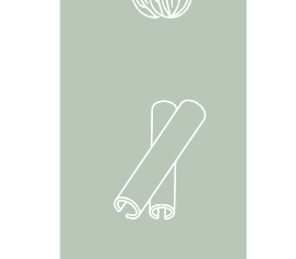
Left side final:
This is the design for the left side of the design
The right is something that was easy to make as It was exactly the same as the left hand side just different ingredients. I did the exact same process but in this case used my iPad a lot more to draw the outlines.
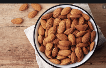
Almonds
The almond is a species of tree native to Iran and surrounding countries but widely cultivated elsewhere. The almond is also the name of the edible and widely cultivated seed of this tree.
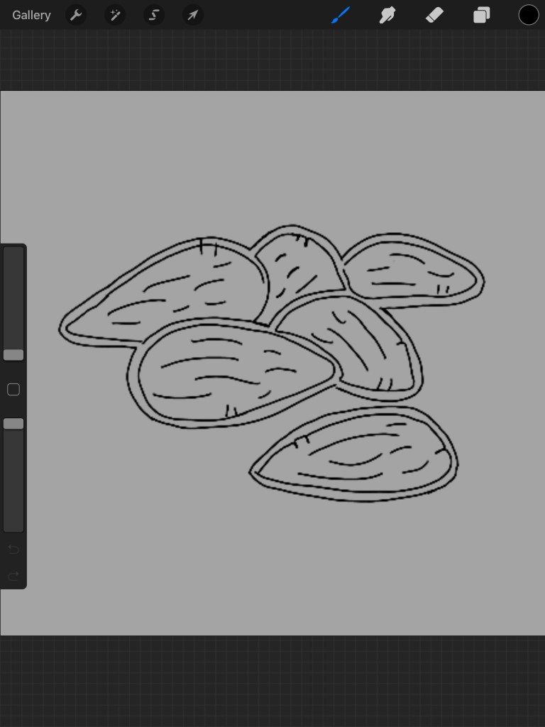
I actually tried to draw these but it would not transfer from my iPad to my Mac book but I thought it would be an easy sketch. As you can see from the image below it displays the almonds I created but they did not turn out the way I wanted them and personally speaking thinking they had way to many displayed where as I only wanted a few therefore I looked for a different image.
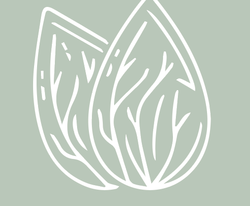
Using a reference image, and quickly sketching them and then taking them into illustrator to tidy it up I created a more structured format of almonds that were effective but simple to view. As you can see I only displayed two, in the white line work again and for the time being sitting on this green background again.
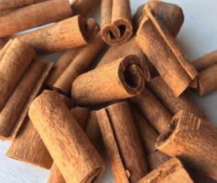
Cassia Bark
Cinnamomum cassia, called Chinese cassia or Chinese cinnamon, is an evergreen tree originating in southern China, and widely cultivated there and elsewhere in southern and eastern Asia. It is one of several species of Cinnamomum used primarily for their aromatic bark, which is used as a spice.
Outline design;
This one is quite a boring ingredient therefore so is the sketch. I thought it would be a simple sketch to display two together and it was a simple sketch and then taken into illustrator from a reference image to make it perfect. I actually doubled up on this design as the lines turned out way to thin, I was considering adding more but I think I will play around with the layout of the order of the ingredients once its all cerated as thinks they need re arranging. Out of all the ingredients this is my least favourite as its quite boring but it portrays the correct ingredient.
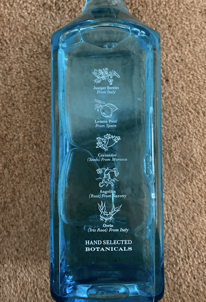
Orris Root
The root is used to make medicine. Orris root is generally used in combination with other herbs and can be found in homeopathic dilutions and tea preparations. Orris rootis used for “blood-purifying,” “gland-stimulating,” increasing kidney activity, stimulating appetite and digestion, and increasing bile flow.
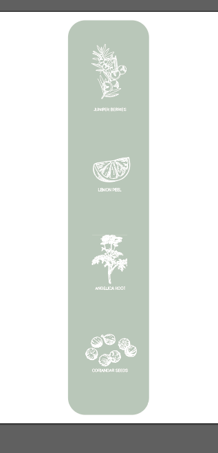
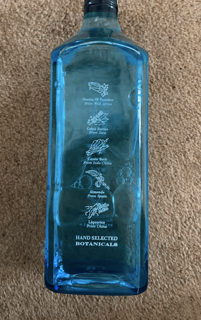
The first thing I did was actually the sides of the bottle as this then sort of tied in with the rest of the design. I am using natural botanics within my distilled gin and like a certain inspiration shown in the previous blog, I want to showcase these on the sides of the bottles. To make sure each botanic was right, and showcasing the right ingredients and the small icon that would display it.
I drew all the ingredients first before design it onto the bottle to make sure I had them all secure.
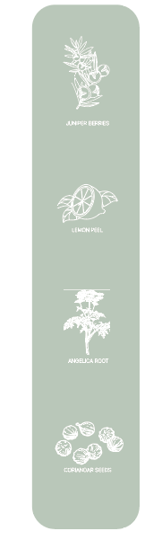
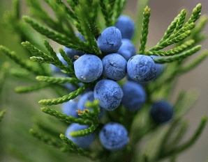
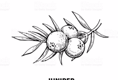
JUNIPER BERRIES:
A juniper berry is the female seed cone produced by the various species of junipers. It is not a true berry but a cone with unusually fleshy and merged scales, which gives it a berry-like appearance.
OUTLINE SKETCH
to create the outline sketch I googled an outline image which is displayed below however I did not like how the lines linked with one another as to me it felt a bit too bulky. Therefore I transferred this outline onto my iPad and began sketching it myself.
outline:
my sketch:: I made the sketch white and sit on a colour background just so I could see what it would look like against a colour background as this is how I would create the sides of the gin bottle.
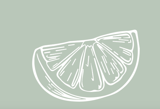
The next ingredient I designed was lemon peel to be added to the gin. I googled into it and got a reference image and with this design I felt as it would be okay to image trace it. The image in large scale I took into illustrator and I decided just to image trace it to see if the lines would be ok to use.
I decided to image trace it then make it white to make sure it would work in this type of style; I felt as if the design was simple and effective and linked to the image before in the case of the thickness of the lines.
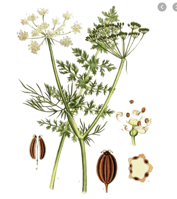
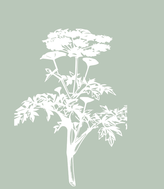
Angelica root
Angelica archangelica, commonly known as garden angelica, wild celery, and Norwegian angelica, is a biennial plant from the family Apiaceae, a subspecies of which is cultivated for its sweetly scented edible stems and roots.
I tried to draw this on my iPad but personally it just didn’t look right and almost looked a tad rushed. I image traced it and turned it into a white outline to see if it would would and personally speaking it did the job. Unlike the other designs it is filled in but that is what the product is like to it matches the realistic image. Again, I placed it on this green like background and it worked well as small and format a far. Its a little more blocky and more triangular than the other designs but it does not stick out it fits nicely within the design process.
I decided to show case 4 different ingredients thats involved within the design on the left and the right making a total of 8 ingredients all together.
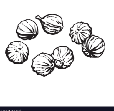
Coriander seeds:
Coriander is an annual herb in the family Apiaceae. It is also known as Chinese parsley, and in the United States the stems and leaves are usually called cilantro. All parts of the plant are edible, but the fresh leaves and the dried seeds are the parts most traditionally used in cooking.
I typed in coriander outline and within that displayed this image which is shown below. The image works so well as an image trace therefore thats what I did. Once image traced I again made it a white outline and this automatically made the lines appear thinner.
I decided to make it the exact same as the other designs as I wanted to make sure it would work through the same design process. I made the lines white and this stood out the most. What makes these seeds stand out is that they are all spaced out so you are able to see it.
Combining the ingredients together:
I then had to combined all the designs with one another to ensure they all worked when combined.
I went for this sort of green colour as personally speaking I think it matches with the logo with the idea of seaweed and this would be on both sides of the design. I made sure each ingredient had the same distance between one another, and by doing that I made a box and carried this through the design to ensure the correct space was shown.
Quick design:
This is a quick design show casing how this would look as a design aspect. I wanted to ensure it displayed the right information and was clear to the audience but also match the front and the back of the design, with that seaweed colour displayed. I will change this design once I have completed the right hand side therefore make it perfect.
To make a gin product you need to know the exact elements that make a gin in the first place therefore thus can be shown within the design and accurately portray a design.
London Dry Gin – grain alcohol is re-distilled with only natural botanicals and only a minute amount of sweetener can be used after re-distillation. London Dry doesn’t have to be from London.
KEY NOTE FROM FINDING
The actual gin is a lot more malty. Flavors added can be cloves, caraway, ginger, nutmeg. So you’ve got vaguely different style of taste, and you certainly have way more earth notes within it.” You won’t often taste citrus like with London Dry, some distillers don’t even add it at all.
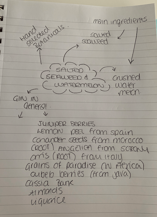
at first my design was going to be a dry gin as it was something that most gins are however I am adding ingredients that are unusual and the add of watermelon acts a citrus flavour. Therefore it could to be a dry gin. therefore I had to look into the other forms of gins. When looking at the gin styles, the one that stood more towards the idea of flavours I had wads DISTILLED GIN.
Distilled Gin – neutral spirit and natural botanicals are re-distilled, but additional natural or artificial flavourings and colourings can be added after distillation.
Neutral spirits, also known as neutral alcohol, rectified spirits, rectified alcohol or ethyl alcohol is highly concentrated ethanol distilled until it reaches a min. ABV of 95% (190 proof). Neutral spirits can be made from grains, grapes, molasses, potatoes, and other agricultural origins. As the name suggests, neutral spirits are considered neutral in flavour, odour and are colourless. Having said that, there are some slight “flavour” variations among the neutral spirits, leading some to question if neutral spirits are truly flavourless.
NATURAL BOTANICALS
Coriander. …
Angelica. …
Lemon. …
Orange. …
Orris Root. …
Cardamom. …
Licorice.
SO researching the natural spirit and the natural botanicals that feature within gin I started making mind maps to think of what ingredients would feature well within my gin and how many I should use. There is brand name Bombay Sapphire which inspired my for a lot of the added ingredients within gin. On the left side and the right side they display the added ingredients to this gin, which are displayed in the images below. This is for dry gin as there is no added citrus fruit in the gin specifically.
Mind map of ingredients:
Most Gins contain next to Juniper berry and citrus botanicals such as lemon and bitter orange peel, anise, angelica root and seed, orris root, liquorice root, cinnamon, cubeb, savoury, lime peel, grapefruit peel, dragon eye, saffron, baobab, frankincense, coriander, nutmeg and cassia bark.
I thought I would look into existing brands that are already out there, I did look into the gin cupboard which had popular brands in there however I analysed the design more. I thought I would look into the most popular gin brands, identify what makes them different and stand out and analyse them as an overall, and what makes them special in the n
MOST POPULAR GIN BRANDS ANALYSED: (UK)
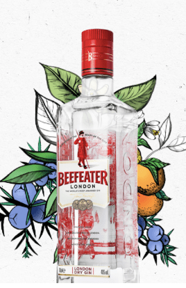
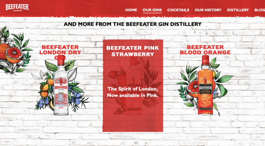
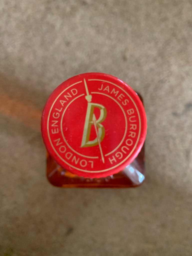
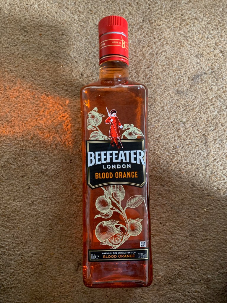
Beefeater
Beefeater is a classic London dry gin, with a juniper- and citrus-forward recipe that dates back to the 1860s when James Burrough began to distill gin in London.
I decided to look on their website and get a full understanding of the product. There are 6 main gins within the product and I decided to analyse each one.
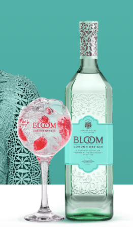
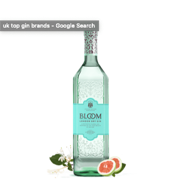
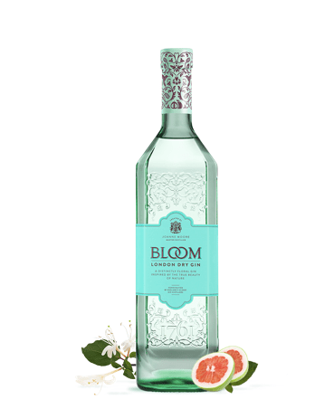
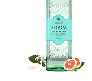
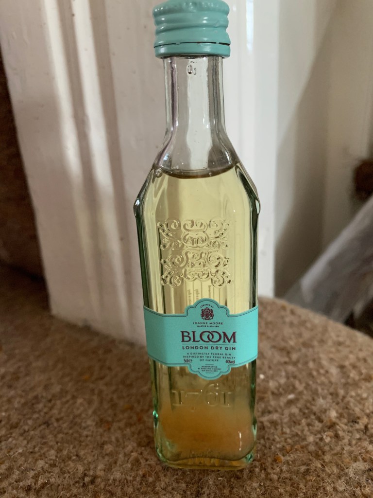
Bloom gin
Bloom is a premium London Dry Gin from Greenall’s distillery portfolio. Infused with botanicals such as chamomile, honeysuckle and pomelo, the gin captures the uplifting sense of spring gardens. … The gin is triple distilled and uses demineralised fresh spring water to reduce the spirit to a final bottling of 40% ABV.
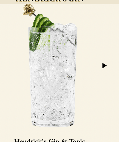
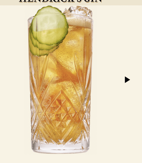
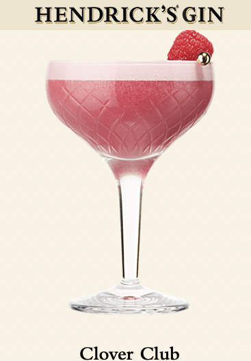
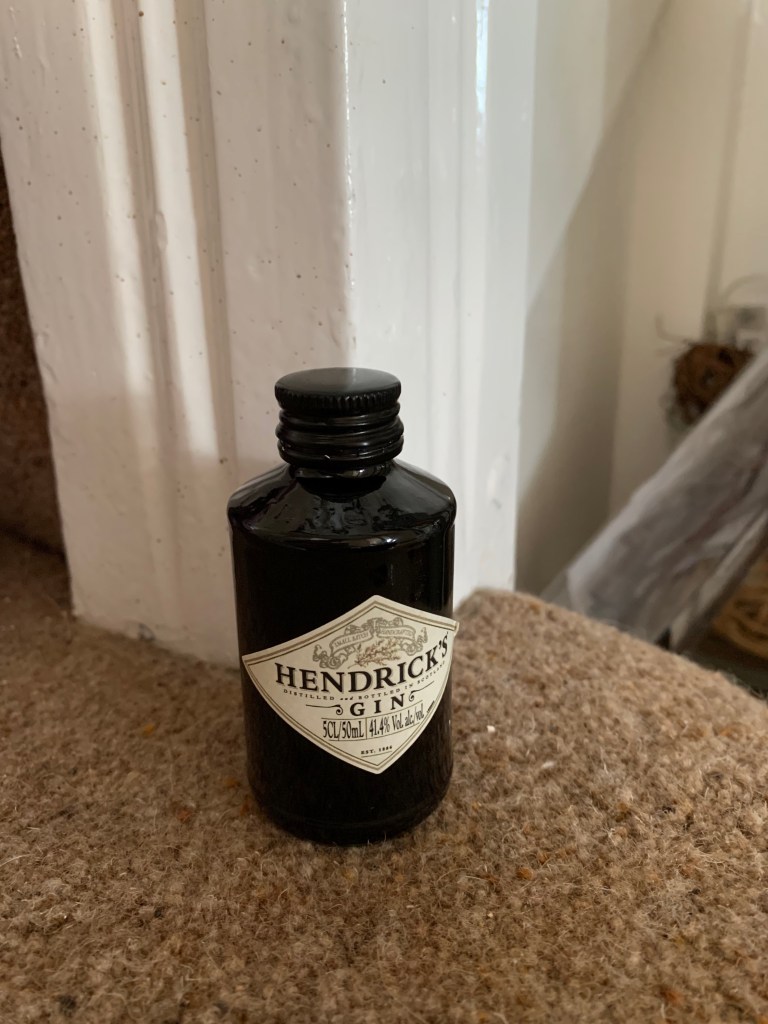
Hendricks gin
Hendrick’s Gin is a brand of gin produced by William Grant & Sons at the Girvan distillery, Scotland, and launched in 1999. It was invented by Lesley Gracey, a Yorkshire native, who was hired by William Grant & Sons to work in new liquid development for some of their products.
Even though every gin is a different shape and portrays a different story through its designs. I wanted to showcase what different shape bottle are already out there and if there is a meaning to them. I also looked into different materials that gins are made from as personally speaking I would want to create a product that is benefitting the environment and helping decrease the issues that we are surrounded by today so also in this blog post I looked into sustainable glass and other products my design would use.
Majority of the gin bottles are made out of glass, I decided to look into certain manufactures to understand gin making a lot more. When typing into google the different types bottles and the manufacturing process, I could not actually find a lot, however the main thing that kept coming up was premium glass so I decided to look into this more.
Every gin I already looked into were a different bottle shape there was not one that was a certain shape it just depended on the flavours that were used in the gin that would determine on the shape and the design. One thing I noticed particular was that there seems to be a sophisticated appearance within gin designs and gin bottles and thats the only consistency that follows through gin bottle design making.
I typed into google – gin bottles and looked on this website https://www.fromtheginshelf.com/the-most-beautiful-gin-bottles/ and this allowed me to understand different gin bottles as there was so many on here. I have technically already analyse gin bottle designs but this was focusing on the gladdest and the lid not the label and flavour design, and the marketing design.
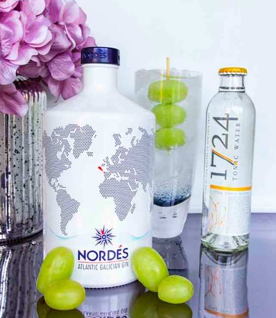
NORDÉS GIN
The bottle design is inspired by traditional ceramics of Sargadelos from the gin’s home in Galicia. Synonymous with utilising singular designs and white and blue colours, Nordés mirror these designs expertly to create a bottle instantly recognisable as their own.
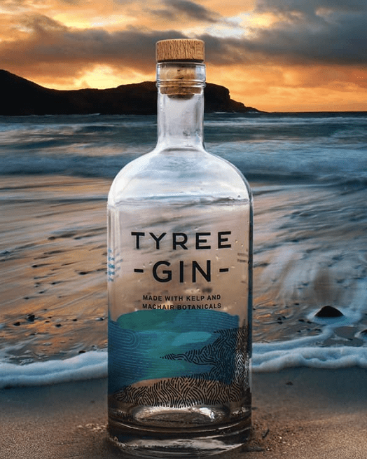
TYREE GIN
The first of many island gins on the list is Tyree Gin. Created by Glasgow-based consultancy O Street, it focuses on a clean design using two of Tyree Gin’s main botanicals – kelp and machair – marrying the land and sea with simplistic turquoise and charcoal hand-drawn type marque. A really stunning design in its simplicity.
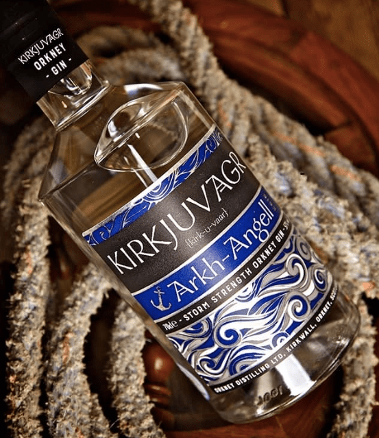
KIRKJUVAGR STORM NAVY STRENGTH GIN
Ever since I was a small boy, I’ve always been fascinated by the Vikings. Perhaps that’s why I’m so drawn to the packaging of Kirkjuvagr, particularly their navy strength gin – “Storm”.
TARQUIN’S CORNISH GIN
ENGLAND
Tarquin’s Gin has always had a really pretty bottle. With its signature wax finish, it’s one that stood out. In August 2018, to mark the 5th anniversary, the bottle went to a whole new level.
The sea glass design – “a tactile and emotive nod to the Cornish provenance” – really is beautiful and further adds to what is, a truly great gin.
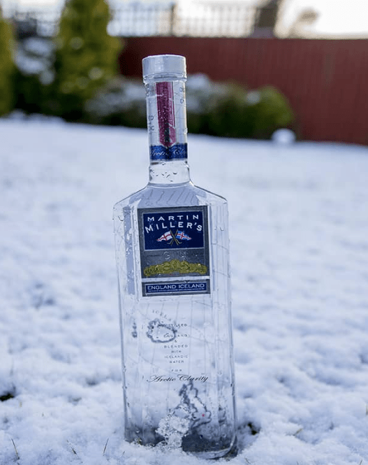
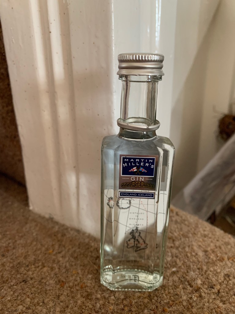
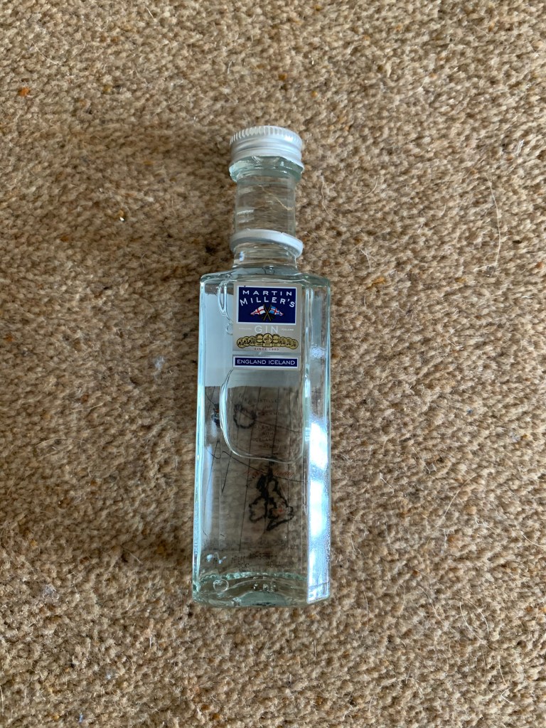
MARTIN MILLER’S GIN
ENGLAND
Martin Miller’s Gin was one of the frontrunners of the gin revival. Launched in 1999, it remains an excellent gin to this day.
The bottle itself is cleverly styled. With transparent glass the designs on the front and back of the bottle work in tandem, showing the location of its distillation (England) and the journey it makes to add the pure waters of Iceland that are synonymous with the brand.
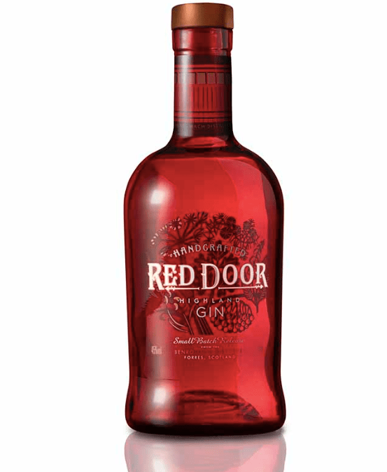
RED DOOR GIN
SCOTLAND
After 120 years of distilling whisky, Benromach Distillery in Speyside turned their hand to gin in July 2018. Taking its name and bottle design from the distinctive doors on the distillery, it makes for a striking red bottle.
Around its neck you’ll find the doors themselves and if you look closely, their resident distillery cat!
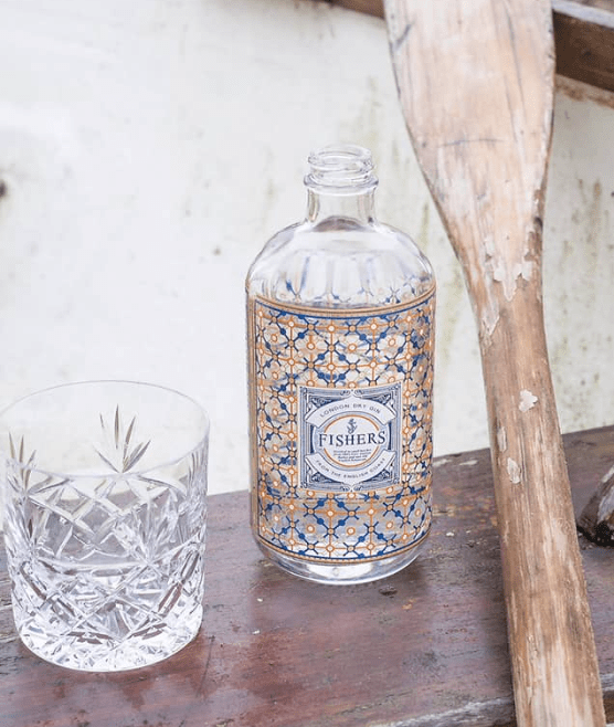
FISHER’S GIN
ENGLAND
The Fishers Gin bottle was designed by Parisian, Gilbert Lopez. Following a three-day visit to their Aldeburgh home in Suffolk, he took inspiration from the coastal town for his creation – most notably the fishermen’s lanterns and the vibrant colours of their nets. It makes for an extremely pretty bottle, tying in perfectly with the brand.
Conclusions gathered from these photographs:
From these photographs above the focus lies with the bottle design and the background they are displayed on. Each bottle is completely different from one another, and each one have a completely different story to one another. The background relates to the gin and the name of the brand and that creates the story. The size and shape of the gin doesn’t matter, whatever fits with your message allows the design of the bottle.
My boyfriends mother is very aware and educated on gin, more than most people. In order to create the best gin possible I wanted to ask her everything and get an understanding of what to involve within my design and also how to adverts it to someone who loves gin.
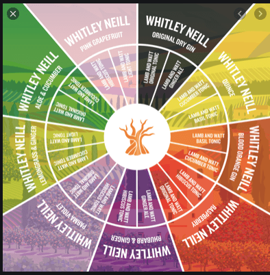
She made me aware of the gin wheel which indicates what you have with certain gins. I asked her a questionnaire which I then thought could help me within the advertising platforms and also the design process for the gin. I already knew what flavours I would be creating – but I wanted to know her opinion on whether it should be a dry or distilled gin and different avenues my design could take.
The gin wheel:
The gin wheel was so helpful through my design process and without speaking to my boyfriends mother showed me this wheel and this helped me so much as I was able to understand what sort of gin I should design and the ways in which I could mix it with certain elements. I did not even know this existed I always just thought gin was gin but after exploring this wheel and understanding it more in depth it allowed me to understand gin and other elements to help me with my brand and design process.
Questions I asked SUE:
What would you usually put in your gin?
I usually have my gin with light tonic water just so it does not take away form the flavour, but I do like to mix and match so I use different flavour tonic waters depending on the gin I am drinking.
How often do you drink gin?
I have a gin cupboard to that answers it for itself. I love to drink gin most evenings, but the special ones the more expensive ones I save for occasions.
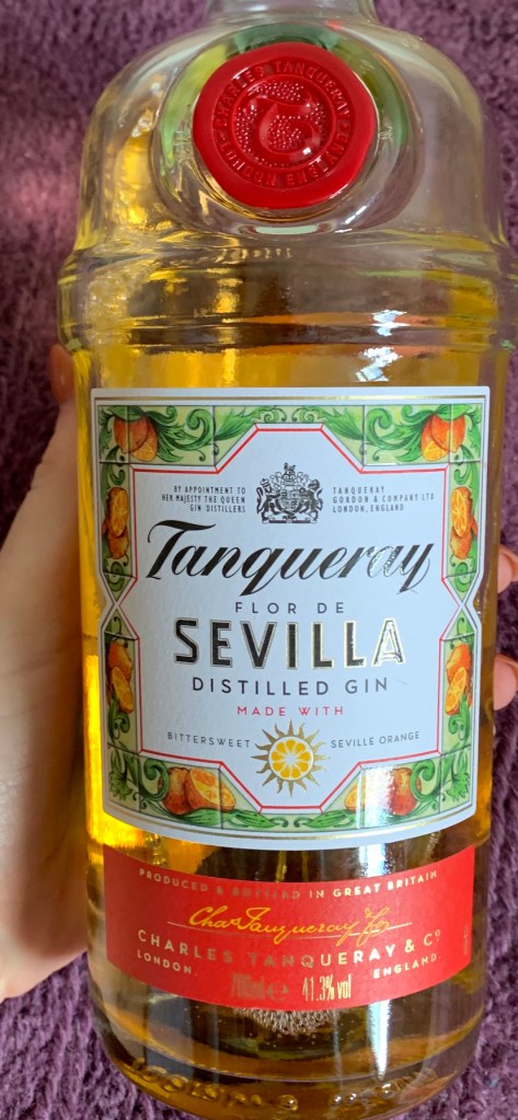
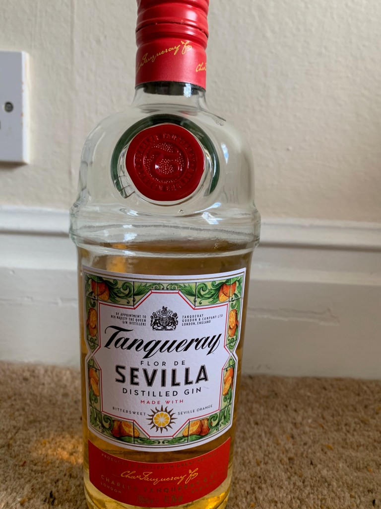
Whats you go to gin?
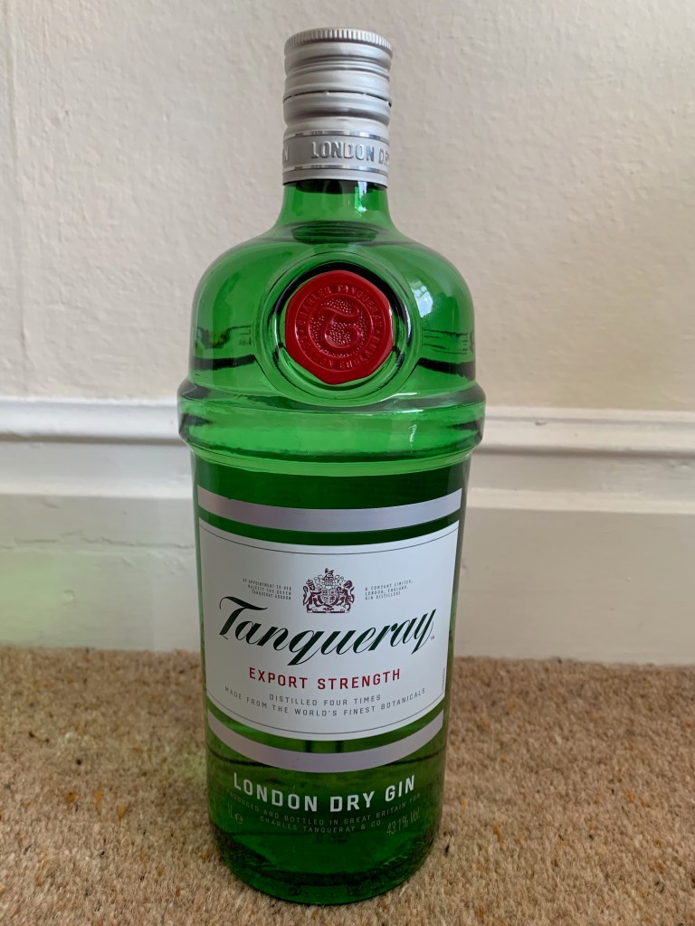
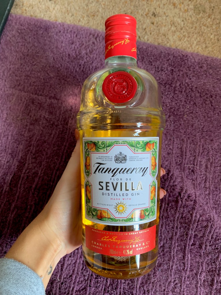
I love citrus flavours such as orange and more pink like fruits. At the moment I am loving the tanqueray flor de Sevilla distilled gin made with bitter sweet orange. (image is below)
What fruit would you add to gin?
II would usually put a slice of orange or lime within my gin but it depends on the gin I am drinking as sometimes a fruit is not needed. My favourite is just to add a block of ice with my gin.
Whats your favourite taste – dry or distilled gin?
Distilled – as its more fruity unlike dry that comes in more organic botanics.
Why do you like gin?
Each gin is different, the personality of the gin is displayed within the bottle designed and that always links to the finishing taste. Gin allows you to almost create your own drink as you get to decide what added liquid you put in and the gin it self. With gin every single one is different and its never the same as the same glass of wine, thats why I enjoy it.
I already looked into the looks of bottles that interested me, but I feel that to develop my ideas further, and making sure my labels and designs fitted into the gin world as to research labels (front and back)
WHAT GOES ON THE LABELS OF GIN BOTTLES
Name and address of the bottle
Country of origin
Nominal volumen in litres, centilitres or millimetres
The alcohol strength should be shown by volume
Allergy declarations
recyclable glass
I chose a few gin bottle labels to analyse to get an understanding of the gin world branding.
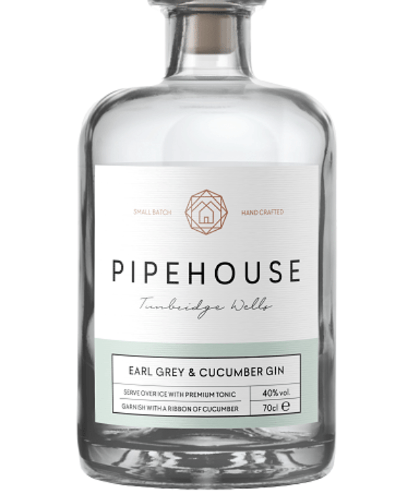
The first one I chose to analyse was this one below. At the top of the label sits the brand logo, with the main title and then the location of the design. The label is just white which fits into the flavour of earl grey gin. I think this label is very simple but fits so well with the flavours. The colours within this design are grey and a cucumber colour, which then almost provides a story through the design. This design shows that the design can be simple yet effective as long as it fits with the product and what it is selling which this one does. The space within the design is important as each separate part of the design represents something different but they all come together well. The brand logo also is a different colour to the rest of the design to make it stand out.
I chose this one as its slightly different with the logo as it becomes more unique. This presents quite a cold through the design/. The reason I chose this was the use of different patterns, reflections on the label. The design has elements of gold and different styles of type. Within the logo there sits a triangle pointing down but this then creates an overall square. Sometimes adding so much different type doesn’t work, however within this design having the different adds
After analysing these two designs, I decided to look into another two that I felt would inspire me through the process of gin label designing. I think there is a sot of sophistication that comes through gin label designs and thats why its important for me to research them well.
I chose this one below to showcase the ways in which a complex pattern can be incorporated within a design. Unlike the other gin designs I have seen I feel as if this one portrays more pattern through its design but also focuses a lot on the word gin. The word gin is the main title within the bottle, not the flavour which is unique in comparison to other peoples designs, and usually the flavour becomes the focal point for the design. The main focus here that I wanted to point out, was even though this design features a pattern the type is designed so well and bold with the choice of colours to showcase it from a far – and it works well. The only issue for me is I am unsure what sort of gin this is and the flavour is is from a far – but then looking closely I do not think I can even view it from up close.
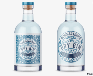
I chose this one below to showcase the idea of beach like colours displayed in a dry gin design. Now this design as two alternative designs in which they could display therefore I thought analysing both would be interesting as they are the same brand but different designs. This design has that dry gin appeal to it, meaning its quite subtle and basic which most dry gin is. On the left hand side the design features the logo with the pattern whereas on the right hand side it does not. Now the design on the right to me looks quite vodka like and doesn’t have that gin appeal to it. The design features a pattern within but the entire bottle as a whole when the design is placed does not scream gin to me. I then think adding the background on the label allows the entire design to come together and allow it to portray that gin sophistication targeting a certain market and telling a story.
I have looked into gin bottles that are just on google, but now I think its best to look into the designs that already exist within the market showcasing the different brands the feature in the UK now. This will enable me to understand product marketing as well as a design for the product.
I typed into google, top gin designs and clicked on a. few websites and bottles to analyse through this blog post.
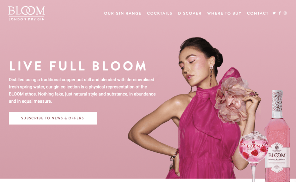
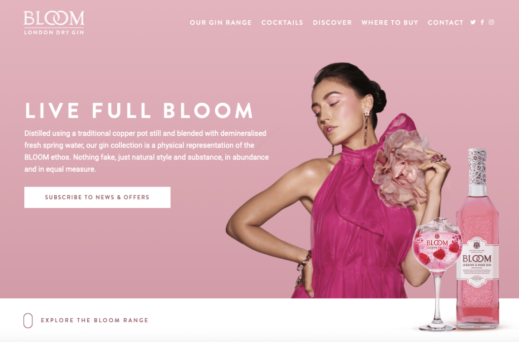
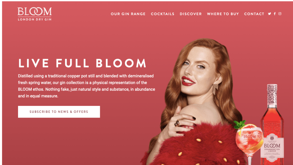
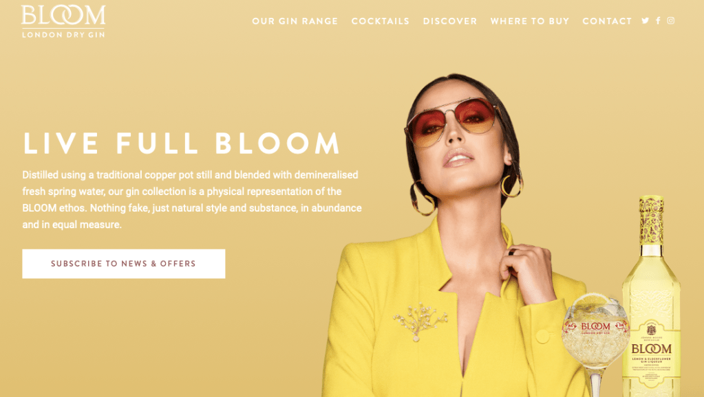
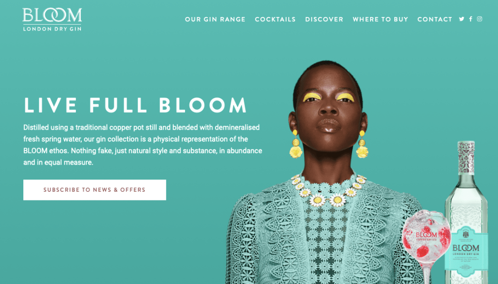
The first one I looked into was the brand bloom gin – which has an online website where they showcase their design and products through that. When you first go onto their website they showcase 4 alternative flavours that are displayed showcasing the different flavours. Each flavour show cases a model wearing the same colour as the gin and the entire design focuses around the certain flavour and colour of gin.
Now above is the advertising for this certain gin therefore – the bloom distilled gin original. When you then scroll down the website you enter into the ‘explore the range’ I found this so interesting because its almost like a website for new clothing products exploring the range.
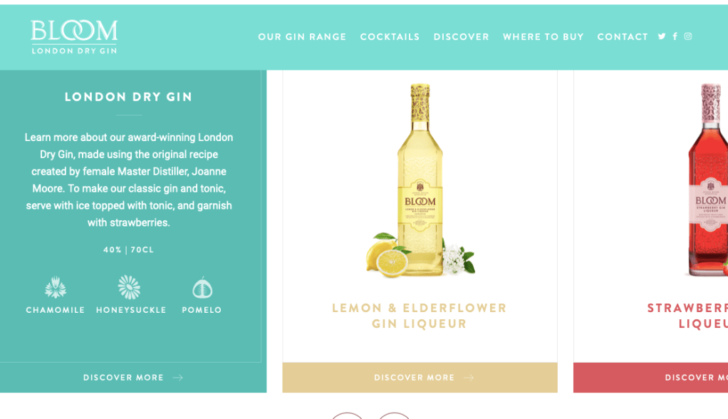
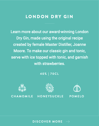
The gin I decided to analyse was the most iconic design and the original design for blossom. This design on the website was hovered over with an image that displayed the description of the gin and used as a form of advertising for the consumers. The description I almost what you would display on the label of a gin bottle, as it displays the name, description, the CL and the ingredients.
When the design is featured after the quick hover over image, you get a simple design of the bottle. This design works so well as it just focuses on the bottle, nothing else. The shape of the bottle is very sophisticated and displays a unique style to the dry distilled gin. The colour palette for this design is a turquoise which personally speaking fits in with the dry gin style, but also links with the bloom idea. The thing that stood out to me not just the logo and the bottle design (with the pattern) but the small details of the ingredients placed either side of the bottle. In the lower right corner you have dragon fruit and then in the back another ingredient which I am unsure off – however it works so well for the design advertising techniques. Adding the small ingredient almost allows the audience to taste the fruit to a hole new level.
When you then click on this certain gin – it takes you on a story. I find that most gin brands have a story behind them and portray a certain personality through their designs and Bloom showcase this on their designs and their website.
Their advertising continues through the branding, as it displays where you can buy the gin from and I think this is such a good advertising platform because it allows them to showcase where their audience can purchase their designs from. You never see this on adverts or on the bottles the fact they can showcase this on the website is a really good idea and perfect advertising platform.
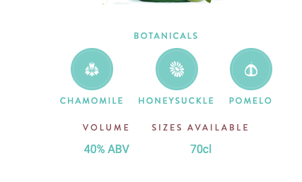
Above is the images displayed when scrolling down on the design – they showcase the bottle the way its shown at the beginning of the design. They showcase almost what it would look like on a poster. The image is clear, and the product is so appealing to the audience. They display the botanicals involve and the volume, and the sizes available throughout the product. The pictures of the bottle is so small I think it would work so much better if it was sightly larger as I find it hard to see some of the key points, or to even analyse the design. The entire design throughout is dedicated to link with the bottle, meaning the same colours and style will be used.
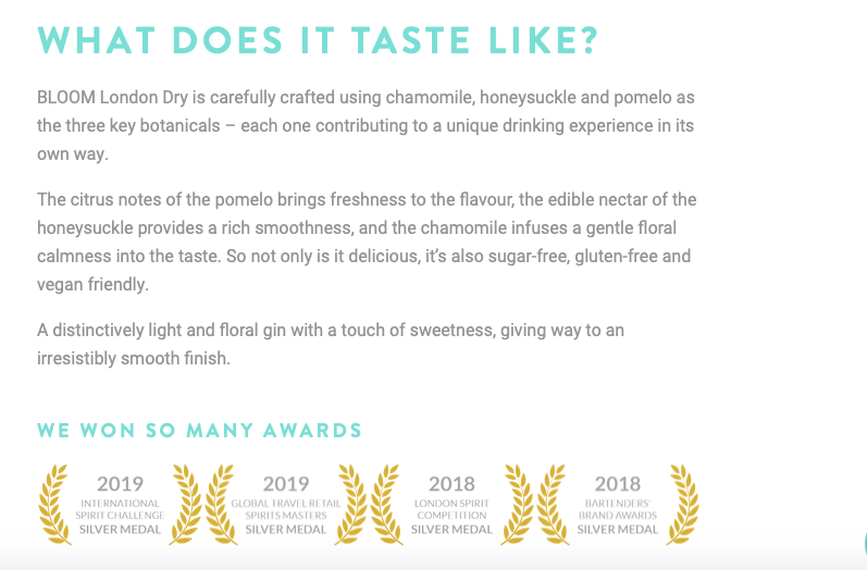
The best thing about this, is they describe what it taste like. When you want to try a new gin, you want to be able to know what it taste like without tasting it, if that makes sense. I think the design it self makes people almost taste it due to the ingredients displayed either side, and now they describe which draws the audience in even more.
The description is simple, effective and allows the reader to want to try it. I want to try it now I have read that. The entire Bloom brand portrays this elegant and sophistication through their design, it gives people a feel of spring and summer and the flowers blossoming. The design overall is dedicated towards elegance and flowers and thats what makes it work so well when advertising for the design and creating platforms.
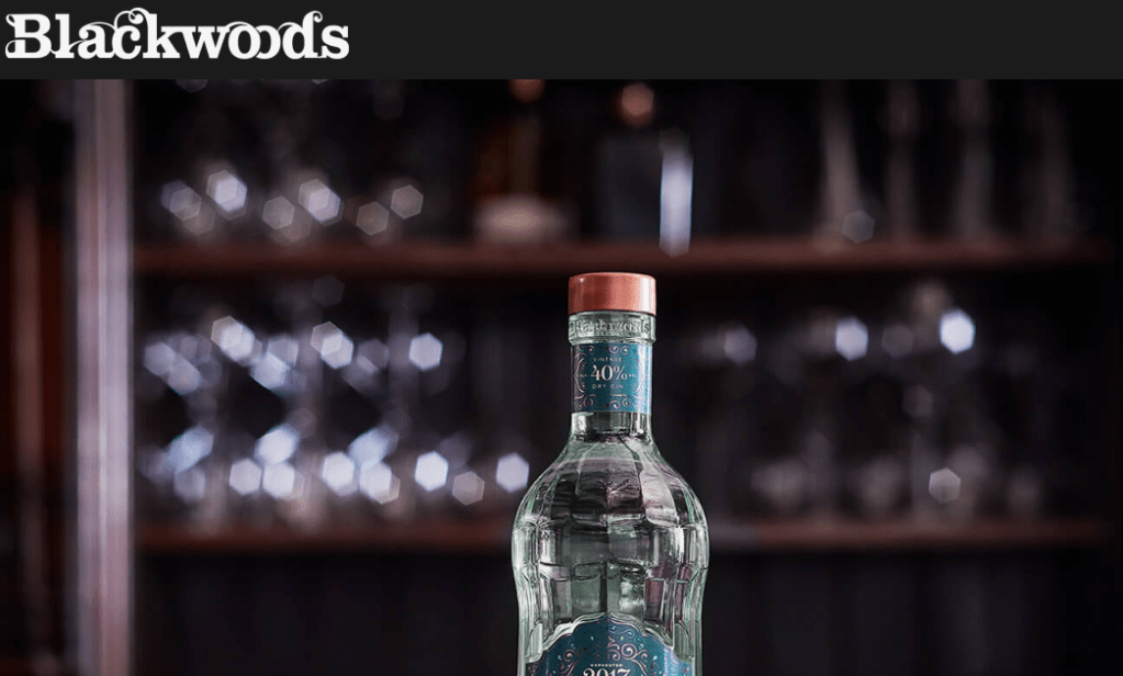
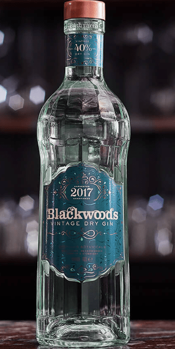
The next brand I decide to analyse due to their marketing techniques, website and product was Blackwoods Gin with botanicals from the Shetland Islands. Their website has that very pub feel to it, with a traditional sort of display. The type for the brand/product is very tradition, and old school and sets out the rest of the design for the bottle, logo and the website advertising platforms. When you first click on the website you see this image, no words, no random images, just a single bottle displayed within a a sub scenery which tells the story straight away about this gin.
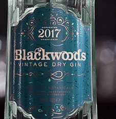
The bottle:
The bottle it self is so different in comparison to other designs I have seen – I personally think it looks so much like tonic water styles, its quite simple, small but has the elegant sort of style to the design. The bottle it self has a sort of pattern engraved within the design, and the top of the bottle features a label that links with the main label. The logo it self is very traditional like, with a teal background and a vintage type colour palette to relate to the description of vintage dry gin. The thing with vintage, is its old and unique and I think that this is displayed within this design throughout and thats its personality and story towards the bottle.
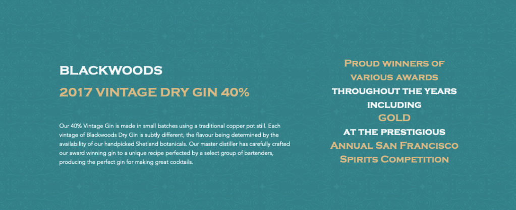
The design for this website is quite different to the previous design, when you scroll it then takes you into the next informative section. The colour palette is decided due to the colours used within certain bottles therefore in this case is this teal colour to link with the vintage dry gin design. They display key information, that they are proud winners and advertise their product as a hole. The information is clear, easy to read and gets. Straight to the point.
The last thing I wanted to analyse was this image below the related to the product. they have done it sightly different to other gins and displayed different ways in which you could use the gin and mix it with your favourite flavours. They showcase a more sophisticated design along side a more tradition every day design. Having these two designs, and showcasing how one could encounter this design allows the audience to experience what it could be like if you purchase this gin.
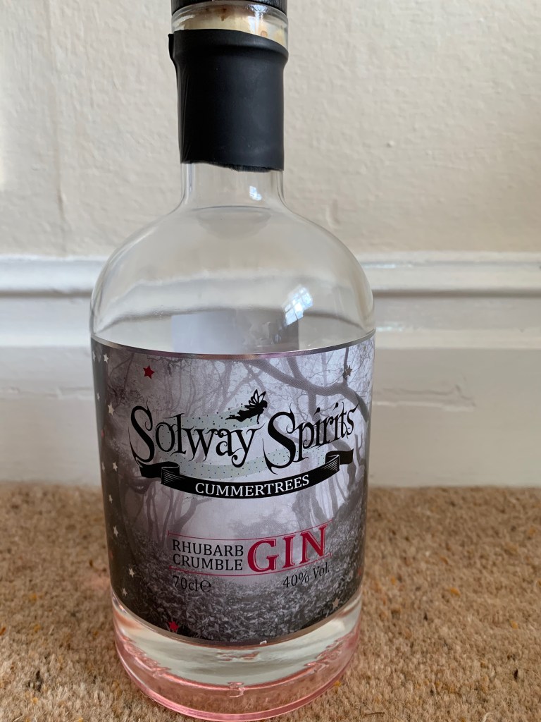
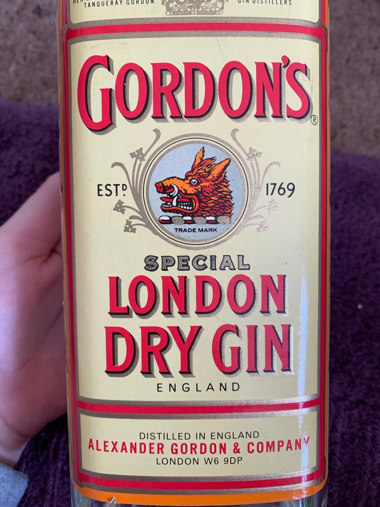
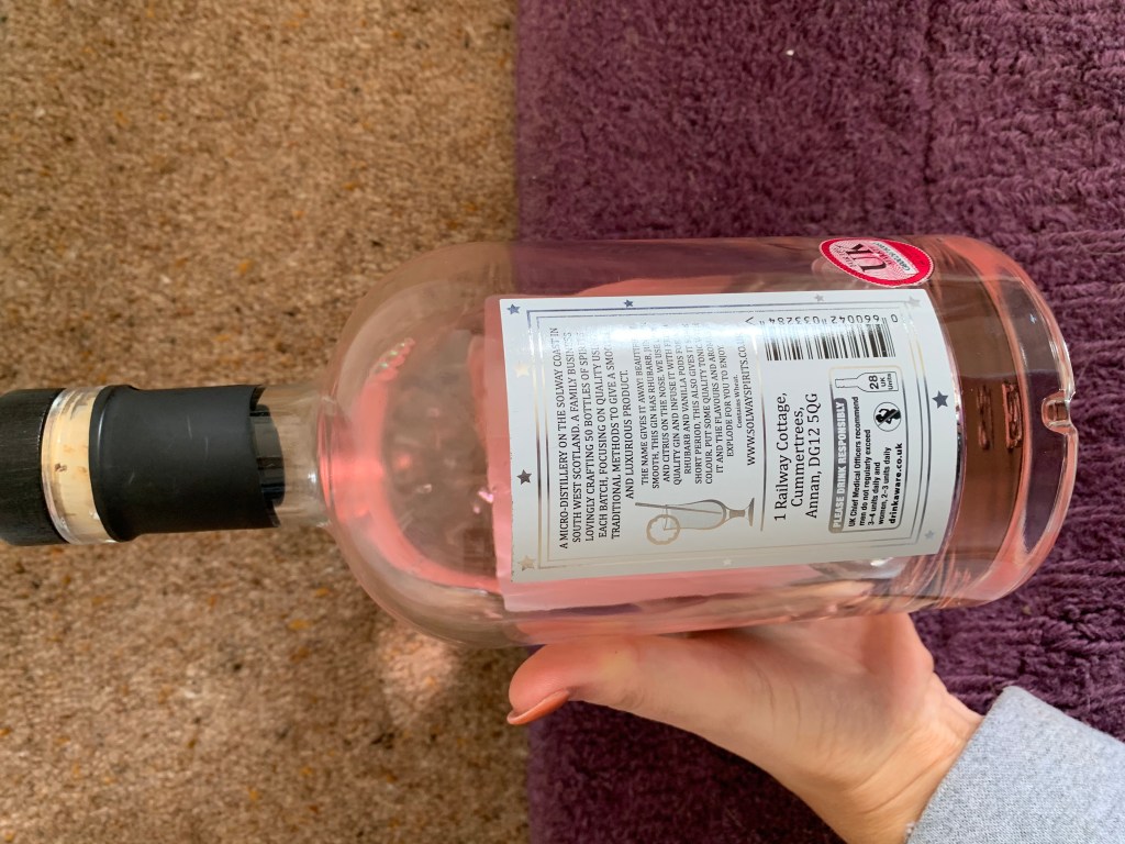
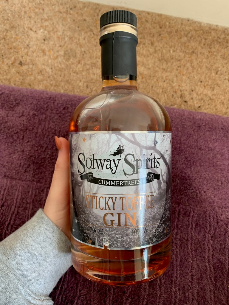
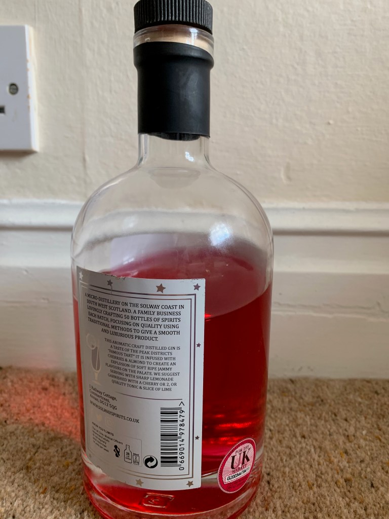
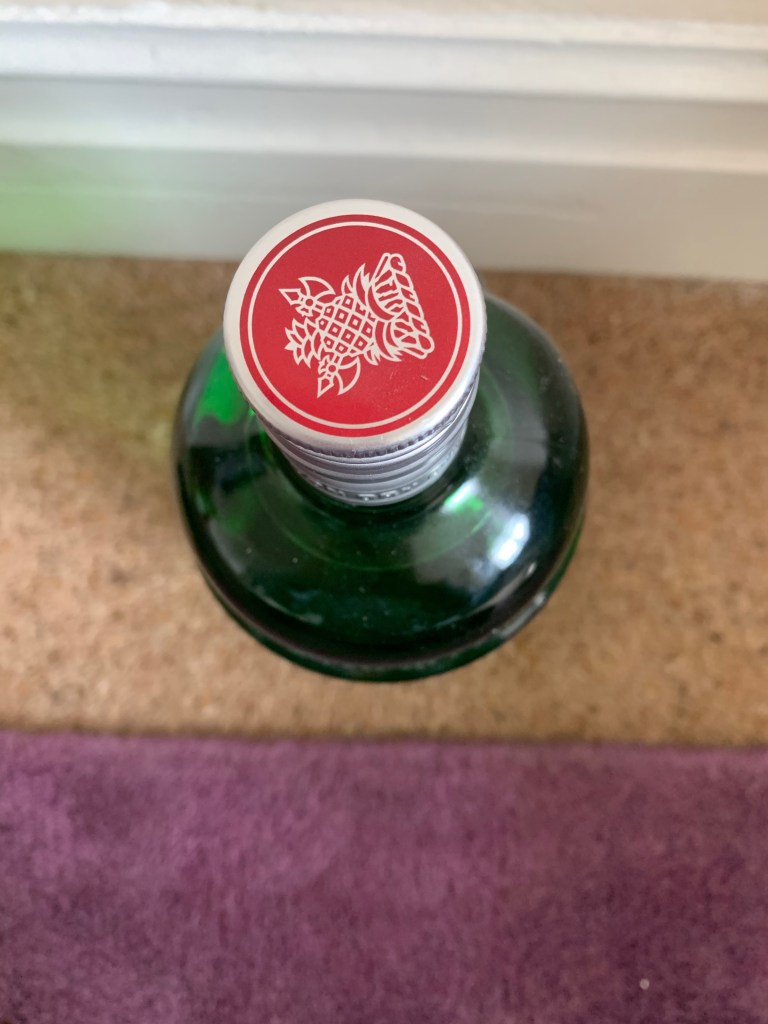
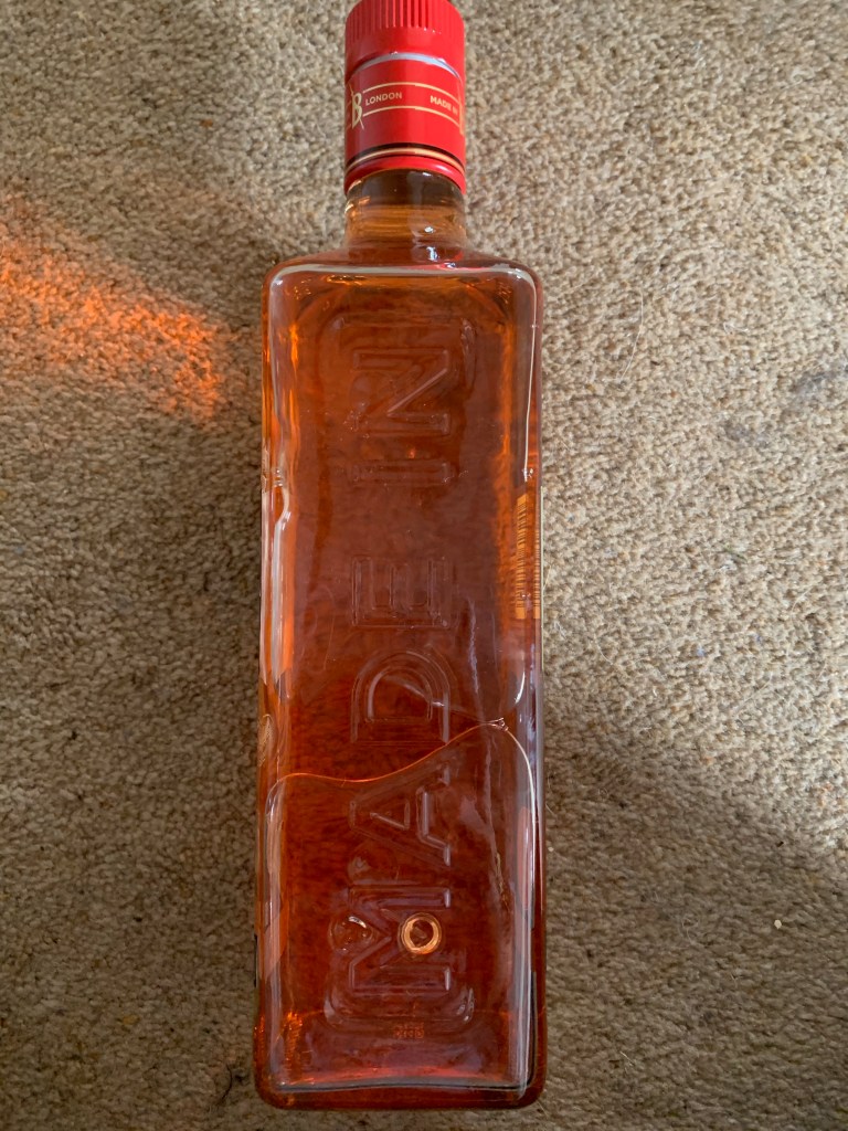
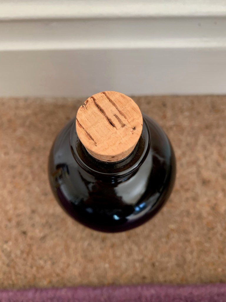
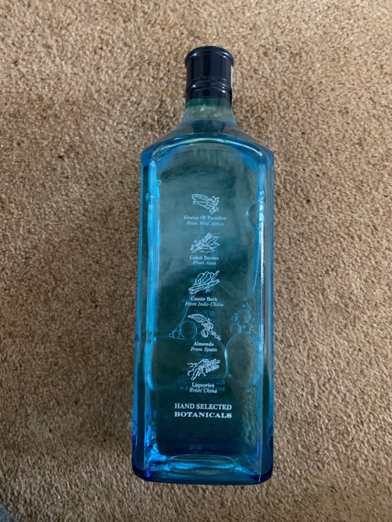
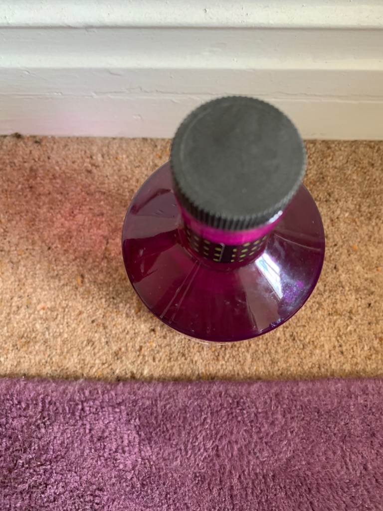
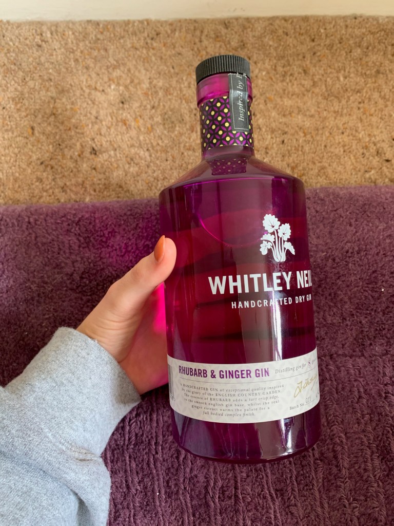
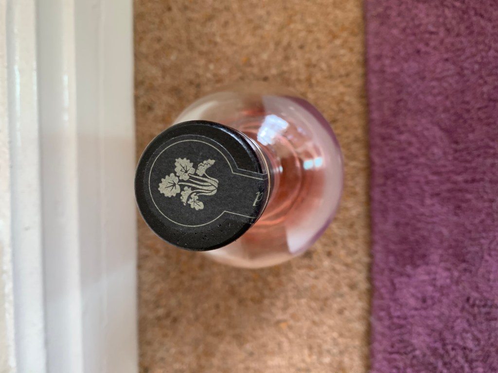
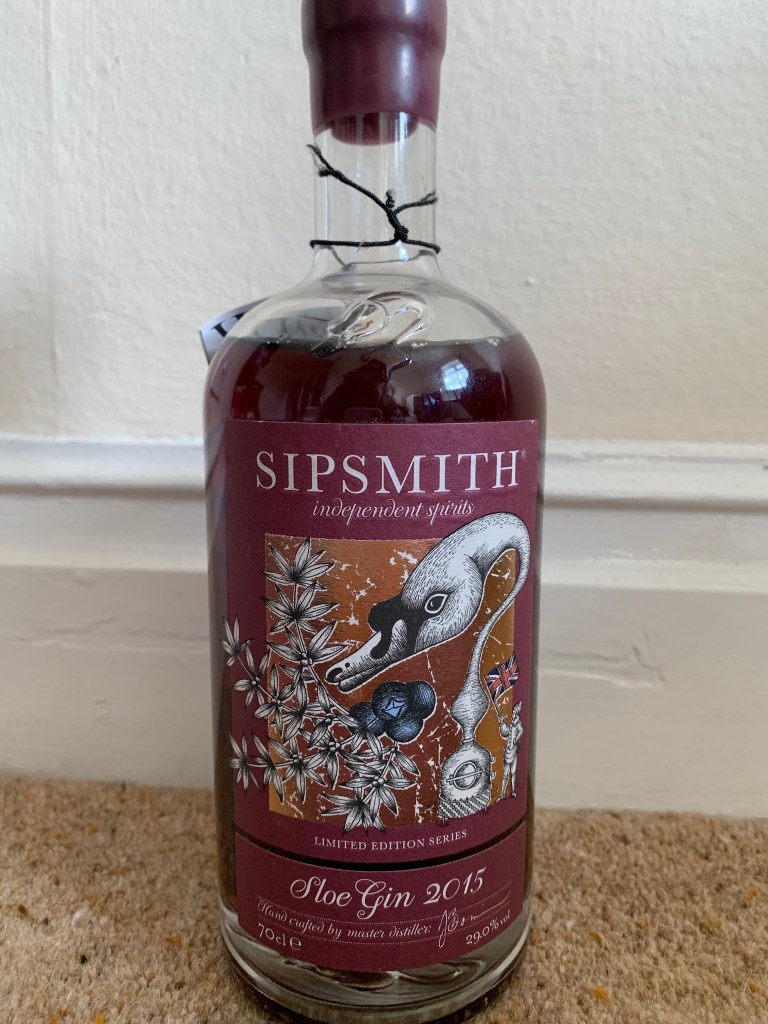
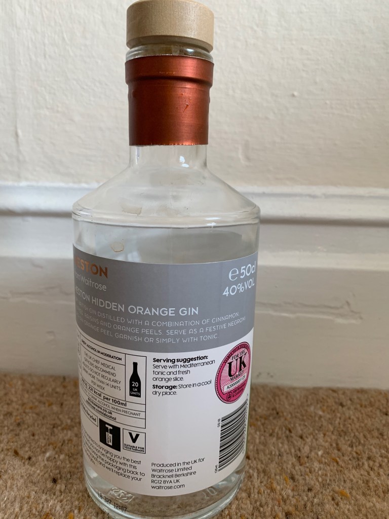
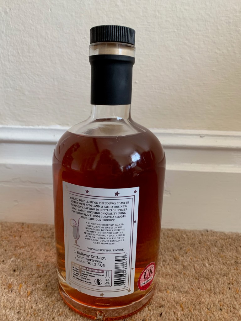
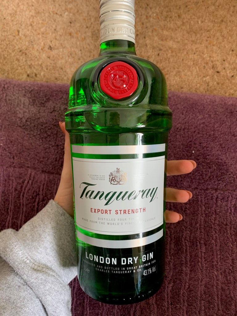
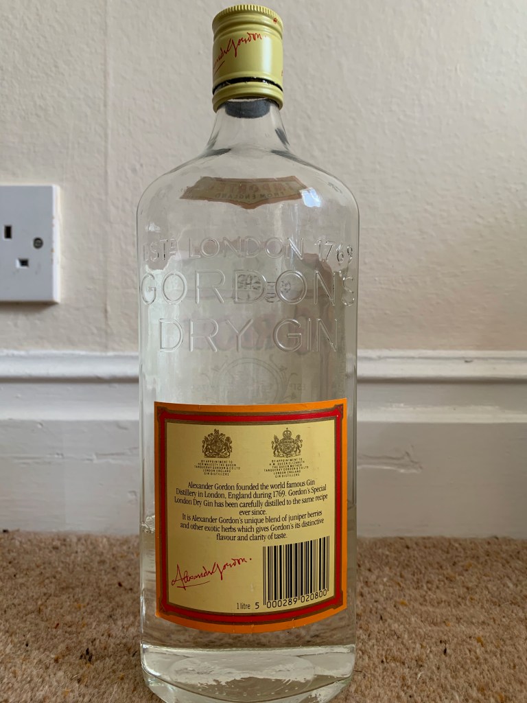
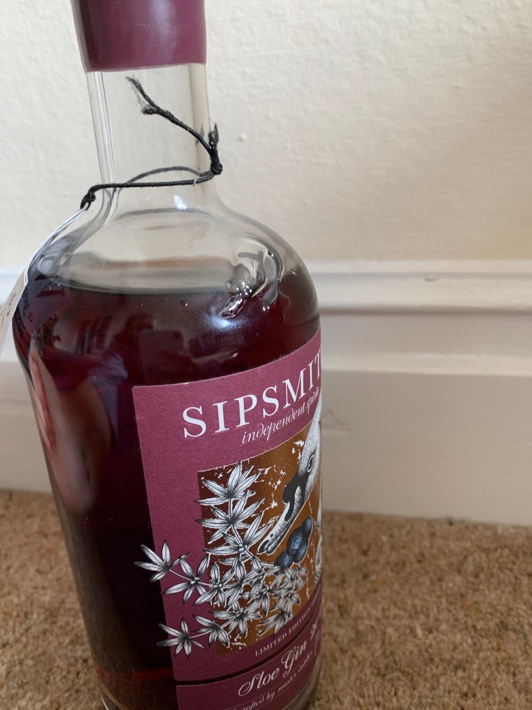
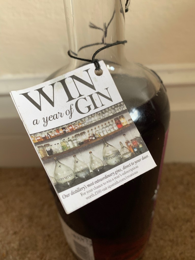
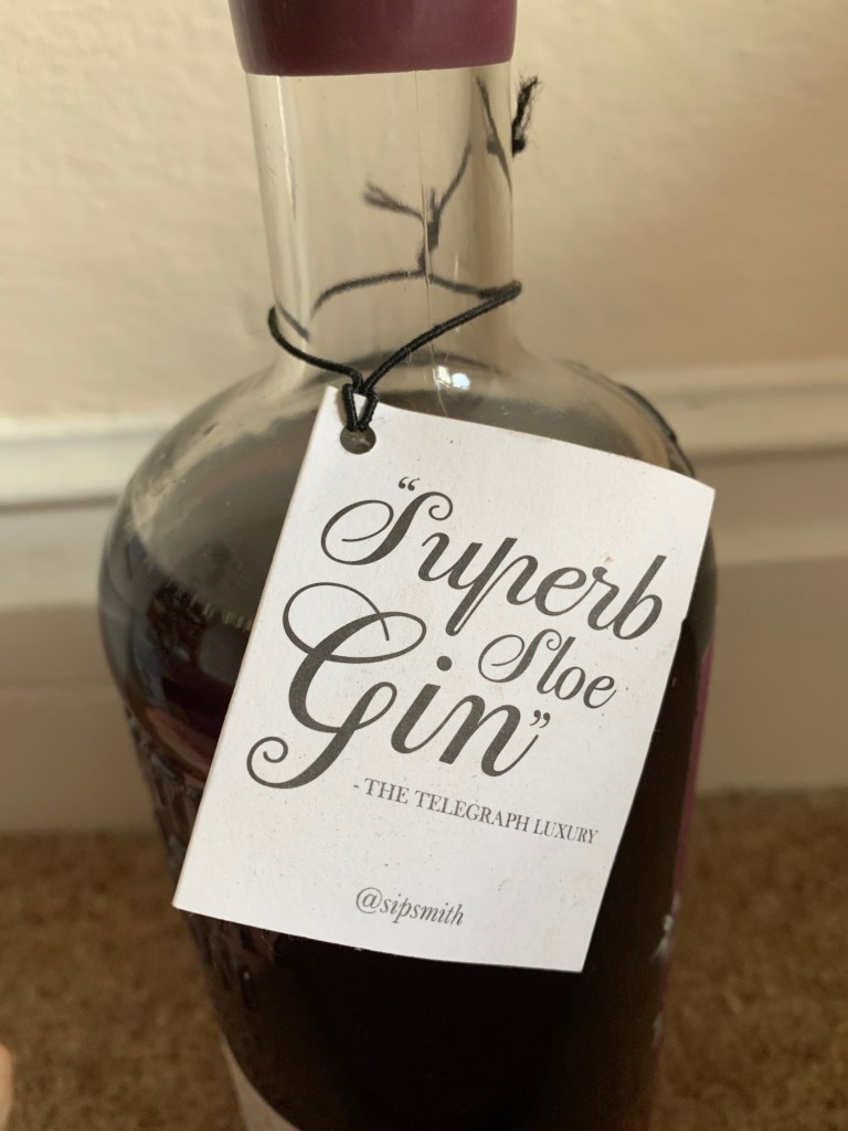
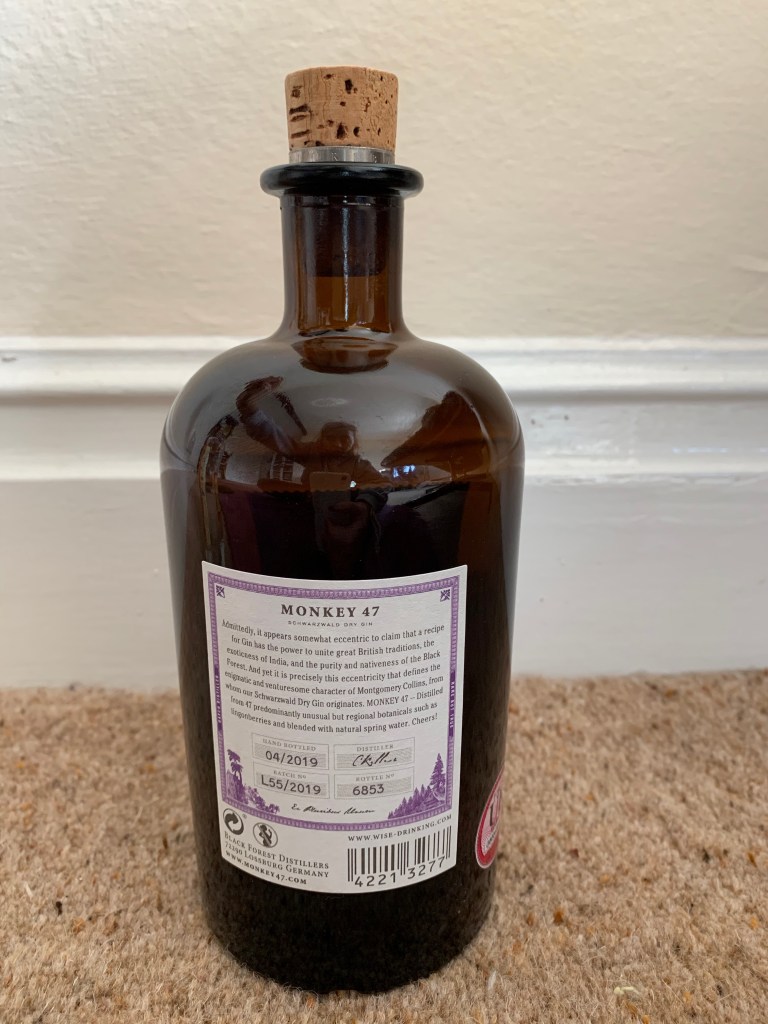
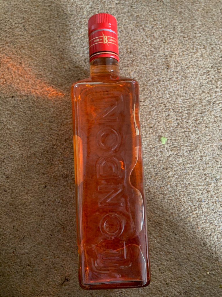
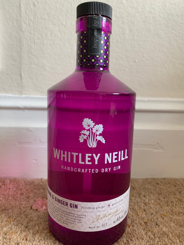
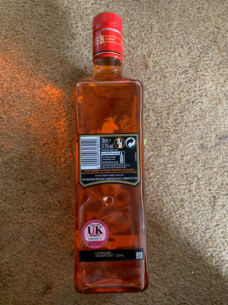
My boyfriend mum is a lover of gin and over her years has collected a vast majority of gin, for this project I found that looking through her cupboard and photographing elements would be more beneficial than online imagery as to to me I was able to hold the bottle and a real feel of the product.
Now there is over 50 gins within this cupboard and I could be here for absolute days trying to explain it all. I decided to showcase every single one on this blog, however I would only annotate in detail the top 5 that inspired me through the design process. I took the top 5 to my iPad and competely analysed them throughout which really helped decided my design ideas.
All images:
All the images below are different angles of the gin bottles that I took, taking them from al different angels allowed me to understand each bottle individually. What is interesting about these gin bottles is that they all portray different stories and portray alternative personalities depending on the flavour of the gin.
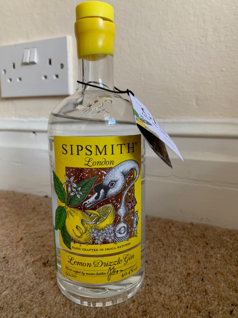
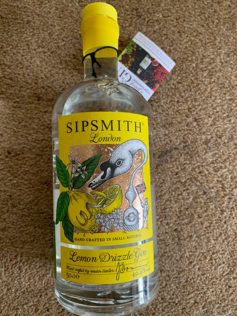
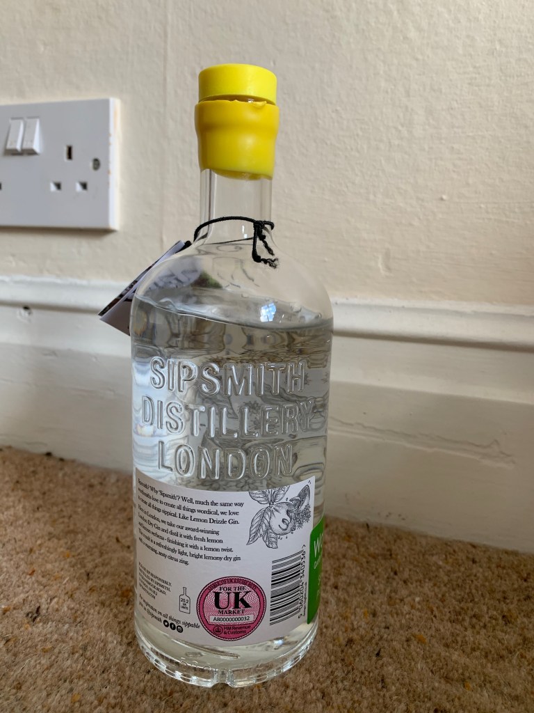
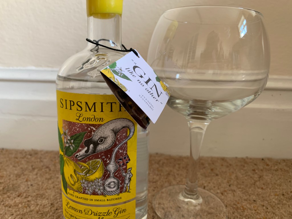
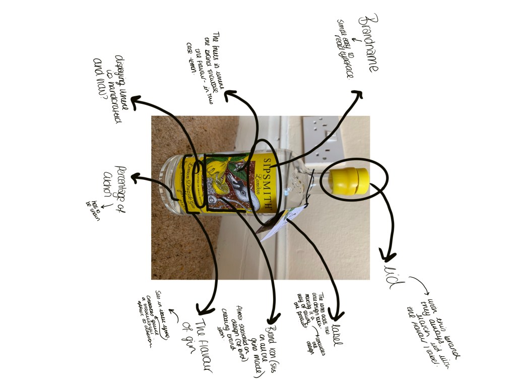
Out of all the designs of gin there was one in particular I wanted to analyse and take further to understand how it looked and portrayed certain elements. I was going to take 5 gin bottle designs and analyse them, but personally I thought analysing one specific one would allow me to be certain of what to add in my gin bottle and the design.
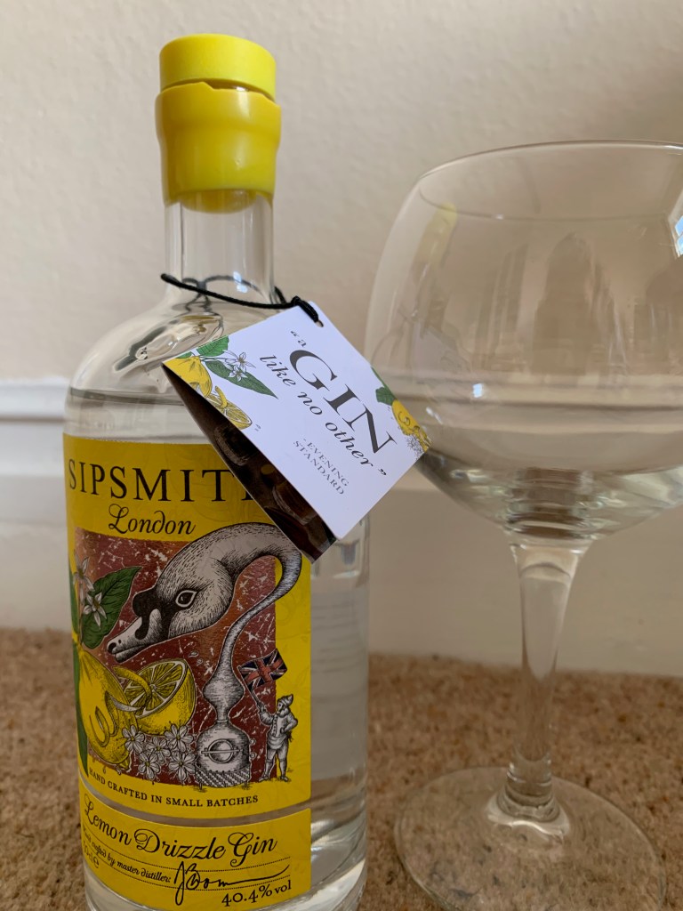
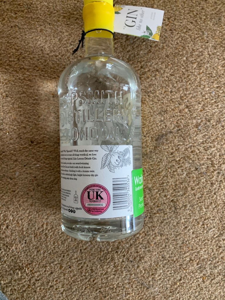
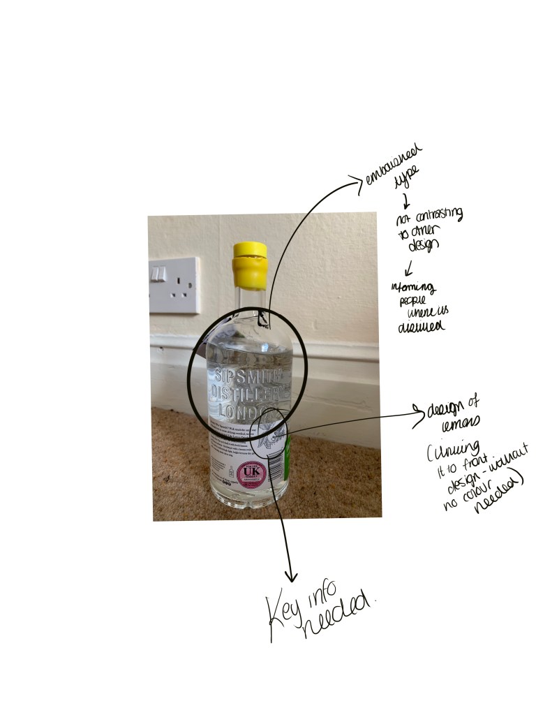
The first one I analysed was the sip smith Lemon drizzle gin. This one stood out to me the most due to the shape and the colours used within the design. The shape of the bottle allows the designate work so well together. I analysed every single part of the bottle to understand all the elements that had to be part of the design.