Research images: Gin in general
The first image is from Pinterest – by typing in gin bottles. The reason this stood out to me was the unique reflection of the pattern. I love the fact the pattern is design at the back of the bottle (inside) but because of the glass and the liquid it reflects through the entire bottle creating a story. The top Is wood like making it look clean and simple with a little label over it. The label is so simple but works well against the image. Gins have this elegant appearance to them, and this is a great example of that within this image below.
I fell towards a lot of gin designs with patterns behind them. I think ti gives that really classy clean look to them. This one portrays a box (which I could potentially create) with also a bottle with the label on it. This one portrays a blue pattern background, with the flavours thats involved (ingredients) placed on the label which then links to the packaging. The label that sits on top of the pattern, is white with black writing, every little detail stands out due to it being white and bold text. The flowers overlap the design making it stand out and come together as a design rather than being a seperate label and separate pattern.
So when continuing research, majority of gin designs have a unique pattern about them. This one below stood out so much due to its unique pattern. Unlike the other designs it did not portray the ingredients used it was a simple yet effective mirrored pattern that followed through the entire bottle design. Dry gin doesn’t usually involve a lot of flavours and thats shown within the design. The pattern fills around the entire bottle and stands out, however the label sits nicely on the design not making it too overcrowded.
MY TOP DESIGN INSPIRATION:
Out of all the different sorts of inspiration I saw online this one stood out to me the most. I love the way the pattern is filled around the entire bottle. The pattern then links into the triangle making it all come together. Its designed so perfectly and stands out so much as a design. The pattern is bold colourful and beautiful then the label is sophisticated and a unique shape unlike the others.
- Document
- Block
No block selected.Open publish panel
- Document
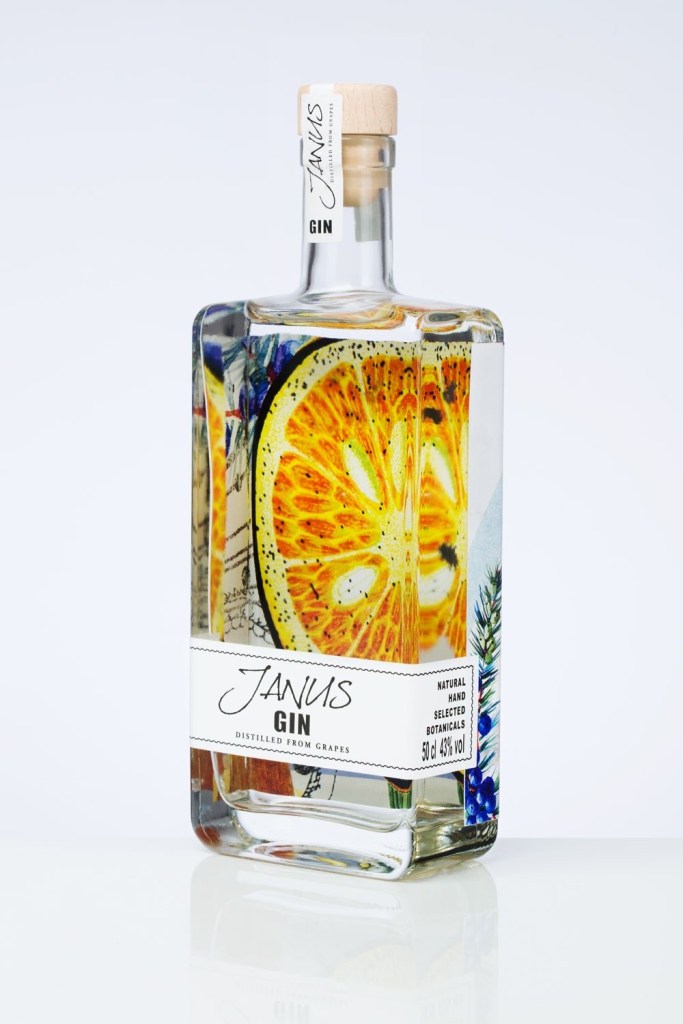
The first image is from Pinterest – by typing in gin bottles. The reason this stood out to me was the unique reflection of the pattern. I love the fact the pattern is design at the back of the bottle (inside) but because of the glass and the liquid it reflects through the entire bottle creating a story. The top Is wood like making it look clean and simple with a little label over it. The label is so simple but works well against the image. Gins have this elegant appearance to them, and this is a great example of that within this image below.
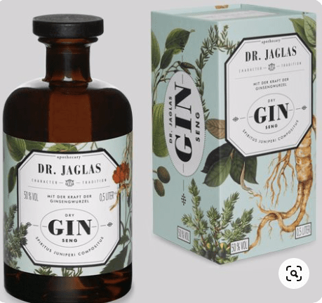
I fell towards a lot of gin designs with patterns behind them. I think ti gives that really classy clean look to them. This one portrays a box (which I could potentially create) with also a bottle with the label on it. This one portrays a blue pattern background, with the flavours thats involved (ingredients) placed on the label which then links to the packaging. The label that sits on top of the pattern, is white with black writing, every little detail stands out due to it being white and bold text. The flowers overlap the design making it stand out and come together as a design rather than being a seperate label and separate pattern.
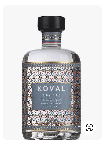
So when continuing research, majority of gin designs have a unique pattern about them. This one below stood out so much due to its unique pattern. Unlike the other designs it did not portray the ingredients used it was a simple yet effective mirrored pattern that followed through the entire bottle design. Dry gin doesn’t usually involve a lot of flavours and thats shown within the design. The pattern fills around the entire bottle and stands out, however the label sits nicely on the design not making it too overcrowded.
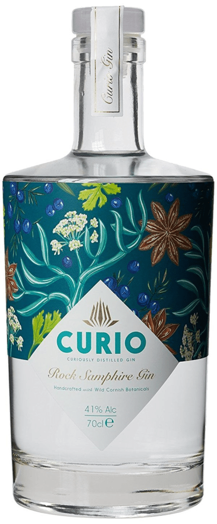
MY TOP DESIGN INSPIRATION:
Out of all the different sorts of inspiration I saw online this one stood out to me the most. I love the way the pattern is filled around the entire bottle. The pattern then links into the triangle making it all come together. Its designed so perfectly and stands out so much as a design. The pattern is bold colourful and beautiful then the label is sophisticated and a unique shape unlike the others.