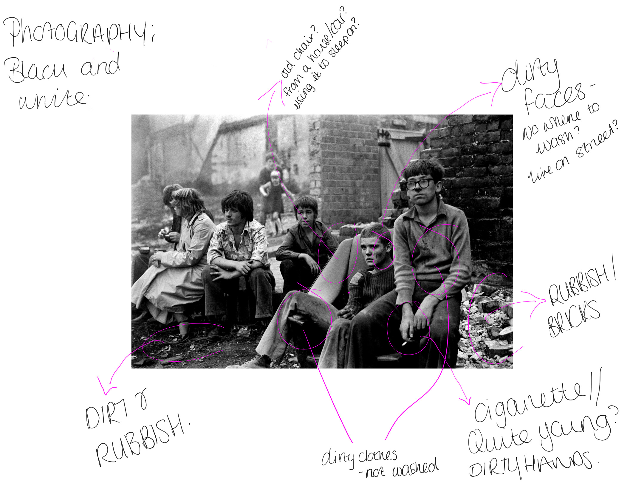
I thought I would look into some existing adverts that are already out there for poverty but for global issues and analyse them. I do want my designs to be slightly different but also follow the format that comes along with poverty photography and advertising . Before looking into adverts I thought I would look into some some sort of photography used and then this could lead into advertising posters.
Photography // poverty global photography
Tish’s images capture a raw picture of the struggles faced by the youth at the time. She would often photograph her family, friends and neighbours – people she spent time with every day, and whose struggles she shared. Capturing candid shots of youngsters on the streets, playing cards, building dens and fire, or causing mischief came naturally, because the subjects trusted her.
https://www.bjp-online.com/2018/05/deprivation-and-community-in-thatcherite-britain-with-tish-murthas-youth-unemployment/https://www.bjp-online.com/2018/05/deprivation-and-community-in-thatcherite-britain-with-tish-murthas-youth-unemployment/
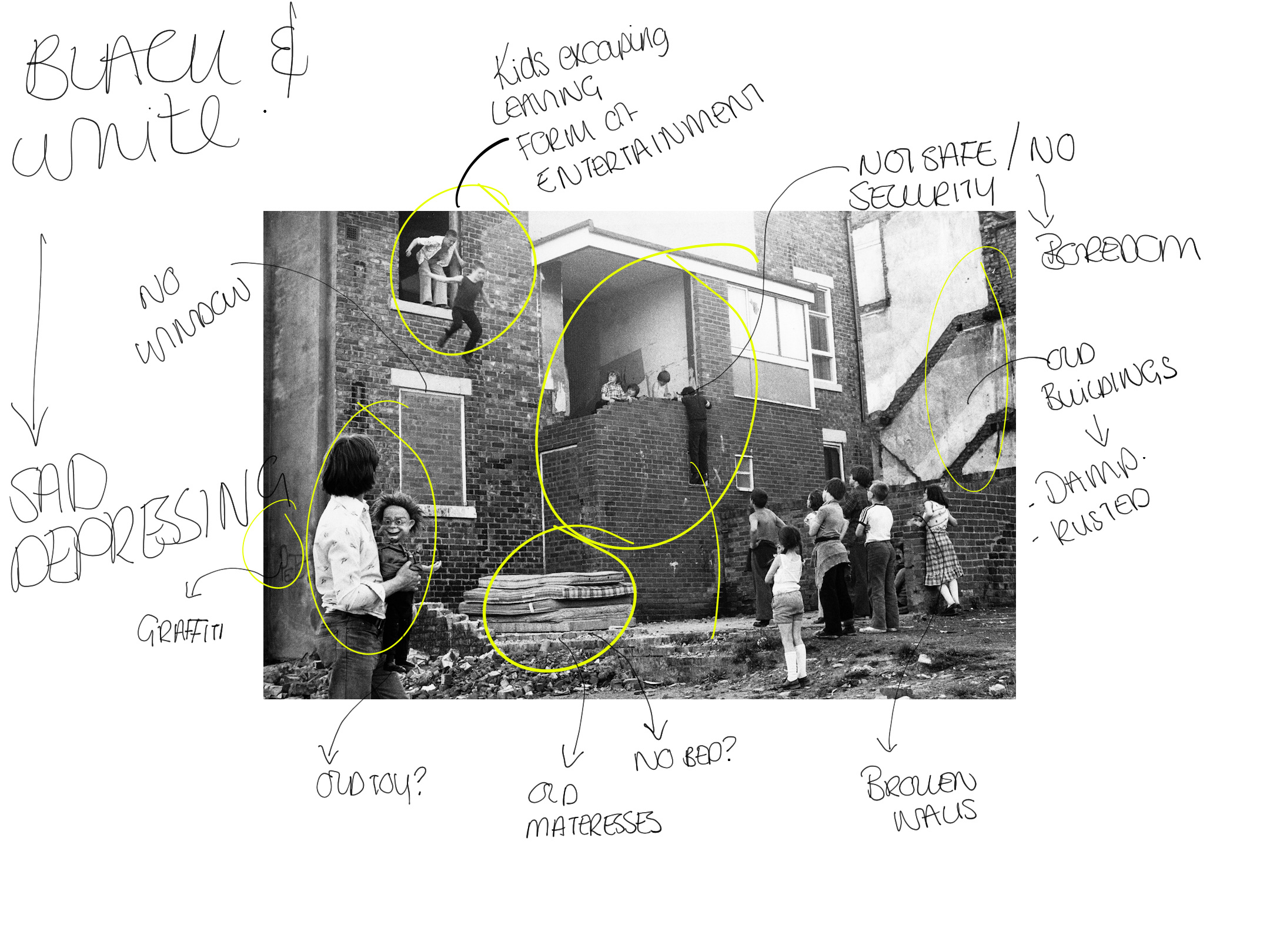
The first photo was this one below. I decided to annotate not before writing notes in my blog about it to make me have more of an understanding of the photography / story being told through the photo.

Annotation of image

Notes from annotation
At the top there are two boys jumping off the window. This shows the idea of the kids having fun despite not having a lot. Boys behind boys. Everyone is watching them and egging them on. On the other hand it could show the idea of them escaping but they have happy faces on so to me it displays them having fun and symbolising you cans have fun despite what you have.
Need to this… a kid is hanging from. This shows how unsafe this area is. However if you look closely he is standing on a window to reach up to his friends to chat. The kids just look like they are hanging out in this urban area.
Below this sits a bunch of old mattresses without any sign of a bed. This indicates that there is no bed around here, do these children sleep on these? It also suggest a bit of a “dump” as they look quite dirty and not well looked after.
There is loads more annotation to this and this is displayed in the photo the last thing I want to mention is the colour. I think for poverty the idea of black and white really makes it stand out and makes it more depressing and shows the sad side to poverty and this is definitely something I would use within my designs as it makes it so powerful and tells a story.


https://flashbak.com/powerful-photos-of-glasgow-slums-1969-72-54283/