I wanted to allow the design to be amazing for the LFB – I wanted them to really connect with the magazine. I did not just want the audience to be pleased with this design I also wanted LFB and a fire fighter to give their opinion on the design.
I asked my uncle and I told him to be as honest as he could – here is his response:
” I though it was really good Katie and very professional. Lots of accurate info and well researched. “
I stupidly forgot to write how the design process for the presentation actually enhanced my designs therefore would discuss this at the end of my design process. I think that having the 3 presentations, total of 2 achieved at the moment allowed us to develop ideas. I have noticed in the pass I have achieved work without discussion of others and tutors then lost marks because I did not ask. This time round, the I got opinions at the start middle and end.
I thought I would analyse the designs displayed within the power points and discuss the development through them and how the power point has helped me achieve that.
First presentation:
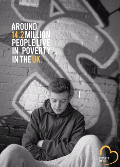
The first presentation was simple, it was displaying the research we have looked in to so far and this then allowed us to undertake ideas and elopements for further investigations within design research. I displayed the research I had found, and the designs so far. The designs were not as good as the finals now and this really shows as development achieved through the designs.
At this point in the design process, this was these were the designs I had created. I HATE THEM. looking at them now. the type is off, the logo is off everything is off. This shocked me so much, as I had no idea the presentations had so much of an influence towards my final designs, but they have. The logo is absolutely massive, and sits so awkwardly almost like its floating. The type is kind of there and has no source from where it’s from. It just fills a bit rushed. When we had this critique, the suggestions was to take more photographs inside the house for the magazine because at this point no magazines had been developed or design. At this point there was a hashtag that I was going to develop, I think it looks so childish and makes it look unprofessional the way it has been positioned and designed just doesn’t work in comparison to my finals now.
Second critique.
The second critique was an entire month after therefore the designs developed a lot more and the magazine began happening. This powerpoint just featured the designs currently made at this point but this was only a week ago and the development is crazy. I have developed so much more professional and I am so proud of that.
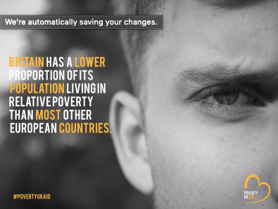
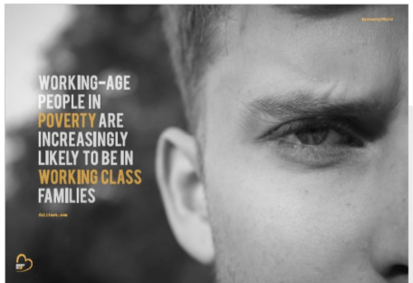
I won’t discuss every poster but this one as they all follow the same techniques but this one changed the most. The type made absolutely no sense when I did the first design, it looked so cramped and oh my goodness its awful cannot deal with it. I clearly did that over night on lack of sleep. I then changed the entire sentence which was recommended by my tutor and this then allowed this design to come alive and become so much better. I would not of even noticed this if my tutor didn’t say it, ( I probably would have but at the time I didn’t)
HOW CLEAN DOES THIS LOOK IN COMPARISON TO THE FIRST DESIGN. I cannot get over it, how my designs and little tweaks made this poster come alive. Making the logo smaller, making the hashtag turn into an @ and smaller in the corner. Just by adding a source from where the information came from made this such a realistic poster and so iconic and reliable for the reader.
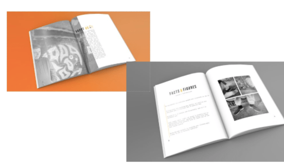
Within this powerpoint, I showcased some of my magazine finals. Considering this was a week before hand in, they are so different in comparison to the final mock ups I handed in. The development of my magazine was not shown as much in the presentations just because I made this after the posters, and from the posters kind of knew what to do and what not to do.
do you hate these mock ups as much as me? its ok yes me too. They are awful. They look so tacky and the colour why on earth have I put an orange in the background. Sometimes you do not realise until its on a big screen infant of everything. I remember this slide coming on to the page and thinking why Katie. I did not like how the angel of the mock up sat and if you compare it to the mock ups I have achieved now its completely different and 10000 x more professional. The colour background makes it to kid like.
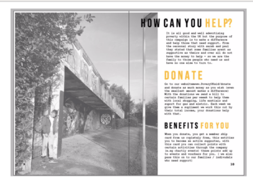
The last thing that helped me through this critique was this photograph and this page of the magazine. I thought that this page was ok, and again until it was on a big screen and I had people analysing it; only then I realised it.
Now looking at this page, it makes me want to scream at past Katie. Why does that type sit over the image, and forgot sake get rid of that lamp post. Sometimes you get so lost in your own designs you do not pick up on these things as soon as my tutor said about the lamppost it was the only thing I could see. And if I had no shown this in the presentation I probably would of handed it in like this.
All these designs are a massive comparison to the final designs that I am going to display in the next blog posts. You can see for yourself, how much these presentations have helped me develop my skills, and professionalism. I have studied graphics for 5 years, and this is the first year I have actually learnt from my presentations, benefitted from doing them more than once and think we should do it more. Doing test prints is a big thing I need to continue. I have developed so much in my own work and finally found my style and found the process to achieve to that.
After collecting all the photos I thought I would make sure they portray the message wanted once editing them.
Photography tells a story and once adding black and white the photographs taken the story became more personal and real. When show casing the word to people, they said the photos portrayed poverty well due to the angels used within the photography and the subject used within. I made sure each photo told its own story, therefore hardly any text would need to be used.
When designing for a subject that is so sensitive like poverty, portraying imagery that is not stereotypical is so key. When I research, there was so many stereo typical imagery and it almost made people resent these ‘sort of people’ when in actual fact thats not what everyone in poverty is portrayed like in real life. I think the imagery portrays normal working day people struggling and this is reached out to the audience well.
I thought I would look into exciting posters out there surrounding the idea of poverty within the UK to get inspiration but also create something slightly different.
What I noticed when typing this into google was that the majority of poverty posters are in an infographics format. When typing it into google I could not find much; therefore I compared the two different styles that are out there.
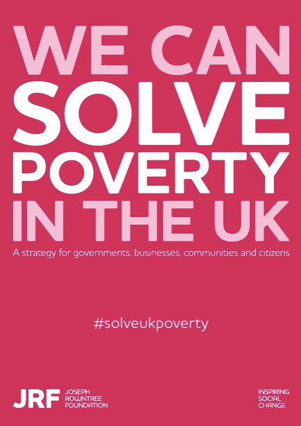
This one displays a more simple graphics design. They have used the idea of portraying just type over the poster. Then used a hashtag to make people aware and actually take a stand. The only thing that I dislike about this is the colour choice, if you weren’t to read this and happened to just be scrolling pass it I would off thought it had something to do with period poverty, due to the pinks used. I think they should used a more collective choice colour. This design displays that you can have such a simple design aspect and get the message across, however I think having a photographs enables people who aren’t in poverty understand it more where as this design is just speaking to you directly. How can we solve poverty then?
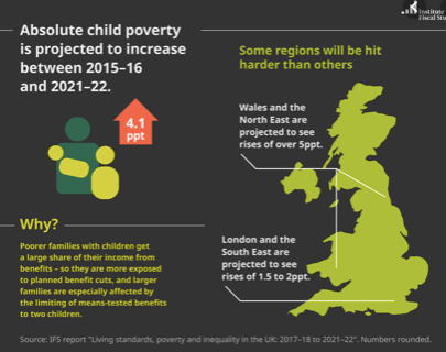
The majority of the designs are about child poverty not much about family poverty. This is an example of these infographics displaying child poverty. They are very simple, they do give the correct information and they portray what it is like however it might be too simple. it does only focus on child poverty, I personally do not think infographics portray poverty well, I think you should display what it is like to design for the good.
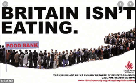
This is the only poster that I thought was slightly advertise due to the photos used and the way it represents UK struggling with it. I chose this because it was displaying what it is like to be in poverty, and the type really catches the readers attention making you want to make a difference. It is an awful design due to the layout but having type that catches the eye and images that portray what it is like is what poverty advertisement should be like.
I could not find a lot on google, therefore began to look into companies and their idea of advertising as I then had the idea of creating an entire new company. The first poster I advertised in this blog post was by JRF who are a comapny who want to change UK poverty.
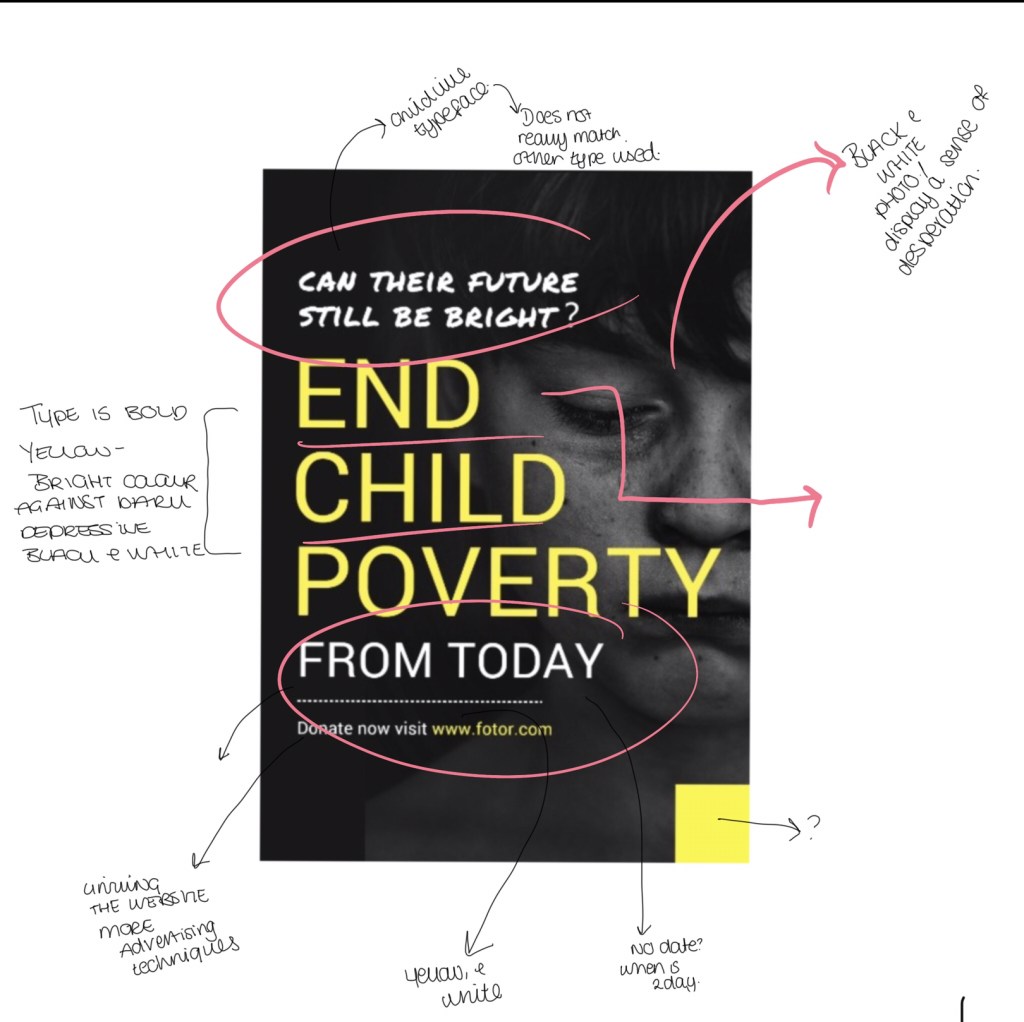
I then found some on google that I thought would be great to analyse with the iPad to pick out key things that could inspire me in my designs. There was design that sin pried me so much and stood out in comparison to the other designs. This poster below is about child poverty but the way in which its designed is what inspired me so much. The way in which they have used a black and white photo of a child that portrays emotion, and this is black and white creating a deeper meaning stands out more and portrays a story of life in poverty. They then use a bright colour of hope which is the yellow, and this makes the writing not only stand out and catch the eye against the black and white but also allows the page to have hope and happiness through a negative design and meaning. They then have a child like type and this makes it more personal and connects with their audience in portraying poverty.
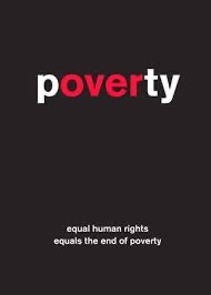
The final poster I looked at was this one below. This to me showcases that poverty can be designed and portrayed sometimes without any imager. They have managed to add the words poverty and over highlighted within one word which makes it powerful to the reader. This displays that simple is key sometimes on senstivie topics.
when we got home after the first crit I wanted to take more photos to portray poverty within homes. Therefore I used jack as an extra model and gathered some mor photography symbolising home poverty.
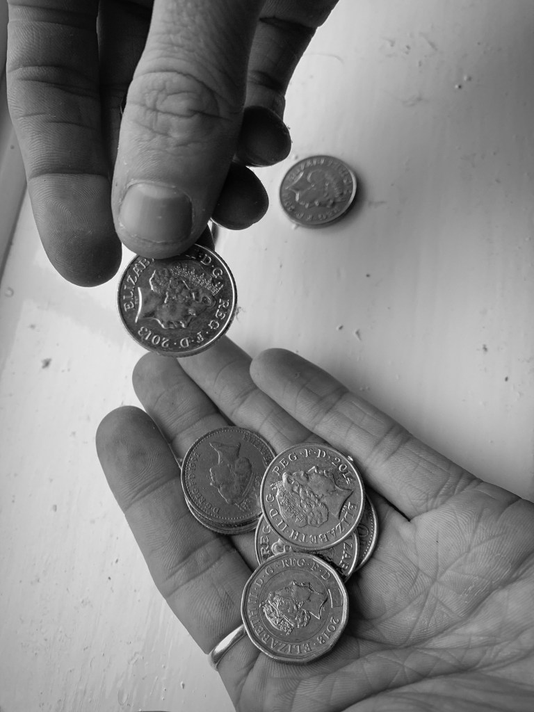
From experience, in our home we have a change pot you use it for bread and the basic essentials, however sometimes this is actually what people only have to provide them with the basic needs.
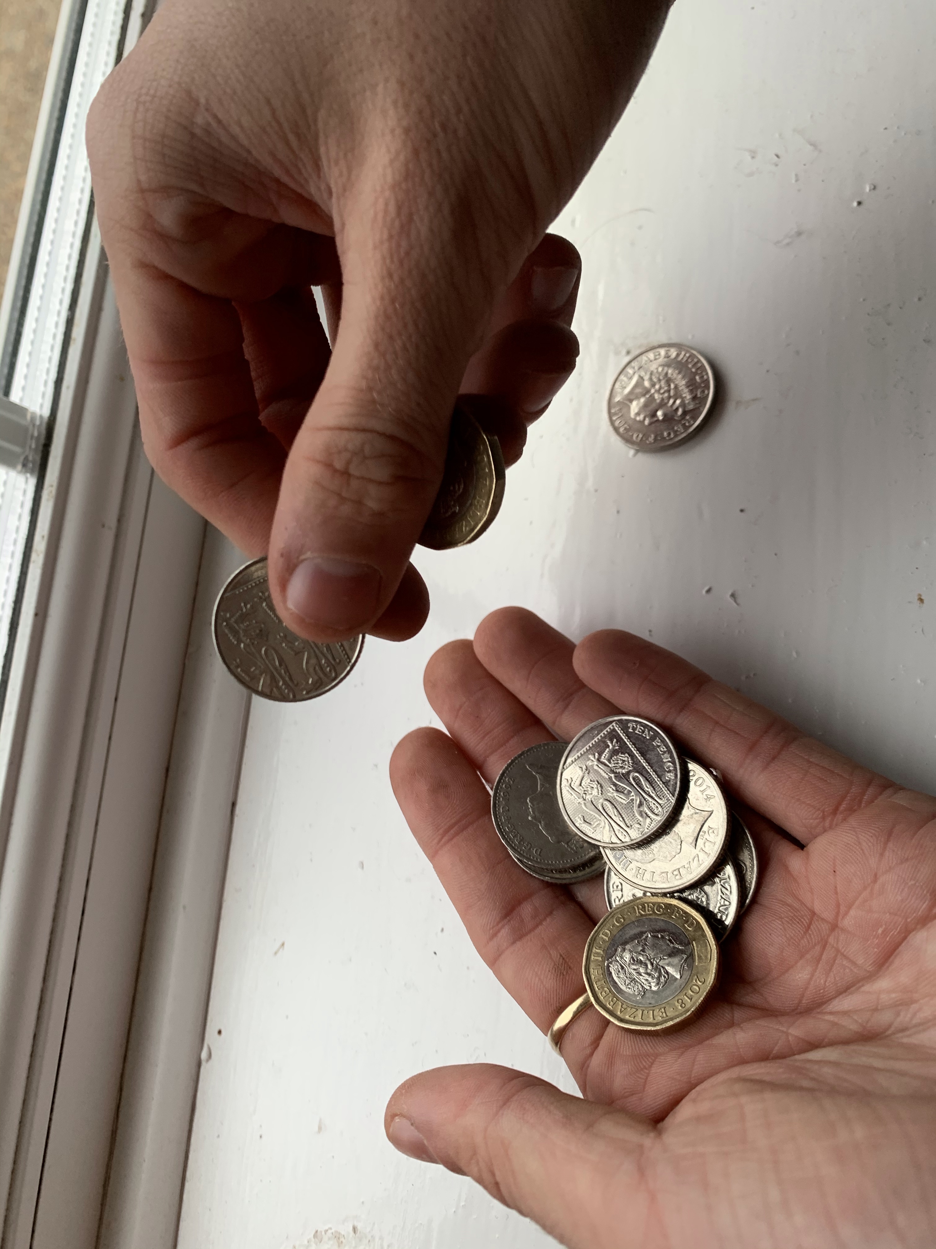
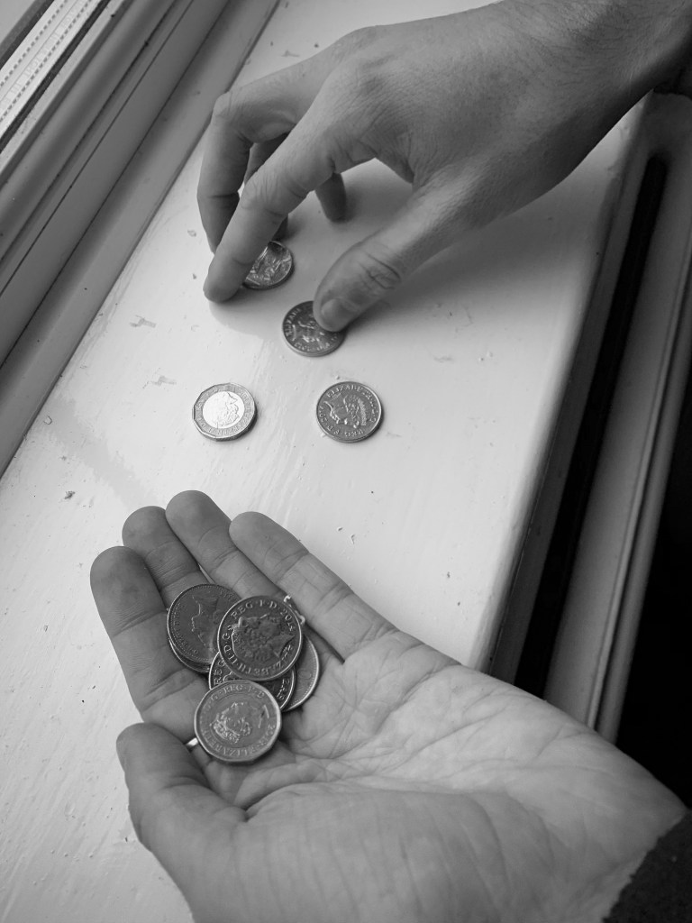
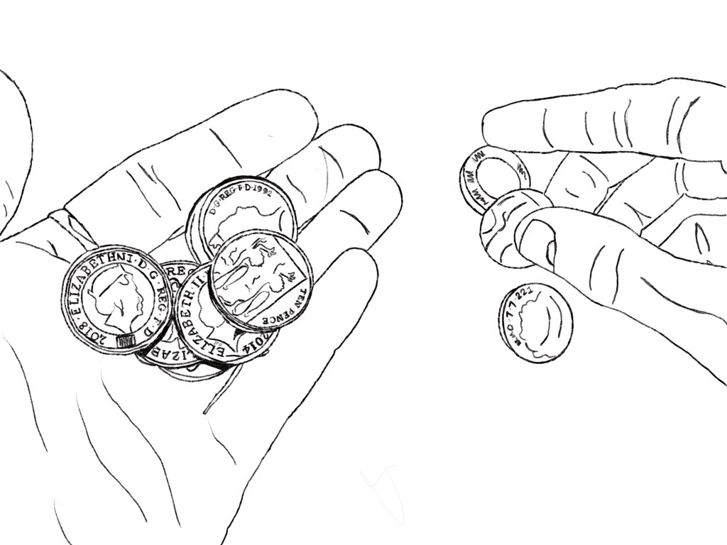
The first photo I took was this one below. This displays someone looking for lose change. I did not want to look like begging so he isn’t sat on the street, he is trying to collect lose change for bread and milk (as an example)
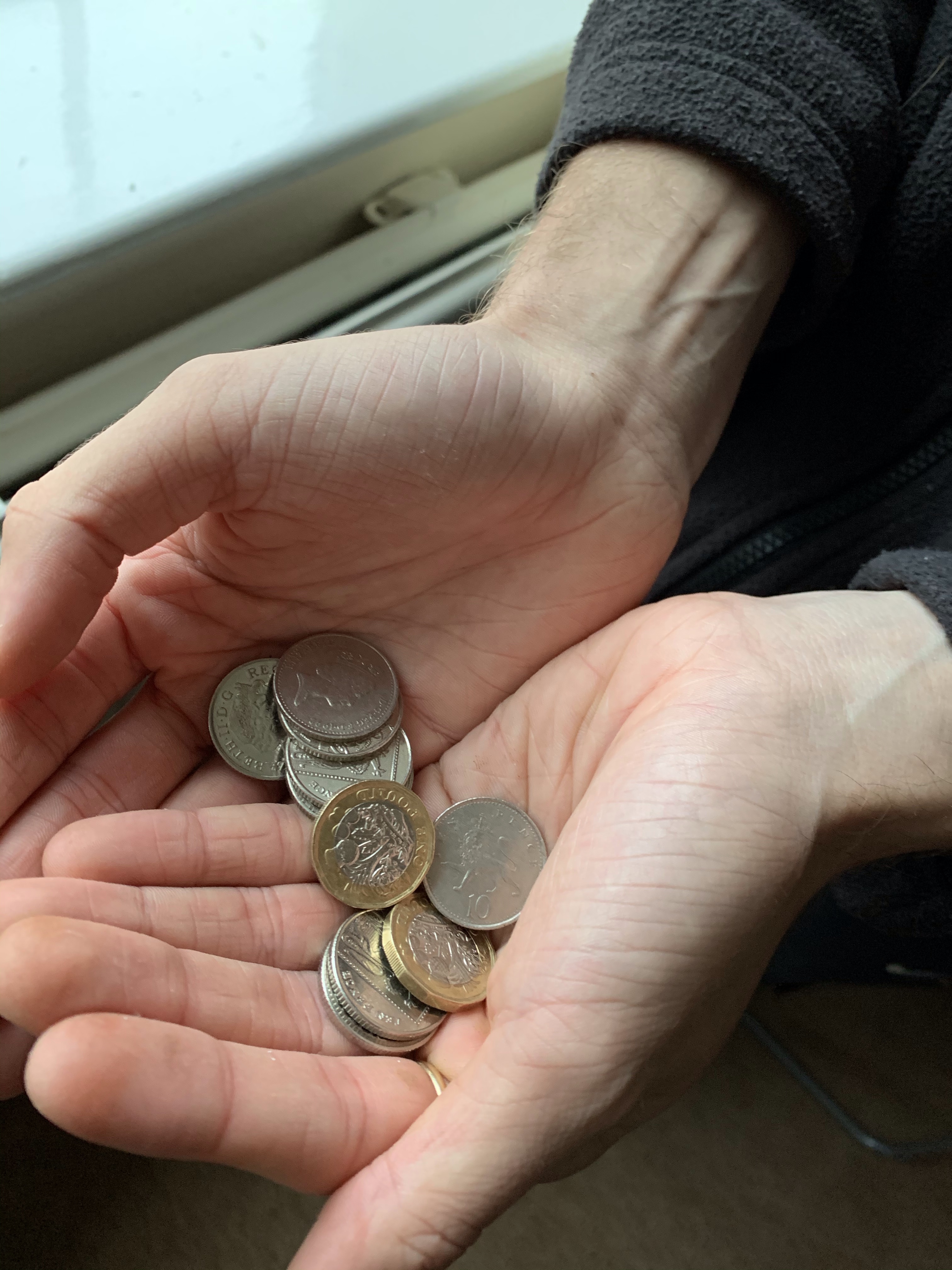
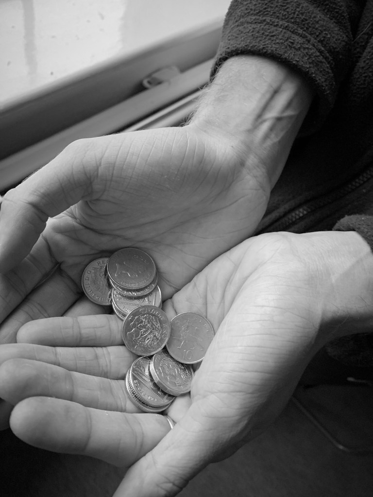
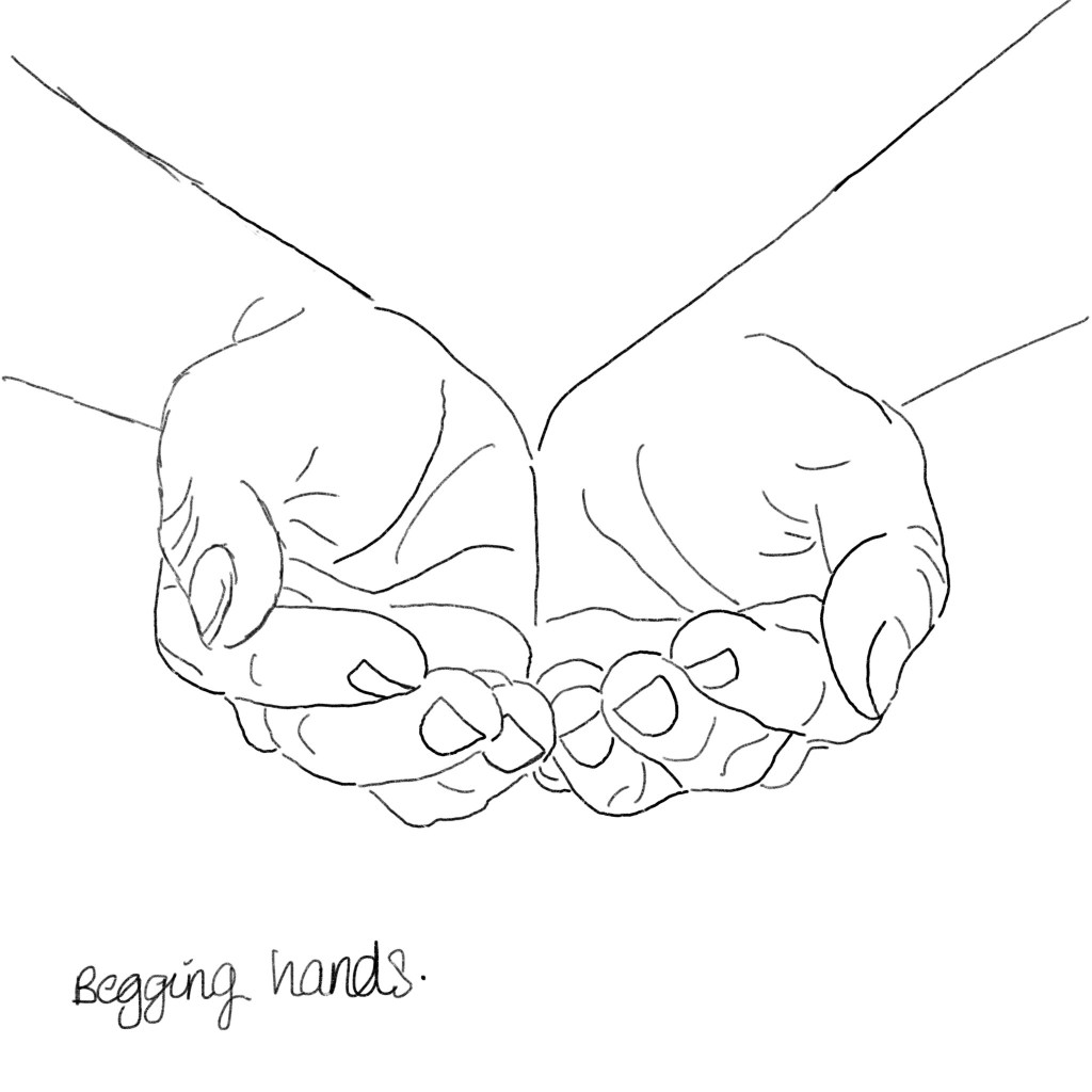
I wanted to photograph someone holding the money but not begging for money, to indicate people living on lose change. Therefor explains the next photograph. Within this photograph the subject displays him holding some loose change, and this spreads over both his hands. this indicates looking for loose change for essentials, and not begging or really asking for help.
I then like the other photographs decided to make these images turn into black and white as this then portrayed a continuous meaning through the designs. I used the same PS app on my iPad to make the black and white theme so I knew there would be consistent through the deigns. At this point I was unaware of what photos I would use but to me they all portrayed life of poverty in the house gold and portrayed emotion through the colour choice and subject choice.
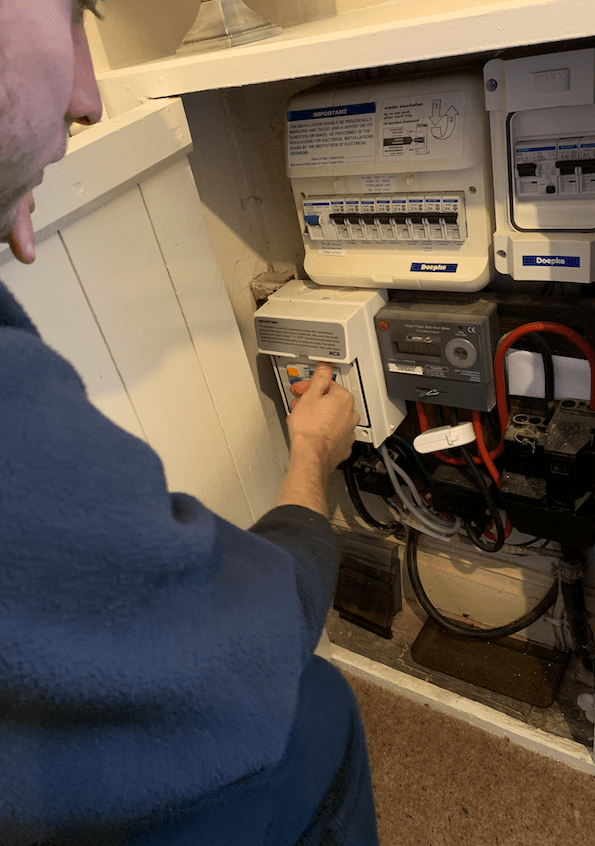
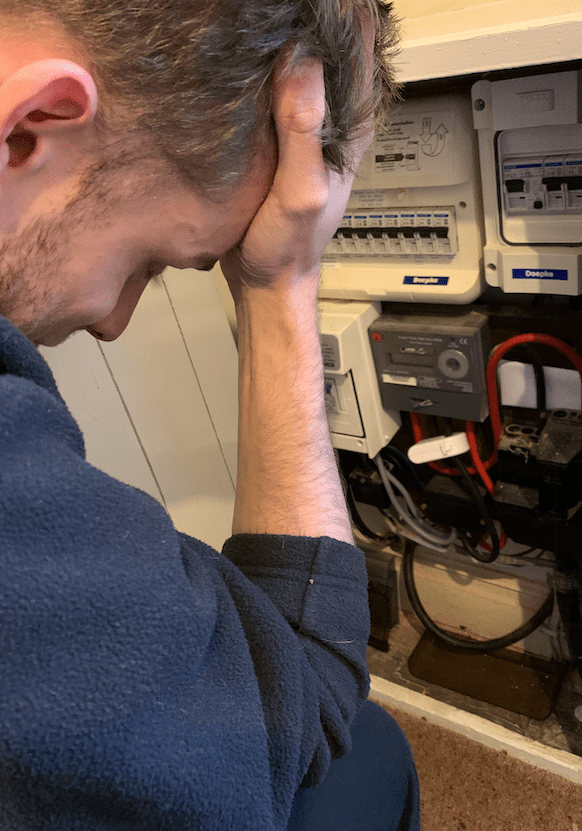
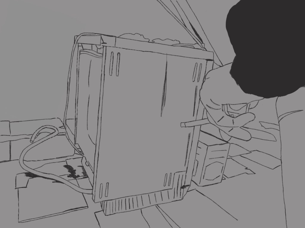
I then decided to take photos of gas and electric. From personal experiences this was something that happened a lot at home, and gas and hot water was an issue. I remember coming home when little from my nan and grandads and we would have to wear our coats until the boiler would heat up providing us with heating. This is something you do not think about when suggesting poverty therefore I thought this would be beneficial for my design as its all about making awareness. In the living room there was a gas box and jack was sitting near it I turnt my head after taking the first set of photos and thought “this could be a perfect way to capture life in poverty to people”
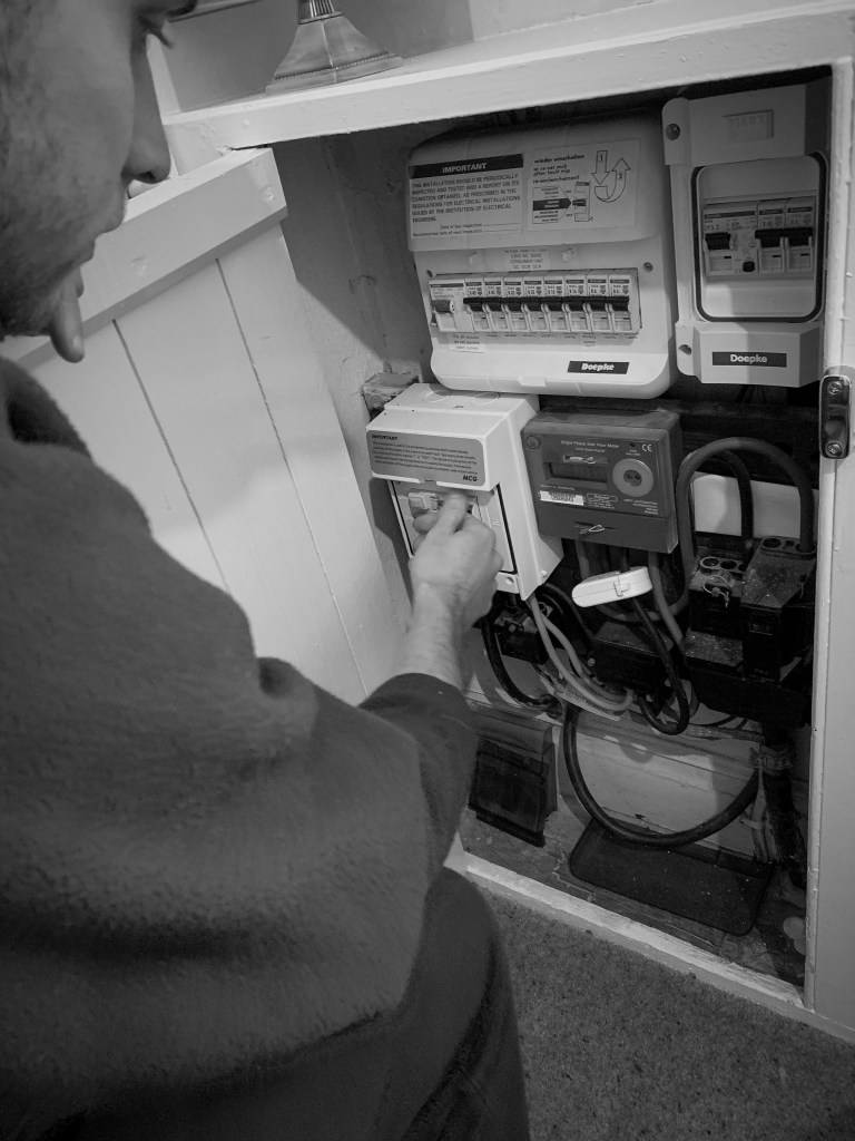
The first image displayed at the top shows the subject fixing elements of the metre. I wanted it to look like he was trying to fix a problem with it. Therefore I think this showcases that well.
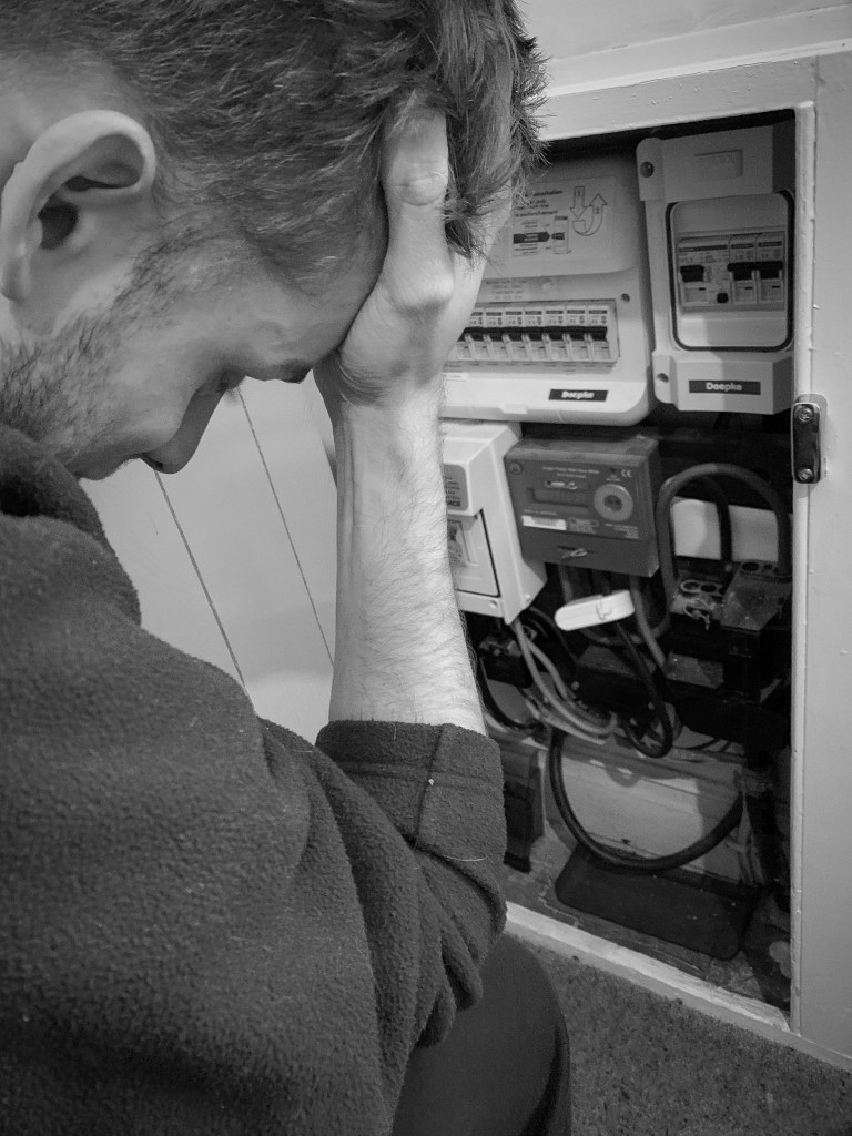
I then thought that the first photo did not show the emotion that comes along things like this not working. Some of us take gas and electric and heating for advantage and do not actually think about the cost and the issues that some people face. The top image displays a problem with the metre and the subject trying to fix it, then the bottom one is almost displaying the after effect it has on the subject because it cannot be fixed. I made jack put his hand on his head as this indicated a sense of struggle and desperation. I wanted to portray through my photography the sense of alone and the need of help and this was going to be continued through all the photographs I would off taken.
Again, it was time to make these images black and white. When I made them black and white it enhanced the emotion of struggle and desperation. You could still see al the elements but the black and white made it more depressing and created a atmosphere around the design.
Out of the two, the bottom one had the biggest affect with adding black and white personally speaking. You could feel the emotion pouring off the rage, indicating desperation and being tired of living like this. With the subject leaning on the floor, with his hand to his head, with his head down made this photo tell a story without any words needed to be presented and that was the aim of all my photographs together.
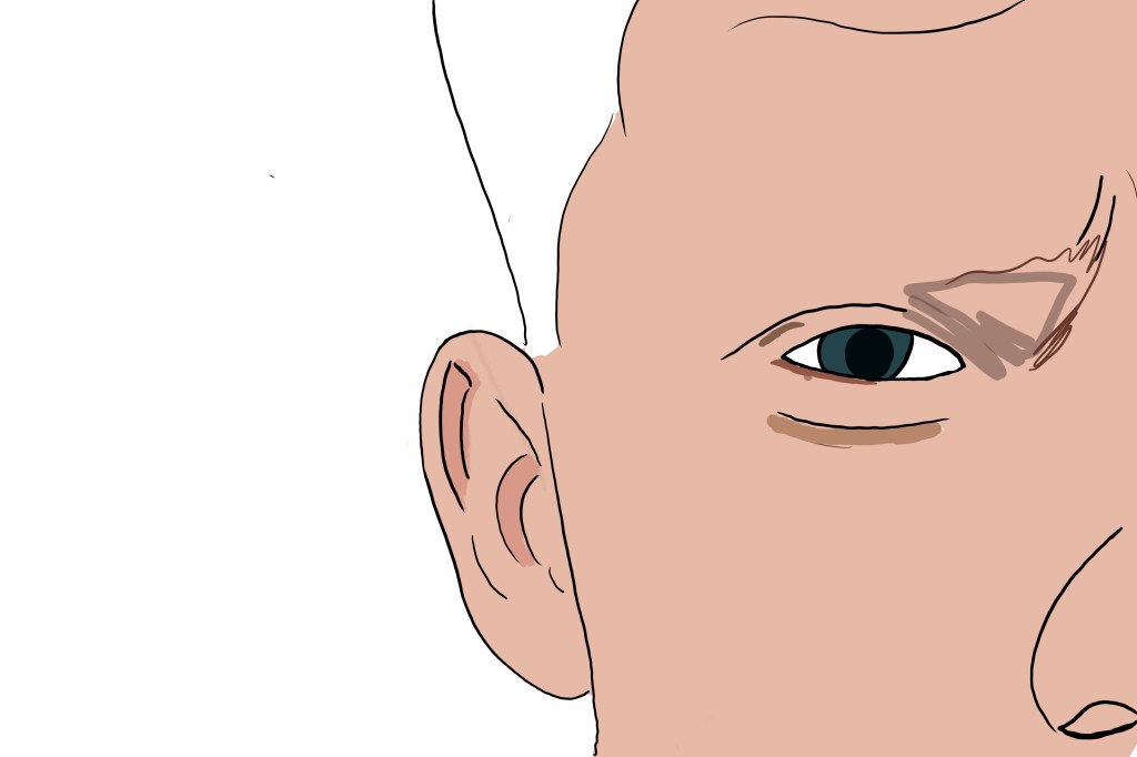
I then decided to take a few outside, to be featured in the magazine and show a link between the posters. (this is when I took the photograph of jacks eye used in one of the main posters) All these images below were taken in the garden, and the camera was angled a certain way to make sure you caught the right elements that portrayed poverty in the UK.
Few of the non edited photographs:
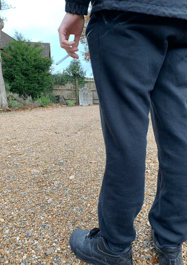
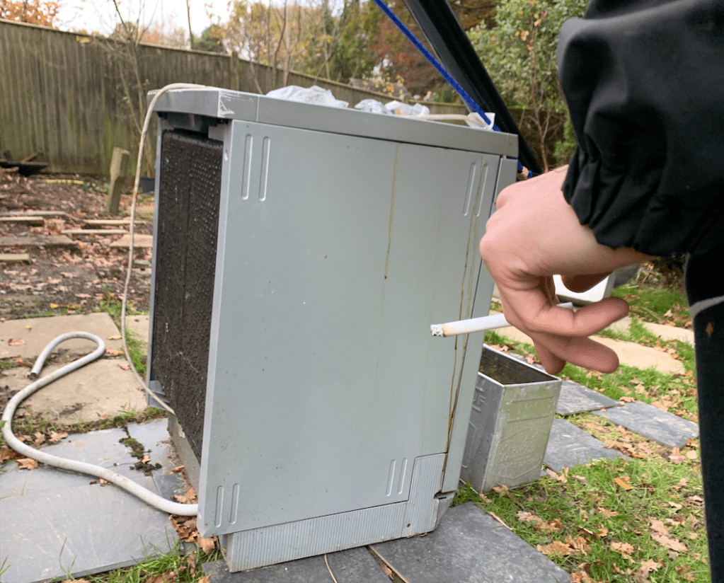
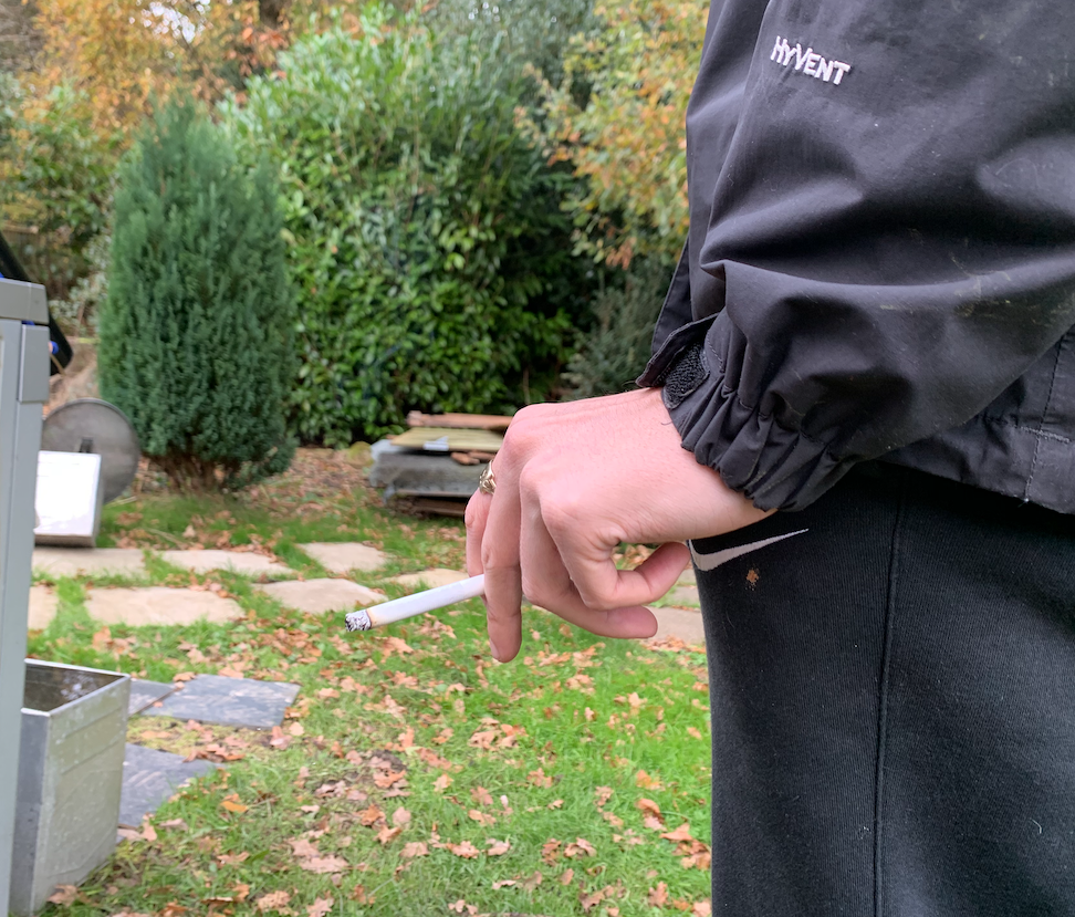
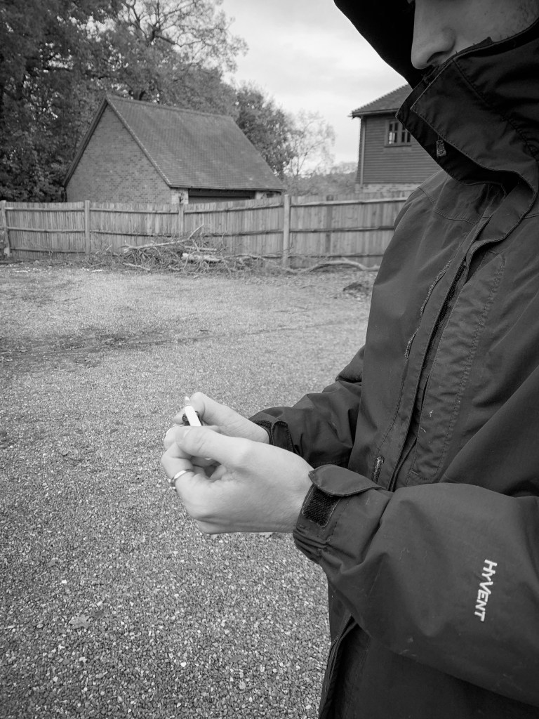
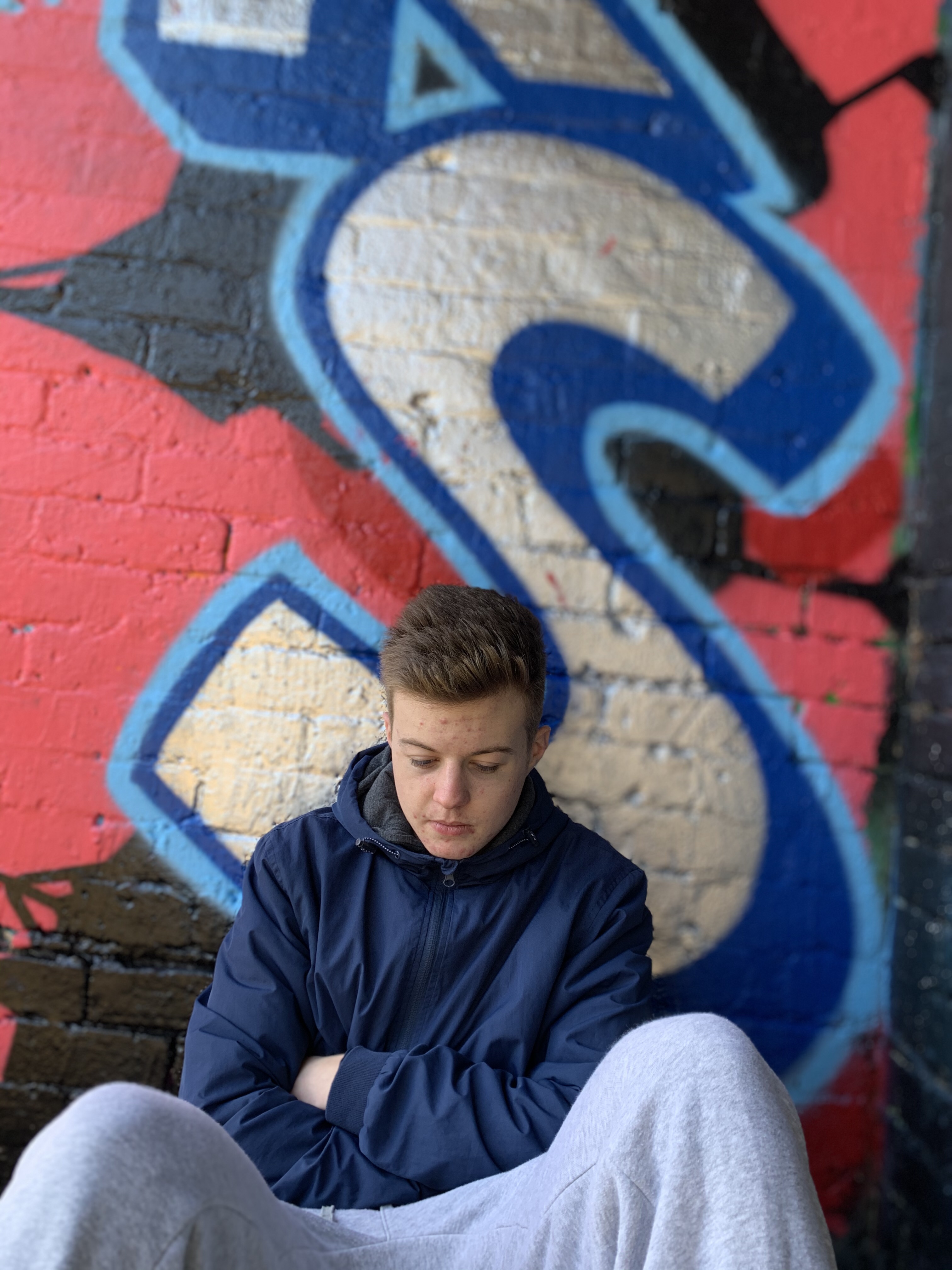
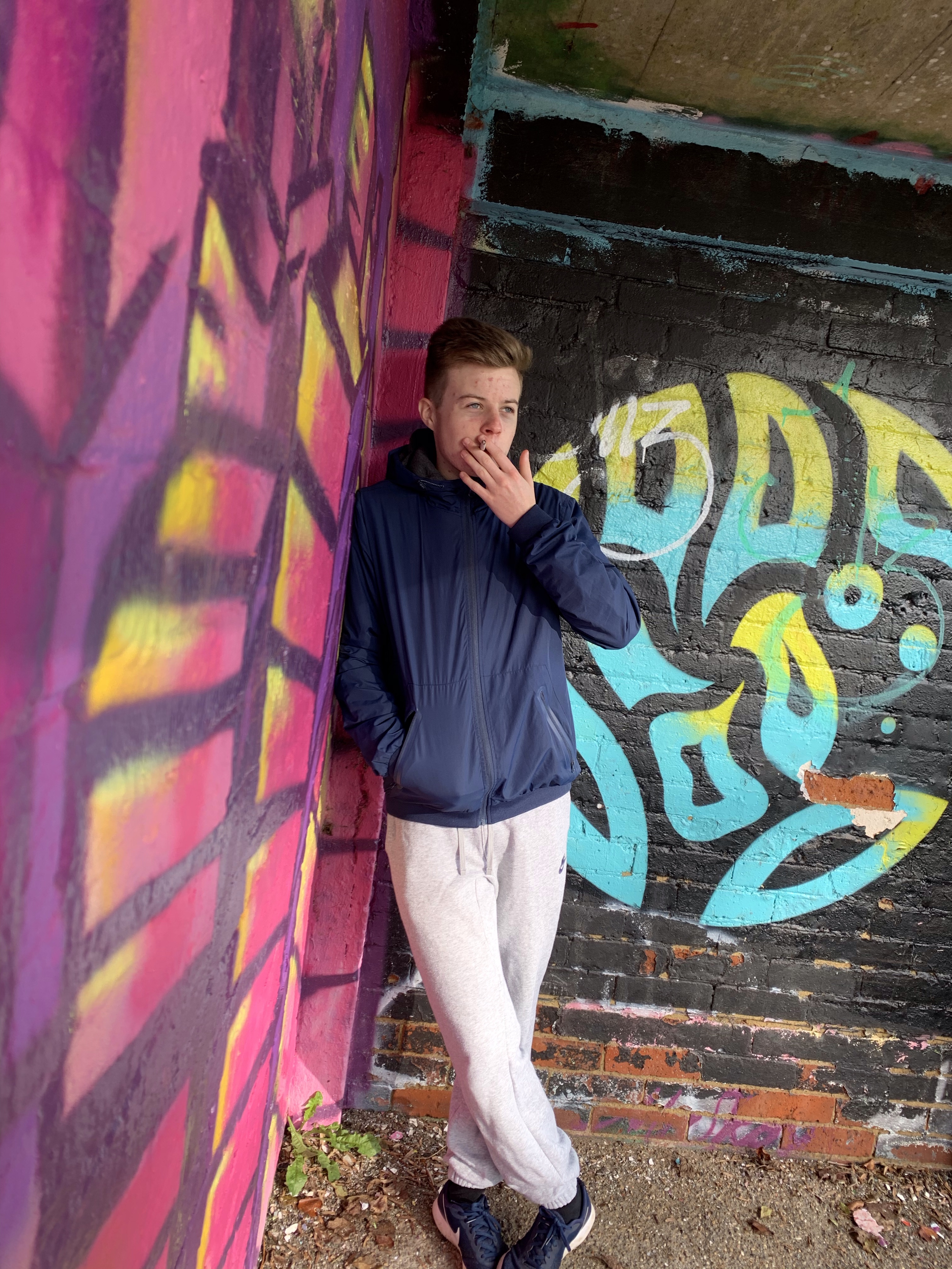
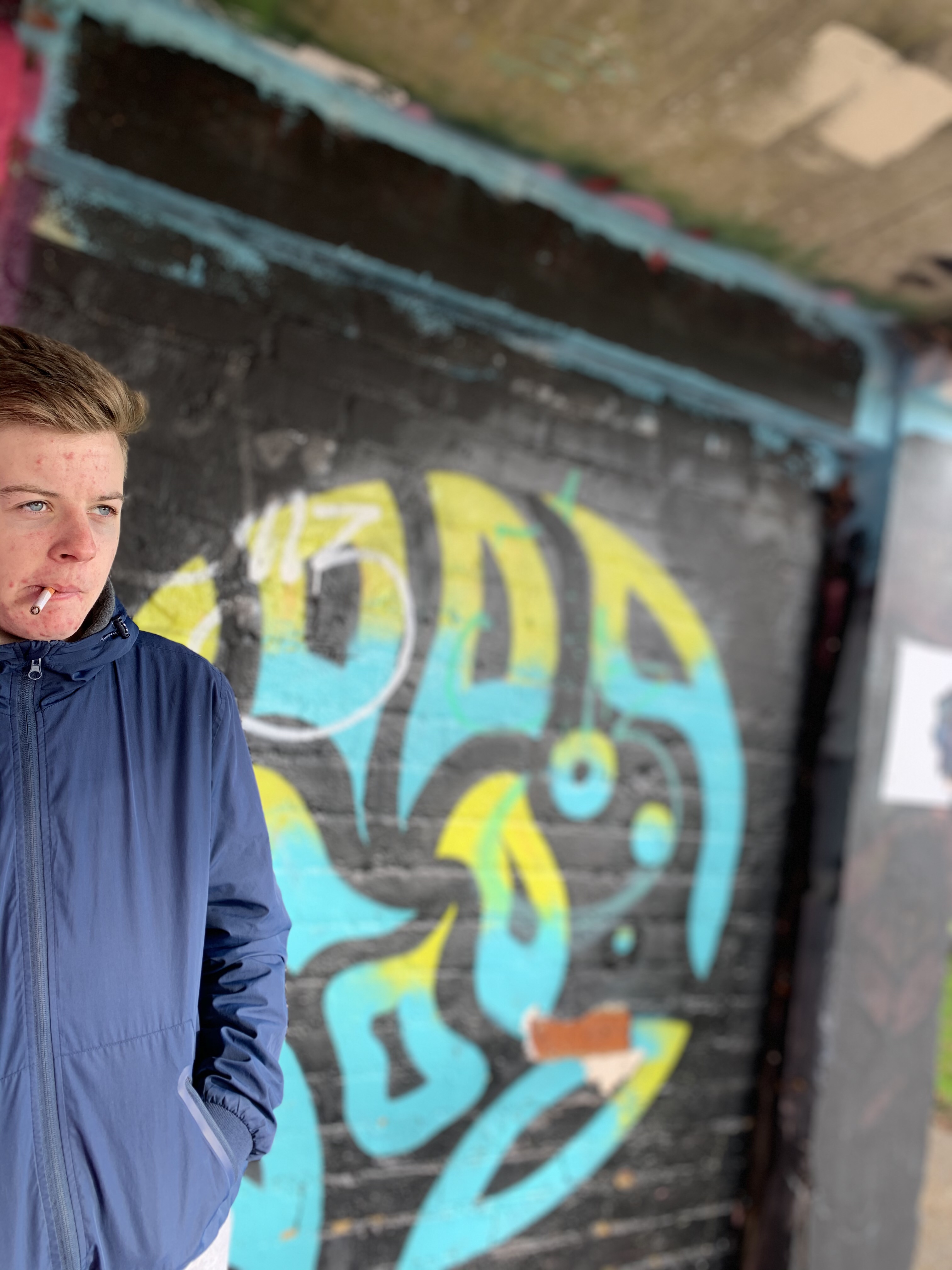
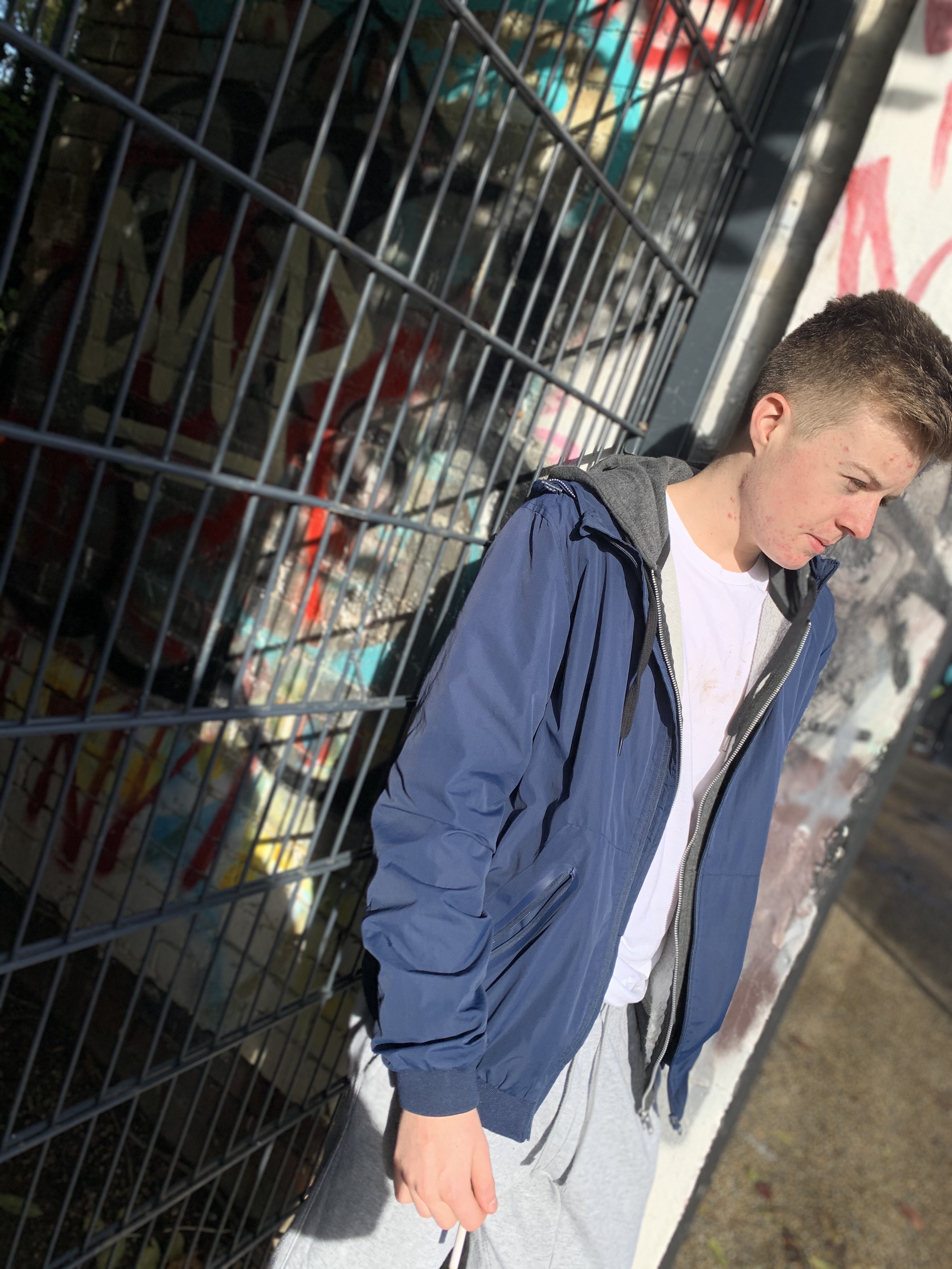
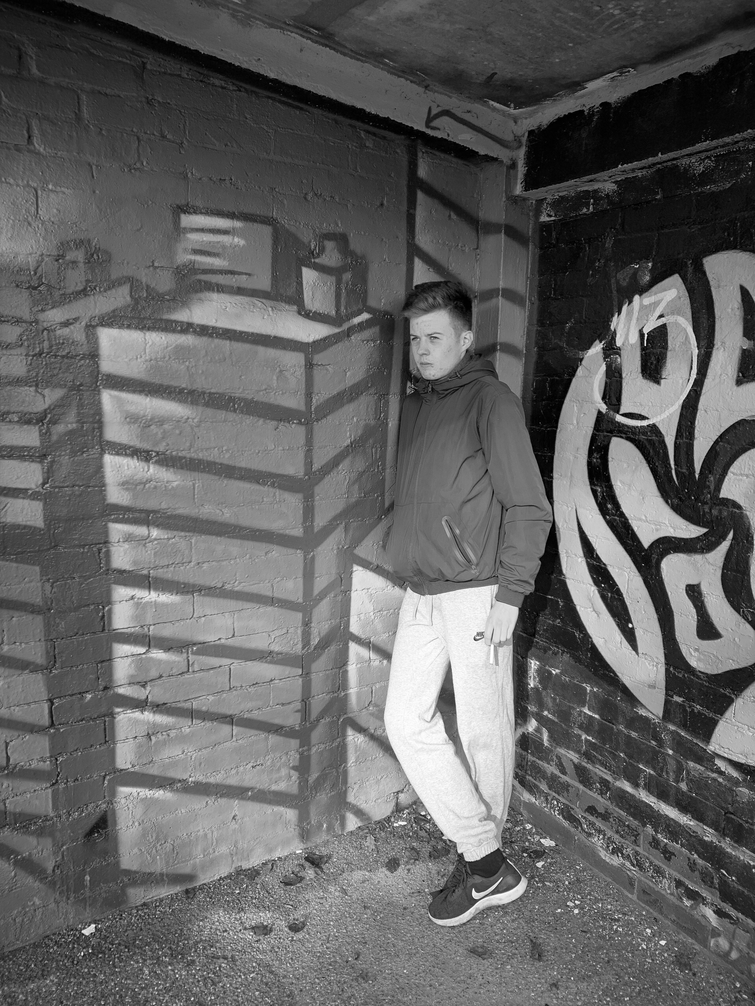
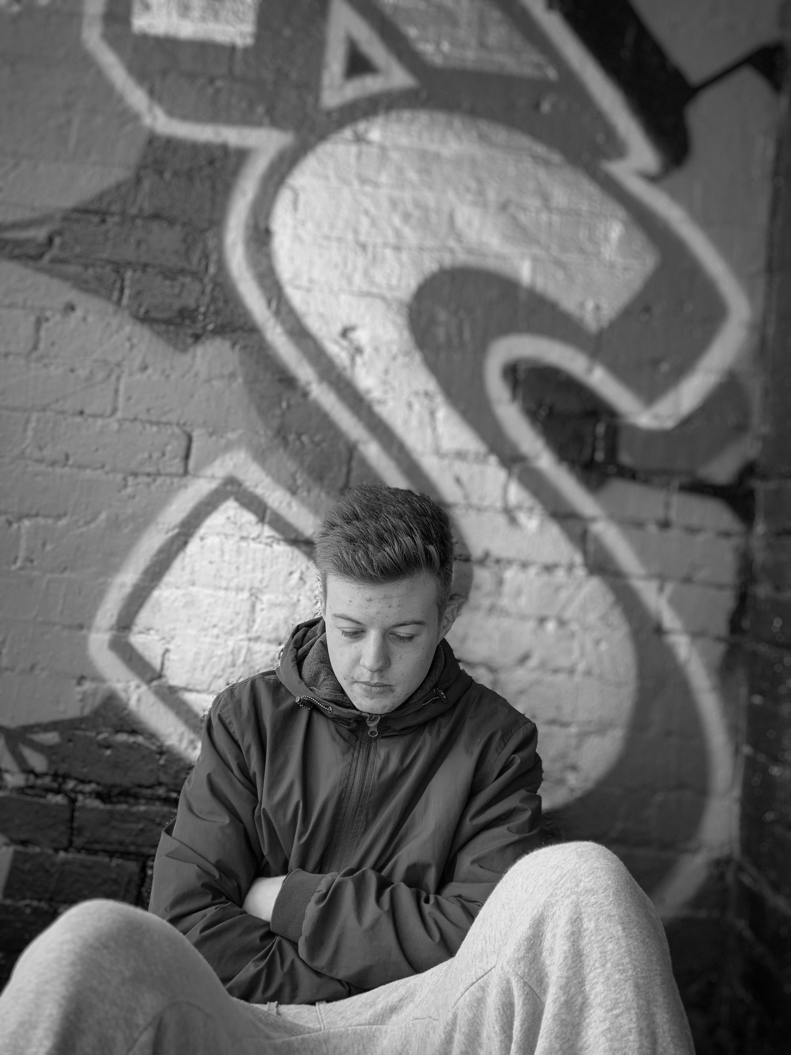
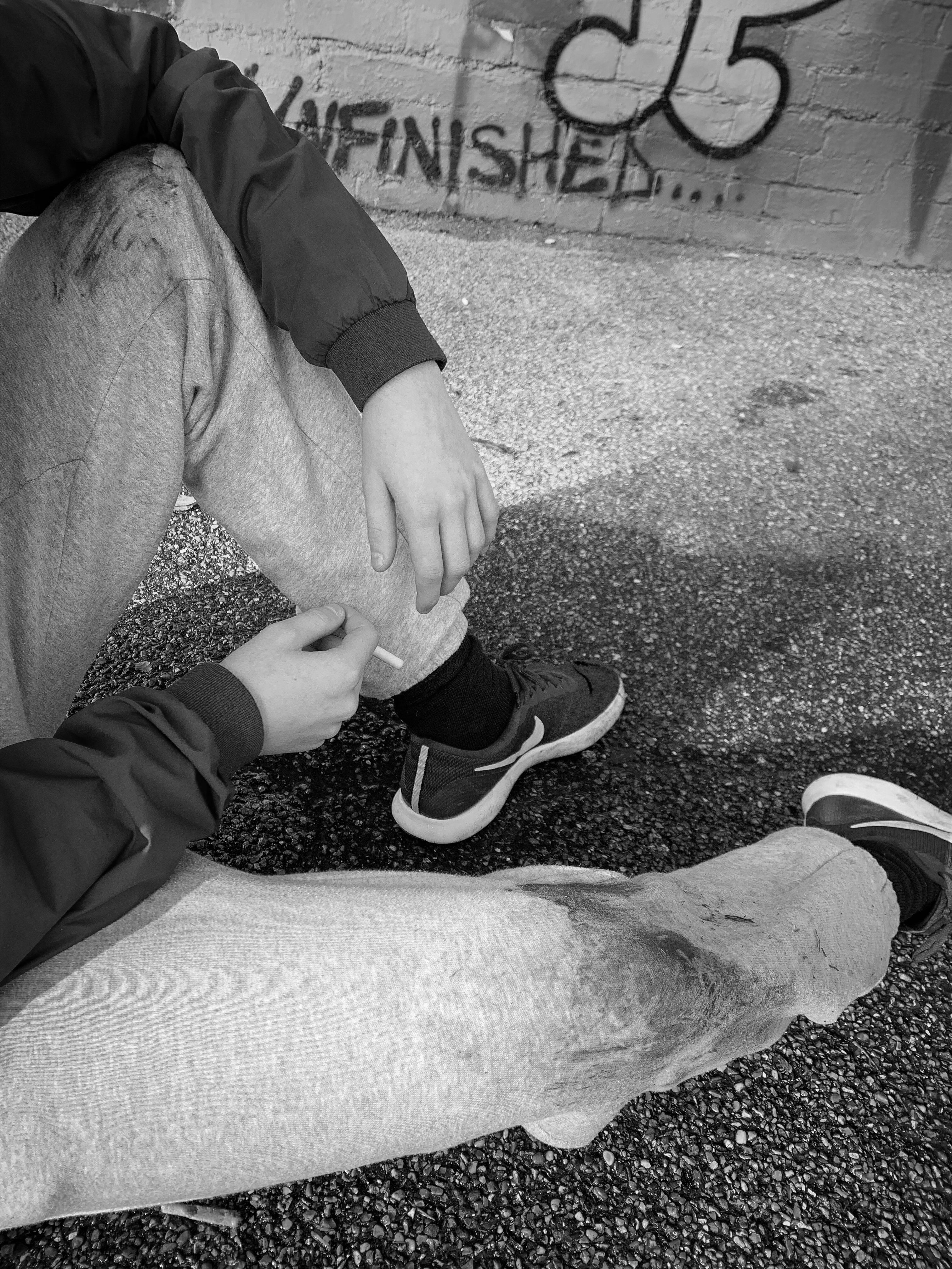
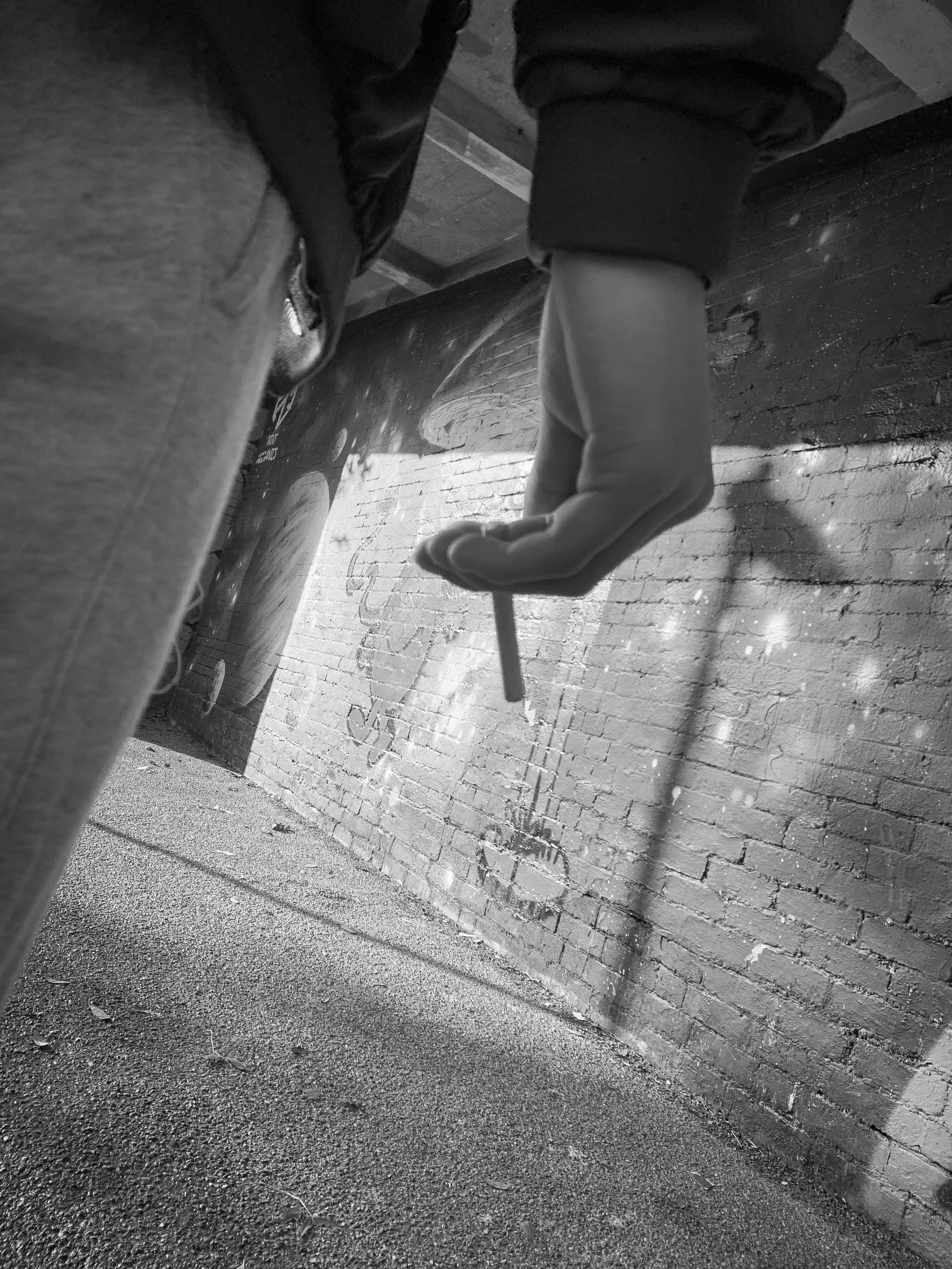
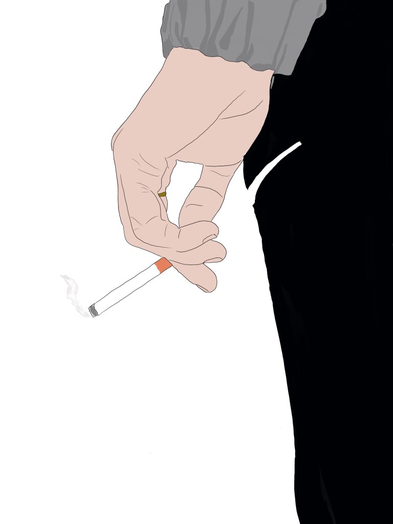
Below are just a few that I took to give you an understanding of the type of atmosphere I was going for within these designs. When I took the first set of pictures there was one of my brother with a fake cigarette and it was angels up so you could just see the cigarette and the background was blurred creating depth of field. I then wanted to continue this through some of the designs and use this as sort of an act of boredom displayed. the cigarette symbolises boredom, and wasting money on the not so important things in life. I shot different photographs in different scenarios to display this, I made sure it looked rough in the background. I wanted to create more photos that displayed objects and materials instead of emotion in faces of what life was like, and these would then feature within the magazine aspect of the campaign.
Some black and white edits
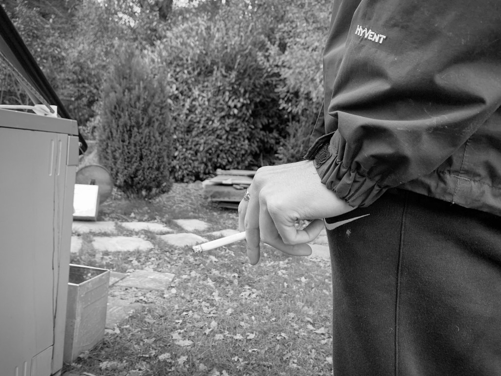
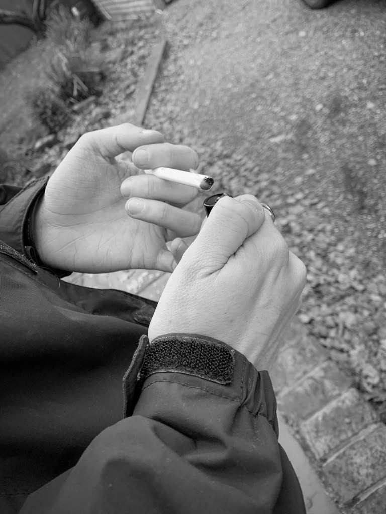
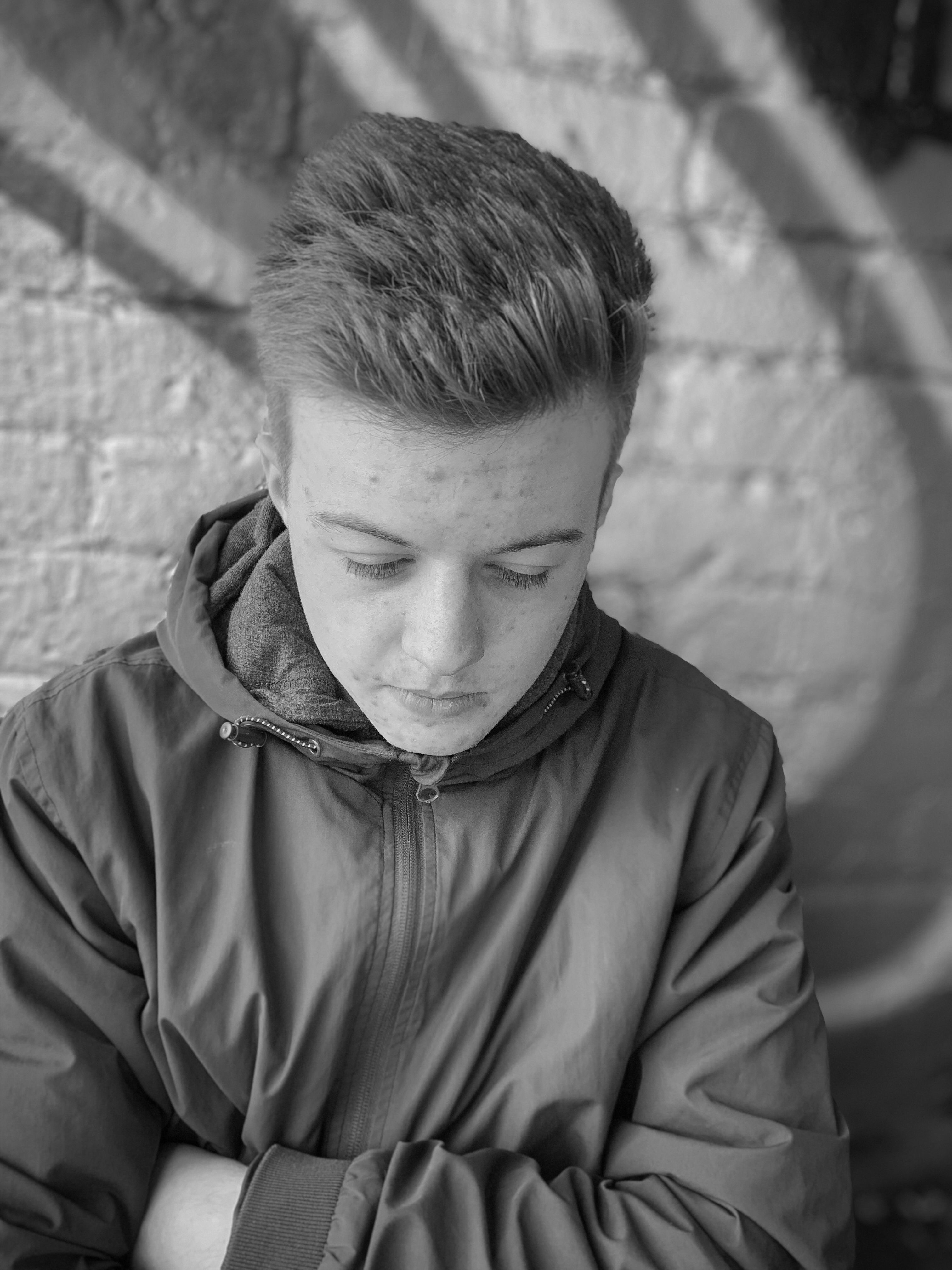
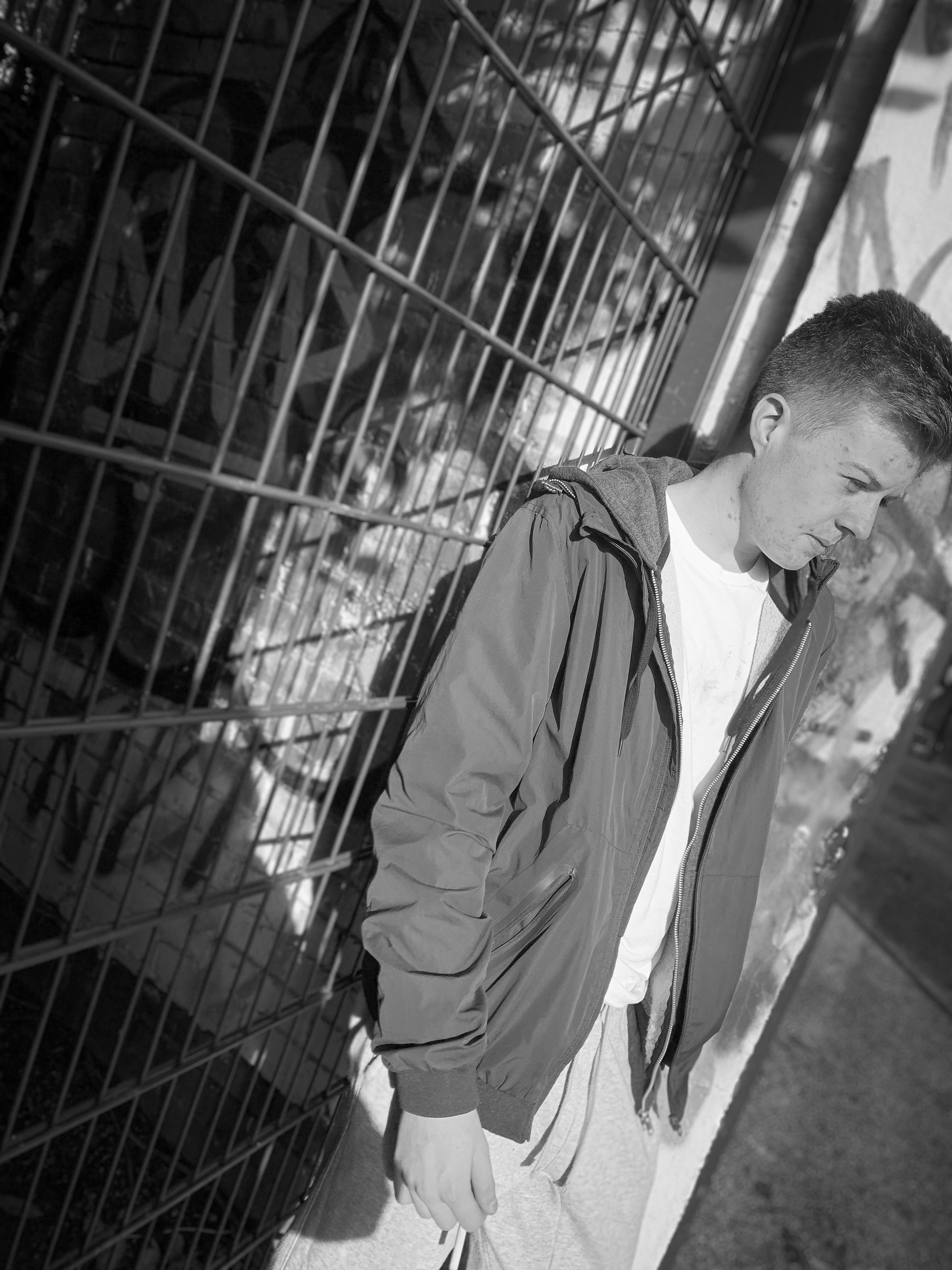
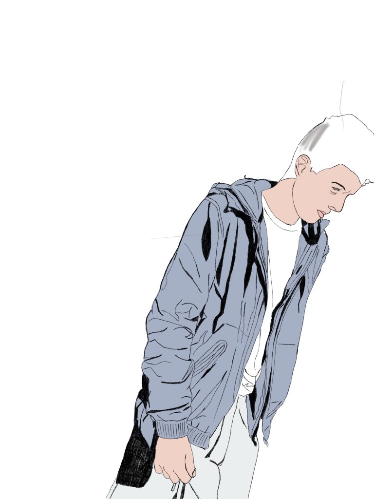
Again, the cigarette was part of the photograph and some of these are from the non edited images above. I shot it from alternative angles, and I wanted to showcase that not everyone in poverty looks like they are and this stereotypical aspect has too stop. This boy has a coat and has a ring on, but his home income makes him sit on the poverty line, And I hope these photos all showcase this some how or another.
Where would these photos feature?
I wanted all these photos to feature within the magazine. I did not want to use them for posters just because personally did not think they were as powerful with emotions compared to the poster designs. I wanted photos that indicated poverty in house hold and I think these photos achieve that well.
I took my own photography for this project as I wanted it to become personal and a certain message through my designs. My brother does acting therefore using him for a model seem appropriate for this as he likes the camera. I did use jack on a few also after the experiment of the first set of photography.
When researching different photography either global or uk the street paid a big impact – in the uk the main purpose in the background was the graffiti and this is what inspired me for the photography I took at first.
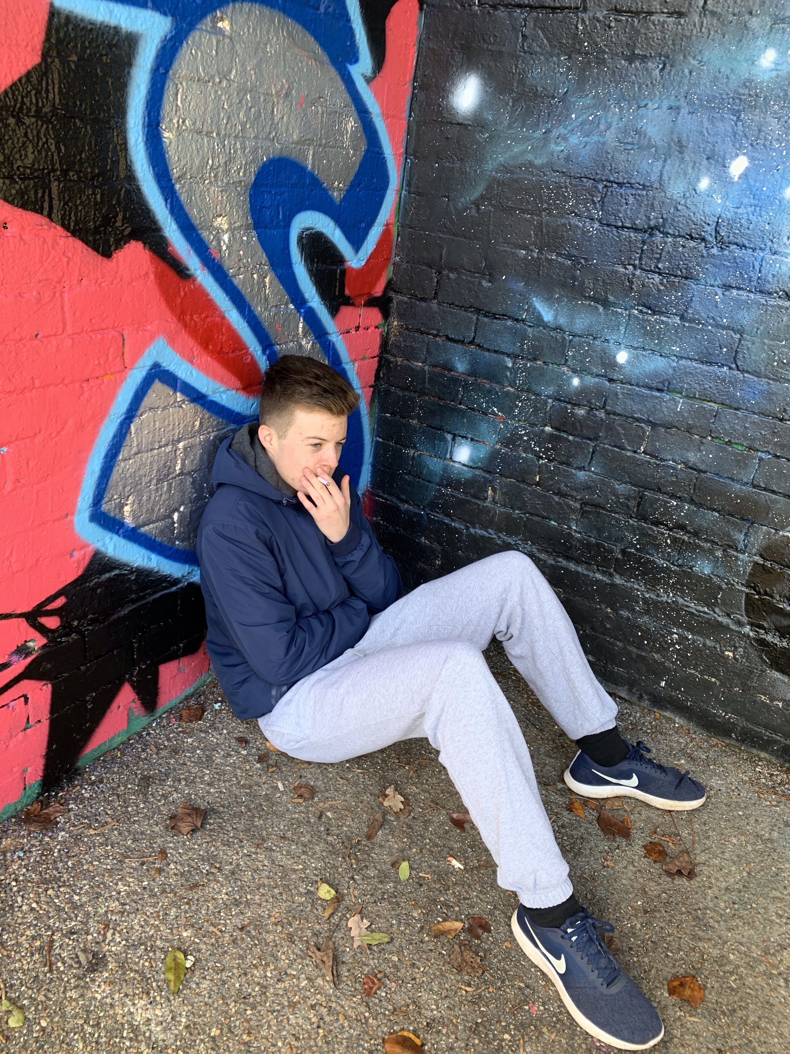
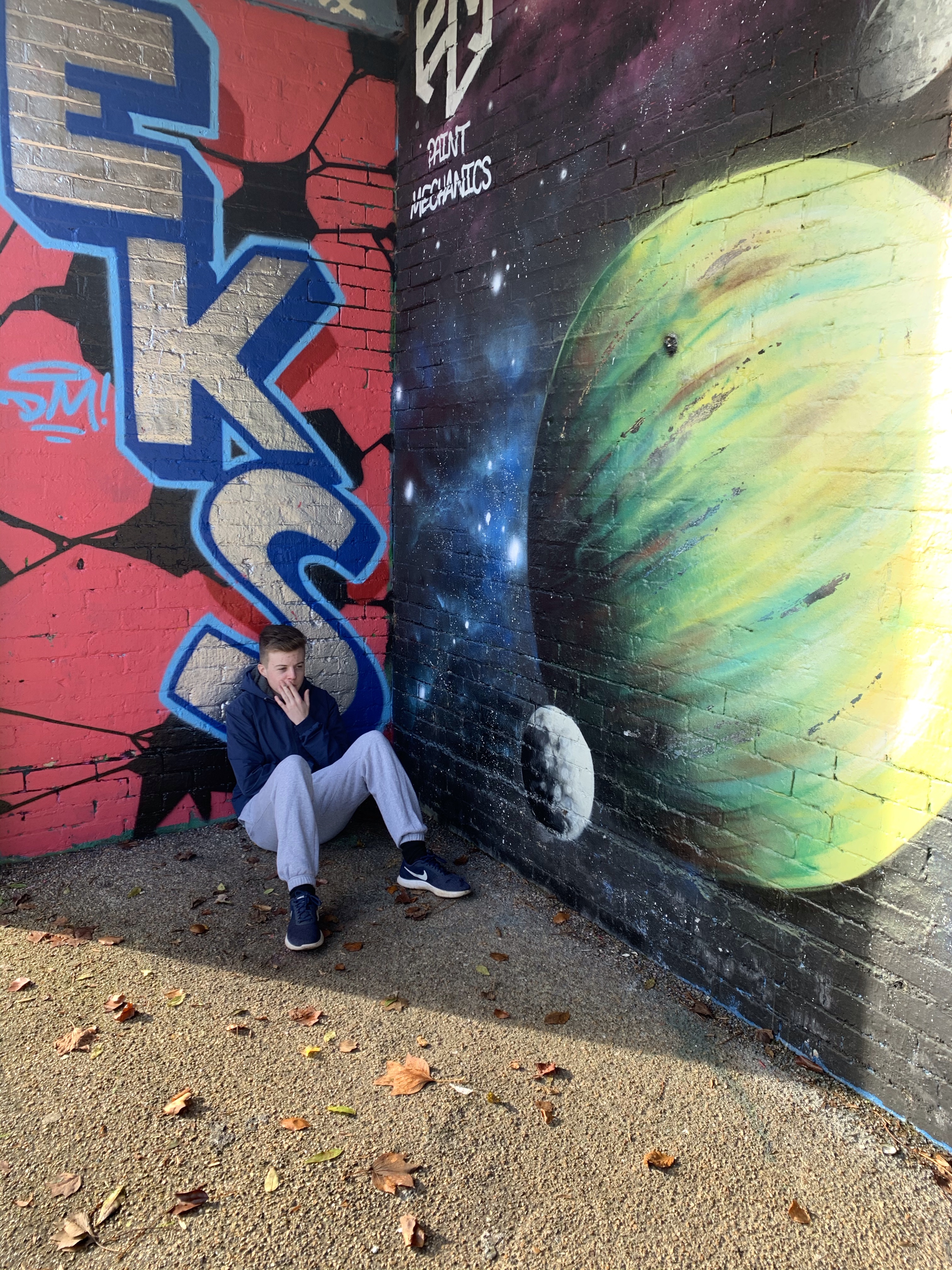
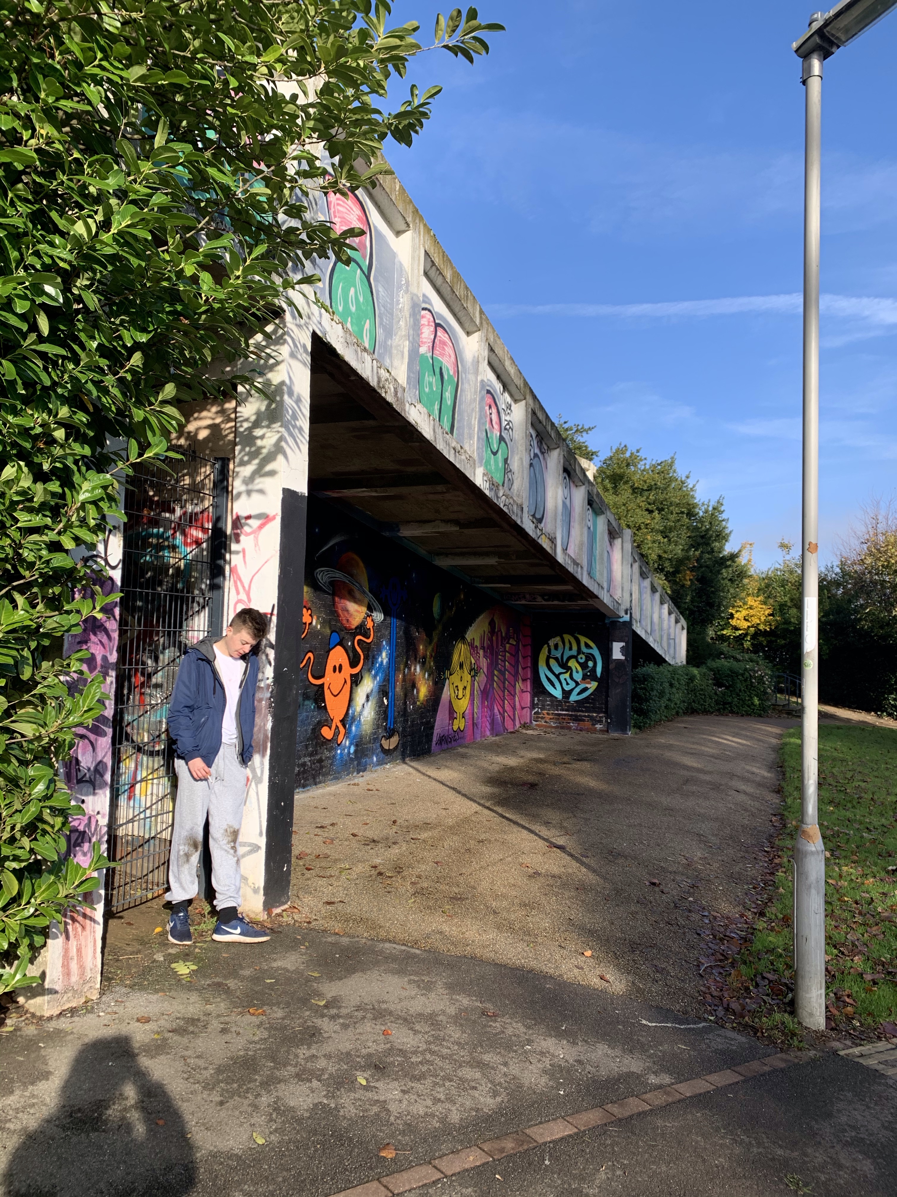
Within an area near my house there is a graffiti wall and is where the photography took place. All these photos are un edited therefore they are bright and bold at the moment. The graffiti wall is huge so we took photos in different aspects and angels to portray alternative images
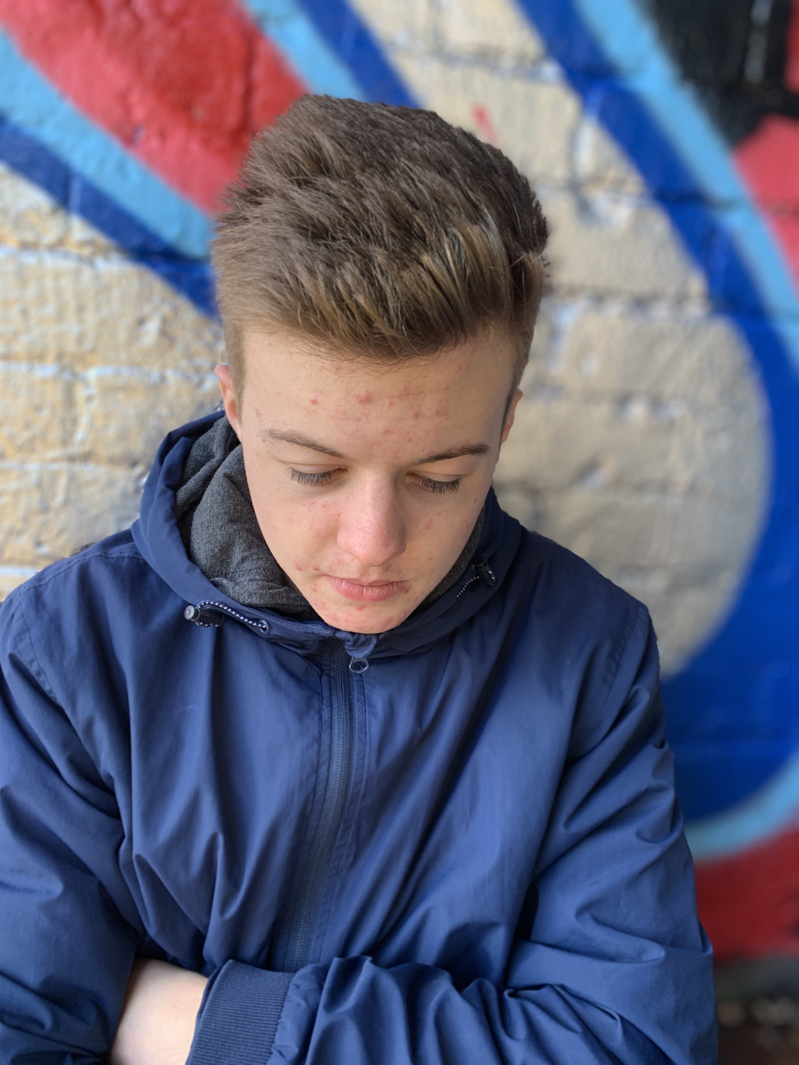
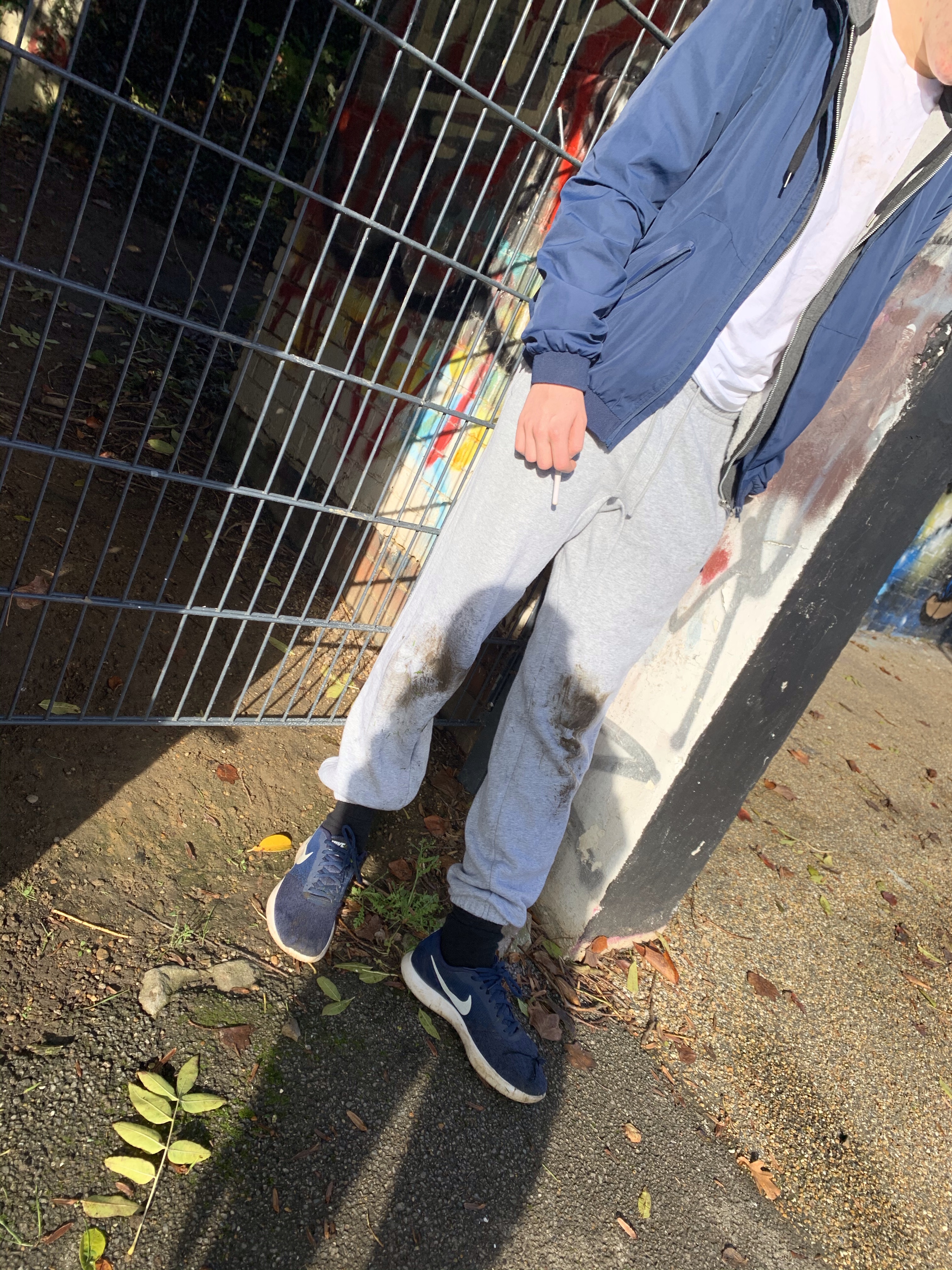
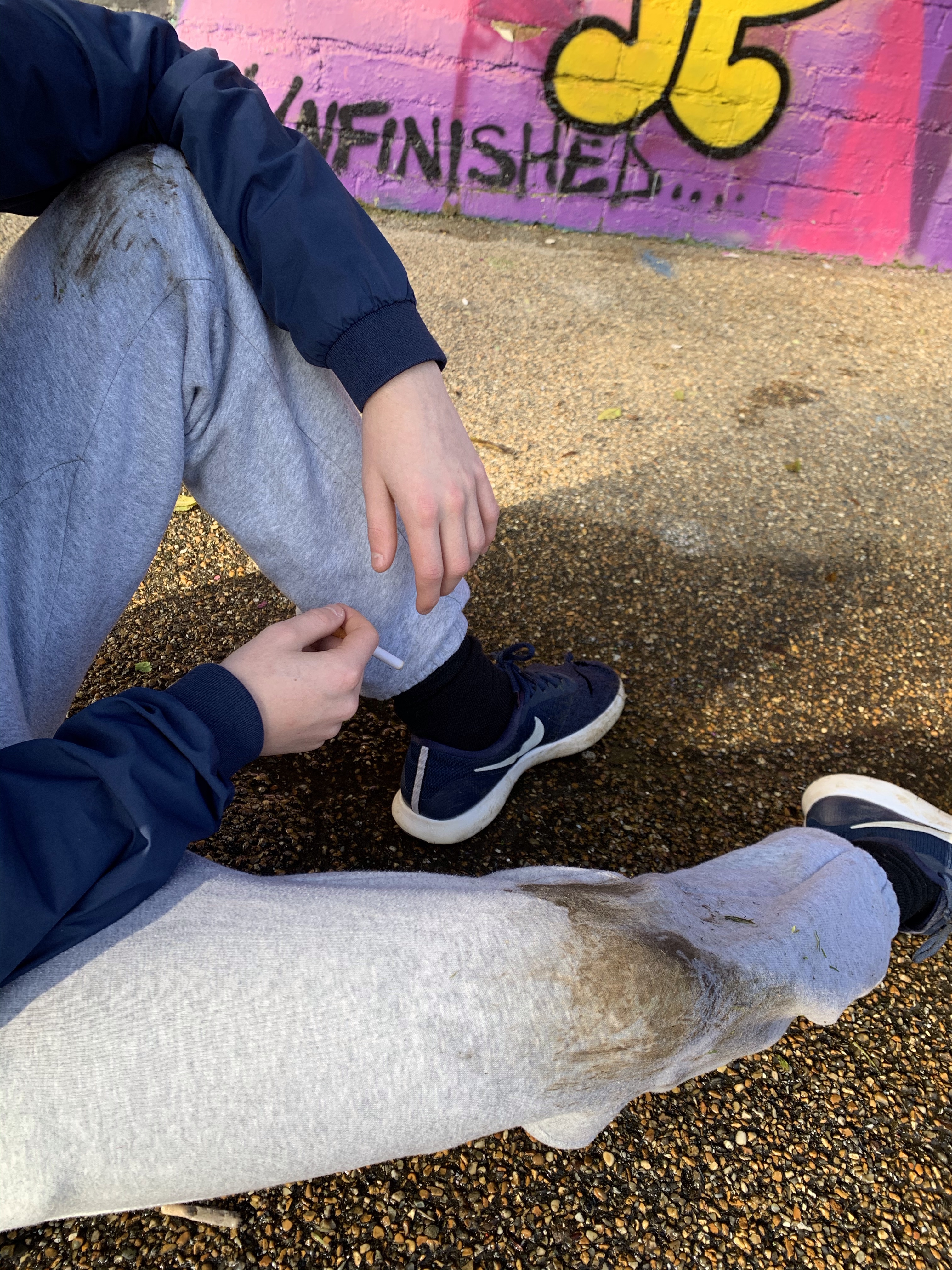
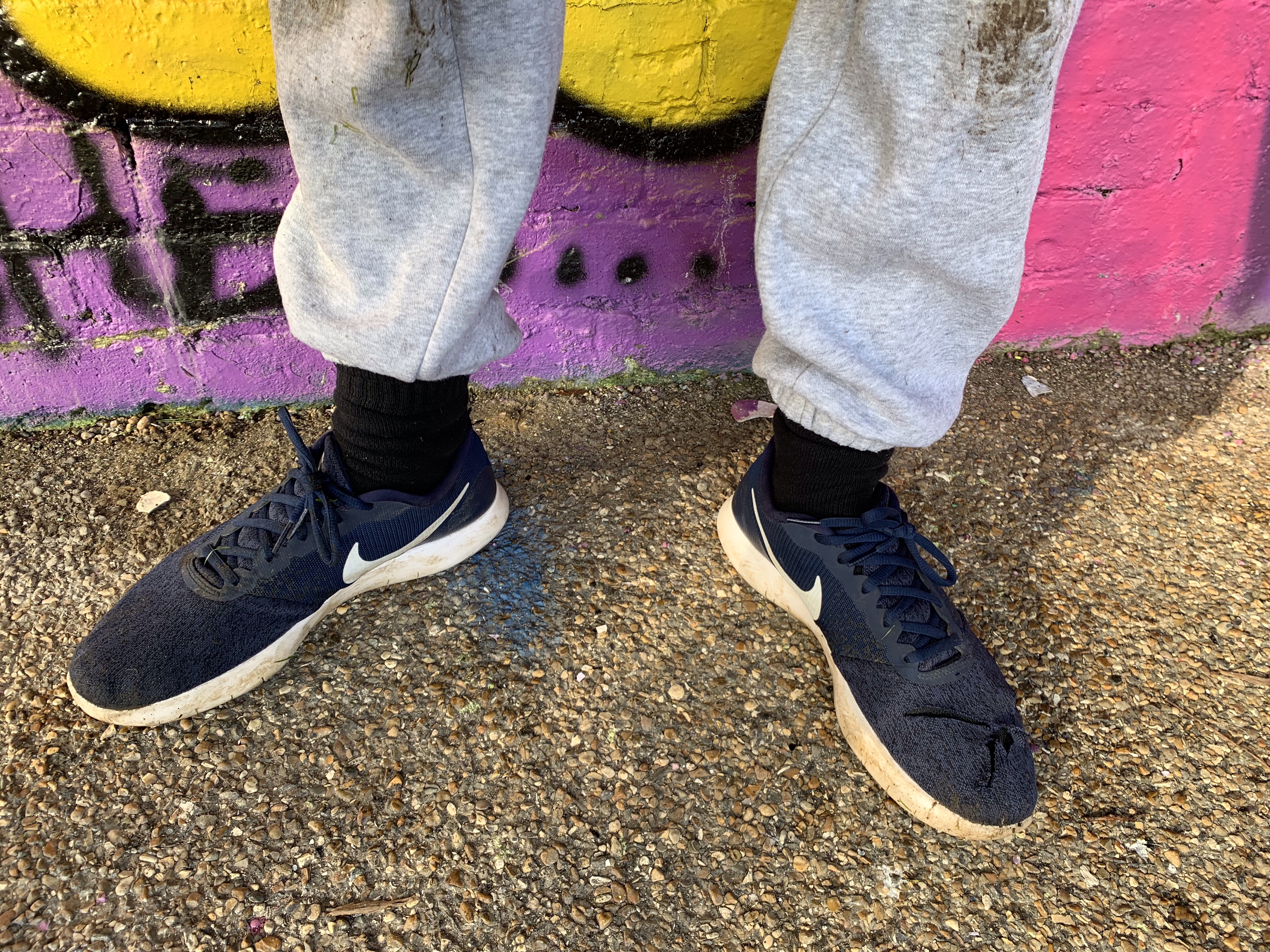
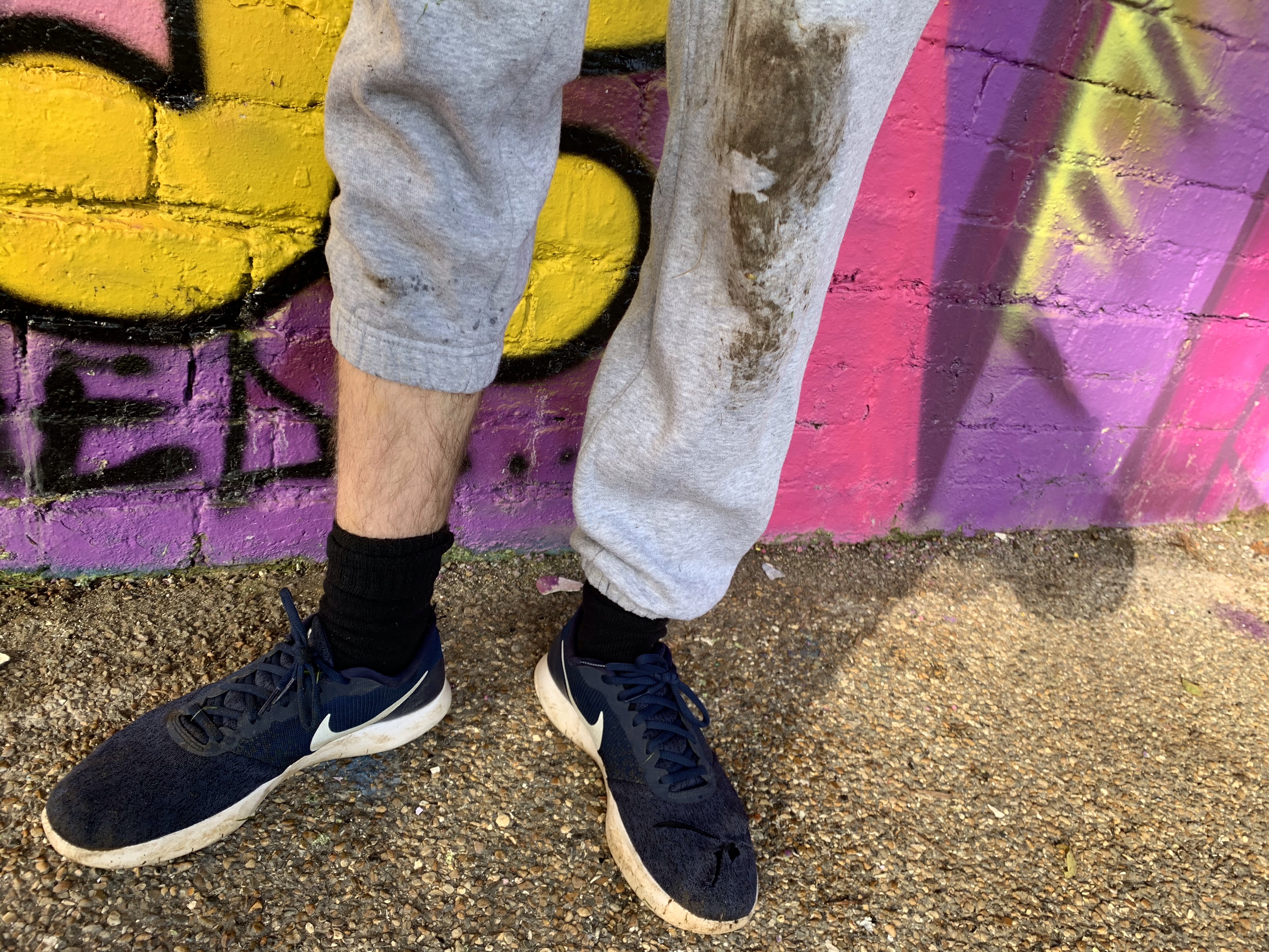
I tried to make my brother look as ‘rough’ as possible he had a fake cigarette which we used in this is… we made him wear old clothes and covered in mud to portray the stereotypical idea that covers poverty. Below are a variety of images with this background – some feature Danny sitting on the floor, others standing up to portray a variety of lights which create alternative meanings etc.
Photos:
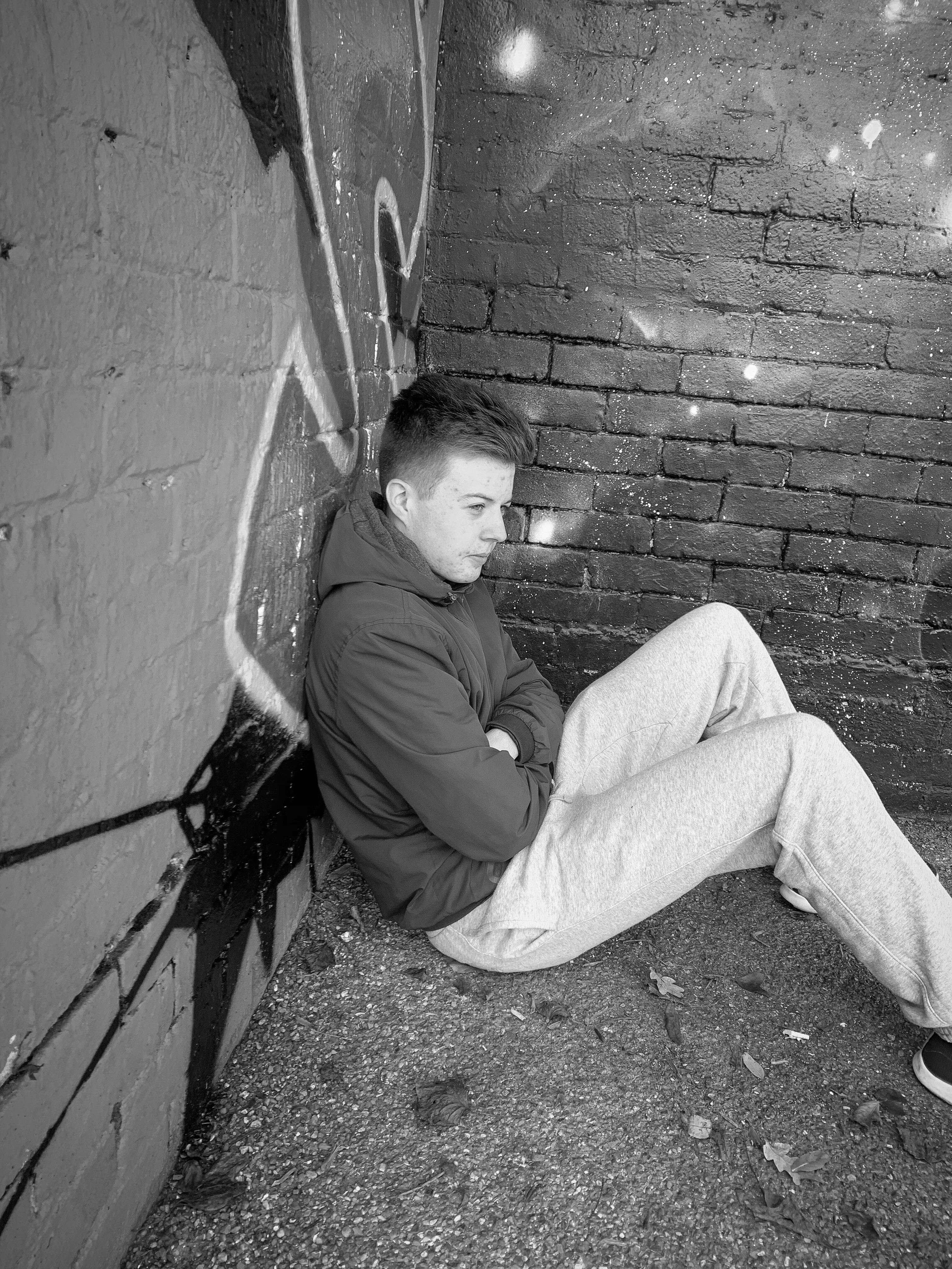
Sitting on the floor | smoking | looking sad
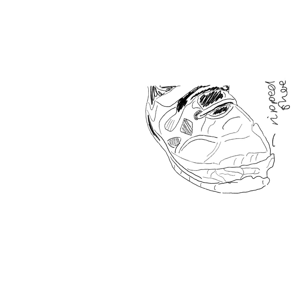
All these photos represent poverty in alternative aspects. I got photos of his face up close, with the background blurred to show some depth of fields which are similar to the photographs I had researched. I photographed, shoes that had holes in, muddy clothing. The purpose of these photographs was to show the stereotypical like of poverty, and these photos represent that, it’s not about being on street asking for money it’s about finding things to do and go on about your day despite the issues you face. These photos to me work so well for poster ideas as they show emotion throughout the persons face.
I wanted these photographs to look depressing as the photographs originally taken were way to bright to portray life through UK poverty. I used an app of my iPad and just made each photo that I was going to use in black and white. Automatically making the photo black and white gave the photos a meaning and through the photos it portrayed an emotion of being in poverty. I think that because the photos had elements of sunshine it made the photos stand out more when adding the black and white and gave them more depth.
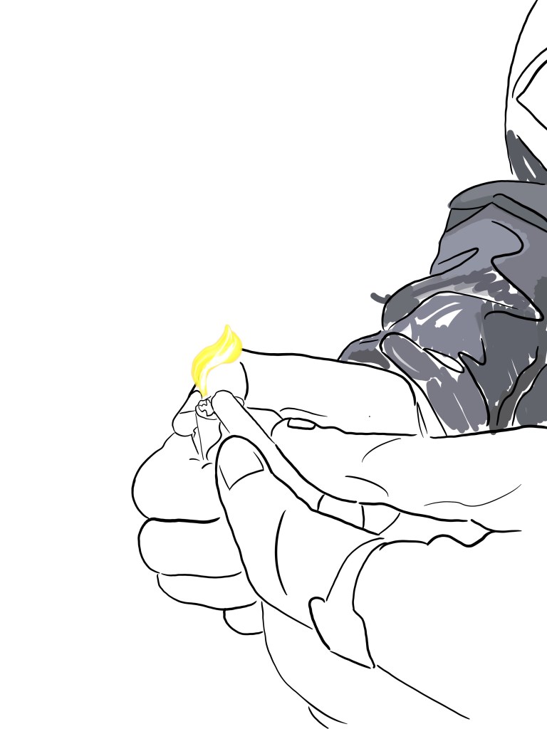
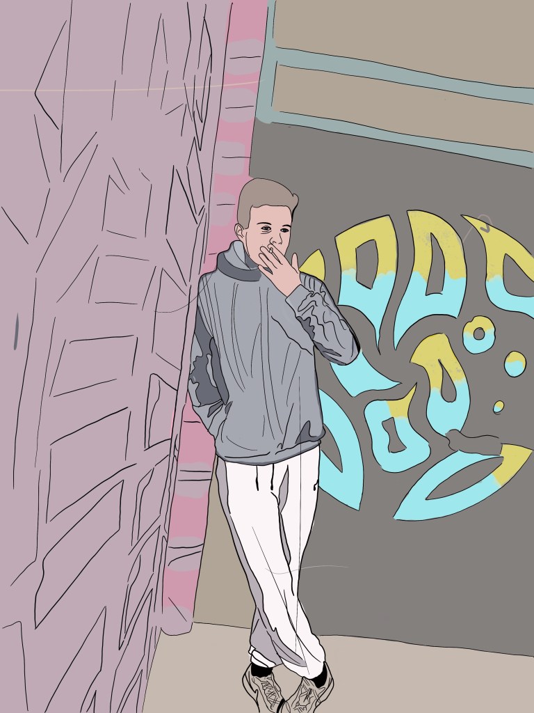
I always sketch some of my ideas before creating stuff just to get an understanding of the sort of images I wanted to take and how I could portray certain things within my design. I did some of these sketches before taking photos and some after but just to show the process of the inspiration before completely anything further.
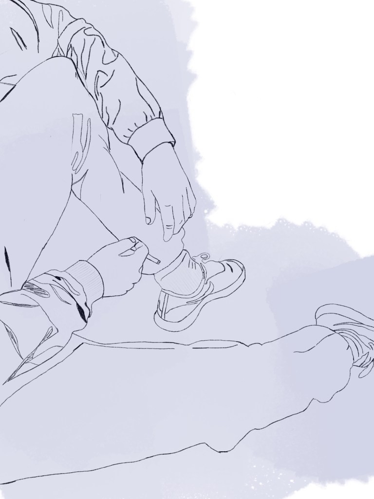
Below are all the sketches I have accumilated over the course of these designs. I recently purchased an image and found a new way fo sketching a developing ideas. I have always enjoyed sketching on either illustrator or photoshop not always by free hand just because it never links with my finals. I found a new way of rotoscoping to make it easier for me to develop ideas. I found when is sketched from my photos it developed ideas further of layout etc. This allowed me to create more portfolio work than just photography.
There are photos here based on imagery taken and some from my head.
For this project I thought I would I create personas to enable me to understand what sort of characters and audience I would portraying my work towards.
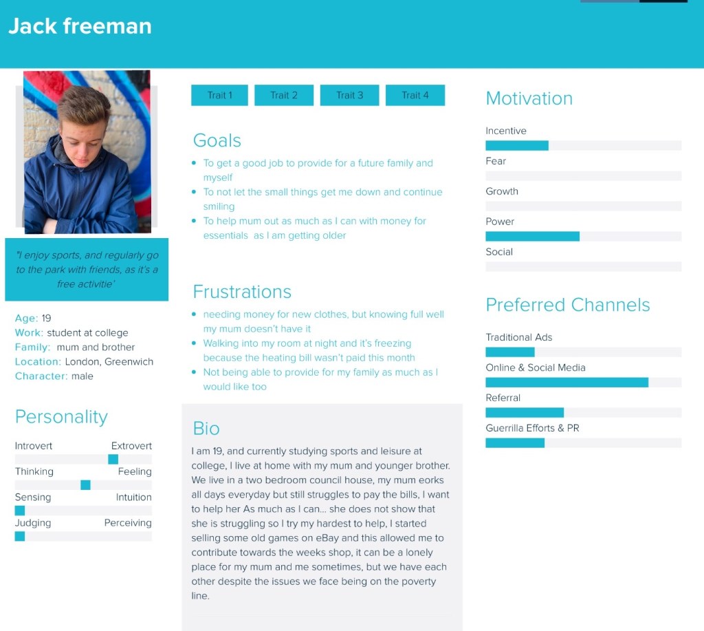
Using an app online I decided to create two personas based on the subjects displayed within my designs to tell them more of a story to the audience. The first persona is Jack Freeman. (random name)
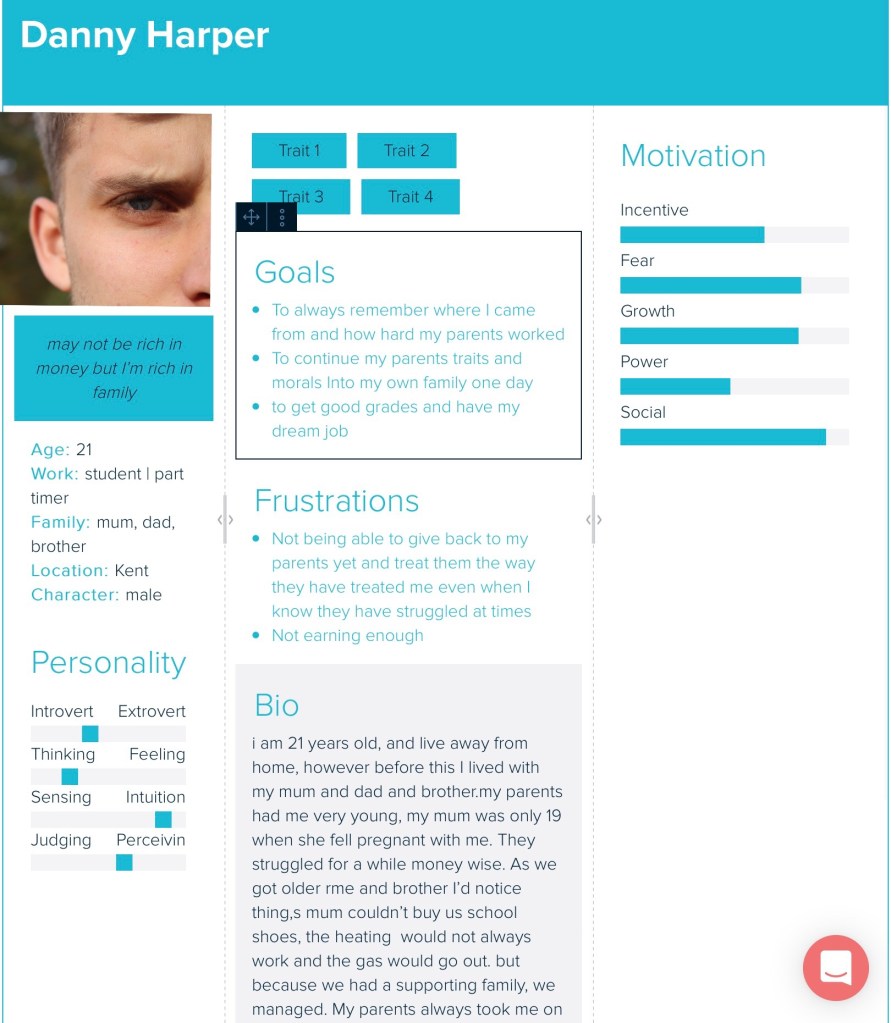
Below sits the image of the persona dedicated to subject one. The name is completely made up and the story but its an example of the types of poverty issues that are around there and what it means to fall into the poverty line. Within this person, the goals display that he wants to get out of poverty and feeling like he cannot afford things. The frustrations for a teenager with parents living on the poverty line are wanting to wear the next new thing in when in some cases this is not possible for the parent, and this is displayed within this discussion. Within the Bio, it gives you a run down of what its like for this boy Jack, living with a single mum and what its like for their family.
Danny harper
The next persona was based on the image of Jack, but did not want to give him his real name so gave him my brothers name with a fake last name. However from my experiences, I added this into this persona, so it became more personal, and my side of the story could come out more. The fact with all these people, is how their family in poverty affects them and their daily life, these two are about how it effects the younger people and below is a final one of a mum and dad and how thats effected them being on the poverty line.
Not only have I created personas to help me understand audience I wanted to create a blog post explaining it.
Poverty is all around us, and some of us have never even experienced it therefore wanted to show case it not only for those who have been through it but also those who have no idea what it’s like. I want this campaign to be for everyone no mater who you are, to understand life through poverty in the UK. The things you take for granted some people cannot even afford and every now and rhino you should remember that. Also this campaign is for families who need support when they have no one to turn to and hopefully poverty uk aid can be that extra support they need.
I thought I would look into some existing adverts that are already out there for poverty but for global issues and analyse them. I do want my designs to be slightly different but also follow the format that comes along with poverty photography and advertising . Before looking into adverts I thought I would look into some some sort of photography used and then this could lead into advertising posters.
Photography // poverty global photography
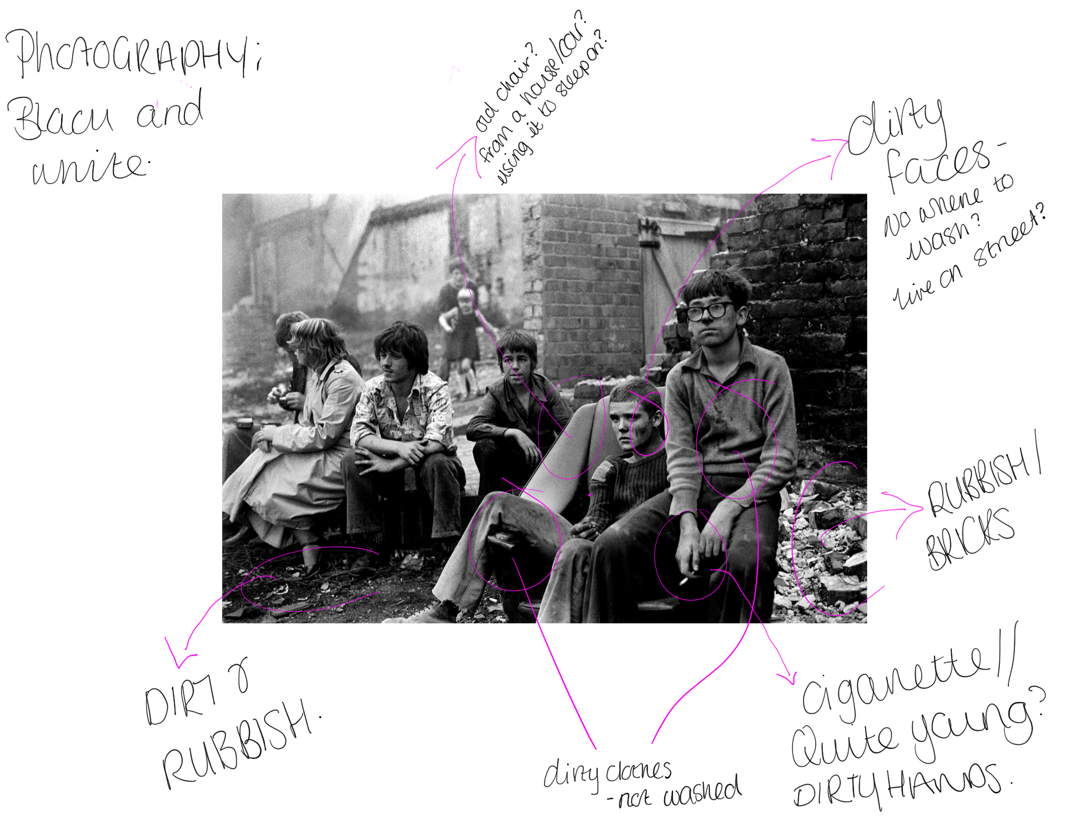
Tish’s images capture a raw picture of the struggles faced by the youth at the time. She would often photograph her family, friends and neighbours – people she spent time with every day, and whose struggles she shared. Capturing candid shots of youngsters on the streets, playing cards, building dens and fire, or causing mischief came naturally, because the subjects trusted her.
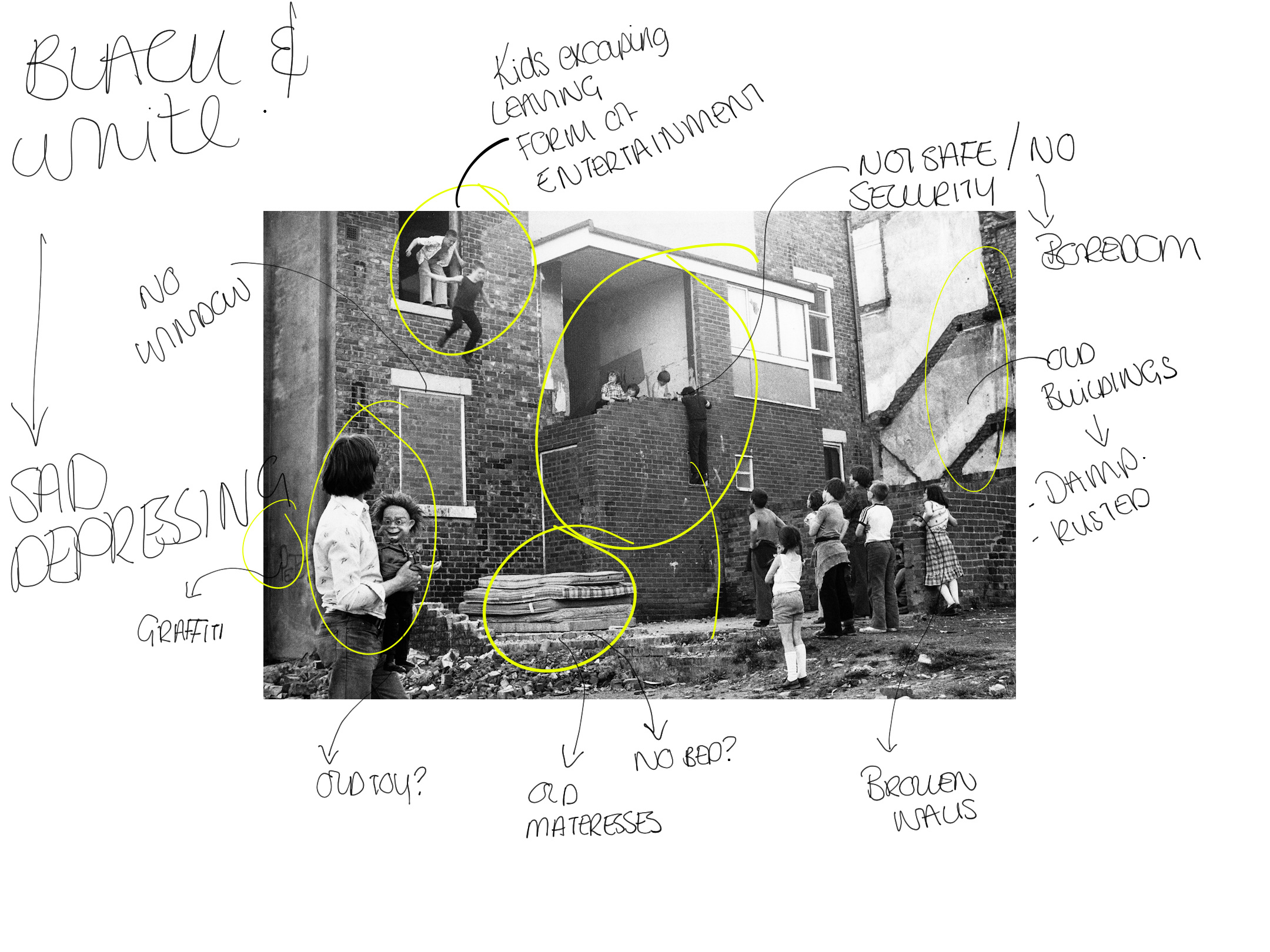
The first photo was this one below. I decided to annotate not before writing notes in my blog about it to make me have more of an understanding of the photography / story being told through the photo.
Annotation of image
Notes from annotation
At the top there are two boys jumping off the window. This shows the idea of the kids having fun despite not having a lot. Boys behind boys. Everyone is watching them and egging them on. On the other hand it could show the idea of them escaping but they have happy faces on so to me it displays them having fun and symbolising you cans have fun despite what you have.
Need to this… a kid is hanging from. This shows how unsafe this area is. However if you look closely he is standing on a window to reach up to his friends to chat. The kids just look like they are hanging out in this urban area.
Below this sits a bunch of old mattresses without any sign of a bed. This indicates that there is no bed around here, do these children sleep on these? It also suggest a bit of a “dump” as they look quite dirty and not well looked after.
There is loads more annotation to this and this is displayed in the photo the last thing I want to mention is the colour. I think for poverty the idea of black and white really makes it stand out and makes it more depressing and shows the sad side to poverty and this is definitely something I would use within my designs as it makes it so powerful and tells a story.