The process of Gin making

Uncategorized

To understand gin to a top level I wanted to research the process of making gin to understand exactly what flavours to showcase within the design.

To produce a decent (i.e. distilled) gin requires a two stage process – first a base ‘neutral spirit’ is made and then this is flavoured by through re-distillation with seeds, berries, roots, fruits and herbs and spices – collectively known as ‘botanicals’.

information from: https://onthesauceagain.com/2015/10/29/the-process-of-making-gin/

Gin can be batch distilled in a pot still in a similar way to malt whisky, although a column still can also be used. A pot still allows a distiller to make only one batch of spirits at a time, and the still needs to be emptied out and cleaned up before the next batch can begin. The still is usually made from copper. The base spirit is added into the pot of the still and reduced with water before adding botanicals. It is important to reduce the alcohol levels as the pure spirit would make extraction of the oils difficult by hardening the skins of the botanicals. It is, after all, the oils from the botanicals that give the Gin its unique flavour.

Some methods include a pre-heating process and the complete charge (the alcohol, water and botanicals) is left for several hours, sometimes even overnight, to macerate. The stillman will apply enough steam to make the alcohol boil. As soon as the vaporised spirit comes to the top of the still the pressure must be reduced. The alcohol vapour is passed through a chamber, the ‘gin basket’, which holds the botanicals. This vapour will extract the essential oils and aromatics from the botanicals as it passes through the chamber and on to the condenser. Using a smaller still or making it in small batches results in a higher-quality Gin and captures the essences of the botanicals better. This also helps to maintain the balance of the ingredients and the same character during each batch.

The Dutch method means Gin is produced by adding flavourings; the essential oils are extracted from the botanicals or artificial flavourings can also be used. These are added into water, which is then blended with the spirit. No redistilling will take place. According to the EU regulations the final product can simply be called Gin but not Distilled Gin or London Dry. See more about Gin styles below:

GIN STYLES

According to EU regulations, there are three types of Gin.

London Dry Gin – grain alcohol is re-distilled with only natural botanicals and only a minute amount of sweetener can be used after re-distillation. London Dry doesn’t have to be from London.

Distilled Gin – neutral spirit and natural botanicals are re-distilled, but additional natural or artificial flavourings and colourings can be added after distillation.

Gin – base spirit and flavourings (can be natural or artificial) are combined without re-distillation. This method is also known as ‘cold-compounded’. It is a cheaper way of making Gin, nevertheless not a very popular method.

There are other styles of Gin, but these aren’t regulated.

Dutch Genever (or Jenver ) – made using a process similar to whisky, with malted grain, and aged in barrels.

Old Tom – sugar is added in re-distillation to make a sweeter Gin.
Front cover design / logo design

Uncategorized

Now I was not creating a logo in such for a brand, but for the magazine. LFB is already to company therefore it was being designed to act as a title for the magazine.

Inspiration:

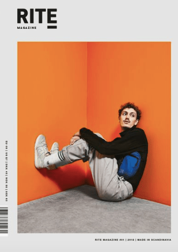
This logo above inspired my logo a lot as you can see its very similar. I wanted to make sure I was creating something that stood out, and because this entire page inspired my design I thought I would experiment with the type as part of my design.

I wanted to make it a short and snappy and straight to the point with the logo as I felt it would work well as a design – similar to my inspiration.

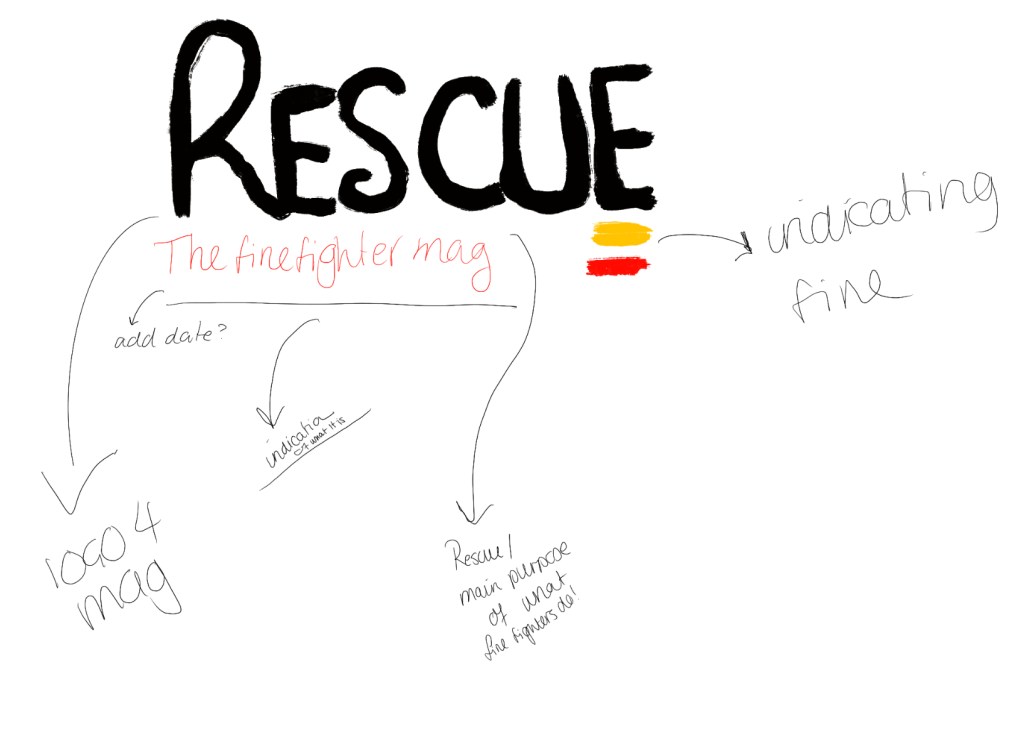
Before I created the logo I had to think of words that related to fire fighters and also the message I want to achieve. I wanted to create an awareness through the designs to portray fire fighters as not only putting out fires but rescuing people. when I thought of fire fighters the main thing that game to mind was the idea of the idea of fire fighters rescuing people.

I thought of the word – RESUCE. I wanted to showcase a simple yet effective focus on the fire service. As you can see the inspiration is from the image above. I wanted a simple word that would be bold and I felt like this worked well – I then decided to add a bit of colour and this is when I got inspired to use the two lines (yellow and red) to underline key elements for example page numbers or website link. In this case I added t below the E to make it more of a image and come together to stand out and set a colour scheme for the rest of the magazine. I then added fire fighter magazine as I felt this represented the entire purpose of the design.

CREATIVE CONSCIENCE – picking apart LFB website

Uncategorized

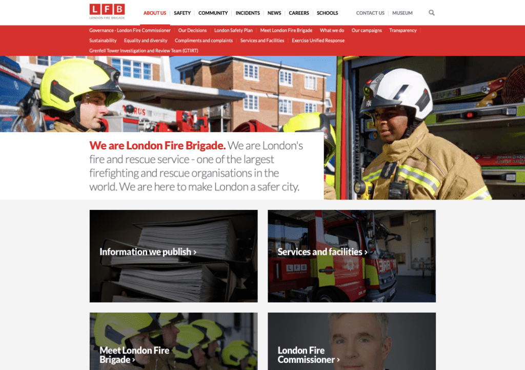
The colours used within the double page spread will be decide d through the colours used within the website and to even understand the LFB to its full potential picking apart the website will enable me to do that. by doing this I will be able to understand what information to provide and how to provide it.

First and full most the first thing I wanted to showcase the logo and the colours used within the logo as this would be used frequently within my designs and outcomes to showcase the LFB. The logo is simple and easy and represent the LFB well. The LFB IS IN RED BLOCKS and then underneath is the description of what the letters stand for. The main colour is a red and this goes through all the entire website which then links to the overall design for the LFB.

The website is full of key information and images to portray the LFB and what they are about. Within the menu bar they portray about us, safety, community, incidents, news, careers and schools. The first page you see when you go onto the website is vibrant , consistent of the colour red throughout. The images are quite friendly not to graphic and display what London Fire Brigade are all about.

CREATIVE CONSCIENCE – sketches for ideas

Uncategorized

A5 IDEAS:

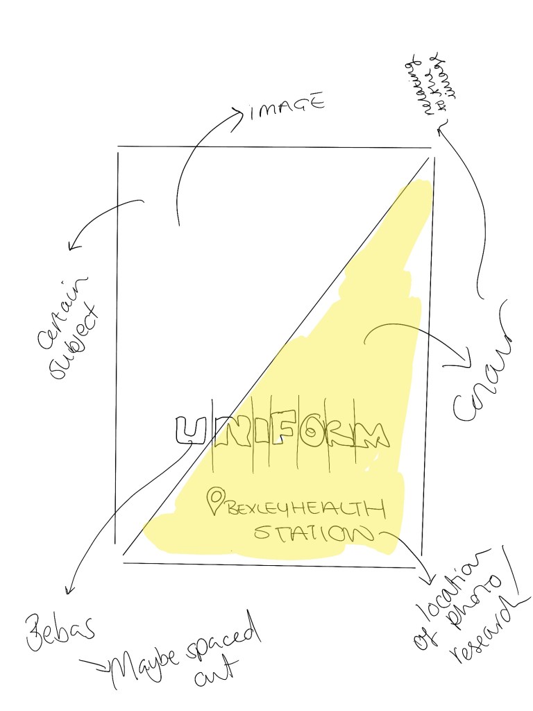
I had an idea of creating an envelope design for the fire fighters to give out in assembly’s , before creating anything I did a quick sketch of what I wanted to outcomes to look like. This is a very quick sketch but indicates what I want the a5 displays to portray. I am unsure yet what the a5 pieces of paper will intel and what topics but the focus would be on keys things that I think make awareness of the worth of the fire fighters within the UK. These could be topics like the fire trucks, the equipment, the uniform making it general information to educate children.

The design:

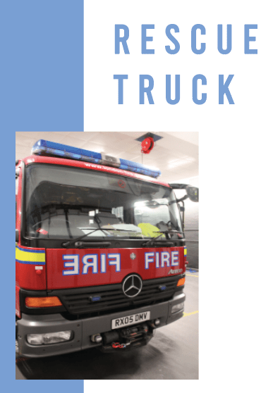
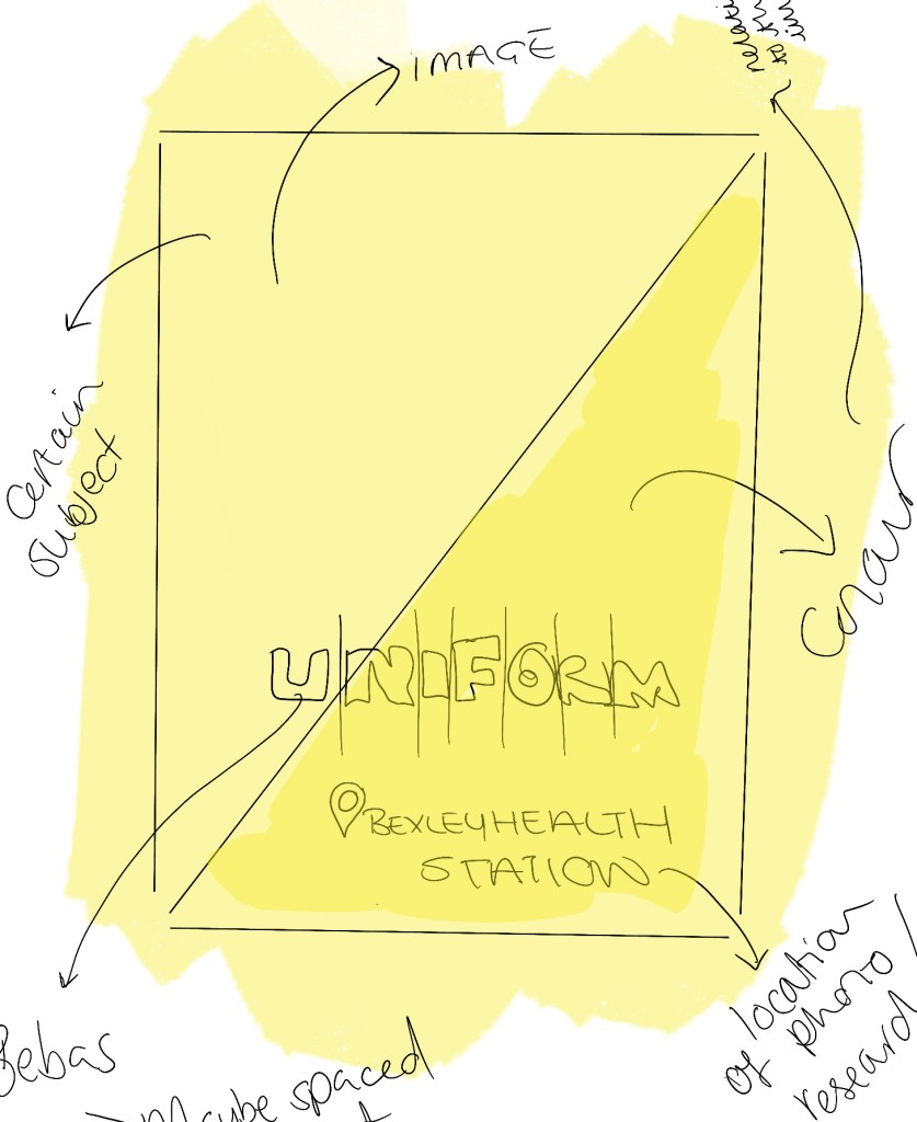
The idea have had to make an a5 card design. I am not sure how I would layout it out yet but this is sort of the initial idea to start with. Because it is for children I think there should be some aspects of colour within the design, whether that be the background in general or a section. Both the images displayed are slightly different but focus the same. I think I will experiment both then come to the conclusion what is better. the first one displays the entire a5 being filled with colour, the image would be placed in the corner, with a title at the bottom that links to the image. The colour will determine depending on the image, so if there is a large scale of yellow the colour of the background would be yellow. the type I would use would probably be bebas, as its my favourite and works so well with portraying messages, how this would look is unpredictable yet as it is depending on the layout.

I personally think the top one is a trial and era as it may look quite tacky and I prefer designs to be clean and simple. I do think colour is needed within the design as its featured in a pack for school children therefore colours should be somewhere. I had the idea of splitting the page in half with the triangle going across the right hand side and this would represent the colour choice through the design, with then maybe the type sitting over this almost layering over it.

Topics I could potentially use within these a5 designs:

fire trucks

fire equipment

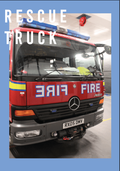
rescue truck

rescue equipment

uniform

traiing

and drills

Magazine sketches / logo design

Creative conscience: Message / audience / purpose

Uncategorized

I am doing the open brief so I already read that and understood what my finals need to be however to make sure I was creating and the purpose addressing the audience, purpose and message speaks that.

message / topic

I am creating a campaign awareness for the LFB, and the daily lives the fire fighters intel, Making the awareness of the worth of the fire service. I want to educate people all about what the fire fighters do and the way their day goes about and creating an awareness of the importance and worth of fire fighters main focus being LFB. My uncle is a fire fighter and the aim is go and visit him and undertake information and photographs and use him through this campaign.

Audience

The audience for this campaign is for secondary school kids. I want to create a school pack for the fire fighters to give out during assembly’s so the kids can actually learn something rather thanking frightened by the work of fire fighters and the situations they face.

Purpose:

the purpose of this entire design relates to the message slightly as its all about understanding of making awareness of the importance of fire fighters and making it more of a job choice, due to the cut backs its important to showcase how important these fire fighters are and the worth of them.

FMP initial idea 2020

Uncategorized

The journey to my final idea:

Now I wanted to create a blog post now to showcase where my head is at the the FMP stage and the focus I want my designs to be on.

At first I was going to create something to do with travel (I even created a logo) the idea was going to be about student travel, BUT I HAVE DONE THIS. I experimented bu telling people and basing it off their reactions and from this I knew if it was the idea or not. One day I told my mum, and the reaction was crao because I had already done this last year just on Florida. So I changed my ideas.

For a while I was stuck, I would spend days writing ideas down etc. I have recently been so devoted to ww2 films and the idea of understand what it was like to be in the way, whether that be a solider, a mother, a kid, a a wife etc, and the general life through the war. I went to Anne frank house and it was the most amazing expeicner and from this I knew I would want to find out more.

Not only because I want to learn for myself, I also want to encourage people to really understand what it was like for people during WW2. This year is the 75th anniversary of VE Day, my parents are moving down to the coast and they have parade there and from this topic of conversation is where the idea sparked from. I am aiming to go to imperial war museums, collect images form people and create an entire advertising campaign for the British legend education people of the personal stories and the after maths of WW2. Everyone knows about the war so it seems silly to educate people, I want this to be a campaign where we provide to the next generation what this certain generation had to go through and the after math it left those solders and families it was never the same after the war, mentally and physically for people and that’s what I want this campaign to show.

About fire trucks / rescue trucks

Uncategorized

Following on from the previous blog about the images taken from the different fire trucks and the equipment used, I thought I would discuss the information I have gathered from the trip and also online research.

Research from the trip:

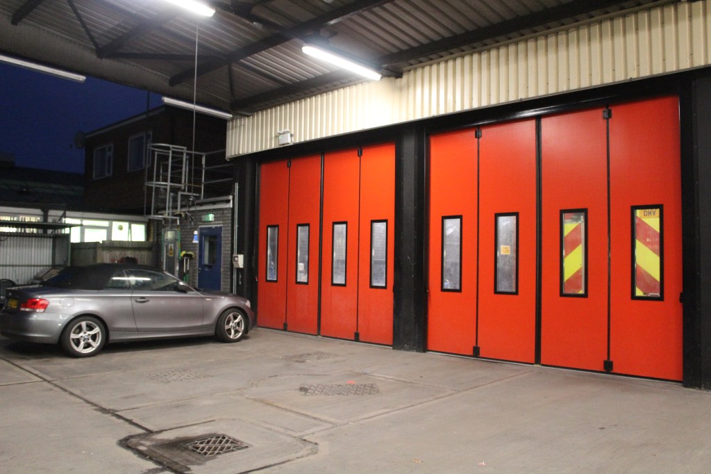
Within the fire station (example being Bexley health) but the majority of the stations are like this. They have the iconic red garage doors where behind them sit the two fire trucks. (image below)

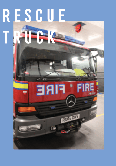
When you walk in on the left hand side is the rescue truck and on the right is the fire truck. I did not know there was two different trucks that feature within the fire service I always just through they had one with everything in it, which made me realise I wanted to show case this somewhere within my design.

Rescue truck and equipment

From trip / My uncle explained to me about the two different types of fire engines and what the equipment implied. The rescue truck is used for more maintanence, road traffic accidents (RTA) horses getting stuck etc. Within the fire truck on both sides there is equipment used for this incident that occur. Now these two different fire trucks are located in this fire station, there is a large amount of other fire trucks that can be used but the focal point within this research and the designs are the rescue and fire ones.

definition of a rescue truck:

A heavy rescue vehicle is a type of specialty emergency medical services or firefighting apparatus. They are primarily designed to provide the specialised equipment necessary for technical rescue situations, as well as search and rescue within structure fire

Notes from the recordings:

list of equipment in a rescue fire truck:

Mindmaps from research trip

Uncategorized

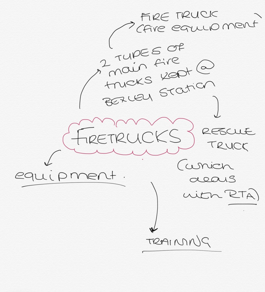
When I went on the trip there was somuch information which will be displayed in this blog, but to narrow it down into subtopics to make it less confusion for me and the audience I created mind maps. The minds maps include the different aspects of the fire service and some key points of that topic that I found out which then led to ideas for layout.

the first mind map was quite short and sweet but displayed the different fire trucks, being fire and rescue and what the purpose of each is. This then linked onto the equipment and the training for the trucks.