I thought I would look into exciting posters out there surrounding the idea of poverty within the UK to get inspiration but also create something slightly different.
What I noticed when typing this into google was that the majority of poverty posters are in an infographics format. When typing it into google I could not find much; therefore I compared the two different styles that are out there.
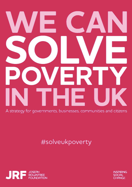
This one displays a more simple graphics design. They have used the idea of portraying just type over the poster. Then used a hashtag to make people aware and actually take a stand. The only thing that I dislike about this is the colour choice, if you weren’t to read this and happened to just be scrolling pass it I would off thought it had something to do with period poverty, due to the pinks used. I think they should used a more collective choice colour. This design displays that you can have such a simple design aspect and get the message across, however I think having a photographs enables people who aren’t in poverty understand it more where as this design is just speaking to you directly. How can we solve poverty then?
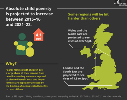
The majority of the designs are about child poverty not much about family poverty. This is an example of these infographics displaying child poverty. They are very simple, they do give the correct information and they portray what it is like however it might be too simple. it does only focus on child poverty, I personally do not think infographics portray poverty well, I think you should display what it is like to design for the good.
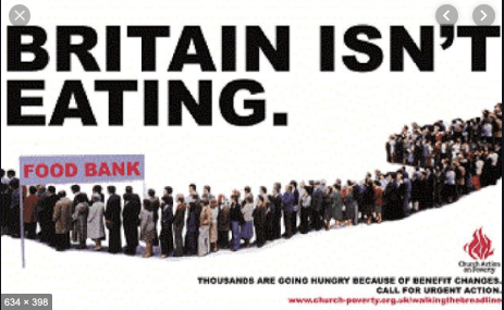
This is the only poster that I thought was slightly advertise due to the photos used and the way it represents UK struggling with it. I chose this because it was displaying what it is like to be in poverty, and the type really catches the readers attention making you want to make a difference. It is an awful design due to the layout but having type that catches the eye and images that portray what it is like is what poverty advertisement should be like.
I could not find a lot on google, therefore began to look into companies and their idea of advertising as I then had the idea of creating an entire new company. The first poster I advertised in this blog post was by JRF who are a comapny who want to change UK poverty.
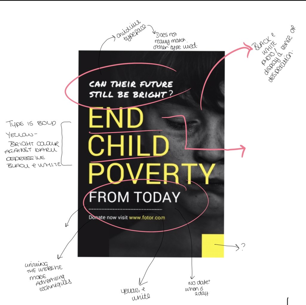
I then found some on google that I thought would be great to analyse with the iPad to pick out key things that could inspire me in my designs. There was design that sin pried me so much and stood out in comparison to the other designs. This poster below is about child poverty but the way in which its designed is what inspired me so much. The way in which they have used a black and white photo of a child that portrays emotion, and this is black and white creating a deeper meaning stands out more and portrays a story of life in poverty. They then use a bright colour of hope which is the yellow, and this makes the writing not only stand out and catch the eye against the black and white but also allows the page to have hope and happiness through a negative design and meaning. They then have a child like type and this makes it more personal and connects with their audience in portraying poverty.
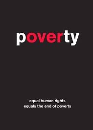
The final poster I looked at was this one below. This to me showcases that poverty can be designed and portrayed sometimes without any imager. They have managed to add the words poverty and over highlighted within one word which makes it powerful to the reader. This displays that simple is key sometimes on senstivie topics.