For my design I wanted to create an entire new brand to help poverty within the UK and create a platform where w make awareness of the current issues and allow the public to help other families in need. I wanted to show case live through photography and advertising techniques and create something different in comparison to other companies. Therefore I created poverty uk aid.
Creating the logo:
I wanted to create a brand, a logo and a platform which enable me to help others who struggle through the lives of poverty in the UK. I wrote down a bunch of words that I felt represented poverty well and this then enabled me to research ideas and connect for the logo design.
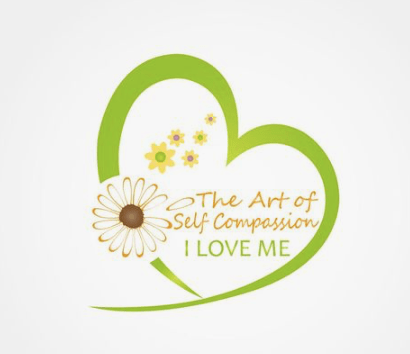
The word that stuck with me the most was the word COMPASSION. I then searched this within Pinterest and thought of the best way in which I could display this within a logo form. I found this image.
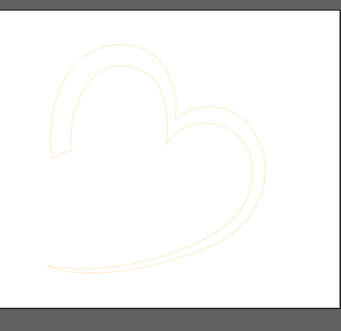
I actually did drew it myself on my iPad but have unfortunately miss placed this sketch, however it was just the heart shape that inspired me not the wording. I then started playing around with colours; I found a connection with the colour red and orange. I then looked into alternative reasons behind colours, the purpose behind my design is to present the depressing side of poverty in the UK, Therefore I wanted a colour to contridic that that expressed hope and positivity.
definition of the colour orange:
Orange combines the energy of red and the happiness of yellow. It is associated with joy, sunshine, and the tropics. Orange represents enthusiasm, fascination, happiness, creativity, determination, attraction, success, encouragement, and stimulation. … In heraldry, orange is symbolic of strength and endurance.
^https://www.google.com/search?client=safari&rls=en&q=orange+representaion&ie=UTF-8&oe=UTF-8
This then inspired me to create a black and white, with orange theme within the designs and the logo.
The process was so easy as I already had a simple idea in my head. A logo is meant to be simple and effective therefore complicating it would mess with the original meaning of a logo. I simply vetoed around the inspired image of the heart.

I then filled in the heart in this bright orange that stood out for me. The type I think works best is BEBAS it is simple, bold and effective. Therefore this was inspired for the type. At first I was not going to leave the gap between the heart but then I thought this would be a good place for the title to sit.
I made the ‘poverty UK” grey and then the word “aid” match the orange heart. At first I tried the entire writing orange and that is came across way too much orange and portrayed too much of a positive appearance. Then I tried black and that became too dark, then I lowered the opacity and then thought to show a connection between the type and the logo so they did not become separate from one another.
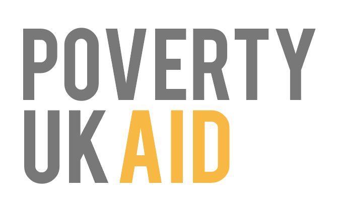
Final logo:
This then became poverty aid UK’s final logo. I think it works so well and portrays the idea of compassion and poverty all in a simple logo. The colours worked well with one another and acted as a starting point for the colour choices within my design.

