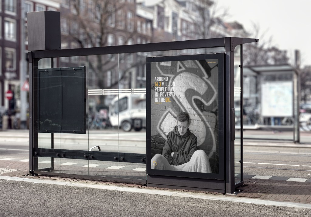
For my portfolio I wanted to design elements of editorial, posters which lead to billboard advertising as its the topics I want have a future career in. Therefore once I created the posters and the basic mock ups I wanted to see what a few of them would look like when added into a billboard sense.
This one below symbolises what it would potentially look like when displayed on an advertising board. Posters can be displayed on undergrounds, cities, bus stops etc. I wanted to portray it on a bus stop, to emphasise that people would sit and read it whilst waiting for a bus which essentially is the aim of any bus stop advertising poster. You can see the type clearly, and if you were to zoom in more you’d see the other elements. The main purpose is the type and image then makes you want to move closer to read and find out more. I think the orange against the white within the type works so well, it makes the most important information stand out and grabs the readers attention.
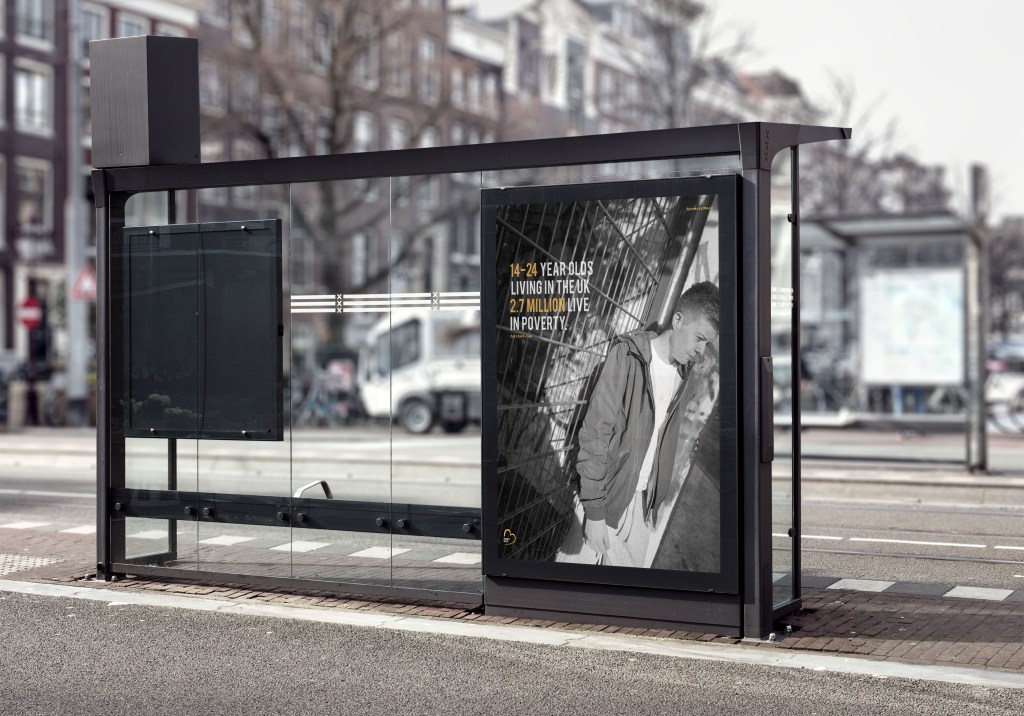
I could not do poster 3 in a billboard as it was landscape but square landscape, it wa impossible to find a mock up that actually fitted it. I then thought that one would more likely be in an underground display as those ones are on a larger scale. The worry for me was that the posters would not be seen from a far due to the black and white, however what I think makes the poster pop is the colour orange through the type and logo, without that I do not think it would work as well. The images are clear and shine light on the fact of poverty in the UK and are clearly seen even when black and white.
