Within my magazines, I think I have found a style that relates well with me and relates to the topic, I think I finally found my style and what I love.
I think within magazines should be simple, when they are over crowded the information becomes too much and the reader finds it hard to visualise on one particular thing. I thought that the information would benefit from having a simple design.
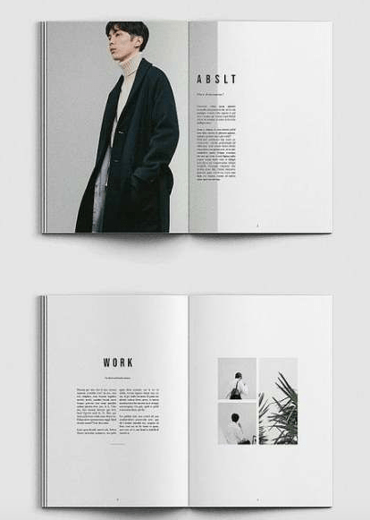
Whenever I design a magazine my first place for inspiration is Pinterest. The simplicity of the designs and the way they are so effective makes them stand out to me so much, it creates a unique appearance to them.
My inspiration:
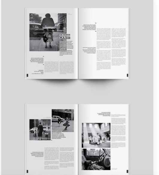
When you look at my first two pages you will understand where the inspiration has come from as they are inspired by these two pages. The first page (top page) in the image inspired me due to the way the image continued over to the next page; then the type sits against this leaving negative space for the type to be read easily. The bottom page interested me because of the layout of the images. I thought that the minimalistic effect works so well with this design and almost grabs the readers attention more than if it was crowded.
I did not use this through my designs but I did use it for referencing to understand how some magazines display images. I chose this one because it used a black and white imagery which I would be using within my magazine, I think when you limit your pictures to black and white you do not have other colours to fall on to create a theme therefore researching into that made me understand how to layout and portray black and white photos against type and layout.