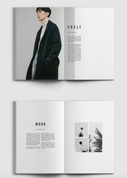
The first editorial page was inspired from the picture below (the top image) and as you can see I tried my best to make it as personal to fit Poverty UK aid as best as it could.
Inspiration:
My design
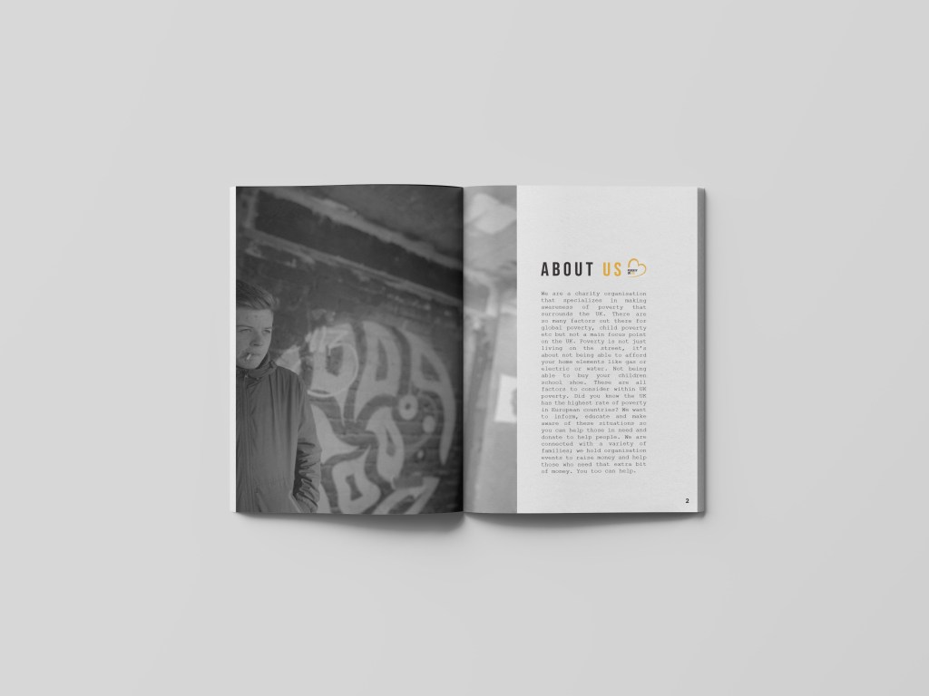
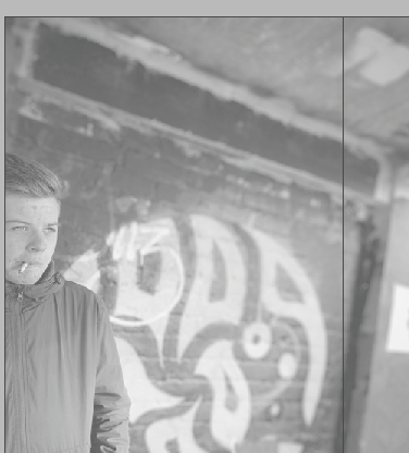
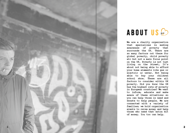
As said in previous posts poverty is a very sensitive topic and portraying it in a sensitive like is key through designs. The first page sets of the design layout for the rest of the pages to make it enhance and create a theme throughout. For the first page, the image used was this one below, but as you can see I lowered the opacity quite a bit to allow the type to be seen but through the changes the type alternates; however the opacity feel gives it quite a subtle look and not too in the audiences face. Just like the inspiration pages; I decided to make the image sit on the left hand side and slightly go over the gutter to the next page, what’s great about this layout technique it makes both the double pages come together and tell a story, rather than being two separate pages against one another.
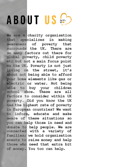
At first this is where I placed the type; however this now has been altered. This page is all about indicating to the audience what Poverty UK aid do as a collective. Therefore the title for this page is ‘about us’. Now unlike the posters this type is slightly different, if you look closely there is space between the letters which was inspired by the magazine on Pinterest. I think it allows the title to be read clearly and not make the page too cramped allowing room for negative space within the design.
I wanted to add the logo within the ‘about us’ title so the audience are clear who we are and what we do, this logo than links the posters with the editorial pages. I decided to make the ‘about’ in black and then the ‘us’ in orange to portray both the colours that feature within the logo and would be used throughout the design.
Below the title sits the type that informs the audience about what we do as a collective. At first, I followed the inspiration from the photo from Pinterest and overplayed the writing against the image, which made me lower the opacity of the picture. However when then doing the critique, a comment made was would this readable to the eye when printed. I think if the photo was not black and white then maybe we could see it more, however there is a lot of negative space on the page therefore I decided to change it and create a test print to secure the design layout choice.
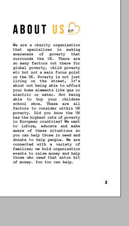
about us’
We are a charity organisation that specializes in making awareness of poverty that surrounds the UK. There are so many factors out there for global poverty, child poverty etc but not a main focus point on the UK. Poverty is not just living on the street, it’s about not being able to afford your home elements like gas or electric or water. Not being able to buy your children school shoe. These are all factors to consider within UK poverty. Did you know the UK has the highest rate of poverty in European countries? We want to inform, educate and make aware of these situations so you can help those in need and donate to help people. We are connected with a variety of families; we hold organisation events to raise money and help those who need that extra bit of money. You too can help.
Above is what I have displayed in the about us section its short and sweet and allows people to understand what we do as a hole. As you can see the type sits in courier 10, which is the same as the posters, (where the key information was placed). I feel as if this type works so well with short sentences and articles within editorial design it portrays the type writer effect making it quite quirky and unique.
The changes made:
As previously mentioned after have a critique I decided to alternative the layout of the writing due to the image, and the amount of negative space used within the design. I kept the image to a lowered opacity, because to me when it was a full 100% the image seemed to bold and in your face which is not what I wanted to present through my designs. I decided to move the type slightly to the right into the negative space. I think the reason I did not do this in the first place was 1 because of the inspiration and 2 because I did not want the pages to be separate design elements, however because the image falls through to the next page it concludes the design together nicely and the image almost acts like a story line for the type.
Adding page numbers:
Within editorial design it is important to add numbers to ensure ti the audience what page is what, and if we had more time I would off created an entire magazine of a front cover and contents page therefore this is when the numbers would be involved. I wanted the numbers to be in the same typeface as the writing other wise there would be way too much type going on. They are not the eye of the design but are important to a magazine design for navigation. I decided to make them quite small and sit within the grid for designing and this allowed them to be position nicely within the design.
Final design:
This is the final design piece. I wanted this page to indicate the design and colour theme through the rest of the magazine and I think it achieves this well. The image is off a low opacity so it does not take over from the rest of the image, and continues through to the next page. I defiantly think the type works better sitting in that negative space, its easier for the audience to read and makes it bold and stand out for them. The design is simple. Yet effective creating a clean cut within the design and thats why I think it works well . If the type was any bigger it would over power the design which isn’t what I wanted. I think when the reader looks at this page they get a sense of sentivity , the image is not too bold and the design is subtle to the eye. I wanted to display within the designs a sense of calm, and I think these designs show that and this is mainly because of the negative space used and layout choice. The information is clear to read, a lot of designs I looked at had a lot fo writing on pages, but this one is easy tread and not too much so the audience does not get bored. I also think the first page is like a sneak peak for the rest of the design, as I did not want to portray too much to the audience on the first page otherwise they would not need to read on.
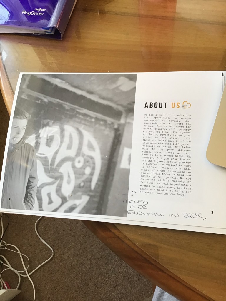
TEST PRINT
Below is an image of the test print before the mock up was created. This allowed me to understand if the writing was readable to the eye. I do not usually do a test print but this helped me so much to understand what it would appear to the audience when printed.The writing was easy to read, no spelling errors and portrayed the correct message. This is defiantly something I will be doing from now on and wish I had done sooner. Test print saves a lot of editing on screen and panicking.
The final mock up
Below is the final mock up. Due to the shadowing the left page seems darker however it is not. The mock up allows me to visualise and the audience what it would be like when printed in a magazine.