I wanted to make a magazine for this APP as I absolutely love the design features that come along with a magazine. I thought before designing or getting into inspiration towards layout, I would look into existing magazines out there that portray poverty whether this be UK or global.
When you type into google poverty magazine, the majority of things that come up are front covers and this isn’t something I was going to do for my APP; Just editorial pages. Therefore I came across a magazine that was dedicated towards poverty in the UK.
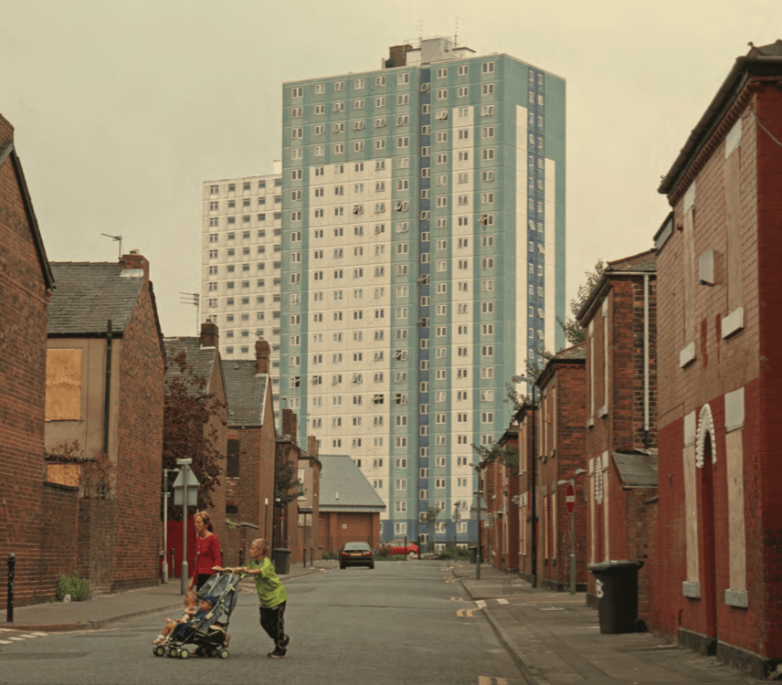
The magazine is prospect magazine … after all the main elements of magazine such as editorial letter etc. This is the first image displayed for UK POVERTY. How stereotypical is this magazine image used? They have a tower block in the background of a narrow street, its almost like they added this tower block there to indicate poverty. On the street is a young mum with 3 kids with the young boy pushing the buggy. This is exactly the opposite of my designs, this is so stereotypical and actually quite offensive, you do not need to live in a tower block to be in poverty.
Articles within the magazine:
They do not use a lot of imagery within the magazine, the majority of it is type which to me doesn’t portray what life is actually like for people in poverty that well. The articles are similar to this one below following the same style, with the two columns the drop cap and the question. I cannot read any of this as it bores me to sleep; there is way to much writing so people zone out they need breaks within the design or some sort of imagery.

All the writing is the same; but what really catches my eye is the images used and how stereotypical this magazine actually has been to me it seems like it’s someone from a higher class that has wrote it and wanted to show case the ‘lower’ way to live almost acting like an inconvenience to them
The photo that shocked me the most was this one below. The angel of this shot is really good, I think it showcases the surroundings well. but again why a tower block? you are giving the impression that if you live on a council estate you are automatically in poverty, which isn’t the case there are families in houses who struggle with poverty. The young boys are behind a bar which to me indicates they are trapped and not free which may be true to poverty issues but aren’t you separating these boys from everyone else? People in poverty aren’t scary people, disgusting people, they are normal people who just need a bit of help. I think the emotions within the children showcase poverty well, I just do not think you need an estate to show that and comes across very stereotypical as this is the second tower block image they have used.

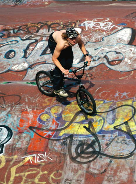
The final image I wanted to discuss was this one below. How on earth is this photo, representing poverty. I understand the graffiti as graffiti displays emotions through art, and something for people to do and the more rough areas do appear graffiti but its peoples way of expressing themselves. A boy riding on a bike? I am not sure how this is poverty at all. its almost like the writer/editor is show casing ‘chavs’ a sort of lifestyle choice not people in poverty.
http://www.prospectmagazine.co.uk/wp-content/uploads/2013/11/jrf_web.pdf
What I have noticed when looking into poverty magazines is the images tell the story, the type should be short and sweet and not too full on so people who haven’t experience poverty get a chance to understand it. I think the key is making the type sit in black and the titles not becoming too over powering against the images.
I could not find a lot of magazines out there that were based on poverty, they were either magazine articles about poverty (which I noticed drop caps were used a lot to grab the readers attention) I then saw that some of the magazines had adverts that slid into them to portray a poverty campaign, I thought I would look into the front covers of the poverty global magazines to get an idea of what sort of imagery and people they represent within this topic. When looking at the front cover of magazines they use the same sort of nationality to portray poverty, and I could not find one online that portrayed just UK poverty. They use a multi cultural family, a women and a baby struggling, its about saving a life within a different country. but what I noticed about this design was the black and white which is what I have achieved with my front cover, therefore was inspired to continue this through the magazine design. It portrays a negative response to the problem which is what I am aiming for within my designs.

