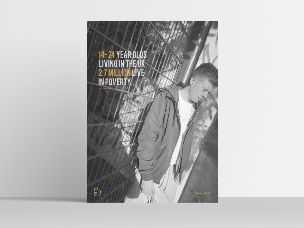
The design elements within the magazine are similar therefore not much needs to be discussed. The key elements that need to be continuous through the design are the logo and the link to the instagram page, and the full fact . com. This poster indicates life through the ages of 14-24 therefore I wanted to use a photograph that indicated younger people and how it would be for them. I decided to use the exact same layout as the design before hand by this using the bebas type, and the colour scheme. Again, the key information which in this case is 14-24 and 2.7 million, these sit in the colour orange as they are the key information, and again sit in the opacity of 78%.
Again, the link of the website where all the information is collected from sits in orange in the courier type facd underneath the type. In the right hand corner again sits the @povertyUKaid in the corner.
The image;
The image within this poster features my brother leaning up against a gate. What I think makes this photo work so well is the angel of the photography, you can see Danny’s emotion and the background he is surrounded in. Again, making this photo black and white allows the photo to portray emotion through the design; the original photograph displays sunlight and even with the black and white you can see the sunshine, and this reflects on the subject and the background well.
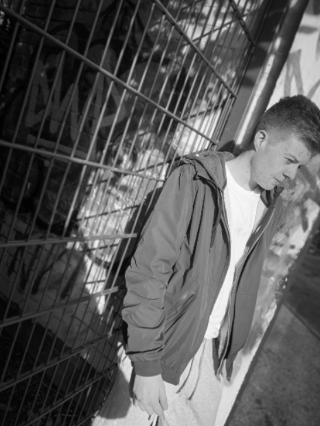
Final image:
This is the final poster design for the second poster. As you can see this is exactly the same as the previous poster meaning it has the same position of type, same colours, and the indication of the instagram and where I gathered the information from, sits below the type.
The key thing for this design was to make sure the logo and the type and all the elements were in the exact same place as the previous design. To do this, I had to copy and paste it from the previous design and align It in the exact same place. It was key to ensure there was enough space between the top of type and the width as the previous page, and the @povertyUKaid and the logo sat in the same place.
This photo is exactly the same as previous and portrays the same message. The image explores the emotion through different ways such as the colour, the posture of the subject. I think what makes this photo excel more than the other is due to the light that is portrayed through the photo. I think displaying the subject in different angels allow the sensitivity of the subject come alive more. Overall this image portrays poverty well, links with the type and advertises the life of poverty through a 14 to 24 person. These posters act as a taster to the magazine, and then explore more into what poverty is exactly like.

Mock up of poster