Now this design is slightly different in comparison to the other designs due to the layout of the design. I wanted to create a poster that could potentially be on a billboard and sometimes this would more likely be landscape therefore I created a design that was slightly different and had alternative images and mock ups to present that.
When we had our first critique, I got the feed back to photograph at home poverty more… therefore when I got home that day, I decided to photograph jack in our garden. When taking the photos we took one that really inspired me. When I was originally researching I found a photograph that inspired me through the taking, therefore you can slightly see the link between the research I gathered and my photograph/poster.
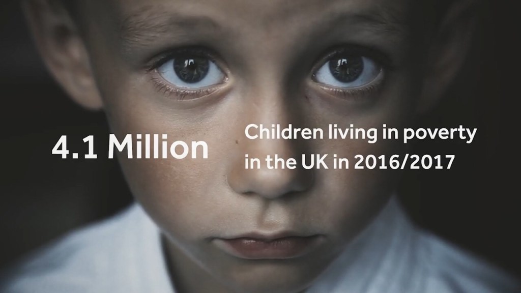
Inspiration photo:
This photo is about children poverty, but what made the emotion come through was the look in his eyes. The purpose of these designs are to portray emotion through poverty… and portray to people what it’s like to be in poverty.The eyes tell a story, of sadness and hope but still show life within the eyes. this is what inspired the final photography for this design.

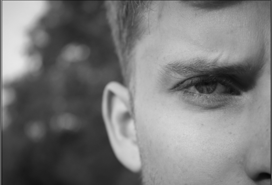
My campaign is displaying poverty within adults, and families, therefore wanted to use someone who was an adult. I decided to use one eye, and have him skinning to display emotion. With a lot of the photography within poverty, they use depth of field to display the emotion and this image portrays that.

The same layout features within this poster but is almost completed on a larger scale. When we completed the first critique without even noticing the wording was completely wrong and did not make any sense therefore this was something that had to be changed. I used facts from full fact.com therefore all the facts link together and come from the same website.
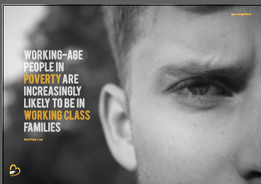
” WORKING-AGE PEOPLE IN POVERTY ARE INCREASINGLY LIKELY TO BE IN WORKING CLASS FAMILIES “
Within this sentence that’s featured in the poster there is not a numerical number to highlight and focus on therefore, within this sentence I chose words that stuck out the most to highlight the issues in the world. In this case would be POVERTY and WORKING – CLASSS. I highlighted these words to ensure to the audience that poverty affects the working class the most.
Just like the other designs I wanted the logo to be placed in the bottom left hand corner, and the @PovertyUK instagram account located in the same right hand corner.
I Thought the type would sit perfectly on the left hand side due to the empty space the sat aside the image and I believe it does. With the type with all the posters it follows the same layout purpose, meaning that the words on each line are around 2 to 4 and this then creates a block in which the type sits in.
The final poster:
Below is the final poster for my landscape design. It portrays a deeper meaning of emotion in comparison to the other posters and I think this is because the look in his eye. This photo does not show surroundings he is living in but the way in which his life is effecting him. Within his eye you get a sense of struggle, without even seeing the rest of his face because of the eye brows and how they are frowning indicates anger and fed up. I think this photo captures peoples attention because the focus is in the eye; the emotion comes from his face. Unlike the other ones where I have displayed a subject and his surroundings this one focuses on one thing. The black and white made a huge difference to the effect of this poster, and turned the mood from vibrant and positive to depressing and in need of help.
I did not want to use one person to model the entire work because it effects thousands and singling one person did not seem right. I wanted to showcase a multiply of people and the different ways in which it could be affected.

Mock up of final poster
