The first two pages have been short with information and did not want to go not a lot of detail within poverty. I did this so the reader would have to read on and want to continue to find out about UK poverty and ways in which they could help. Therefore the next page is “defining poverty” Again all the information is taken from full fact . com and this has been said in the type.
left hand page:
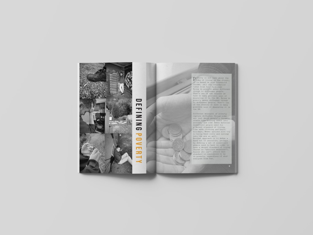
I wanted this page to be slightly different; meaning it would still have all the elements the other pages would have like the orange and black and white colour theme but the layout to be slightly different. This page is all about poverty and defining it therefore was a perfect platform to showcase all the elements that fall on the poverty line. On the left hand side I wanted to display a column of photographs that represented poverty within the UK and try my hardest to show case that well. I used the images that I felt represented the idea of struggling and desperation through photography… as you can see they are all black and white and the theme. At first I was going to make the entire left hand page a collage, but then felt as if it would become too over crowed in comparison to the other pages within the magazine already designed. Therefore, I stuck with the idea of collage but then moved the two columns right over to the left hand side so no gaps were shown, this then allowed me to have a bit of negative space left on the left hand page and follow through to the gutter to allow more images or text to be added. I am not sure if you can notice but when I screens hotted this to add It to my blog, I noticed a white gap that was between the two images which automatically made me change it. I did not change the design just made sure this white gap was gone (however I already did mock ups therefore had to change them also) this made me realise I NEED TO DOUBLE CHECK EVERYTHING!!!!!
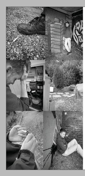
this is the updated one without that annoying white space between the two photographs at the bottom just to showcase that. I made them slightly thinner and this then made the white space disappear and no longer annoyed me.
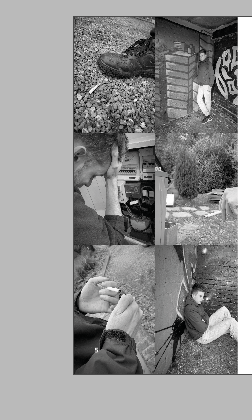
I then thought about making the title slightly different in comparison to the other designs. This page was different already due tot amount of images used so why nit make the type slightly different. I enjoy making posters and editorial visualise that are unique and different and that’s what Made me design this editorial spread like this. The aim was to make this page more about the photographs, therefore I did not want the type to over power that. by making two column collage it enabled me to create negative space between the left hand page and gutter and this then made a perfect space for the title. The type spaced BEBAS is that sort of typeface that can be read from any positioning therefore this made me want to alternative the positioning. With the negative space it worked so well and was readable still. I made the working defining in black and the world poverty in orange to follow the colour scheme that follows through the magazine. I was worried this would not be seen but it breaks of the images from one another creating negative space, and does not make it over crowded giving it that minimising effect.
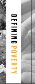
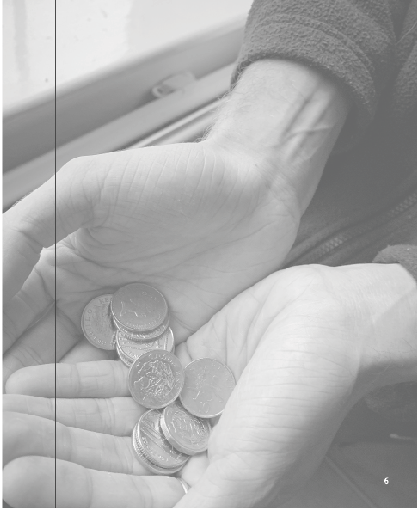
I could of easily left white negative space over the gutter to the next page, but I felt as if this was then separating the two pages and not continuing the story. due to layout of text I thought it would be appropriate to put an image over the gutter next to the text following through to the next page. Within the image below, you can slightly see this image coming over the gutter and links the pages well together.
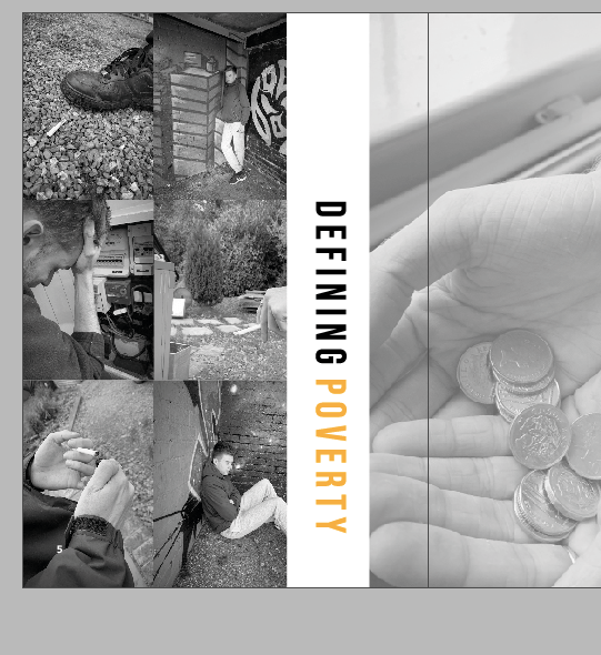
On the right hand side I wanted the entire page to be filled with an image and then the text to sit over the as this page was all about portraying life in poverty. Out of all the images I had taken one stood out to me the most, and that was the money holding, it represented the idea of living on what you have and not beyond your means therefore thought it was a perfect choice of larger scale image to fill the page. Because, I knew I was going to add type over this image I lowered the opacity to around 70 so the image could still be seen but did not contrast against the writing. I was worried that it would look weird lowered just because the other photos were not but I actually think it worked well and they told different stories but linked together through their meaning.
Adding type:
The type was an issue, but I got there in the end it just took a few stages to end up with it. I wanted all my information to be from the same website and source therefore again it was from full fact.com.
Poverty is not just about the idea of living on the street, it is based on your household income. (All the information taken from full fact.com)
Being in poverty means different things to different people. That’s one of the reasons we have so many possible ways of measuring it in the UK. Being in poverty means different things to different people. That’s one of the reasons we have so many possible ways of measuring it in the UK.
Different measures of poverty capture different things—some are just about people’s incomes, others take housing costs into account, and some define material essentials people need for a decent standard of living, like warm clothing and basic holidays. Newer options also try to bring fixed costs and savings into the mix as well.
Another approach is to define a fixed set of resources, perhaps by defining a set of essentials people need to have in order to have a decent standard of living (known as “absolute measures”). Anyone who can’t afford that standard is considered to be in poverty, regardless of what everyone else has.
SOURCE FULLFACT.COM/POVERTYUK
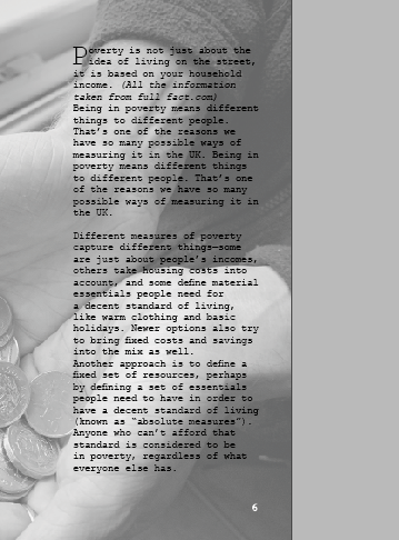
This was the first attempt of adding type to the page. I really wanted to use a drop cap due to research I had found and to me they make the text stand out so much more so the reader wants to find out more about what you are discussing. I made the type sit in courier and followed a column structure like magazine portray within their designs. However when we had the critique one of the comments was that this was hard to read in the mock up and the editorial design therefore I created a test print to see if that was the case.
test print
Below is an image on a4 the printed editorial layout on this page. I wanted to see if the writing was hard to read. and it was. I positioned this design in different places and stood away from it then close up to it and it was difficult to read on both aspects. I think it’s because the picture is black and white, and the type is so thin and small they contrast with one another. I showed this to my tutor and she suggested adding a block like some of my other pages and see bow that would look therefore I did just that and thought it worked 100000 times better for the reader to visualise and understand the writing.

I decided to add a lower opacity white block behind the writing – and automatically this made the type stand out and become more easier for the audience to read. I could off easily made it a solid white but then yo would not see elements of the image as much and would clash with the rest of the design.

Final editorial design:
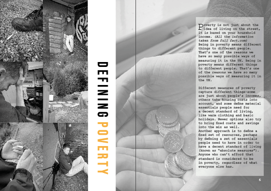
Below is an image if the final editorial design. I think this design works so well with the message I am trying to portray which is poverty in the UK. The photos on the left hand page are an indication of what life is like for the everyday person struggling with the small things some of us take for granted. I think the type in the middle separates the two images but weirdly connects them together well. The page indicates sensitivity to the topic and does not portray any stereotypical images that surround people in poverty. The image on the left also portray more than one person, as I wanted to ensure I was displaying what life is like through a variety of people not just one person, I also think not using the same image twice makes it stand out a lot and not a relative element going on in the design.
Mock up of design
Like all the pages I wanted to create a ,mock up for the audience to see what this would look like when featured in a magazine spread. When looking at this mock up you can see all the key elements well and they all tell a story in their own way but connect well with one another. There is a lot of imagery going on but its not too cramped to the readers eye. Having the image on the right be more lowered in opacity makes the page present more sensitivity towards the topic and not too in your face filled with images. The title works so well when featured in the spread, and this is due to the image on the right going over the gutter allowing the type to be seen well.
