I stupidly forgot to write how the design process for the presentation actually enhanced my designs therefore would discuss this at the end of my design process. I think that having the 3 presentations, total of 2 achieved at the moment allowed us to develop ideas. I have noticed in the pass I have achieved work without discussion of others and tutors then lost marks because I did not ask. This time round, the I got opinions at the start middle and end.
I thought I would analyse the designs displayed within the power points and discuss the development through them and how the power point has helped me achieve that.
First presentation:
The first presentation was simple, it was displaying the research we have looked in to so far and this then allowed us to undertake ideas and elopements for further investigations within design research. I displayed the research I had found, and the designs so far. The designs were not as good as the finals now and this really shows as development achieved through the designs.
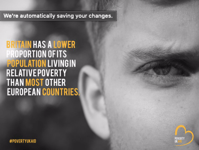
At this point in the design process, this was these were the designs I had created. I HATE THEM. looking at them now. the type is off, the logo is off everything is off. This shocked me so much, as I had no idea the presentations had so much of an influence towards my final designs, but they have. The logo is absolutely massive, and sits so awkwardly almost like its floating. The type is kind of there and has no source from where it’s from. It just fills a bit rushed. When we had this critique, the suggestions was to take more photographs inside the house for the magazine because at this point no magazines had been developed or design. At this point there was a hashtag that I was going to develop, I think it looks so childish and makes it look unprofessional the way it has been positioned and designed just doesn’t work in comparison to my finals now.

Second critique.
The second critique was an entire month after therefore the designs developed a lot more and the magazine began happening. This powerpoint just featured the designs currently made at this point but this was only a week ago and the development is crazy. I have developed so much more professional and I am so proud of that.
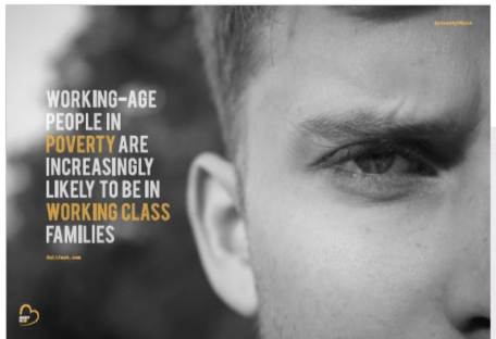
I won’t discuss every poster but this one as they all follow the same techniques but this one changed the most. The type made absolutely no sense when I did the first design, it looked so cramped and oh my goodness its awful cannot deal with it. I clearly did that over night on lack of sleep. I then changed the entire sentence which was recommended by my tutor and this then allowed this design to come alive and become so much better. I would not of even noticed this if my tutor didn’t say it, ( I probably would have but at the time I didn’t)
HOW CLEAN DOES THIS LOOK IN COMPARISON TO THE FIRST DESIGN. I cannot get over it, how my designs and little tweaks made this poster come alive. Making the logo smaller, making the hashtag turn into an @ and smaller in the corner. Just by adding a source from where the information came from made this such a realistic poster and so iconic and reliable for the reader.
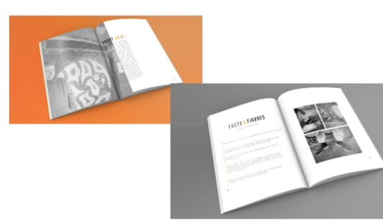
Within this powerpoint, I showcased some of my magazine finals. Considering this was a week before hand in, they are so different in comparison to the final mock ups I handed in. The development of my magazine was not shown as much in the presentations just because I made this after the posters, and from the posters kind of knew what to do and what not to do.
do you hate these mock ups as much as me? its ok yes me too. They are awful. They look so tacky and the colour why on earth have I put an orange in the background. Sometimes you do not realise until its on a big screen infant of everything. I remember this slide coming on to the page and thinking why Katie. I did not like how the angel of the mock up sat and if you compare it to the mock ups I have achieved now its completely different and 10000 x more professional. The colour background makes it to kid like.
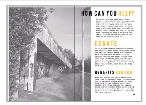
The last thing that helped me through this critique was this photograph and this page of the magazine. I thought that this page was ok, and again until it was on a big screen and I had people analysing it; only then I realised it.
Now looking at this page, it makes me want to scream at past Katie. Why does that type sit over the image, and forgot sake get rid of that lamp post. Sometimes you get so lost in your own designs you do not pick up on these things as soon as my tutor said about the lamppost it was the only thing I could see. And if I had no shown this in the presentation I probably would of handed it in like this.
All these designs are a massive comparison to the final designs that I am going to display in the next blog posts. You can see for yourself, how much these presentations have helped me develop my skills, and professionalism. I have studied graphics for 5 years, and this is the first year I have actually learnt from my presentations, benefitted from doing them more than once and think we should do it more. Doing test prints is a big thing I need to continue. I have developed so much in my own work and finally found my style and found the process to achieve to that.
