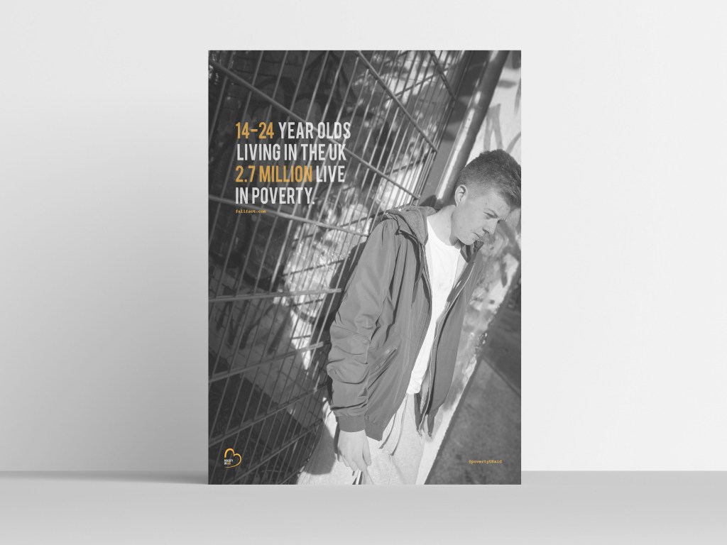
One thing to discuss through the design process was the alternations for the posters once printed. Not everything had to be changed but one poster in particular needed to be altered due to the wording. Within each poster there is a fact, this fact has been taken from full fact . com which has been displayed on posters and in the magazine as a reliable source. When i was printing this final indicated below, I was sure this was the final design; however after reviewing it once printing the type just made no sense to me.
Within the mock up the statement used is ’14-24′ year olds living in the Uk,2.7 million live in poverty. for me this made absolutely no sense there needed to be a use of punctuation or rephrase the entire sentence. I then decided to ask my tutor what she thought and we came up with a new phrase to use through the design.
“Nearly 3 million 14-24 year olds in the uk LIVE IN POVERTY” This automatically sounded so much better in comparison to the first poster. The purpose of all these designs was to make it stand out to people and be in peoples faces. I wanted the information to stand out to people and really make them think and wonder how they can benefit from helping. I wanted to facts to be shocking and this one defiantly achieves this. I decided to highlight the words 3 million and poverty and these were the key words for me within this design. Comparing this to my first design type you can already see as a reader that it stands out more and hits you a lot harder than previously.

