A couple of weeks before the canteen display we designed our first set of outcomes and this then we would show case this to rest of the class to develop the idea further in time for the canteen project. I was extremely ill over the beginning of project X, I had to visit doctors with an awful chest infection therefore did not come in for I believe one day but I kept contacting my group where I did not get a reply therefore did not leave anyone in the loop. We all kind of knew the aim and the outcomes but I did participate to the bets I could considering the circumstances I was facing. We all sort of had alighted tasks to complete this outcome and that is what happened.
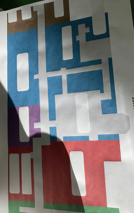
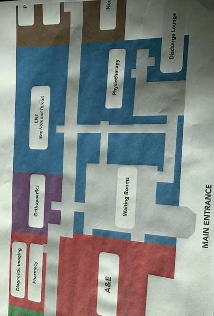
Jacob created the outline and the map for the hospital with names of the rooms and another one with no rooms on therefore people could stick the right ones on, a this would be the main focal point for the design. Sam created the small icons that people would stick on, and then when I returned from being ill I sat them all down and worked out a plan in order of what I had to to do next. I personally did not think this design was amazing and could be developed a lot due to the dark dull colours used.
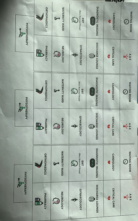
Sams icon
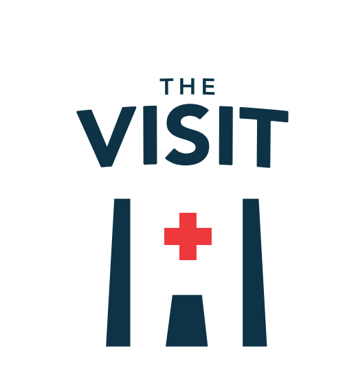
We had no title or branding for the entire display therefore I suggested we create a title which could conclude everything together and I suggested that tom created that and he created the phrase named ‘the visit’ from this title I would use this to create ‘did you know cards’. When tom had created the logo I asked him to send them over to me and then I thought of how I could incoporate this within the cards. I thought about the cards as I personally think that are people actually learning from this display and creating something educational therefore thought it would be a great little additions. The actual purpose was for these to be double sided and to be printed landscape a5 so people could take them way but these actions did not fall through due to group decisions.
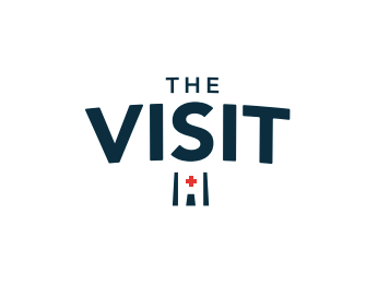
Logo: This is the logo I got sent and I love it think its a really good logo simple and effective. I got told to use the middle on for the cards as the front and that what I did.

I asked what type face was used on this title therefore I could use this for the type within the cards. When we did project X the first year the main issue was consistency within the design and this was a big down fall with ours, therefore for this project I knew I wanted to make sure that we was consistent throughout.
The type faced used within the title was avenir bold and then I used light within the cards.
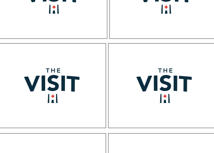
The card design:
Front of card:
I got told to use a certain logo for the front of the cards which I did, however I also added the small icon as I felt like this was necessary for the front of the card to link with all aspects within the design and to show consistency. I made sure the logo was centre and this would be the same on all the cards.

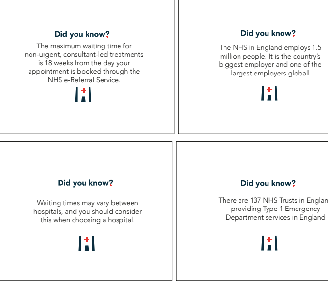
The back of the cards:
The purpose of the back of the cards was anything to do with the wait time, the hospital on general and the A&E procedures.
Facts used: (taken from a variety of websites)
- the maximum waiting time for non-urgent consultant-led treatments is 18 weeks from the day of your appointment is booked through the NHS e-Referral service
- The NHS in England employs 1.5 millions people. It is the country’s biggest employer and one of the largest employer globally.
- Waiting times may vary between hospitals, and you should consider this when choosing a hospital.
- There are 137 NHS trust in England proving type 1 A&E department services in England.
- Since 2015 at least 112 Emergency consultants and 171 trainees have left the UK to work oversea/
- An A&E department deals with genuine life-threatening emergencies such as loss of consciousness, chest pain, and concussion.
These facts are general knowledge about NHS and A and E and some linking to wait times and hospitals in general.
The final card designs: (before editing)
Before we presented this to the class this is what I thought the final outcome would be however this altered. The only thing that changed within the design for the cards was some typos and other than that it was all ok but the purpose of the design changed.
CHANGES:
We also altered the perspective of our hospital layout and made it clearer for people to understand – for a while some one in our group became very bossy and was making up rules for the design but the fact was they didn’t work, so we all suggested simple works better.
