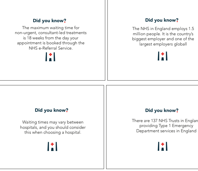
A MOCK UP I CREATED TO SHOWCASE WHAT THEY WOULD LOOK LIKE:
My group decided to not actually print them in the way I was hoping for – therefore I decided to create a mock up to showcase what it would look like as a printed card.
I am creating a campaign awareness for the LFB, and the daily lives the fire fighters intel, Making the awareness of the worth of the fire service. I want to educate people all about what the fire fighters do and the way their day goes about and creating an awareness of the importance and worth of fire fighters main focus being LFB. My uncle is a fire fighter and the aim is go and visit him and undertake information and photographs and use him through this campaign.
Audience
The audience for this campaign is for secondary school kids. I want to create a school pack for the fire fighters to give out during assembly’s so the kids can actually learn something rather thanking frightened by the work of fire fighters and the situations they face.
Purpose:
the purpose of this entire design relates to the message slightly as its all about understanding of making awareness of the importance of fire fighters and making it more of a job choice, due to the cut backs its important to showcase how important these fire fighters are and the worth of them.
When visiting the fire station my uncle told me that due to the cuts and kids not knowing much (other than fire fighters deal with fire) people are not as interested in becoming a fire fighter. When they visit schools, he sometimes feels as if they are not interested or take much in. The purpose of this campaign is to make awareness of what a fire fighter does on a daily basis, and what it’s like to be part of LFB. The audience is secondary school children, when the fire fighters go to the assemblies to educate about fire safety this is an added part on what it’s like to be a fire fighter and everything you need to know. With a magazine for the children to take away for their parents, and an envelope packaged to educate the children.
In what ways does the visual communication/message of the piece meet the needs of the brief?
The aim for this project was focusing on the NHS – the entire purpose was to create a design to displayed in public. The aim of the design is to act as a prototype for something which engages the community about the NHS. I think this design does engage the audience due to colours but I don’t think my group thought about the audience that much. It does portray a link to the NHS but I personally felt like it needed a bit more indication to the NHS as if I walked pass it I wouldn’t even know it’s part of the NHS. I understand the purpose and it is displayed in the corner but personally speaking I defiantly think more boldness and titles needed to happen. I do also think it meets the needs of the brief due to the fact that it’s aimed for the NHS and we created prototype of a game – that could potentially work.
What are the strengths of the visual communication?
The logo is really well designed and links to the message of the prototype. I think the bold colours within the hospital layout make it stand out and interesting towards the audience. At first the colours were so boring but after making it bolder and more interesting allowed it come to life. – if your trying to attract the public which in this case was west Kent younger people associate with colours and think ok what is that- also a lot of board games are very colourful. Also the tokens i created were unique and shaped interesting.
What are the weaknesses of the visual communication ? Why?
There was a lot wrong with this design and a lot of things I wouldn’t of done. I think that there needed to be more of an indication of NHS – when this was placed in the canteen there was no big sign and people were not interested. For me when your creating something for someone’s attention you need to have a call to action and I felt like our design lacked that – therefore a downsides to visual communication. I don’t think the design is very powerful and I would just walk pass it.
In what practical ways could the piece be developed or improved?
I personally think there needed to be more informative I did make the information cards and they worked because if we did not have they would not of been an aim. I think there could of been a lot of ways this could of been developed. We could of made a banner – a big title – a focal point and USP I think a lot could of been developed and some younger years felt like it would just be a pretty design and there’s a lot more to that.
In what ways did you consider design for backwards or application of systems thinking in your project?
I think in project x you have to consider all the good design elements due to the factors that are considered with the brief and the project. I think during this project I could of added backwards applications a little bit more. However this project was always about the end result and creating things for presentation so thinking of he end result allowed us to know how to design and the best way – and in that sense that’s how we used design for backwards.
In what other ways have you considered the sustainability of your project process and outcome?
Whenever we do project X I always considering sustainability. I feel like as the years have gone on and this is my final ever project X I have developed in the sense of understanding sustainability. When I first did project x I never thought about the sustainability outcome , but as the years have gone on and I have been taught more it’s the first thing I think of as well as design for good and ethics etc. I think the design needed to be considered through printing and this would be because there was a group of us we couldn’t print one piece per person so this had to be considered throughout.
In what other ways have you considered the ethical implications of your project process and outcome?
I think as I am developing within graphics my view and outcome on life has really developed. Whenever I design now I think of the ethics I and I remember saying that my group this was involving other people’s perspectives and this also allowed us to come up with a final. – you have to think about a lot of ethics when designing for good and this is what this project aimed towards.
What targets can you make at this point for your work in the future as a socially conscious designer?
I think as the years have gone on since project X 217 I felt developed and understood the purpose within being a conscious designer and I personally think without project X I wouldn’t of achieved that even if the outcomes weren’t great I learnt a lot. I think it’s important to always design for good and understand why your designing. I will make sure to always continue this skills as a future graphic designer as I want to be a conscious designer and I feel like I’ve achieve that and to continue it u will always try and design for good and make a difference not add the the problems already!
REFLECTION OF OWN WORKING PRACTICE !
How was my time Keeping?
I feel like it could of been so much better I had a lot going on in my life so I was struggling to keep up with it all. I wish I set our goals for myself so I could of finished and be proud of our final but I don’t think that’s the case. I did always try to make it as best timing I could but sometimes life got in the way but I wish I kept up with blogs a bit more.
How was my analysis of the brief?
I believe my analysis of the brief was really good considering it was my third year I didn’t really need to refer to it as much as I knew the outcomes and the sorts of aspects to consider within project x group work.
How was my research?
I wish I did more – I think when working in a group you all try and do something and show of your skills and our group lacked trying to bin point allocated research task and I felt like we needed to communicate more therefore I could of researched more. However I did research on my own a lot and that has proven though me being a design for good designer.
How did I draw conclusions from my research?
Like any design project without any research the design wouldn’t work. I think we could of researched a little more like I would on my own project. I think that research allowed us to have. USP and also understand what we was going to create.
How did I use evaluations to help with my ideas generation and development ?
I always analyse my own work and use evaluations to make the work better. I think when we had to group first feedback tutors allowed us to conclude evaluations and come up with next step for us and without that our work would not of developed at all.
How did I use experimentation during the project? How can I make this more effective
I think when your working in a group a lot of people have opinions and the idea of experimenting sort of goes away as you start to think of outcome which isn’t always great. We experimented when we did the game and that sort of started as a key point for us and then we developed from there. I think we should of experimented a lot more as this would of made us realise people’s strengths were and I think we could of made a better outcome. Therefore taught me to always experiment never go for the first idea.
What parts of the project did I enjoy the most?
I enjoy learning about design for good and helping people out. I think that even learning about the NHS was interesting. Project x taught me a lot and I wish I could tell first years to pay attention more to it and give it more credit as it’s taught me to much on my 3 years and if I could tell first year katie to speak up more and do it and participate I would.
What parts of the project did I enjoy the least? Why was that the case?
I find working with younger years quite hard this year they just wanted to make it pretty and not really think of the design for good or the USP or anything and I then kind of stood back because my voice wasn’t get heard even thought my points were valid. I think being a girl in graphics sometimes is quite hard and project x has shown that because I always try and speak up and finally I felt like people actually a thought ok she know what she is taking about but they didn’t really listen. I do wish more people were also in the canteen and we did it slightly different to attract people’s attention more.
What areas Inspired me ? Why was this the case ? How can I follow these up?
What areas inspired me? Why was this the case? How could I follow these up?
I personally always get inspired my project X and I wish I could tell HND1 Katie to listen and pay more attention to it. Without project X I do not believe I would have to knowledge of design for good, it’s a great way practically to undertake design for good cases and allow designers to understand why they are designing and benefitting towards the world. I will follow this up and always aim to design for good and use my knowledge from Project X in upcoming careers and jobs.
What areas were challenging or difficult? Why was this the case?
I am ok working in a team; but some people in our group felt like they had a bigger opinion to others when in actual fact their design skills didn’t make sense. I do think some people find it hard to take criticism and understand working in a graphic design team and sometimes with project X this shows through people therefore I found this quite challenging dealing with the younger years this year. `
How can I go about developing and improving the parts I found difficult?
I think always discussing with the group enabled me to conclude parts we all found difficult and without group discussions I don’t feel as if we would of even completed a final.
Do I need to develop certain skills? Do I need these now? Or later?
I personally think I need to speak up more, I did a lot but I got to the point of not trying as I had other work to do and sometimes felt like my opinion wasn’t listened too. I have learnt over project X that being a girl can be difficult when in a group of boys who have loud voices and I have learnt to speak my mind a lot through the years.
Any other points?I encourage every younger year to pay attention to project X without it I would not be the conscious designer I believe I have become and walking away with.
I did write an entire blog showcasing the canteen display but I felt like I should write an entire blog explaining it as I felt like it was needed.
I think we needed a call to action. our display was very boring if im honest. Over the years of studying graphics I have learnt a lot and within project X I have especially learnt how to attract the audiences attention and I just felt like ours was missing it. The layout of the canteen was very cramped so it almost looked like everyones work was connected and it should of been like when we created in in first year. I feel like our group had nothing hanging up on walls and mixed in with everyone else’s. no one wanted to really play the game as they didn’t see the purpose. I think if we had a banner or something to draw in the audiences attention the entire message and feedback would of worked so much better.
I found group work this year extremely hard due to the lack of listening within my group. With project X I was extremely stressed due to the hand in of my dissertation and I felt the timing wasn’t amazing. Due to this my group didn’t really communicate with me and therefore I never really knew what was happening unless I asked. Due to their being another BA in the group I felt like no one actually listened to me but did listen to them therefore I stepped back. I did turn up most of the lessons, but when I did my group would be off doing something without communicating where they were and when I did ask them what’s going I hardly got filled in with anything therefore I grew a lot of frustration. I got told by my group not to worry about coming in early for the exhibition but then I almost got stabbed in the back as they turned it around as if I wasn’t actually bothering to turn up which wasn’t the case. When it came to sorting out who was doing what in the canteen I got told not to bother coming in until after my dissertation was handed it and I thought my group had understood that considering it was Tomas’ idea… we agreed as a group sam would be first then hand his dissertation in Tomas would take over then me an then Jacob. But when I turned up no one even let me sit there and I then gave up with trying. I had to then leave early due to my car not working therefore I couldn’t stay and needed Jacks help. I had tried emailing back and forth and I will demonstrate that – no one told me the final outcome and I had to work alone to create the cards and was my decision to even create them. I think overall the lack of communication was awful and more like a one person group. I feel like if they had made more of an effort our design could off been amazing. I am angry because my group turned it around like I didn’t bother but I actually did and as tutors know I always try my best and felt like I was let down on this occasion – as no group chat was made just back and forth emails without people actually answering me – and I had to bug for ages to get the finals and send mine.
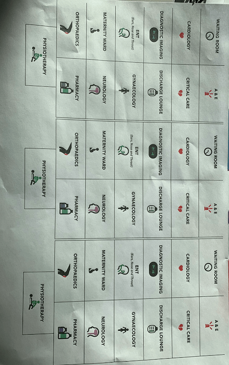
With the final display, I created the icons where all I did was create a hexagon and put the different numbers within – this was then part of the game process that featured in the canteen along side that I also created the cards for people to take away with them.
Final cards: made by me and the logo by tom.
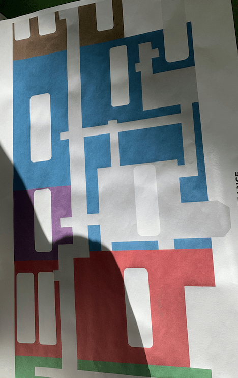
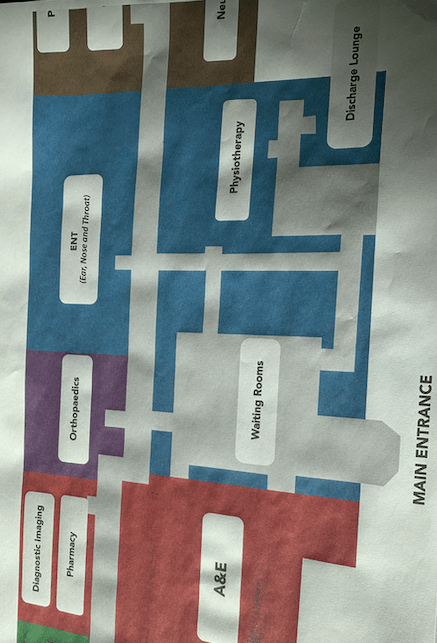
Final hospital layout:
The day of dissertation hand in we also had to be in the canteen showcasing this work so it was a stressful day for BA and some younger years did not appreciate that. As a group we worked out timings, they told me as a group to turn up after my dissertation hand in therefore was not my fault if I was late as I followed group rules which I felt then turned on me for following their orders.
When I turned up the exhibition was already up, in comparison to other years the displays did not look appealing it almost looked a bit rushed. But as a group we tried to get people engaged which is a challenge within a college.
Images of the display in the canteen.
Conclusion of the design:
The design worked well overall but personally it could of been better – it was not captivating when it was displayed in the canteen It did not stand out well at all and did not engage people we had no posters which I did suggest and people could easily walk pass it and not give out any attention. The design was clean and worked well and was a development of our game, but did it educate people? i’m not to sure it did.
My group never actually gave me the feedback we got from the group therefore cannot evaluate that but know majority of them was filled out by members of the class, and one did mention it was not that engaging.
A couple of weeks before the canteen display we designed our first set of outcomes and this then we would show case this to rest of the class to develop the idea further in time for the canteen project. I was extremely ill over the beginning of project X, I had to visit doctors with an awful chest infection therefore did not come in for I believe one day but I kept contacting my group where I did not get a reply therefore did not leave anyone in the loop. We all kind of knew the aim and the outcomes but I did participate to the bets I could considering the circumstances I was facing. We all sort of had alighted tasks to complete this outcome and that is what happened.
Jacob created the outline and the map for the hospital with names of the rooms and another one with no rooms on therefore people could stick the right ones on, a this would be the main focal point for the design. Sam created the small icons that people would stick on, and then when I returned from being ill I sat them all down and worked out a plan in order of what I had to to do next. I personally did not think this design was amazing and could be developed a lot due to the dark dull colours used.
Sams icon
We had no title or branding for the entire display therefore I suggested we create a title which could conclude everything together and I suggested that tom created that and he created the phrase named ‘the visit’ from this title I would use this to create ‘did you know cards’. When tom had created the logo I asked him to send them over to me and then I thought of how I could incoporate this within the cards. I thought about the cards as I personally think that are people actually learning from this display and creating something educational therefore thought it would be a great little additions. The actual purpose was for these to be double sided and to be printed landscape a5 so people could take them way but these actions did not fall through due to group decisions.
Logo: This is the logo I got sent and I love it think its a really good logo simple and effective. I got told to use the middle on for the cards as the front and that what I did.
I asked what type face was used on this title therefore I could use this for the type within the cards. When we did project X the first year the main issue was consistency within the design and this was a big down fall with ours, therefore for this project I knew I wanted to make sure that we was consistent throughout.
The type faced used within the title was avenir bold and then I used light within the cards.
The card design:
Front of card:
I got told to use a certain logo for the front of the cards which I did, however I also added the small icon as I felt like this was necessary for the front of the card to link with all aspects within the design and to show consistency. I made sure the logo was centre and this would be the same on all the cards.
The back of the cards:
The purpose of the back of the cards was anything to do with the wait time, the hospital on general and the A&E procedures.
Facts used: (taken from a variety of websites)
the maximum waiting time for non-urgent consultant-led treatments is 18 weeks from the day of your appointment is booked through the NHS e-Referral service
The NHS in England employs 1.5 millions people. It is the country’s biggest employer and one of the largest employer globally.
Waiting times may vary between hospitals, and you should consider this when choosing a hospital.
There are 137 NHS trust in England proving type 1 A&E department services in England.
Since 2015 at least 112 Emergency consultants and 171 trainees have left the UK to work oversea/
An A&E department deals with genuine life-threatening emergencies such as loss of consciousness, chest pain, and concussion.
These facts are general knowledge about NHS and A and E and some linking to wait times and hospitals in general.
The final card designs: (before editing)
Before we presented this to the class this is what I thought the final outcome would be however this altered. The only thing that changed within the design for the cards was some typos and other than that it was all ok but the purpose of the design changed.
CHANGES:
We also altered the perspective of our hospital layout and made it clearer for people to understand – for a while some one in our group became very bossy and was making up rules for the design but the fact was they didn’t work, so we all suggested simple works better.
Project X is something that happens every year where we work each year in groups to conduct a final outcome for design for good and benefitting an issue thats surrounding the world today. Instead of writing loads of blogs dedicated towards this decided to write a blog on the journey then a separate one on the design process.
This year as a collective we decided to go towards the NHS as our chosen topic to pursue as a group. At first we had to create a game which would replica the topic we was going to use within the display within the canteen in a few weeks.
The first thing we did was write down a bunch of aspects that we felt were important within the NHS, Within the group we had to dedicate aspects we felt were important to the a and e and the NHS as a hole. We concluded as a group waiting time. then we just went of and found as much information as we could for waiting time and patient information that was needed to inform the public with the NHS and the A and E service.
Creating a game:
Within our group we wanted to create something for the display and the game to do with patient waiting – therefore came the idea of the ‘waiting game.’ the purpose of this game was for people to follow the instructions then this would follow through the game. Our game consisted of a plan of a hospital where each square relates to a hospital room therefore show casing a floor plan of what a general hospital looks like.
To make the game interesting for the audience we decided to go for a blue background sheet of paper therefore this would stand out and not come across boring to the audience. The purpose of this game was to use the colour tokens and move around the board using the spinner, when you landed on a room you either picked up a green card or a white card portraying a bunch of information about the game.
Feed back from the game:
As a team we actually worked together well and each did different parts of the game to make it come together one member wasn’t there therefore it was harder with three but we managed as we each took on important roles within the design process. I had to create the cards, the tokens and together we worked out the purpose of the game.
When we went round and we then got our feed back, people found it too confusing. Which is fair enough, I think through the game we lost he purpose a little bit but from this happening we knew what we needed to change in order to complete the designs for the final display.
project X is all about designing for good and being a social designer leading onto the idea of system thinking. I want to become a designer that’s all about design for good, meaning that I design work to help people, and change the world not just a pretty poster or a Mac monkey, design is more than that and some people do not understand that. With graphic design we can help the planet through our designs and through both the projects NHS and creative conscious I thought about ways we could do that.
How to save the planet through graphic design?
Graphic design is about making awareness and promoting or advertising aspects. It sometimes can have. negative impact, as companies portray the false interpretation of things. However, the purpose of design for good is designing for a positive impact and actually creating a final outcome that changes the world and goes against the norm, otherwise you are just adding to the issues already out there and not actually changing it. What I love about graphic design, is its your chance to add your own twist onto design and actually make a difference in the world. An example for design for good, is making people aware of bad situations in the world being homelessness, nHS issues etc, and changing it to make a difference and put an impact into society where it can actually make a difference. A lot of graphic designers are just Mac monkeys and do not plan their designs in order to create something that could be a design for good and its something I cherish from learning through my university days at the uni of Kent.
defintion: Design for Good is an ethos to use problem-solving and design thinking towards social change. … Design for Good sustains designers playing a catalytic role through community projects that create positive social impact.
For me, every project I make sure I think for designing for the good, making issues and awareness of issues that the world faces and using my skills and love to make a difference, its almost like your saving people in your own little way. I love it!
Examples of design for good: pROJECTS I HAVE DONE
throughout my graphic design journey, I have cerated a variety of designs that fit into the category of designing for good. When I was in level 3 this was not the case it was the final project of something ‘pretty’ when starting HND only then did I think and Strat to consider design for good and the development my work took since achieving that.
Within HND2 and BA I created a lot of work based on design for good. Such as…
Homelessness campaign – This was a campaign and a comply I created to prevent the increase in teenage homelessness.
Poverty UK – Making awareness for family poverty in the uK with personal stories and the ways in the UK can begin to help to decrease poverty for families.
LFB – Currently making a project to make awareness of the daily life of fire fighters in London for schools to promote their daily live and what it takes to be a fire fighter.
All these have in common are making awareness of a subject and coming up with a solution to fix it and this is the best thing about graphic design! Making a difference not just a pretty poster! (and this is the most cherish thing I have learnt within my years of studying)
System thinking:
defintion: Systems thinking is an approach to understand, design, systemize the flow of value from various aspects of the organization across the value chain to ensure synchronicity, consistency, integration, and maximization between people, activities, processes, policies, places and resources
HOW I PLAN TO DESIGN FOR GOOD WITHIN THIS PROJECT AND FURTHER PROJECTS:
As the years have gone on within graphic design the man thing I have gained so much knowledge on has been designing for good and making designs benefit for people instead of adding to the issues. Therefore with the NHS project I thought the entire way through how I could potentially benefit people and design for the best which I did feel some people did not understand. When thinking as a group we had to think of ways to make designs better and the system better and fix issues surrounding the NHS.
Since I started my graphic design course the main thing that we focus on when participating within group work is the idea of using divergent thinking within designs to create outcomes and is a way of thinking outside the box.
Definition of divergent thinking:
Divergent thinking is a thought process or method use to generate creative ideas by exploring many possible solutions. It typical occurs in spontaneous, free flowing, non-linear manner, such that many ideas are generate in an emergency cognitive fashion (random and outside the box)
Helping the NHS divergent thinking:-
robotic nursing
holographic first aid
treasure hunt to find way around the hospital
robot doctors
touch screen assistance
Everyone is born a doctor and knows basic understanding