When I looked onto their website there was so much surrounding the London fire service which enabled people to understand them as a unit and the stories they encountered along the way. I also decided to analyse their website to get an understanding of the colours and information they portray.
the reason I wanted to analyse the website was to understand a bit more and to understand the colours, images and information that gets portrayed through the LFB so my magazine could then relate to that.
The first thing you see is the LFB logo and then follows the categories to visualise within the design. I decided to just analyse the front page just to get an understanding of the first set of visuals you see, the colours, the information and this would then allow me to design my magazine.
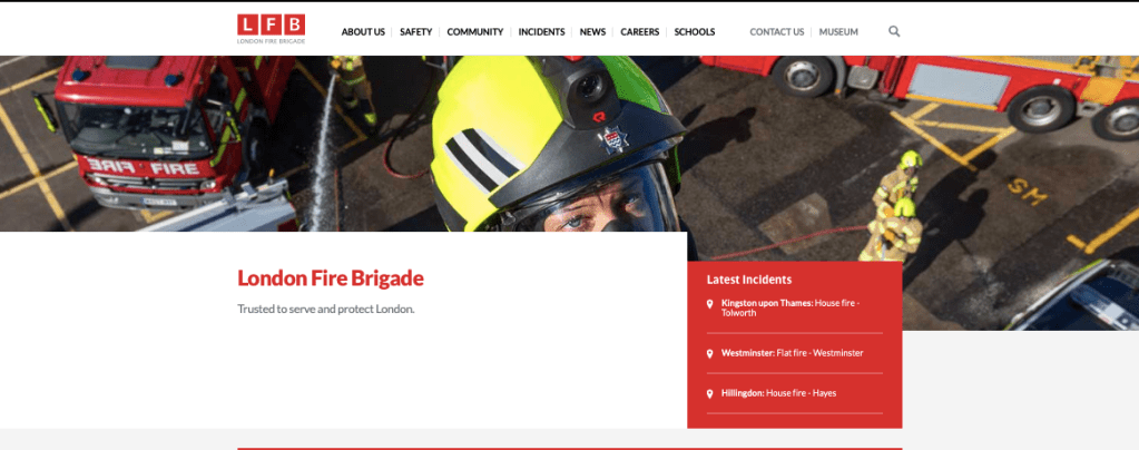
so the first thing is the image, the visual is of a fire fire fighter in his surroundings aiming to finishing his drills, or in action this picture allows you to associate with that. You have the L
