The colours used within the double page spread will be decide d through the colours used within the website and to even understand the LFB to its full potential picking apart the website will enable me to do that. by doing this I will be able to understand what information to provide and how to provide it.
First and full most the first thing I wanted to showcase the logo and the colours used within the logo as this would be used frequently within my designs and outcomes to showcase the LFB. The logo is simple and easy and represent the LFB well. The LFB IS IN RED BLOCKS and then underneath is the description of what the letters stand for. The main colour is a red and this goes through all the entire website which then links to the overall design for the LFB.

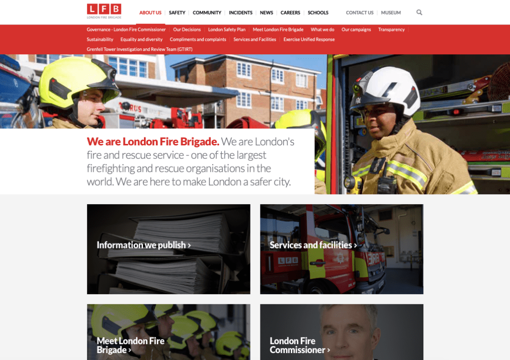
The website is full of key information and images to portray the LFB and what they are about. Within the menu bar they portray about us, safety, community, incidents, news, careers and schools. The first page you see when you go onto the website is vibrant , consistent of the colour red throughout. The images are quite friendly not to graphic and display what London Fire Brigade are all about.