Now I was not creating a logo in such for a brand, but for the magazine. LFB is already to company therefore it was being designed to act as a title for the magazine.
Inspiration:


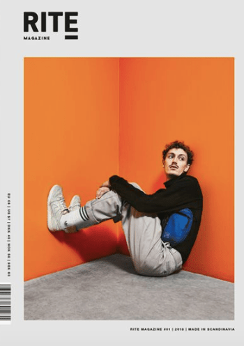
This logo above inspired my logo a lot as you can see its very similar. I wanted to make sure I was creating something that stood out, and because this entire page inspired my design I thought I would experiment with the type as part of my design.
I wanted to make it a short and snappy and straight to the point with the logo as I felt it would work well as a design – similar to my inspiration.
Before I created the logo I had to think of words that related to fire fighters and also the message I want to achieve. I wanted to create an awareness through the designs to portray fire fighters as not only putting out fires but rescuing people. when I thought of fire fighters the main thing that game to mind was the idea of the idea of fire fighters rescuing people.
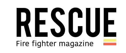
I thought of the word – RESUCE. I wanted to showcase a simple yet effective focus on the fire service. As you can see the inspiration is from the image above. I wanted a simple word that would be bold and I felt like this worked well – I then decided to add a bit of colour and this is when I got inspired to use the two lines (yellow and red) to underline key elements for example page numbers or website link. In this case I added t below the E to make it more of a image and come together to stand out and set a colour scheme for the rest of the magazine. I then added fire fighter magazine as I felt this represented the entire purpose of the design.
