Magazine page 2

APP - finals, APP everything

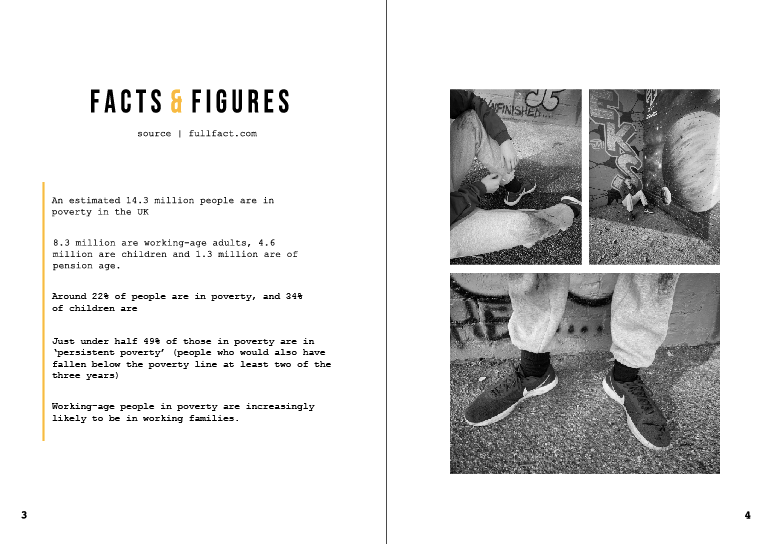
The next page is displaying facts and figures within poverty in the UK. I wanted people to understand what it is actually like, therefore hitting them with facts and figures makes it more real and the facts are quite astonishing.

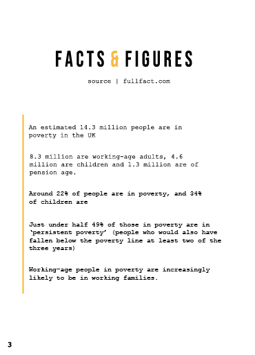
Again, the features are similar within the previous page. On the bottom of each page is the number, which in this case is 3 and 4 and is sat in the courier type face once again. The left hand page believe it not took the longest to create and this was due to the bullet point type feature within. However, firstly let’s discuss the title. I wanted the type to be short and sweet, and the title to be informative and eye catching. Therefore, decided to use the idea of spacing BEBAS again, (this to continue through the magazine design) but have the & sign in orange to make it stand out more. I did try it being black and the words being orange however it looked very tacky, where-as this design works effectively. Just like the posters I wanted to indicate where all the facts were from, so people knew they were true facts, therefore underneath the title sits the source that sits in the courier type face.
The issue I had with this design was the way in which I should lay out the type, within magazine I did not feel as if I should use bullet points because it made the design look unprofessional. It took a lot to make them change to the way they are now; but I noticed as soon as I added a guideline (the orange line going down the side) it made the design structure a lot better. I made sure the type didn’t go near the gutter as this was an issue when placing it into the mock up. I then made sure there was enough space between each sentence so It looked clean and even.

There are so many facts and figures that surround UK, poverty therefore I wanted to make sure I was portraying the correct ones and the post important ones for people to take action to help. All the facts have figures in them to relate to the title.

Sometimes with magazines about a certain topic, they over power the design with information therefore people skim the page and do not pick up key information. Therefore it was crucial for me to provide information that was easy for people to access and want to read. I wanted the design to show negative space and only portray the important facts clearly which I think they achieve well.
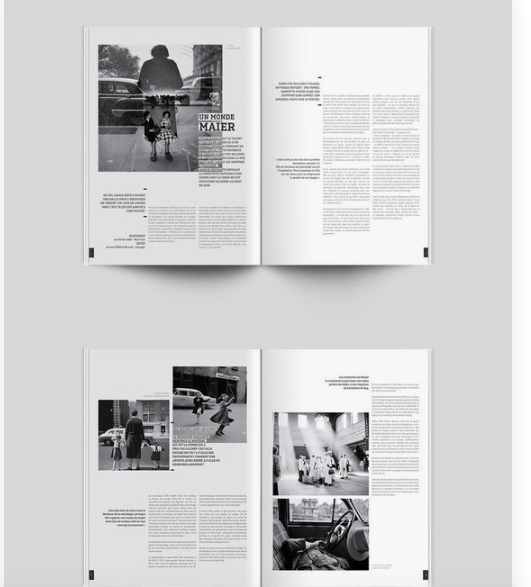
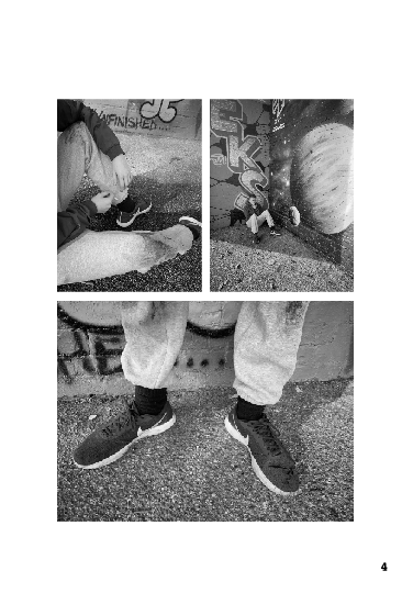
With the right hand page I was inspired by the image found on Pinterest. (bottom image) I loved the way they used collaged with the photography but made it so simple and not over crowded. Therefore wanted to use this within my design on the right hand page.

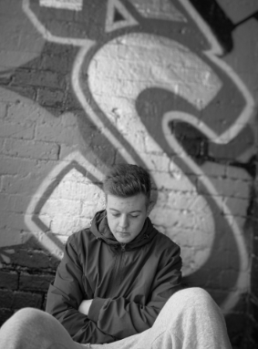
Comparing it the image before, you can see that it is slightly alternated in the way it’s displayed due to the photos I had to use. The top two photos represent the subject sitting down, and the focus on all these images are the clothing, indicating he is wearing the same shoes for a long time. I thought I have used a lot of imagery so far that’d displays emotion of the face, it was time to show case materials and other objects and surroundings that represented poverty. I think this design page is so clean and slick and show cases It in an effective way. The white lines that gap between each of the photo let them be individual photos but they come together well due to the layout and black and white theme.
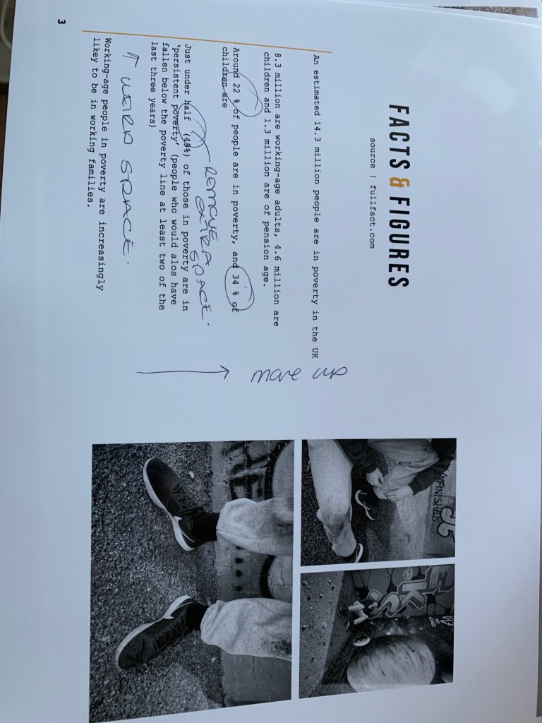
test print

The test print was a great way to visualise any errors that occurred through my designs. When I printed this page I noticed a lot in comparison to when looking at it on screen. I am not sure if it is clear in the picture below however I noticed errors within the type when printing that I did not notice on screen, and analysed them on the printing page. There was a lot of odd spacing between percentage signs and number, and spacing between words. The space between each sentence was slightly off and the writing did not match the alignment of the second page. I then used this to re create the page and adjust the elements that needed adjusting and created it to fit in with the final mock up.

This is the final design before adding it into the mock up. I think it is clean, effective and really grabs the readers attention. I wanted the design to follow through from the first page, and it does so well. it has the same cleanest about it, the same us elf black and white photos and the same colour scheme. I was worried how I would lay out certain photos and I think this simple layout makes the photos stand out well and you are able to locate and identify each photo and realise the story they are trying to tell. The audience, can easily read the writing and get an understanding of the facts and figures that surround poverty in the UK, and I think this is due to the fact its not a over whelming page fill of information and imagery it still incises the reader to continue onto the next page.
mock up

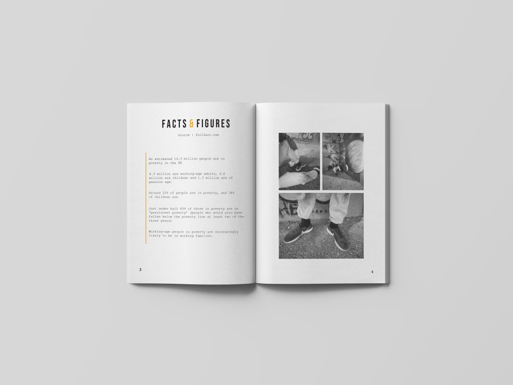
Below this is the mock up of two the pages would look when in magazine. For some reason the facts and figures a lot higher and however when you look at the spread above thats what it looks like its just added in unusually through the mock up. I think the design, portrays the sense of sensitivity around the topic, it does not bombard you and portrays the information clearly to the audience. I personally think the negative space allows the photos to take charge within the design and allows the page to tell a story.
Open Magazine Mockup by Anthony Boyd Graphics

Magazine | Page one

Uncategorized

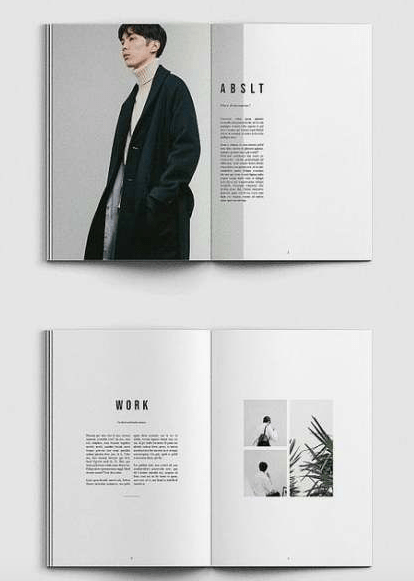
The first editorial page was inspired from the picture below (the top image) and as you can see I tried my best to make it as personal to fit Poverty UK aid as best as it could.

Inspiration:

My design

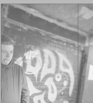
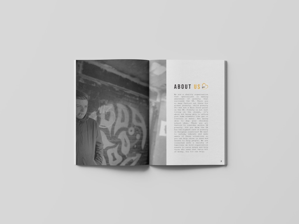
As said in previous posts poverty is a very sensitive topic and portraying it in a sensitive like is key through designs. The first page sets of the design layout for the rest of the pages to make it enhance and create a theme throughout. For the first page, the image used was this one below, but as you can see I lowered the opacity quite a bit to allow the type to be seen but through the changes the type alternates; however the opacity feel gives it quite a subtle look and not too in the audiences face. Just like the inspiration pages; I decided to make the image sit on the left hand side and slightly go over the gutter to the next page, what’s great about this layout technique it makes both the double pages come together and tell a story, rather than being two separate pages against one another.

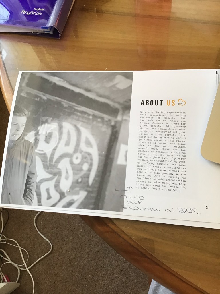
At first this is where I placed the type; however this now has been altered. This page is all about indicating to the audience what Poverty UK aid do as a collective. Therefore the title for this page is ‘about us’. Now unlike the posters this type is slightly different, if you look closely there is space between the letters which was inspired by the magazine on Pinterest. I think it allows the title to be read clearly and not make the page too cramped allowing room for negative space within the design.

I wanted to add the logo within the ‘about us’ title so the audience are clear who we are and what we do, this logo than links the posters with the editorial pages. I decided to make the ‘about’ in black and then the ‘us’ in orange to portray both the colours that feature within the logo and would be used throughout the design.

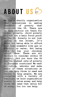
Below the title sits the type that informs the audience about what we do as a collective. At first, I followed the inspiration from the photo from Pinterest and overplayed the writing against the image, which made me lower the opacity of the picture. However when then doing the critique, a comment made was would this readable to the eye when printed. I think if the photo was not black and white then maybe we could see it more, however there is a lot of negative space on the page therefore I decided to change it and create a test print to secure the design layout choice.

about us’

We are a charity organisation that specializes in making awareness of poverty that surrounds the UK. There are so many factors out there for global poverty, child poverty etc but not a main focus point on the UK. Poverty is not just living on the street, it’s about not being able to afford your home elements like gas or electric or water. Not being able to buy your children school shoe. These are all factors to consider within UK poverty. Did you know the UK has the highest rate of poverty in European countries? We want to inform, educate and make aware of these situations so you can help those in need and donate to help people. We are connected with a variety of families; we hold organisation events to raise money and help those who need that extra bit of money. You too can help.

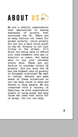
Above is what I have displayed in the about us section its short and sweet and allows people to understand what we do as a hole. As you can see the type sits in courier 10, which is the same as the posters, (where the key information was placed). I feel as if this type works so well with short sentences and articles within editorial design it portrays the type writer effect making it quite quirky and unique.

The changes made:

As previously mentioned after have a critique I decided to alternative the layout of the writing due to the image, and the amount of negative space used within the design. I kept the image to a lowered opacity, because to me when it was a full 100% the image seemed to bold and in your face which is not what I wanted to present through my designs. I decided to move the type slightly to the right into the negative space. I think the reason I did not do this in the first place was 1 because of the inspiration and 2 because I did not want the pages to be separate design elements, however because the image falls through to the next page it concludes the design together nicely and the image almost acts like a story line for the type.

Adding page numbers:

Within editorial design it is important to add numbers to ensure ti the audience what page is what, and if we had more time I would off created an entire magazine of a front cover and contents page therefore this is when the numbers would be involved. I wanted the numbers to be in the same typeface as the writing other wise there would be way too much type going on. They are not the eye of the design but are important to a magazine design for navigation. I decided to make them quite small and sit within the grid for designing and this allowed them to be position nicely within the design.

Final design:

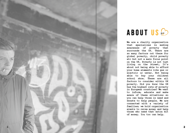
This is the final design piece. I wanted this page to indicate the design and colour theme through the rest of the magazine and I think it achieves this well. The image is off a low opacity so it does not take over from the rest of the image, and continues through to the next page. I defiantly think the type works better sitting in that negative space, its easier for the audience to read and makes it bold and stand out for them. The design is simple. Yet effective creating a clean cut within the design and thats why I think it works well . If the type was any bigger it would over power the design which isn’t what I wanted. I think when the reader looks at this page they get a sense of sentivity , the image is not too bold and the design is subtle to the eye. I wanted to display within the designs a sense of calm, and I think these designs show that and this is mainly because of the negative space used and layout choice. The information is clear to read, a lot of designs I looked at had a lot fo writing on pages, but this one is easy tread and not too much so the audience does not get bored. I also think the first page is like a sneak peak for the rest of the design, as I did not want to portray too much to the audience on the first page otherwise they would not need to read on.

TEST PRINT

Below is an image of the test print before the mock up was created. This allowed me to understand if the writing was readable to the eye. I do not usually do a test print but this helped me so much to understand what it would appear to the audience when printed.The writing was easy to read, no spelling errors and portrayed the correct message. This is defiantly something I will be doing from now on and wish I had done sooner. Test print saves a lot of editing on screen and panicking.

The final mock up

Below is the final mock up. Due to the shadowing the left page seems darker however it is not. The mock up allows me to visualise and the audience what it would be like when printed in a magazine.

Open Magazine Mockup by Anthony Boyd Graphics

Magazine lay out inspiration

Uncategorized

Within my magazines, I think I have found a style that relates well with me and relates to the topic, I think I finally found my style and what I love.

I think within magazines should be simple, when they are over crowded the information becomes too much and the reader finds it hard to visualise on one particular thing. I thought that the information would benefit from having a simple design.

Whenever I design a magazine my first place for inspiration is Pinterest. The simplicity of the designs and the way they are so effective makes them stand out to me so much, it creates a unique appearance to them.

My inspiration:

When you look at my first two pages you will understand where the inspiration has come from as they are inspired by these two pages. The first page (top page) in the image inspired me due to the way the image continued over to the next page; then the type sits against this leaving negative space for the type to be read easily. The bottom page interested me because of the layout of the images. I thought that the minimalistic effect works so well with this design and almost grabs the readers attention more than if it was crowded.

I did not use this through my designs but I did use it for referencing to understand how some magazines display images. I chose this one because it used a black and white imagery which I would be using within my magazine, I think when you limit your pictures to black and white you do not have other colours to fall on to create a theme therefore researching into that made me understand how to layout and portray black and white photos against type and layout.

Magazine research | poverty

Uncategorized

I wanted to make a magazine for this APP as I absolutely love the design features that come along with a magazine. I thought before designing or getting into inspiration towards layout, I would look into existing magazines out there that portray poverty whether this be UK or global.

When you type into google poverty magazine, the majority of things that come up are front covers and this isn’t something I was going to do for my APP; Just editorial pages. Therefore I came across a magazine that was dedicated towards poverty in the UK.

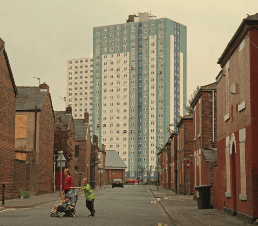
The magazine is prospect magazine … after all the main elements of magazine such as editorial letter etc. This is the first image displayed for UK POVERTY. How stereotypical is this magazine image used? They have a tower block in the background of a narrow street, its almost like they added this tower block there to indicate poverty. On the street is a young mum with 3 kids with the young boy pushing the buggy. This is exactly the opposite of my designs, this is so stereotypical and actually quite offensive, you do not need to live in a tower block to be in poverty.

Articles within the magazine:

They do not use a lot of imagery within the magazine, the majority of it is type which to me doesn’t portray what life is actually like for people in poverty that well. The articles are similar to this one below following the same style, with the two columns the drop cap and the question. I cannot read any of this as it bores me to sleep; there is way to much writing so people zone out they need breaks within the design or some sort of imagery.
All the writing is the same; but what really catches my eye is the images used and how stereotypical this magazine actually has been to me it seems like it’s someone from a higher class that has wrote it and wanted to show case the ‘lower’ way to live almost acting like an inconvenience to them

The photo that shocked me the most was this one below. The angel of this shot is really good, I think it showcases the surroundings well. but again why a tower block? you are giving the impression that if you live on a council estate you are automatically in poverty, which isn’t the case there are families in houses who struggle with poverty. The young boys are behind a bar which to me indicates they are trapped and not free which may be true to poverty issues but aren’t you separating these boys from everyone else? People in poverty aren’t scary people, disgusting people, they are normal people who just need a bit of help. I think the emotions within the children showcase poverty well, I just do not think you need an estate to show that and comes across very stereotypical as this is the second tower block image they have used.

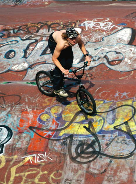
The final image I wanted to discuss was this one below. How on earth is this photo, representing poverty. I understand the graffiti as graffiti displays emotions through art, and something for people to do and the more rough areas do appear graffiti but its peoples way of expressing themselves. A boy riding on a bike? I am not sure how this is poverty at all. its almost like the writer/editor is show casing ‘chavs’ a sort of lifestyle choice not people in poverty.

http://www.prospectmagazine.co.uk/wp-content/uploads/2013/11/jrf_web.pdf

What I have noticed when looking into poverty magazines is the images tell the story, the type should be short and sweet and not too full on so people who haven’t experience poverty get a chance to understand it. I think the key is making the type sit in black and the titles not becoming too over powering against the images.

I could not find a lot of magazines out there that were based on poverty, they were either magazine articles about poverty (which I noticed drop caps were used a lot to grab the readers attention) I then saw that some of the magazines had adverts that slid into them to portray a poverty campaign, I thought I would look into the front covers of the poverty global magazines to get an idea of what sort of imagery and people they represent within this topic. When looking at the front cover of magazines they use the same sort of nationality to portray poverty, and I could not find one online that portrayed just UK poverty. They use a multi cultural family, a women and a baby struggling, its about saving a life within a different country. but what I noticed about this design was the black and white which is what I have achieved with my front cover, therefore was inspired to continue this through the magazine design. It portrays a negative response to the problem which is what I am aiming for within my designs.

How the audience view these posters / what makes it right for the audience

Uncategorized

Poverty is a sensitive subject. There are a lot of stereotypical aspects that surround it therefore when designing this had to come into consideration. I wanted to design for good and portray helping one another and becoming a community again. I think these posters do not portray a stereo typical family in poverty, it portrays normal people and their day to day life. The colours are very subtle but work well together and an entire colour scheme forms due to this. Majority of the posters out there for poverty are very depressing however they are very stereotypical and thats something I did not want, I wanted every person to relate to it some, how because I bet half of us have had elements of being on the poverty line now and then. I wanted to portray within the photographs that its not about begging for money, living on the street, its about living with considerations through poverty and your daily life.

The audience for my design is everyone. Families who have everything, who do not struggle, people who have been there before and want to help others. poverty is a lonely thing, its a constant struggle and having pride to not ask for help and thats why I wanted to create this project to allow families gather that help.

My designs are simple, they attract the eye and are sensitive to the audience eye and I think the audience would agree. I asked my mum what she thought of my work, as the personal story used within this story is from my mum and dad. When I showed her she cried, she said”you have hit the nail on the head of what its like struggle financially in the UK” and this is what then set me up for the rest of my designs in my magazine.

Poverty is over powered with facts and statistics; I could off put 50 facts per poster, but I chose facts from a reliable source that I felt would work best to the audience. Highlighting the key worlds made it stand out to the audience and almost allow them to want to read more.

When I displayed these posters infant of the class and tutors the response was lovely. The fact that people knew I was designing for good, and being sensitive to the topic without even saying anything suggest that the designs do the job they are meant to do and will be continued over to the magazine design.

BILLBOARD DESIGNS

Uncategorized

For my portfolio I wanted to design elements of editorial, posters which lead to billboard advertising as its the topics I want have a future career in. Therefore once I created the posters and the basic mock ups I wanted to see what a few of them would look like when added into a billboard sense.

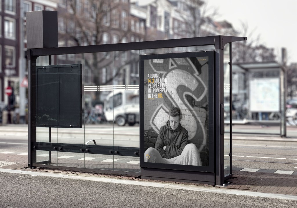
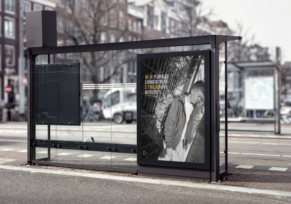
This one below symbolises what it would potentially look like when displayed on an advertising board. Posters can be displayed on undergrounds, cities, bus stops etc. I wanted to portray it on a bus stop, to emphasise that people would sit and read it whilst waiting for a bus which essentially is the aim of any bus stop advertising poster. You can see the type clearly, and if you were to zoom in more you’d see the other elements. The main purpose is the type and image then makes you want to move closer to read and find out more. I think the orange against the white within the type works so well, it makes the most important information stand out and grabs the readers attention.

I could not do poster 3 in a billboard as it was landscape but square landscape, it wa impossible to find a mock up that actually fitted it. I then thought that one would more likely be in an underground display as those ones are on a larger scale. The worry for me was that the posters would not be seen from a far due to the black and white, however what I think makes the poster pop is the colour orange through the type and logo, without that I do not think it would work as well. The images are clear and shine light on the fact of poverty in the UK and are clearly seen even when black and white.

Poster 3

Uncategorized

Now this design is slightly different in comparison to the other designs due to the layout of the design. I wanted to create a poster that could potentially be on a billboard and sometimes this would more likely be landscape therefore I created a design that was slightly different and had alternative images and mock ups to present that.

When we had our first critique, I got the feed back to photograph at home poverty more… therefore when I got home that day, I decided to photograph jack in our garden. When taking the photos we took one that really inspired me. When I was originally researching I found a photograph that inspired me through the taking, therefore you can slightly see the link between the research I gathered and my photograph/poster.

Inspiration photo:

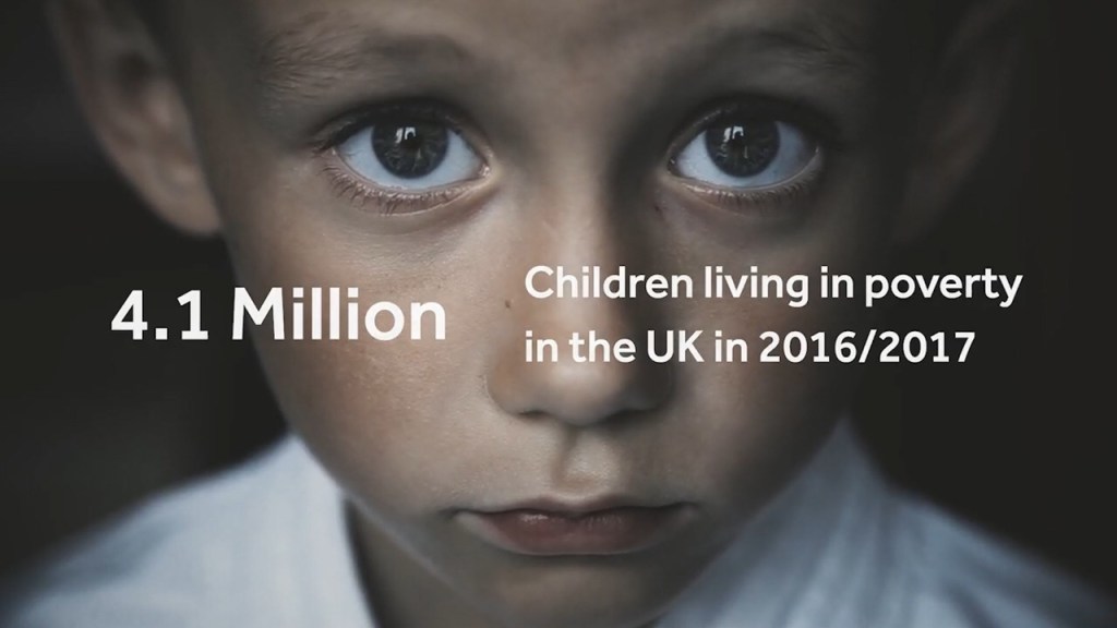
This photo is about children poverty, but what made the emotion come through was the look in his eyes. The purpose of these designs are to portray emotion through poverty… and portray to people what it’s like to be in poverty.The eyes tell a story, of sadness and hope but still show life within the eyes. this is what inspired the final photography for this design.

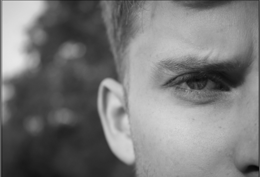
My campaign is displaying poverty within adults, and families, therefore wanted to use someone who was an adult. I decided to use one eye, and have him skinning to display emotion. With a lot of the photography within poverty, they use depth of field to display the emotion and this image portrays that.

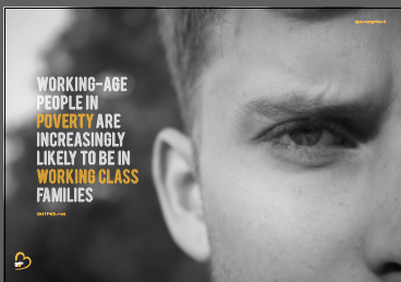
The same layout features within this poster but is almost completed on a larger scale. When we completed the first critique without even noticing the wording was completely wrong and did not make any sense therefore this was something that had to be changed. I used facts from full fact.com therefore all the facts link together and come from the same website.

” WORKING-AGE PEOPLE IN POVERTY ARE INCREASINGLY LIKELY TO BE IN WORKING CLASS FAMILIES “

Within this sentence that’s featured in the poster there is not a numerical number to highlight and focus on therefore, within this sentence I chose words that stuck out the most to highlight the issues in the world. In this case would be POVERTY and WORKING – CLASSS. I highlighted these words to ensure to the audience that poverty affects the working class the most.

Just like the other designs I wanted the logo to be placed in the bottom left hand corner, and the @PovertyUK instagram account located in the same right hand corner.

I Thought the type would sit perfectly on the left hand side due to the empty space the sat aside the image and I believe it does. With the type with all the posters it follows the same layout purpose, meaning that the words on each line are around 2 to 4 and this then creates a block in which the type sits in.

The final poster:

Below is the final poster for my landscape design. It portrays a deeper meaning of emotion in comparison to the other posters and I think this is because the look in his eye. This photo does not show surroundings he is living in but the way in which his life is effecting him. Within his eye you get a sense of struggle, without even seeing the rest of his face because of the eye brows and how they are frowning indicates anger and fed up. I think this photo captures peoples attention because the focus is in the eye; the emotion comes from his face. Unlike the other ones where I have displayed a subject and his surroundings this one focuses on one thing. The black and white made a huge difference to the effect of this poster, and turned the mood from vibrant and positive to depressing and in need of help.

I did not want to use one person to model the entire work because it effects thousands and singling one person did not seem right. I wanted to showcase a multiply of people and the different ways in which it could be affected.

Mock up of final poster

Poster 2

Uncategorized

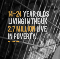
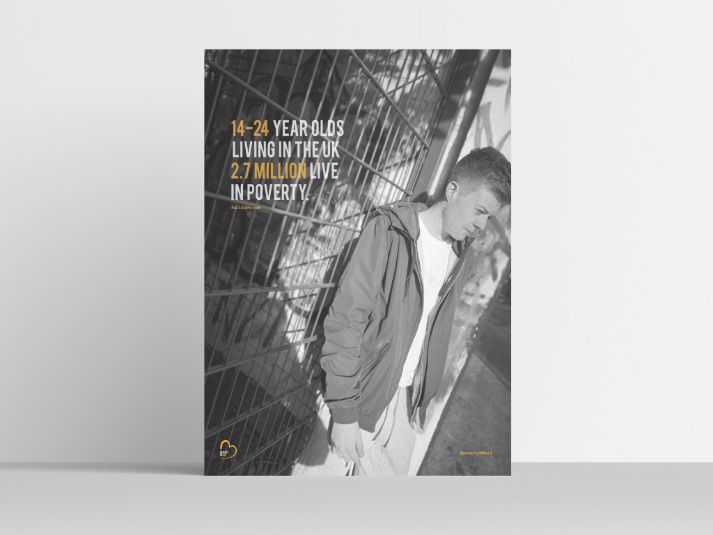
The design elements within the magazine are similar therefore not much needs to be discussed. The key elements that need to be continuous through the design are the logo and the link to the instagram page, and the full fact . com. This poster indicates life through the ages of 14-24 therefore I wanted to use a photograph that indicated younger people and how it would be for them. I decided to use the exact same layout as the design before hand by this using the bebas type, and the colour scheme. Again, the key information which in this case is 14-24 and 2.7 million, these sit in the colour orange as they are the key information, and again sit in the opacity of 78%.

Again, the link of the website where all the information is collected from sits in orange in the courier type facd underneath the type. In the right hand corner again sits the @povertyUKaid in the corner.

The image;

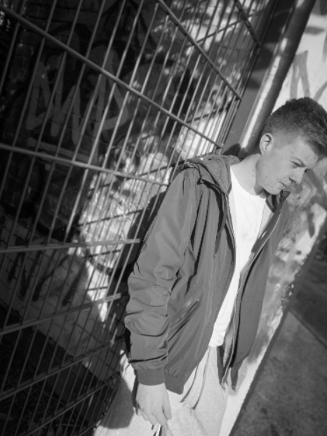
The image within this poster features my brother leaning up against a gate. What I think makes this photo work so well is the angel of the photography, you can see Danny’s emotion and the background he is surrounded in. Again, making this photo black and white allows the photo to portray emotion through the design; the original photograph displays sunlight and even with the black and white you can see the sunshine, and this reflects on the subject and the background well.

Final image:

This is the final poster design for the second poster. As you can see this is exactly the same as the previous poster meaning it has the same position of type, same colours, and the indication of the instagram and where I gathered the information from, sits below the type.

The key thing for this design was to make sure the logo and the type and all the elements were in the exact same place as the previous design. To do this, I had to copy and paste it from the previous design and align It in the exact same place. It was key to ensure there was enough space between the top of type and the width as the previous page, and the @povertyUKaid and the logo sat in the same place.

This photo is exactly the same as previous and portrays the same message. The image explores the emotion through different ways such as the colour, the posture of the subject. I think what makes this photo excel more than the other is due to the light that is portrayed through the photo. I think displaying the subject in different angels allow the sensitivity of the subject come alive more. Overall this image portrays poverty well, links with the type and advertises the life of poverty through a 14 to 24 person. These posters act as a taster to the magazine, and then explore more into what poverty is exactly like.

Mock up of poster

POSTER DESIGN 1

APP everything

The first poster I designed was a. trial and error to establish whether or not it would work as a design concept.

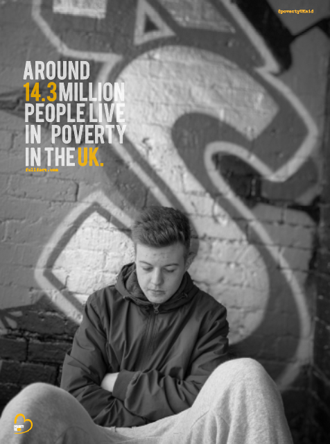
Before designing anything I looked at full fact . com and this is where I accumulated the majority of the facts that are portrayed in the designs, so people knew where the facts came from to make them more true. The first photo I used was this one below as I thought it represented emotion of poverty well and the life that surrounds it. This photo represents sadness and life on a daily basis. What I think makes this photo stand out and work well is the graffiti in the background and the emotion displayed on the face/

The final took a lot of adjusting before the completing it to the standards that I would be happy with. I wanted to have the logo within the poster and this then would set the colour scheme that I would use through the designs.

Finding the right place for the logo was actually a lot harder than you would thing. At first I tried it in the top two corners and it appeared way too big. Below are some examples of what it looked like and to me it was taking over the poster photography and was way too bold for the eye. I then thought I want people to read the text then the image then realise the company therefore I thought it was easier to just to put the logo nearer the bottom.

I then decided to add the logo in the bottom left hand corner because you could easily navigate it and still represented the company well. Due to the fact that the picture is black and white it makes the logo stand out so much more and develops a colour scheme through the rest of the design. I think the logo works well with the BEBAS type through the poster design; the key thing with logo design … is that as long as the design works small and large it can work well with the design which in this case I think the logo works big and small as its able to read.

The purpose of the posters was to make awareness of poverty in the UK. Therefore having facts and statistics would enable people to understand poverty more. Before we had the first crit my designs did not have any indication of where the facts were gathered from. Therefore one of my developments to insure I had somewhere on the poster of where I got these facts from, otherwise it’s the so what factor? and the audience may not believe the facts I am portraying.

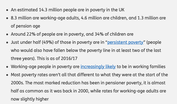
I took all the information from full fact . com therefore wanted to display this somewhere in the poster design. Below is the information I used for the posters. I wanted the type to be short, sweet and straight to the point to make awareness.

I decided to stick with the BEBAS type face to show the link between the logo and the poster design otherwise would be way too much type going on. This is first thing you would notice along side the photography therefore it was key to make this bold and set the entire theme for the poster.

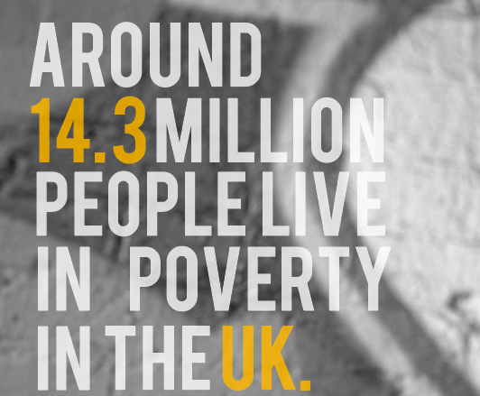
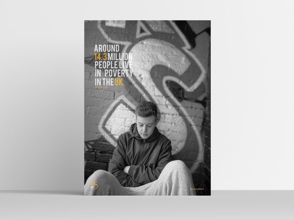
I used the fact ‘around 14.3 million people live in poverty in the UK’ I wanted to use a fact that went straight to point of the million of people who suffer within poverty and how it effects people that are right under our noses.

I played around with the type for a long time to ensure it was the best layout possible for the design. I wanted to make the type feature colours that was in the logo as this then became the theme through the designs. The idea was to highlight the words in orange so these stood out more against the background image. At first I thought the type was way too bold and almost clashed against the image; therefore I lowered the opacity to 78 and this made it visible still to the eye. I wanted the 14.3 and the UK to be in orange – this then makes the audience focus on the facts and want to read more and understand more in ways to help. It is only a small feature but the full stop makes it seem quite blunt and too the point, I think it makes it quite a snappy point; if it did not have a full stop I feel as if the audience would feel as if the information may continue.

As said previously In my first feed back I got told to add somewhere within the design about where I gathered the information from to make it a reliable source. I gathered all my information from full fact. com therefore this was linked within the poster. Within my magazine design I wanted to use courier type face therefore to show a connection between everything I thought I would use these for the smaller information provided on the poster. Therefore below the type, I added this in the courier type face \ I did not put the entire URL as it would look awful and less professional… therefore I just put the general website therefore people could locate other factors for themselves.I decided to make it in this case sit in orange as there was a mixture of white and orange in the text and felt like this stood out more in the orange in this case.

I then decided to actually create an instagram page dedicated towards poverty UK aid to make people aware of the upcoming issues the UK faces today. Therefore, due to the era we are in the main form of interaction seems to be instagram, However I would create a magazine as time progresses.

In the top right hand corner, I decided to add the instagram – I was going to add the website etc however I wanted a quick way people could view what we do and then direct them to websites etc. I then decided to put it in exactly same time as the full fact one so these two aspects acted as information that was key.

Final poster design:

Below is the image of my final first poster. I think it portrays the message well. The emotion for this image is portrayed through the colour of black and white. It’s the idea of being alone and feeling so isolated within the life of poverty. The type is simple yet effective, and sets the colour theme for the rest of the design. Poverty is something quit delicate and something that is a sensitive topic to some people; therefore I think this image portrays’ poverty well and makes a good advertising campaign. Every element within this design will feature on all the magazine. The use of golden spiral through this design allows the perceptive of each element appear to the eye.

Mock up of poster:

CREATING A BRAND

Uncategorized

For my design I wanted to create an entire new brand to help poverty within the UK and create a platform where w make awareness of the current issues and allow the public to help other families in need. I wanted to show case live through photography and advertising techniques and create something different in comparison to other companies. Therefore I created poverty uk aid.

Creating the logo:

I wanted to create a brand, a logo and a platform which enable me to help others who struggle through the lives of poverty in the UK. I wrote down a bunch of words that I felt represented poverty well and this then enabled me to research ideas and connect for the logo design.

The word that stuck with me the most was the word COMPASSION. I then searched this within Pinterest and thought of the best way in which I could display this within a logo form. I found this image.

I actually did drew it myself on my iPad but have unfortunately miss placed this sketch, however it was just the heart shape that inspired me not the wording. I then started playing around with colours; I found a connection with the colour red and orange. I then looked into alternative reasons behind colours, the purpose behind my design is to present the depressing side of poverty in the UK, Therefore I wanted a colour to contridic that that expressed hope and positivity.

definition of the colour orange:

Orange combines the energy of red and the happiness of yellow. It is associated with joy, sunshine, and the tropics. Orange represents enthusiasm, fascination, happiness, creativity, determination, attraction, success, encouragement, and stimulation. … In heraldry, orange is symbolic of strength and endurance.

^https://www.google.com/search?client=safari&rls=en&q=orange+representaion&ie=UTF-8&oe=UTF-8

This then inspired me to create a black and white, with orange theme within the designs and the logo.

The process was so easy as I already had a simple idea in my head. A logo is meant to be simple and effective therefore complicating it would mess with the original meaning of a logo. I simply vetoed around the inspired image of the heart.

I then filled in the heart in this bright orange that stood out for me. The type I think works best is BEBAS it is simple, bold and effective. Therefore this was inspired for the type. At first I was not going to leave the gap between the heart but then I thought this would be a good place for the title to sit.

I made the ‘poverty UK” grey and then the word “aid” match the orange heart. At first I tried the entire writing orange and that is came across way too much orange and portrayed too much of a positive appearance. Then I tried black and that became too dark, then I lowered the opacity and then thought to show a connection between the type and the logo so they did not become separate from one another.

Final logo:

This then became poverty aid UK’s final logo. I think it works so well and portrays the idea of compassion and poverty all in a simple logo. The colours worked well with one another and acted as a starting point for the colour choices within my design.