The only issue with the A5 design was simply the fact I lost them. I had no intention of not using them until my Mac decided to update and I had to work around it. Therefore the main point was to create a school pack this school pack would be involving a magazine and some cards for the kids to take away but due to loosing that I wanted to create this blog in order to explain that. I could off re made them however due the timing I had lost them in I decided not too. Therefore the focal point has changed slightly only meaning that instead of a school pack it is just a magazine the fire fighters can give out after assembly’s.
Author: ktwilliamsdesigns
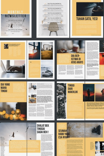
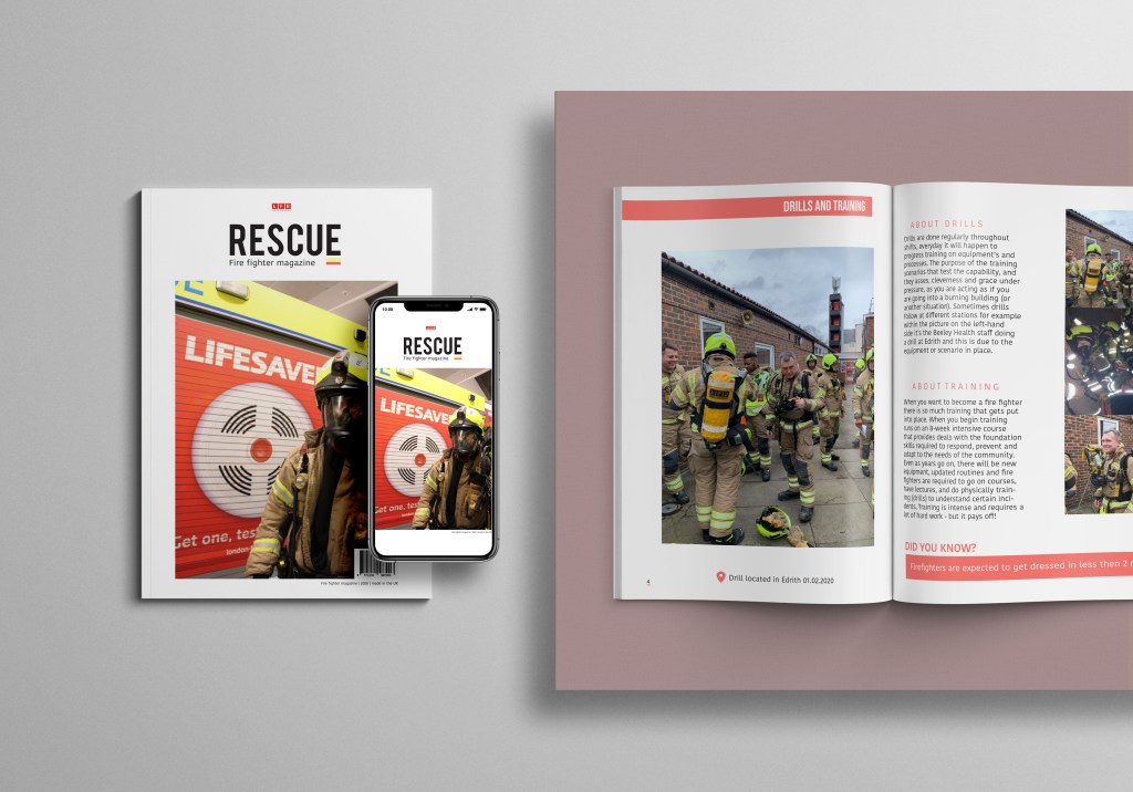
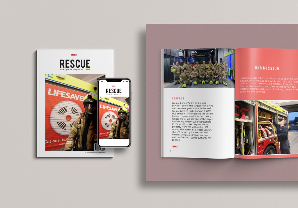
FINAL DESIGN BACK COVER
creative conscience final designs and processThe back cover was needed just to make it all come to an end. I did alter this quite a bit because I wanted to make sure I was ending it on the right message.
this below was the first design and I didn’t actually have a link to the LFB website and thats pretty much where I gathered all my information from and collected the research and I wanted the kids to be able to connect to this quickly and find out more information if needed be. so for a while this was the front cover but I altered it to end on the right message.
final design:
Due to there being a minimalistic theme throughout this design I felt like I had to continue that throughout. So I decided to start the back of the magazine of with the link to the LFB website and to continue the theme – on each page below the number I added the yellow and red lines to link with the idea of fire and their service and I think people associate these colours with them quite well. Therefore to showcase the continuation throughout I decided to add the two lines underneath this to make it stand out and show a connection through the designs – this also allowed the type to have a bit more structure otherwise it was very randomly placed. I then thought because this entire thing is for LFB I wanted to showcase their logo like I did at the beginning to show its all part of same design. Underneath I then added what was on their website for when people want to communicate with them – or how to reach them and they sit in black and red type. I could of just left it like that but I wanted to add an image due to the target audience I felt without an image it was such a boring design and too simple, by adding this image of a fire fighter (jack) in the gear near a fire truck to me represented them well as an overall and great way to end the magazine.
the mock up for this is slightly different purely because its the end of the book so no double page spread needs to be displayed.
here is the simple mock up:
I decided to create a mock up like this just to show what it would look like if they were stacked and handed out like this to schools.
FINAL DPS final design page 5
creative conscience final designs and processNow I decided for this magazine not to be that long – in fact it was more of a educational catalog that fire fighters could give to school children after finishing the assemblies to educate them not only about fire fighters themselves but also LFB and if these kids would want to be a fire fighter here is how and everything you need to know.
I wanted to end this magazine quite quickly and not go on forever due to the target audience and after a while they wouldn’t continue reading. So we continue the title theme again with a red box with the title fire trucks and equipment and this is the category for the next DPS. I used a lot of negative space in this design and wanted to almost mix it up a bit in style of placing images. So on the left hand page I started with rescue and fire trucks and gave a brief explanation and then underneath equipment. The issue with this topic is that fire fighter information and truck information could generally go on forever and its really complex therefore knowing the audience would be schools kids (secondary school kids) I just wanted a brief explanation then I would add links elsewhere to find out more.
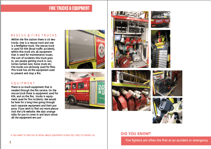
I then decided to add a little information in red that read that if you want to find out in detail about all the equipment contact them as there is so much to discuss and if the kids are interested they can find it out further.
starting on the left hand page I have started a collection of images that then fall over the gutter and into the right hand page. I felt like because I was discussing a lot I felt like a variety of images were needed – but to engage the audience I decided to make them sit with one another and create this collage effect. I think this lay out not only interest the audience its different but it allows the audience to visualise in a unique way different parts fo the equipment used.
I think this page is a great way to end this sort magazine as I feel like its a teaser for becoming a fire fighter allowing the audience to connect with it and want to find out more. its a perfect way to end due to the colours and the layout as it displays a more unique look in comparison to other pages.
thesis the final mock up for this design and when added to the mock up I decided to make a few alternations such as moving the images over so it wasn’t so close to the gutter other wise you couldn’t visualise them therefore now there sits a white line where the gutter is. I also forgot to mention that there is another did you know fact that I added the bottom of the right hand page to allow the audience to walk away with some sort of knowledge.
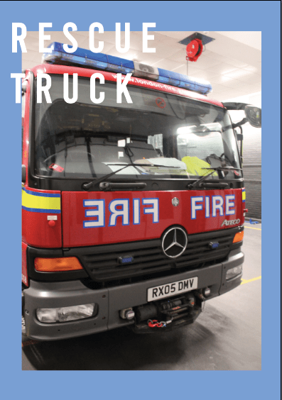
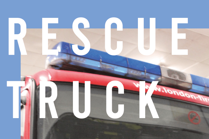
FINAL DPS final design page 4
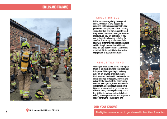
creative conscience final designs and processThis page is all about drills. Fire fighters do this regularly and is part of their everyday routine and I feel its important to educate that.
This was the first page and the first mock up I created BUT I changed it. I am not sure if its my eyes or its actually seen like this but t he big image on the left hand side looks wonky and when adding it to my new mock up it appeared wonky and it was driving me insane therefore I re did the photograph and went from there.
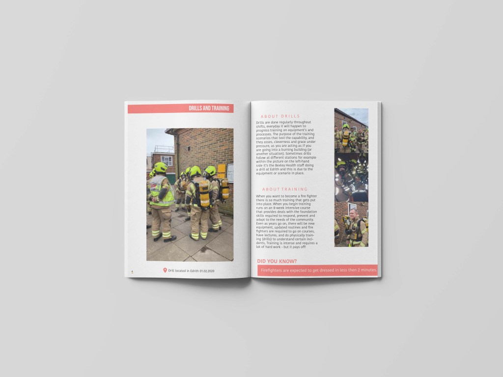
I started the left hand page again with an introduction bar indicating this was about drills and training. I then added a bit more a clear photograph – this was given to me bye my uncle and it clearly shows what its like and the location that drills take place. I wanted to showcase just one image to engage the audience and then the next page showcase the type. I made the image centre in line with the end of the block title. I made it large but not to fill up the entire room leaving negative space to allow the design to breathe and also fit in with the rest of the other pages – then I wanted to showcase where they went for their training and drills and thats located at the bottom of this page acting like an image caption. We then move onto the right hand page. I could go into a lot of detail about drills and training but I felt like it wasn’t needed – this information was taken my own knowledge and therefore I was able to choose how it was wrote. I could of made an entire page because there is a lot – but I wanted to keep it short and sweet for my audience. I then decided to break them up the top paragraph being dedicated towards drills and the next about training – we then have images down the side.
Due to changing all my other designs I felt like I had to change the mock up for this design as then they all come together really nicely and efficiently. SO after alternating the image and adding the features that made this design the design it needs to be – I made a new mock up.
I had to re download the mock up therefore some elements were slightly different to other mock ups but I tried my hardest to make them the same.
The annoying thing about this mock up is the fact the colour background is a different colours to the other mock ups but I do not think that matters so much as its not part of the design. Below sits the mock up for this design: Having this mock up really allows you to see if the double page spread meets the theme and the connection to the front design and I feel like it does and portrays the same style and message we want. The one thing I wish I could change is the type I would off changed it on this one however then I would have to change the entire magazine which I just don’t have time for but now I have learnt that type in a magazine needs to have a certain paragraph edit to make sure all the type is in line with one another.
FINAL DPS final design page 3
APP everything, creative conscience final designs and processThis is the final page for this DPS. This one is slightly different in comparison to other pages as I feel like there is a lot more information. I tried my hardest to make sure I was making it interesting and adding colour so people wouldn’t skip pass this page. Yes I could of made a better design for it or not even used this page – but I felt like it was important for people to understand the life of a fire fighter. I think a lot of people who arrest related to fire fighters or learn about it think all they do is put out fires and that is not all they do. they help the communities in a greater way, they have to sacrifice a lot of time and by show casing different avenues within this design I really am educating kids if they are cut out to be a fire fighter and what fire fighters do.
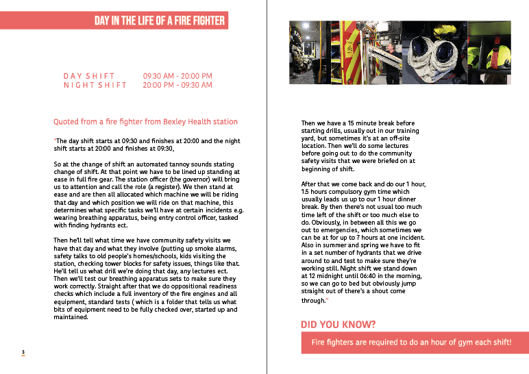
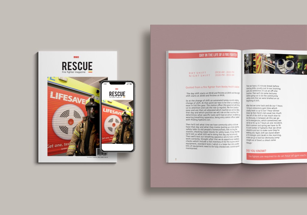
Just like the previous page – I start of with a bold headline indicating what this page is going to be about – sitting the exact style and format as the page prior. I then thought of ways in which I could break this down – I could add an image but I have used so much already and also didn’t have one that I felt would fit the design message. Therefore I went to my best source of colour to fit the page together. Now as your notice the next few pages do not display the red page on the right instead displays white and has elements of red across the DPS. I didn’t feel like it was needed on every single page – the thing with a magazine not every page is the same otherwise it gets quite repetitive therefore where there was more information or not a lot of imagery I decided against the red but the theme does continue.
On the left hand page we have at the start the day shift and the timing that involves that – and then below we have the night shift with the timings on that. I wanted to showcase this purely because I didn’t even know this myself and thought it would be a good idea for the younger audience to visualise what a day in the life of a fire fighter is and understand the long hours they do. We then start of the paragraphs with where I got this information from and it was quoted from my uncle but because we already used him as the interviewee I didn’t want to showcase his name again, therefore it looks like I gathered my information of a bunch of people not just my uncle. I then used red quote marks again and began wiring his day via a night shift and a day shift. AGAIN I wish I could change the awful type as I cannot stand the way its placed and it has to be edited but I just don’t have time – after doing more magazines since this I have developed so much more and I am picking out a lot of issues right now. I would off loved the type to be thinner in and ave the paragraph edit where the enlinements was clearers. On the right hand page I added some photographs at the top – the photos are of equipment as this is part of the daily life of a fire fighter. and then the information continues over the page.
to keep the consistency and the audience entertained I added another did you know fact – but the time it linked to part of their day. Having this little fact really enables the audience to feel attached to the design and actually walk away with something no matter what part they choose to read.
mock up:
This is the final mock up for this page. I think this page works well there are a few things I would change like I said the paragraph settings. I feel though considering there is a lot of information here I have broke it up well to allow the audience to learn something and understand what it’s like to be a fire fighter. I could off put it in bullet points but I always want my designs to tell a story and I think this page achieves that.
FINAL DPS final design page 2
APP - finals, APP everything, creative conscience final designs and processThe page numbers for this magazine is slightly different to other designs I have achieved due to the fact it being so small. So the next DPS counts as page 2 as it follows on.
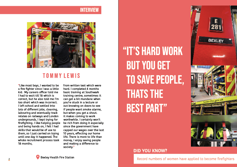
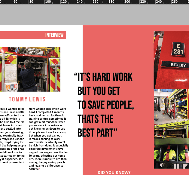
This page is dedicated to the person who inspired me through this design and the person I interview. My uncle has been a fire fighter my entire life its all I have known him to do, when I was little he was a hero to me and my brother looked up at him so much. I wanted to get inside his head – understand what its like to be a fire fighter and even if some of the things he didn’t tell me aren’t on here I did learn so much for him and made me realise a lot. I do have his permission also for this therefore i was able to use his photo and his name.
So the left hand page is dedicated to his interview. I wanted to now start making it a bit easier for the audience to understand the design. Now this a magazine but it acts like a leaflet almost as there is no context page and thats purely because its so small and I did not think it was needed. I started the page with a red square with a white type of interview – to allow the audience to have some indication of the design. I then decided. to add a small photo of the back of my uncle working and showcasing different elements of the fire equipment. I felt like this picture spoke a lot of words as it was able to show all different equipments and see a fire fighter in action without going into fire – preparation is key. Like the first about us page, I made his name in this space out type and this then became a running theme throughout the magazine for titles. Now that I am looking at this design over developing my magazine skills the writing angers me so much – but its too late to chance. I made the writing sit in red speech marks to fit in with the theme – and have two columns of information and this is word by word what my uncle said. I now wish I had edited the paragraph style as I think its so annoying as my skills have developed a lot and there is a lot I would change about this DPS. Underneath I wanted to add the location of his fire station because it deserved credit, I am taking photos of their station and without them this magazine would not have happened – also to make awareness as my uncle said a bunch of fire stations were cut due to the government and making awareness of them is important.
We then move onto the right hand side – this is the exact same as the page before in the meaning of the red background. I wanted to make sure there was a consistency throughout as it was dedicated towards the exact same topic and if they were different it would be awfully designed. When we had the first criticism I got told to change the type as as if you look below the image I explain why*
I made the type sit in quote marks – this was a quote I felt represented what being a fireman was like. This was the best way to describe it. I asked my uncle why he did it and this was his answer. I made this sit a lot larger because I felt it was important for the reader to visualise. I then made all the images sit down the right hand side. Like the first red page I left gaps a there is a lot of information in this magazine and sometimes leaving negative space allows the design to breathe. Having the type large also allows the page to not be as boring – not a lot of kids would read the paragraph but I feel like if they had a focus which is the quote they would actually want to read what its like being a fire fighter.
*
so this was how the type was at first – but someone said at the first crit that when printed they wouldn’t be able to read that. its not always true as depending if the size is large and its a small amount of text it can be read over the gutter but I did understand that it could be hard to read as its a few words. Also that the black wasn’t really fitting in which I knew. Therefore I changed that complexly.
At the bottom of the pages. Then began adding a did you know section. When researching into magazines for school kids (secondary) thy usually displayed a did you know factor. I added this because I think even if someone who hates reading only looks at the pictures and reads the big quote they come away leaning something. If they then read that small did you know fact they are being educated which links to design for good.
first mock up:
This is the final mock up for this design. I did do one like I said previously but I felt like throughout I want to show the finals I would off printed and this is the mock up I would off printed. Doing this also allowed me to see if the DPS actually linked with the front cover and if I was using all similar colours throughout.
FINAL DPS final design page 1
APP everything, creative conscience final designs and processFor my project the magazine is the focal point and therefore I wanted to make sure the design was easy for adults and secondary school kid to read. I did look at some reference layout imagery but personally I found it easier to create from my own I looked at a few from previous but sort of made up my own style which I was quite proud off.
This is the first double page spread. I wanted to have a page that introduced people to the topic I was aiming for with the design and entice them into the design. On the left hand page I have decided to make this was an about page; This is a small magazine therefore it has to be structured well. As the years have gone on I have thought a lot about a reproduction and the way in which a magazine needs to form and structure.
The left hand page starts off with a group photo of them all together and placed in their LFB surroundings – having them in their uniforms when they would go out makes it eye catching the audience. I feel like school kids automatically associate fire fighters in this uniform and therefore acts as an indicator for the design outcome. I decided to make the image sit at the very top of the left hand page leaving no gaps. I didn’t want to over crowd this magazine with information wanted to make it quite simple. I then decided to start of the colour theme within the design – below we have in a spaced out type BEBAS type face. I started this with a red type and then below adding this type. Now I am looking at the finals I realise that the type could be a lot more paragraphed and edited better and I think thats due to the fact that I have developed since creating this. I used the information from the lFB and to showcase that it was from that website and this is the income of information. I think that I wanted to make this design quite simple and not over powering. I think that this page set up the rest of the magazine design. I made the paragraph sit slightly of centre and then below I added the LFB logo which could allow the audience to associate where the information came from and what this entire magazine is focused on. In the corner sits the page number which is underlined with red and yellow as I felt like it was needed to make it seem a less randomly placed.
Right hand page: *
This page sets up the colour theme throughout and works well against the left hand page. I decided to make the page this light red colour and it would then would relate to the inspiration of the Pinterest picture. I made the right hand side was the same colour as the title of the title displayed on the ‘about us’ title. If you look at these pages next together you can see they are opposite – so the right hand page starts with a red background and our mission sits slightly bigger in white and then the type sitting underneath is again sitting in white. Below sits the image – but due to not making exactly the same I thought of adding the photo in the middle slightly and with a white boarder – without the white boarder the image didn’t really stand out due to the fact of the colours and thats the issue if both the pages were colourful.
I think this page really engages the audience and allows you to have an insight into the LFB – when asking my uncle he said that everything displayed on here portrays LFB in their best lights and thats a good reaction. On the left you get an insight into them as a collective and all working together so save their city. I think having the red against the white page makes it become less repetitive and boring to the audience. I think it makes I have a bit more character.
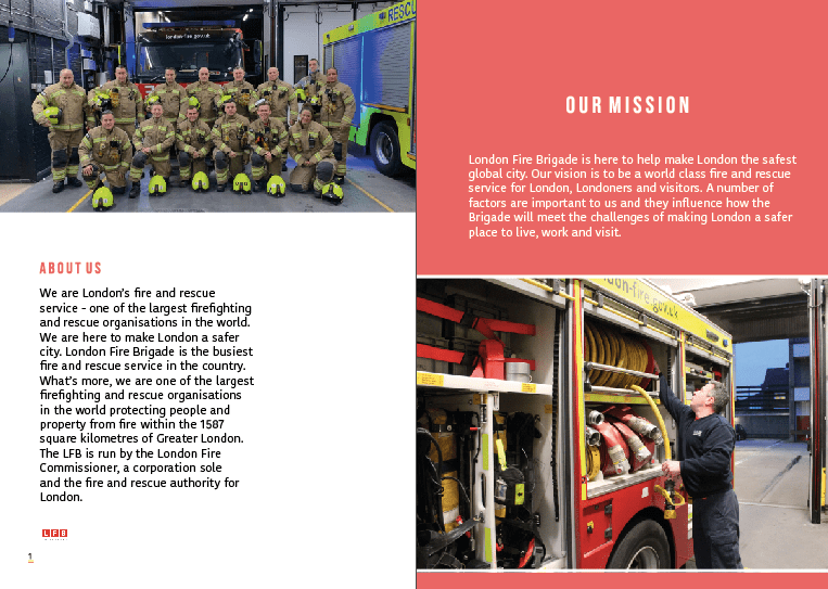
*The right hand page was inspired by this image below; that I found on Pinterest- I thought due to the audience being kids and secondary school kids. I was going to use the entire page filled with colour background but because a lot of the photography had colours and different shapes etc I felt like this would make it a little bit tacky.

I actually did two mock ups and develop them further due to the length of time I had been given I felt like it was needed to make a bit more of a development with the mock ups. An issue had occurred to one of the a5 papers and therefore this is why I decided to mock up a little bit different.
this is the first mock up:
This mock up shows what it looks like as a magazine and it works well and allowed me to understand the design when printing. I actually used this as sort of a test print. As I printed this off at college and started analysing it but I felt like it could be developed a lot more. I actually did all the pages as mock ups and then I developed the mock up and I will show that on each blog.
final mock up:
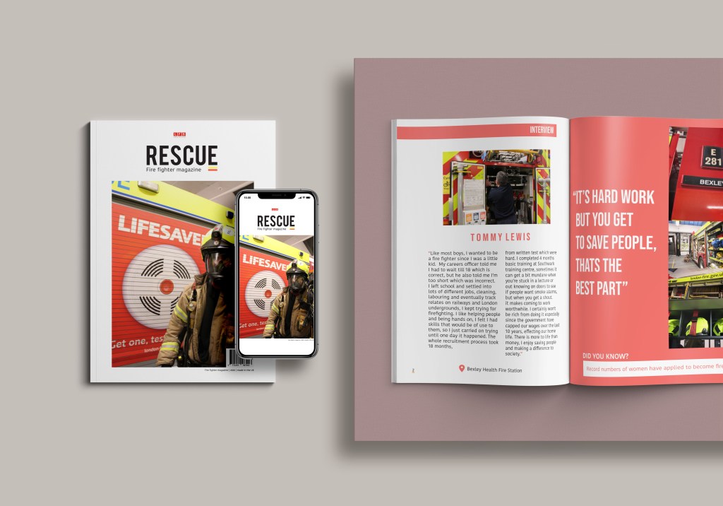
Due to losing one piece of work I had to add more. So this mock up shows not only the magazine but the front cover and also how that would look on a website. I want to make this magazine able to view on the lFB website – say for example when your on their website its a link that takes you to a PDF magazine. the years are progressing and making things feature on phones etc allows the target audience grow and reach down to the younger generation levels.
This mock up therefore displays a front cover – and what that would potentially look like as a on screen magazine. I then have the right hand side the magazine. The issue is it cuts of some but I think the fact that I have the old mock up allows you to visualise what it is like. This entire mock up allows the audience to visualise the entire magazine even if they advent purchased it your viewing the outside and the inside the only thing your not is the back cover but thats a seperate mock up as it wouldn’t be shown on a phone.
A5 design / experimenting
Uncategorized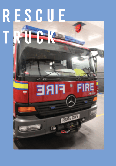

Front cover design / logo design
UncategorizedNow I was not creating a logo in such for a brand, but for the magazine. LFB is already to company therefore it was being designed to act as a title for the magazine.
Inspiration:

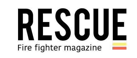
This logo above inspired my logo a lot as you can see its very similar. I wanted to make sure I was creating something that stood out, and because this entire page inspired my design I thought I would experiment with the type as part of my design.
I wanted to make it a short and snappy and straight to the point with the logo as I felt it would work well as a design – similar to my inspiration.
Before I created the logo I had to think of words that related to fire fighters and also the message I want to achieve. I wanted to create an awareness through the designs to portray fire fighters as not only putting out fires but rescuing people. when I thought of fire fighters the main thing that game to mind was the idea of the idea of fire fighters rescuing people.
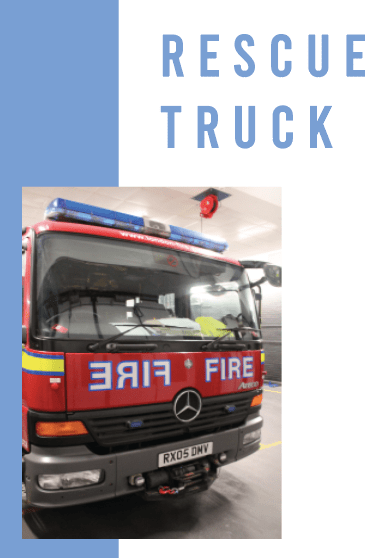
I thought of the word – RESUCE. I wanted to showcase a simple yet effective focus on the fire service. As you can see the inspiration is from the image above. I wanted a simple word that would be bold and I felt like this worked well – I then decided to add a bit of colour and this is when I got inspired to use the two lines (yellow and red) to underline key elements for example page numbers or website link. In this case I added t below the E to make it more of a image and come together to stand out and set a colour scheme for the rest of the magazine. I then added fire fighter magazine as I felt this represented the entire purpose of the design.
Layout decisions / magazine
creative conscience final designs and processThe first thing I created was the magazine therefore the first thing I looked into was the magazine layout that I wanted to use for the front cover and the inside of the designs:
I find layout plays a big role within magazine design as it gives the overall message not only on the topic but also you as a designer.
First magazine front cover inspiration
The first one I loved was this one below, the colours linked well with my topic however for me it was not the outcome I was after. However the reason I am putting this here is to show I did not just go for the first design layout I found – I found this one first experimented with this (but lost the screenshots) and then took elements from that experimentation which would feature in my design meaning the blog ‘icon’ title was something I wanted to include within my design.

INSPIRATION FOR FRONT COVER / LOGO DESIGN
This design was one of my all time favourite designs as its so simple and so effective in the way in which they have displayed their message. The biggest inspiration for me was the type in the corner, ‘rite’ it was so simple but caught my eye right away – which inspired my logo. The positioning of the page worked so well which also inspired me and the little details either side. I personally love having white surrounding the design as it lets the image breathe and the type and title breath a lot more.

Double page spread layout inspiration:
Now I did not stick with one design layout throughout the making it was more of a case of being inspired by a variety of a designs. Now I wanted to make sure there was colours within the design as it is aimed at kids, therefore I picked up designs that had colour. I always aim there to be some elements of white within the designs, as for me it makes the design look clean and simple, but adding colour I felt had to be done right and work well with the topic.
If you look at all these designs, you’ll notice every single one has an element of colour within them. I actually did experiemnt with the first layout, but it did not work at all, I did the exact same layout but changed it to red and added fire fighter colours however it was so cluttered and from that I knew not to just stick with colour just adding elements of colour would allow the design to come together.
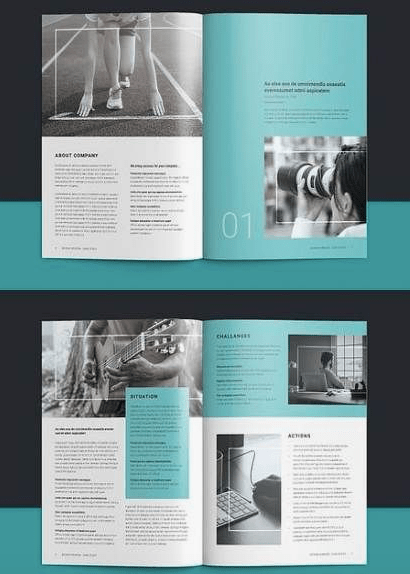
This one was the biggest inspiration for my designs, reason being, that the designs feature a ‘pop’ of colour that goes over white backgrounds. The yellow stands out but also allows the white areas to shine through.