I thought I would look into some companies that specialise in helping poverty in the UK so I could get an understanding of some existing cases out there – this would than develop ideas towards the design aspect through poverty countries. I personally think there is so much out there for child poverty, and teen poverty etc but there is hardly anything out there for family poverty and if you don’t experience this sort of poverty do people even understand it. I decided to look into a variety of companies that specialise in poverty within the UK that is not just child poverty, or teen poverty.
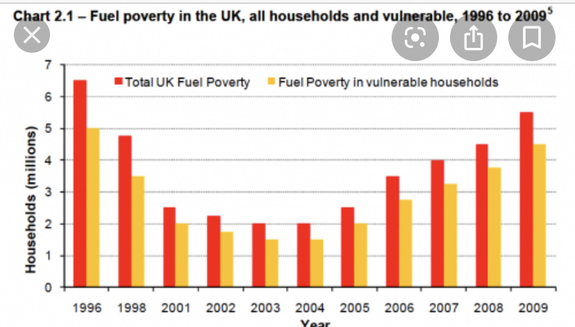
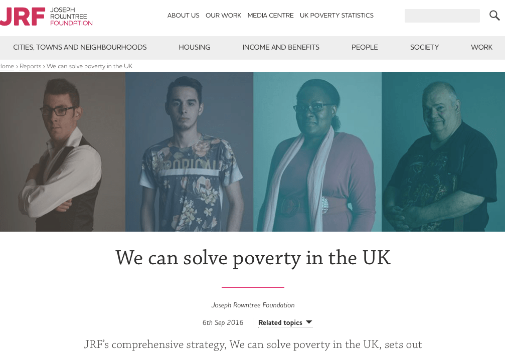
The one that stood out to me first and one where I actually took a lot of the statistic from through my research, we’re JRF. However, they do not seem to create a lot of advertising campaigns its mainly all online.
They claim they can solve poverty in the UK… Have they tho? thats a big statement to say if you cannot actually achieve that goal. Their website displays a variety of characters and then stories and statistics follow this.
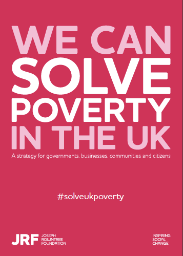
Within this website page, they have a PDF you can download which portrays way in which they want to solve poverty and this acts as their advertising campaigns. They display this PDF advert at the beginning and this then continues the theme throughout. WE CAN SOLVE POVERTY IN THE UK’ you automatically believe it you think ‘omg really how’ which makes you read on. the only thing for me is it looks like a poverty aid poster for periods and this is due to the colours they use. Why pink? They created a hashtag to then expand their audience and make it more aware to people.
The pdf is almost like an editorial design, therefore I chose pages that symbolised the meaning well and fitted in with the editorial aspect of the design . They first display a contents page the displays a completely different colour theme in comparison to the front cover therefore does not really show a link…` It indicates all the issues and questions that face around poverty, ad probably all the questions that formed around the big statement they portrayed on the front cover. They display facts and statistics from goverments investor etc and make the information seem so reliable and understanding.
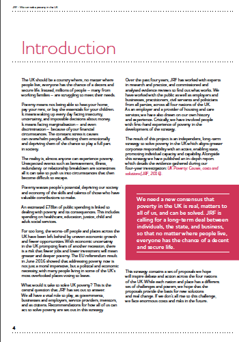
On the third page, there is still no sign of any photography and as a reader it makes you just want to skip past this page. This is introduction but if you look the amount of writing that has been displayed here it makes it hard for the reader to pin point a certain key information therefore makes them skip to another page. The only thing that stood out for me was int he pink box as its bold and in your face, and this statistics followed me through the rest of the design and I remembered it. But did not remember the rest. Displaying its key to make the most important information large and bold for the readers to understand and take it in. Having an introduction allows the reader to understand their purpose, and by the looks of it they are displaying the reasoning bending their mission and ways they want to stop poverty.
I chose this page because they do not just focus on a certain fact or statistic they display a lot. On the right hand side they display in a bright pink a topic opener, they then display facts on how they will achieve their five-point plan to solve poverty in the UK. To make this so believable and actually have faith in them they then display facts in a purple so it stands out about poverty, and the facts hit you hard and make you want to help out.

They continue through this 50 page magazine to express what poverty is, how to define it, what it’s like in the UK, and ways to help it. There are os many pages, therefore thought I would only analyse a few more that I thought would be beneficial for my magazine design and the over all purpose of designing for poverty and the sensitivity that goes around it.
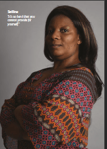
This page when together is portrayed like editorial design, with the advertising image on the right and the information bout poverty on the left. I chose this one because to define poverty in their own words, again they portray a lot of information but this time they show case it with alternative colours to make it stand out. This is the first page where we see an image being displayed. With the quote on the image “it is so hard that you cannot [provide for yourself” This allows the page to become more personal and you understand this women has gone through it. She does not look like she’s homeless or the stereotypical ‘poverty’ which some places advertise she’s a normal women that has worked but struggle and thats what I think is important with designs like this to make sure you are sensitive towards the images you display.
Overall this document makes you understand them, their values, and the ways to prevent poverty. This was an amazing inspiration for my designs, and allowed me to understand the sensitivity it that comes along with portraying a topic like this. Personal stories really sell it, and the personal quotes make you connect with the character. However I do think there should not be loads of type to inform people as there is a lot.